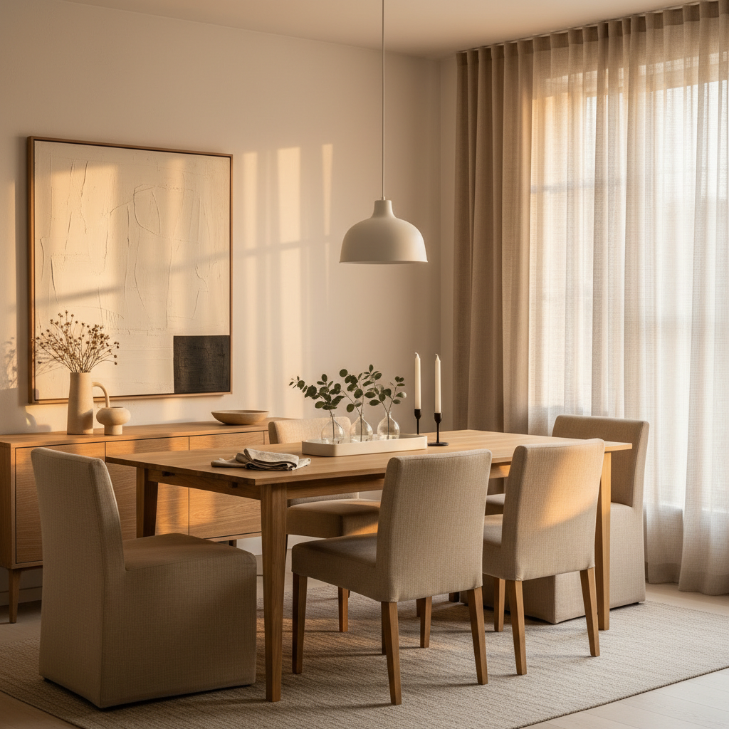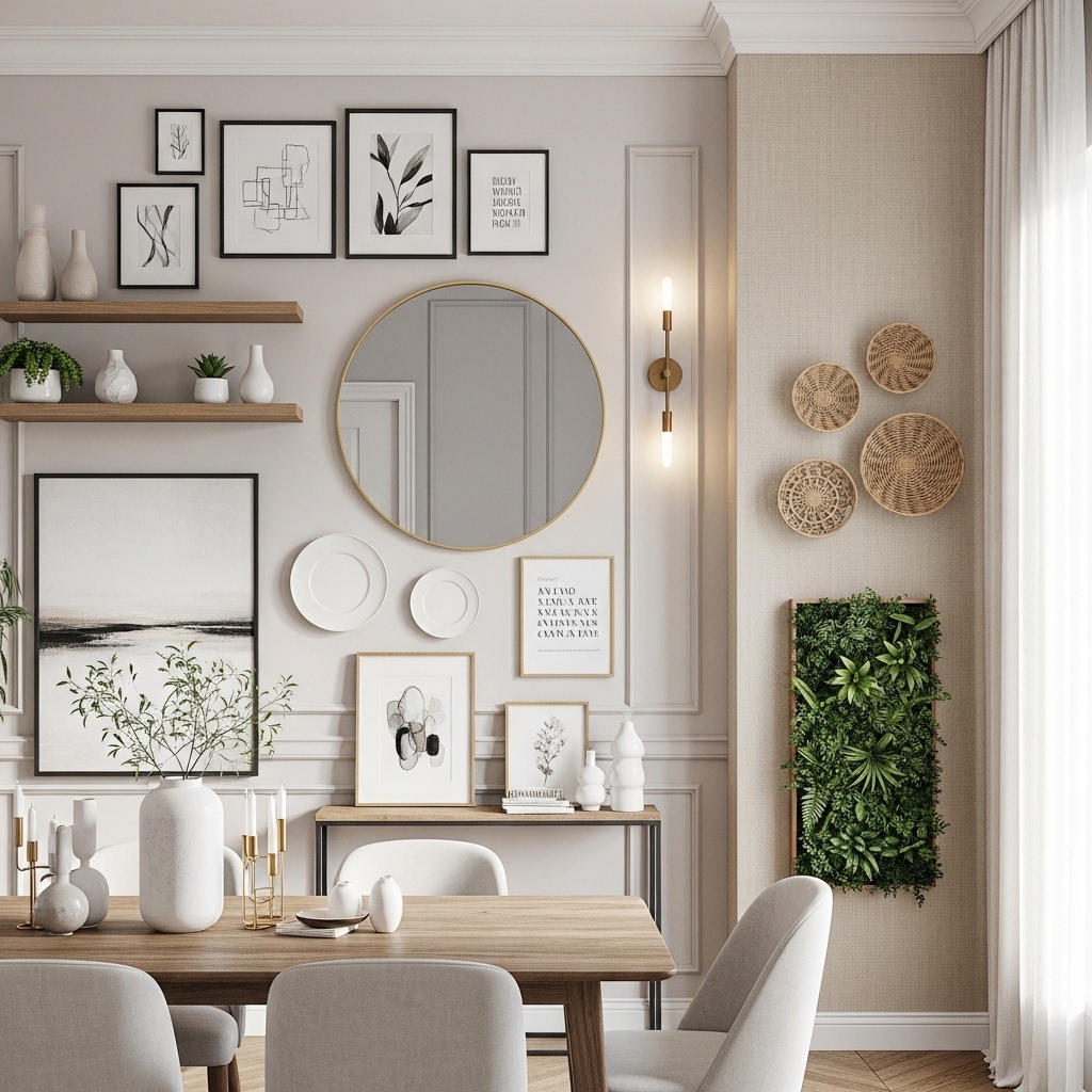
There’s something about dining rooms that makes people freeze up when it comes to walls. The table gets obsessed over, the lighting gets agonized about, but those four walls? They end up bare for months, sometimes years, while the rest of the room sits waiting to be finished. It’s one of the most common decorating stalls I see — and it’s completely unnecessary.
The dining room wall is actually one of the most forgiving surfaces in your home. You’re not sleeping next to it, not waking up to it bleary-eyed, not staring at it during a Zoom call. You look at it while eating, while talking, while winding down. That context matters. It means you can afford to be a little bolder here, a little more textural, a little more personal — because whatever you put up, you’ll see it in the best possible lighting (literally, if you’ve got a good fixture above the table) and in the best possible mood.
This guide is for people who want real ideas, not mood boards full of aspirational rooms they can’t actually recreate. Whether you’ve got a formal dining room, a pass-through nook, or a combined kitchen-dining situation, there’s something here for you. Some of these ideas work brilliantly for renters. Some require a weekend and a paint roller. All of them are specific enough to actually act on.
Let’s get into it.
1. The Statement Gallery Wall Done Right
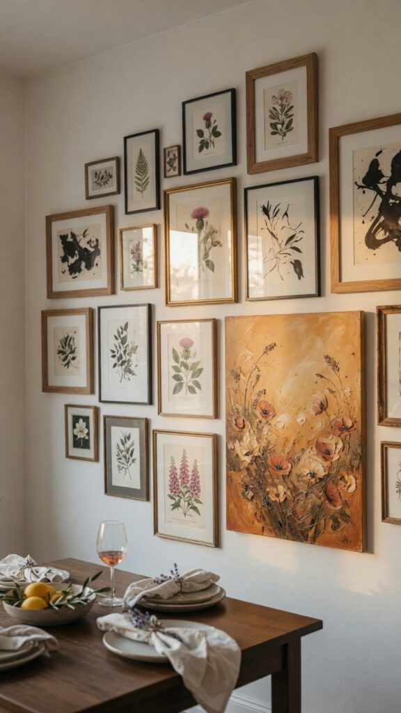
Gallery walls get a bad reputation for looking chaotic when they’re done poorly. The secret isn’t matching frames — it’s finding your tonal anchor first. Pick one dominant color that threads through every piece: an earthy rust, a navy-inked line, a warm cream mat. From there, you can mix frame finishes freely without it looking like a jumble sale.
The layout matters more than most people realize. Start with your largest piece off-center, then build outward. Leave at least 2–2.5 inches between frames — tighter than that looks cluttered, especially from a seated dinner-table perspective.
Mix subject matter, but keep the mood consistent. Botanicals alongside abstract works can live beautifully together if both share the same tonal warmth. Throw in one personal photograph in a similar warm mat and suddenly the wall has actual meaning.
One thing to watch: gallery walls in rooms with very low ceilings can make the space feel top-heavy. In that case, run the arrangement horizontally rather than stacking vertically.
It takes a Saturday to install and years to get tired of. Start with seven pieces, leave gaps, and fill them over time.
2. An Oversized Single Statement Piece
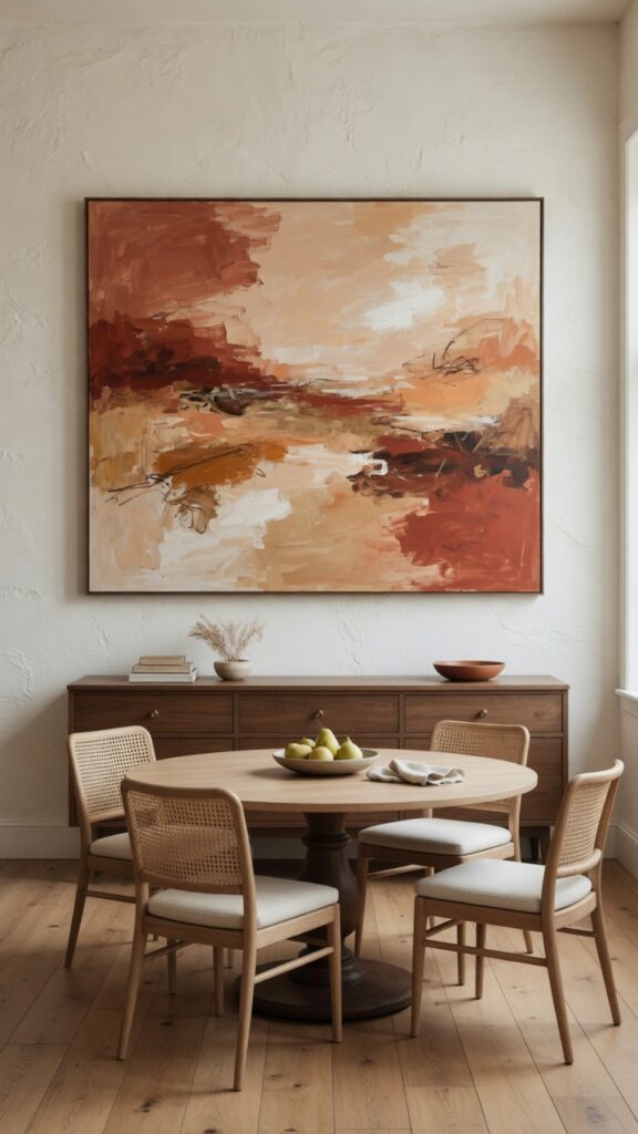
Sometimes the boldest move is restraint. One large painting — truly large, not “large for a small apartment” large — can do more for a dining room than a dozen smaller pieces ever could. The key word is scale. Most people buy art that’s too small and then hang it too high. If the canvas doesn’t make you slightly nervous in the shop, it’s probably not big enough for your dining room wall.
For a standard dining room wall (roughly 10–12 feet wide), aim for a canvas between 48 and 72 inches across. Abstract works are the most versatile — they carry visual weight without demanding a specific style commitment from the rest of the room.
Hang it lower than you think. Center it at roughly 57 inches from the floor — that’s gallery standard — not at the midpoint of your wall height.
One constraint worth naming: if your dining room opens directly into a living area, an oversized abstract can start competing with the sofa wall. In open-plan spaces, keep the palette consistent between the two pieces even if the subjects differ.
Buy the piece that stops you, even if you haven’t repainted yet.
3. Textured Plaster Walls as Decor
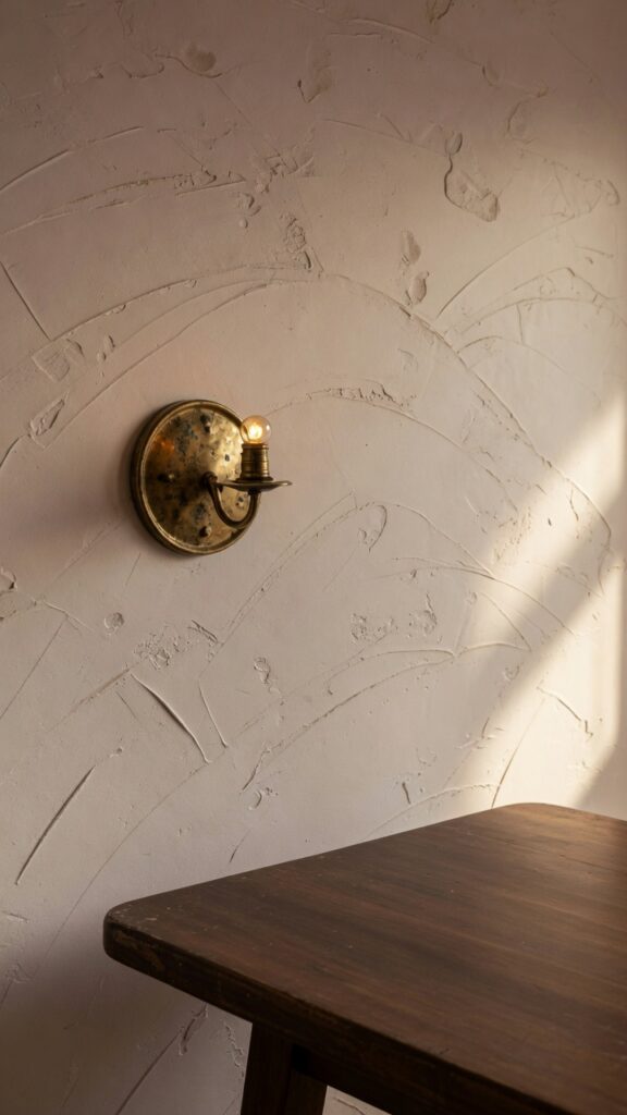
Here’s a radical idea: the wall itself is the decor. Textured plaster — real lime plaster or its easier DIY cousin, Venetian plaster — transforms a flat surface into something genuinely beautiful. You stop needing to hang things because the wall has presence on its own.
It works especially well in dining rooms because the light from your overhead fixture (and any candles on the table) creates a raking effect across the texture, especially at night. The wall literally looks different at dinner than it does at lunch.
The technique isn’t as difficult as it sounds. Pre-mixed Venetian plaster from a paint supply store, applied in two coats with a Japanese trowel, gives a convincing result even for beginners. Expect the walls to take a full weekend and some practice on a test board first.
Color-wise, leaning warm is almost always the right call: putty whites, sand, warm greige, pale terracotta. Cool grays lose their magic once the overhead light hits them at dinner.
One honest trade-off: this is not a renter-friendly option unless you’re prepared to restore. If you’re renting, skip to idea number seven.
The payoff is a wall that makes every single dinner feel like it’s happening somewhere special.
4. A Single Long Floating Shelf Styled as Art
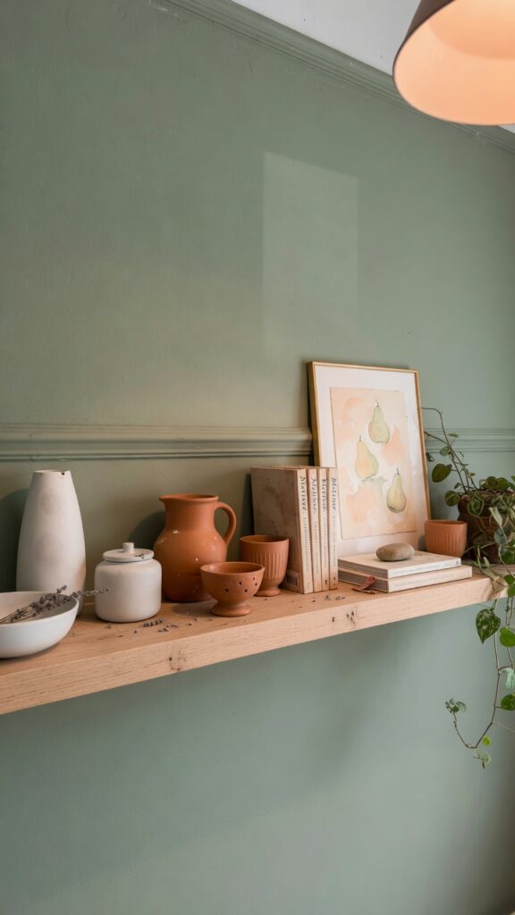
A floating shelf shouldn’t look like storage. In a dining room, one well-proportioned shelf — think 48 to 60 inches long, in oak or walnut, 8 to 10 inches deep — styled with ceramics and objects becomes a three-dimensional piece of art. The depth and shadow it creates gives the wall a richness that flat art can’t match.
The rule here is odd numbers and varying heights. Three ceramic vessels, a small stack of art books, one framed print leaning against the wall — done. Resist the urge to fill every inch. Negative space on a shelf is as important as the objects themselves.
Material-wise, matte and earthy beats shiny every time in a dining context. Biscuit-glazed ceramics, unpolished brass, raw linen-bound books. Nothing that reflects so much light it becomes distracting mid-meal.
Keep the shelf level with or slightly above standard picture-hanging height — about 57 to 62 inches from the floor. Too high and it disconnects from the room. Too low and it feels like a sideboard extension rather than a wall feature.
One watch-out: if you have young kids who eat at this table, keep the lowest shelf objects out of reach or this becomes a daily hazard-clearing exercise.
The combination of texture, object, and negative space makes it feel curated rather than decorated.
5. Dark Moody Paint as a Feature Wall
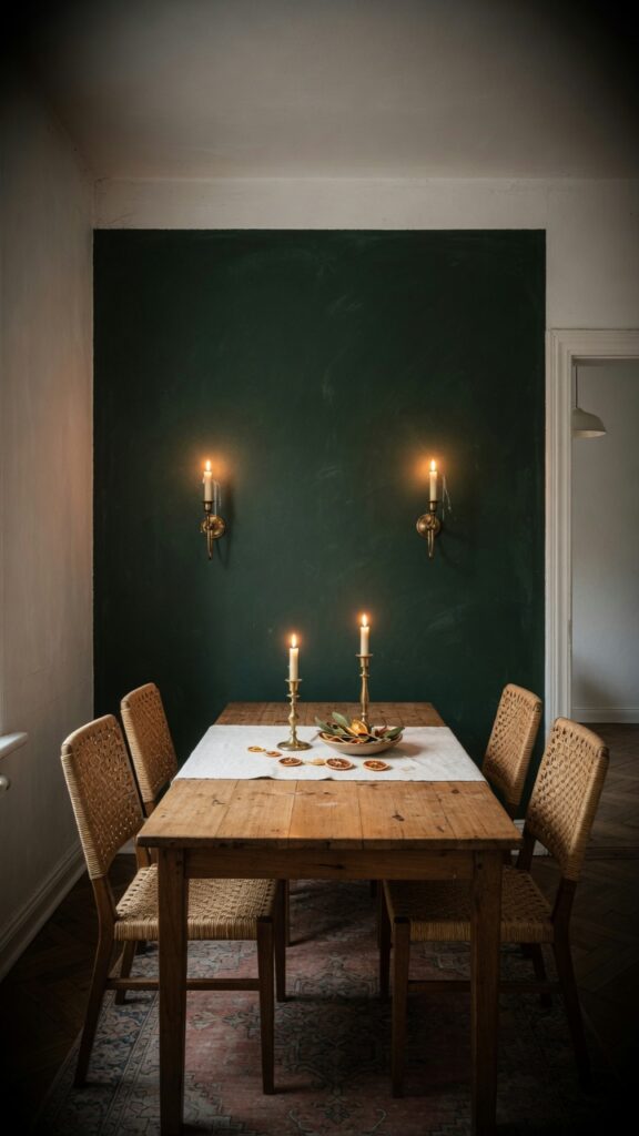
Dark walls in dining rooms are not a risk — they’re a gift. There’s a reason designers keep returning to deep greens, inky navies, and charcoal-blacks for dining spaces: they make everything glow. Candles, glassware, skin tones, food — all of it looks better against a deep, saturated backdrop.
You don’t need to commit the entire room. One feature wall behind the main seating position — typically the wall that faces the entry — is enough to transform the atmosphere. Paint the other three walls in the lightest version of the same hue, or a complementary warm white, and the dark wall reads as intentional rather than overwhelming.
If your dining room is north-facing and chronically gloomy, a dark wall is counterintuitively the answer rather than the problem. It stops the room from looking washed out and creates contrast that reads as warmth.
Finish matters enormously. Flat or matte paint on a dark shade has a velvety, sophisticated quality. Eggshell can start to look plasticky. Spend the extra on a quality flat finish.
One real-world constraint: matte dark paint marks. If you have small children or a dining room that doubles as a homework station, factor in the maintenance.
Done well, this single decision changes the entire emotional register of the room.
6. Woven Textile Wall Hangings
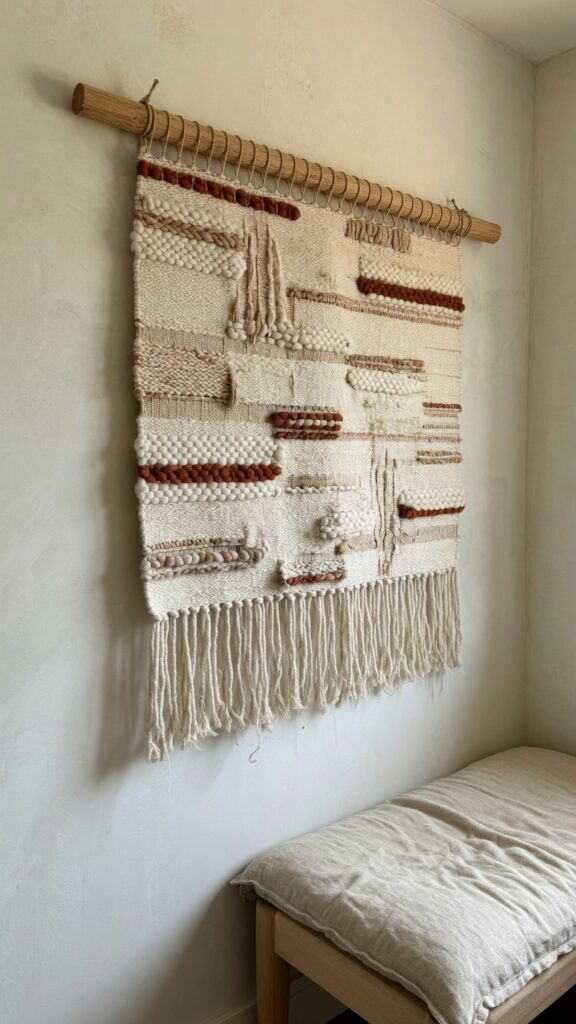
Textile wall hangings are one of the most underused tools in dining room decor. They bring the one thing that framed art almost never can: softness. In a room that’s often dominated by hard surfaces — a ceramic table, wooden chairs, a tiled floor — a large woven hanging absorbs sound, adds warmth, and brings a handmade quality that no print can replicate.
The sizing trap: most people buy them too small. In a dining room, you want a weaving that’s at minimum 30 inches wide, ideally closer to 40–48 inches for standard walls. Anything smaller reads as a craft project rather than a considered design choice.
Natural fiber is the move here — undyed wool, raw cotton, jute. Avoid synthetic weaves that catch light in an artificial way. The beauty of a good textile hanging is exactly that warmth and slight irregularity that only natural materials have.
Hang it from a simple wooden dowel or a piece of raw brass rod — both echo the material quality of the piece itself.
One consideration: dining rooms with open-plan kitchens may deposit grease or cooking smells into woven fabrics over time. If your kitchen ventilation is poor, this becomes a maintenance issue. Position it on a wall that’s further from the cooking zone.
One great weaving, hung with intention, gives a room an artisanal quality that takes years to achieve otherwise.
7. Peel-and-Stick Wallpaper for Renters
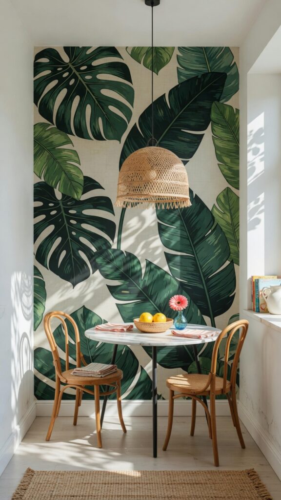
If you’re renting, this is your section. Peel-and-stick wallpaper has crossed the threshold from “good enough” to genuinely impressive — the newer vinyl-free versions lay flat, don’t bubble, and come down cleanly without taking the plaster with them. One accent wall behind the dining area takes three to four hours and costs a fraction of a decorator.
Pattern choice: go bolder than you think. A medium-scale pattern in a tight dining room often disappears. Oversized botanicals, large geometric repeats, and maximalist prints work because the dining table in front of them gives your eye a resting place. The contrast actually helps both the pattern and the furniture pop.
Prep is everything. The wall must be clean, dry, and free of any wax-based polish. Starting from the center of the wall and working outward helps manage pattern matching. Take your time on the first panel and the rest follows easily.
One honest watch-out: not all peel-and-stick products are created equal. Cheap versions from unknown brands bubble within weeks and don’t survive a second repositioning. Mid-range or above is worth the investment, especially if you plan to leave it up for more than a year.
It’s the renter’s version of commitment-free boldness, and it works.
8. Mirrors Grouped as Art
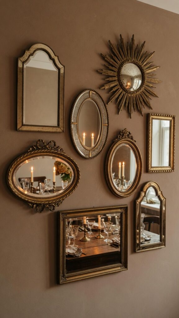
Mirrors in the dining room are the oldest designer trick in the book — and they’re old for a reason. A well-placed mirror bounces candlelight, makes the room feel larger, and reflects the table setting back at you in a way that makes even a weeknight dinner feel like an occasion.
But instead of one large mirror hung predictably above a credenza, consider grouping four to seven smaller mirrors in a variety of shapes and finishes. The effect is more interesting than a single piece and doesn’t require the wall real estate a large mirror demands.
Brass and antique gold finishes warm up a dining room beautifully. Avoid cold chrome or bright silver in a space that’s meant to feel intimate — they reflect everything too harshly.
The arrangement rule is the same as gallery walls: one anchor piece off-center, then build outward. Keep at least 2 inches between pieces.
One thing to watch: mirrors directly opposite a window can create uncomfortable glare during daytime meals. Test the positioning at different times of day before you commit to the holes.
Grouped mirrors are one of the few decor choices that look better at night than during the day. For a dining room, that’s an enormous advantage.
9. Plate Wall as a Decorative Feature
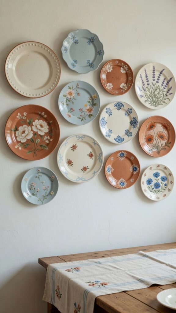
Before you dismiss this as your grandmother’s aesthetic, consider: a well-curated plate wall is genuinely back. Not the mass-produced matching-set version, but a slow-collected arrangement of ceramics that each have their own character — a hand-thrown stoneware plate from a market, a vintage blue and white piece picked up traveling, a hand-painted terracotta from a small ceramics studio.
The palette is what makes or breaks it. Stick to a two-or-three color family — blues and whites, or terracottas and creams, or sage greens and warm ivories — and the collection reads as intentional even when the styles vary widely.
Invisible plate hangers are the hardware answer here. The spring-loaded variety grips inside the rim and leaves no visible mounting — the plates appear to float. For heavier ceramic plates, get the weight-rated version.
Arrangement-wise, start from the center and work outward. Mix sizes: a dinner plate, a side plate, a small decorative piece, repeat. Don’t line them up in rigid rows.
One practical note: this is a light-dusting-required situation. If you genuinely hate cleaning decorative objects, redirect your energy elsewhere.
For people who love food, travel, or ceramics, it’s the most personal wall in any room.
10. A Painted Mural or Faux Botanical Panel
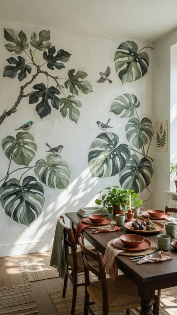
A painted mural sounds intimidating, but a simple botanical panel is entirely achievable for someone with moderate confidence and a few practice runs. The key is choosing a loose, imperfect style — brushy botanicals, abstract branches, oversized leaves — rather than attempting hyper-realism. The looseness is actually the aesthetic.
Chalk paint or standard wall paint works fine. Start with the large structural shapes — main branches, dominant leaves — in your base green, then layer shadows and lighter tones. The final stage is the thin linework details that make it read as intentional rather than accidental.
If freehand feels too risky, projector-trace method: project a reference image onto the wall with a cheap mini projector, trace the outlines in pencil, then paint within them. Foolproof and surprisingly authentic-looking in result.
Color palettes that work brilliantly: deep forest green with gold accents, sage and terracotta, navy and white. Avoid overly bright colors — they lose the sophisticated quality that makes murals feel intentional.
One honest constraint: this is a significant commitment. If you paint rentals, repaint frequently, or share the home with someone whose taste differs from yours, think twice.
But when it lands, it’s the kind of wall people photograph every time they visit.
11. Sconces as Wall Decor Elements
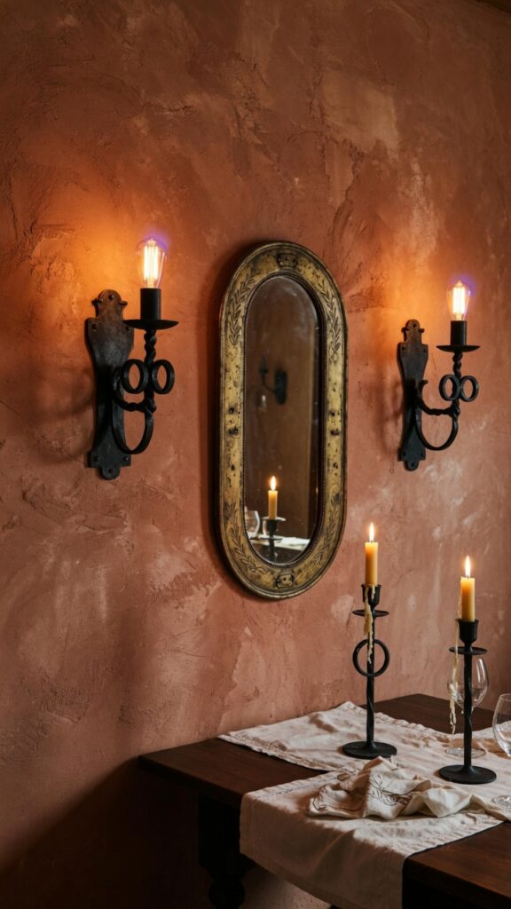
Wall sconces are functional and decorative simultaneously — which is the highest compliment you can pay a design decision. In a dining room, they do something overhead fixtures can’t: they light the walls themselves, creating a layered, restaurant-quality glow that makes the space feel genuinely special in the evenings.
As decor, treat the sconces themselves as sculptural objects. The market for interesting lighting has expanded enormously — hammered brass arm sconces, curved ceramic shade versions, simple blackened steel designs with exposed bulbs. Any of these can anchor a dining room wall without needing anything hung alongside them.
For the most impact, install them at approximately 60–66 inches from the floor — slightly above eye-level when seated. Pair with a warm-toned bulb (2700K or lower) and a dimmer if at all possible.
Symmetrical placement works best in formal dining rooms; asymmetric placement can feel more relaxed and contemporary if the room has a casual vibe.
One practical reality: hardwiring sconces requires either an electrician or existing outlet placement. Battery-operated hardwired-look sconces have gotten significantly better in the last few years and sidestep the installation entirely — a genuine renter-friendly option.
The wall becomes its own light source, and that changes everything about the atmosphere.
12. Floating Ledge With Rotating Art Display
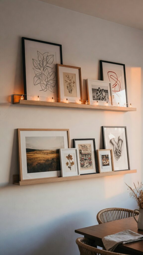
This is the most flexible wall solution in this entire list — and deliberately so. Two floating ledges (standard picture ledge depth — about 3.5 inches) installed horizontally at roughly 48 and 64 inches from the floor give you a rotating gallery that can be updated every season without touching a single nail.
The beauty of leaning art rather than hanging it is that you can change the whole mood of the room in twenty minutes. Swap out prints, rotate photographs, lean a small framed mirror to add depth. It costs almost nothing to refresh.
Styling rule: odd numbers, varied heights, one or two small objects mixed with the frames — a small bud vase, a tiny ceramic figure, a short candle. It stops the ledge from reading as purely functional.
The two-tier arrangement creates a visual conversation between the rows that a single ledge can’t achieve. Let the top ledge be slightly more sparse than the bottom — it draws the eye up without overwhelming.
One thing to watch: if the ledges are long and loaded with heavy frames, anchor them into studs. A ledge that pulls from drywall alone under real weight is a dinner-party disaster waiting to happen.
It’s the decor solution that grows with you, changes with you, and never demands you commit.
In Closing
Dining rooms are one of the last places in the home where people still come together, put their phones down (ideally), and actually look at each other — and at the room. That makes the walls matter more here than almost anywhere else.
What I hope you take from this isn’t a single idea but a framework: think about light first, scale second, and personal meaning third. The best dining room walls aren’t decorated — they’re built slowly, with pieces that mean something and materials that reward looking. A plaster wall that glows by candlelight. A plate collected somewhere you actually traveled. A textile made by someone’s hands.
None of these ideas require a designer or a large budget. They require intention. Decide what you want the room to feel like at eight o’clock on a Tuesday evening, when the food is on the table and the overhead fixture is dimmed low, and then work backward from that feeling.
That’s the only brief that actually matters.