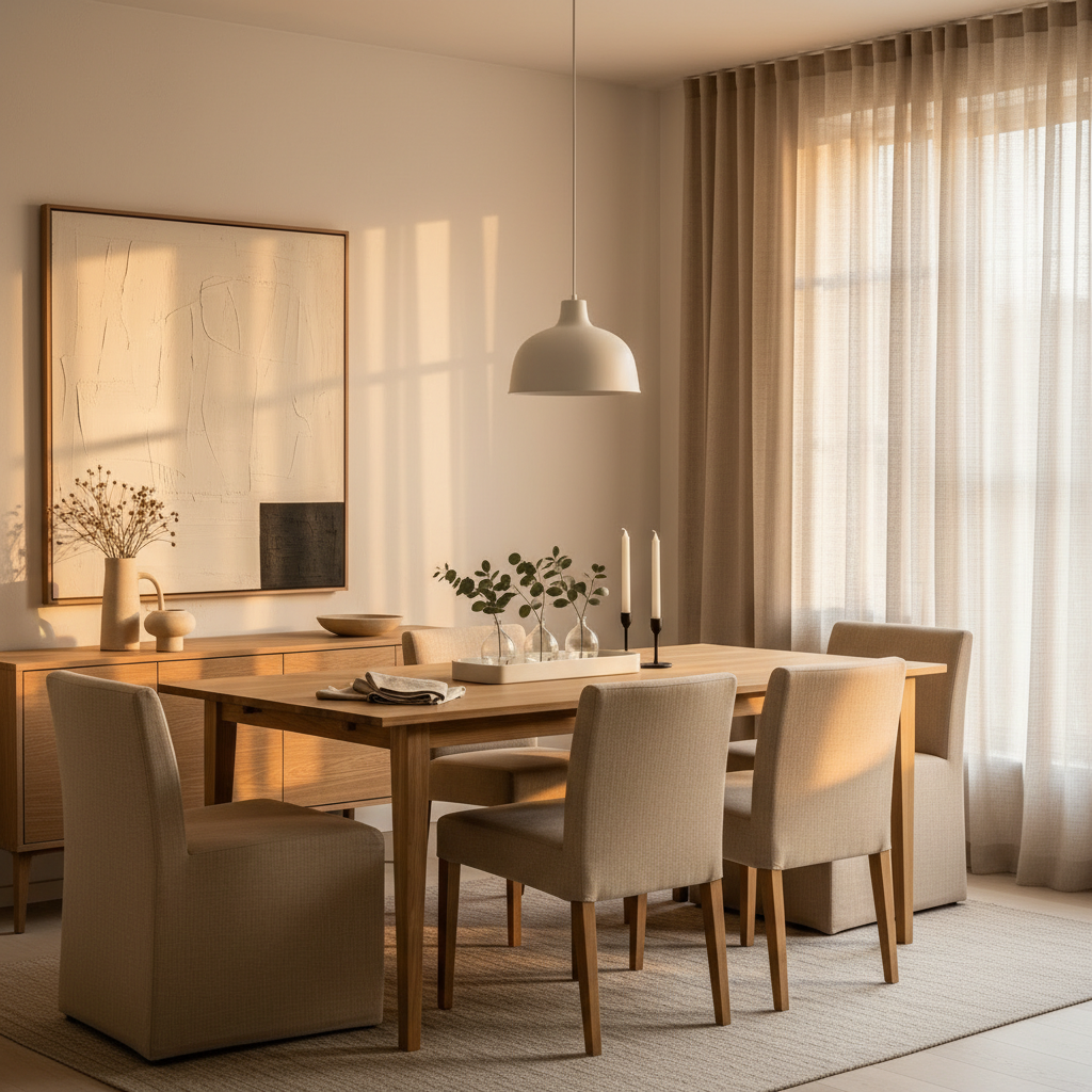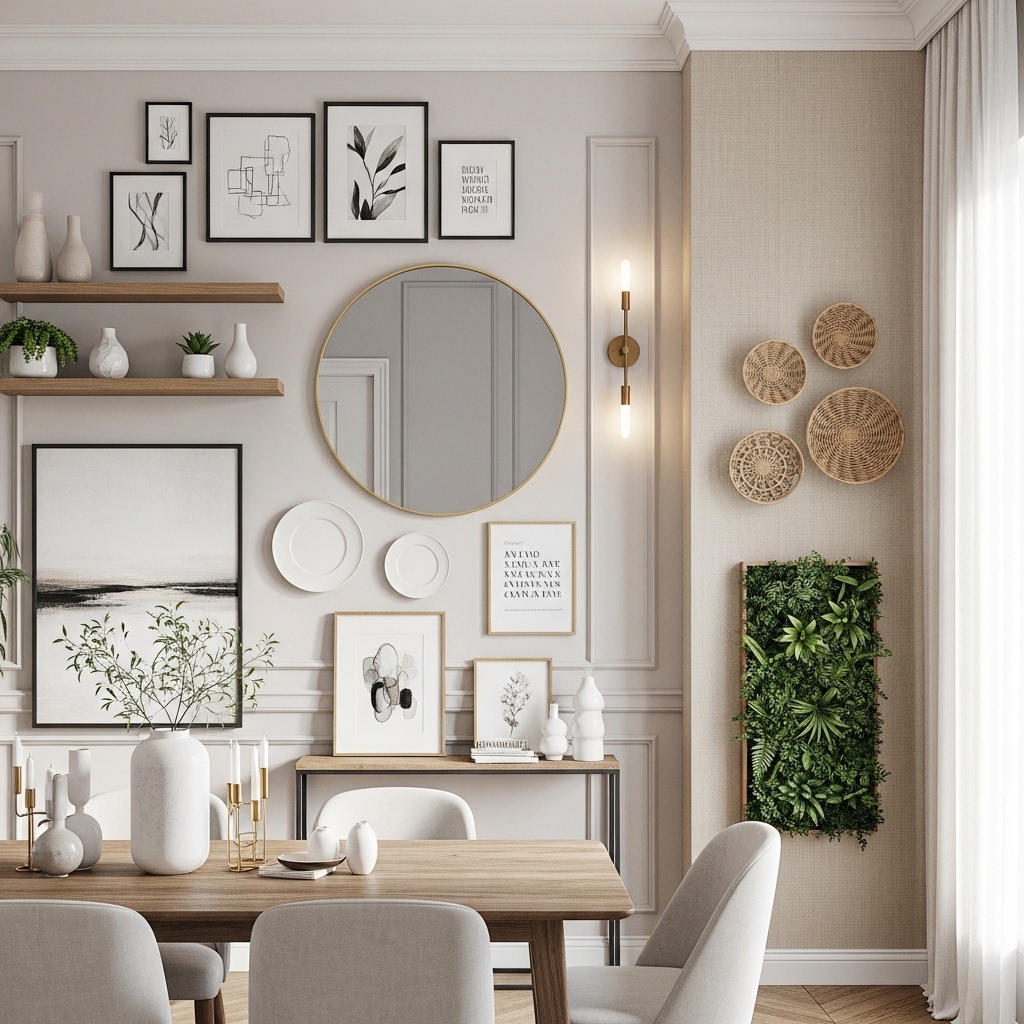
You know that moment when you walk into a living room and every single wall is white, the sofa is gray, the rug is beige, and the only “color” is a sad pothos on a shelf? I’ve been in that room. I’ve lived in that room. And I can tell you exactly what happens: it looks clean for about three weeks, and then it starts to feel like a waiting room. You stop noticing the space. You stop feeling anything when you walk in. That’s not a home—that’s a rental listing waiting to happen.
Most color advice out there is either too timid (add one throw pillow!) or too theoretical (the 60-30-10 rule, as if decorating were a math test). Neither helps you actually commit. The real problem isn’t that you’re afraid of color—it’s that you haven’t seen color used in a way that feels lived-in and forgiving. Bold doesn’t mean reckless. It means knowing which risks pay off and which ones leave you repainting at 2 a.m. with a bad roller.
I’ve tested these 17 ideas in my own home and in friends’ spaces—some for years, some for a season before I changed my mind. Every one of them passed the real-life test: they survived guests, pets, sunlight, and my own changing taste. Here are the ones that actually work.
1. Paint the Ceiling First
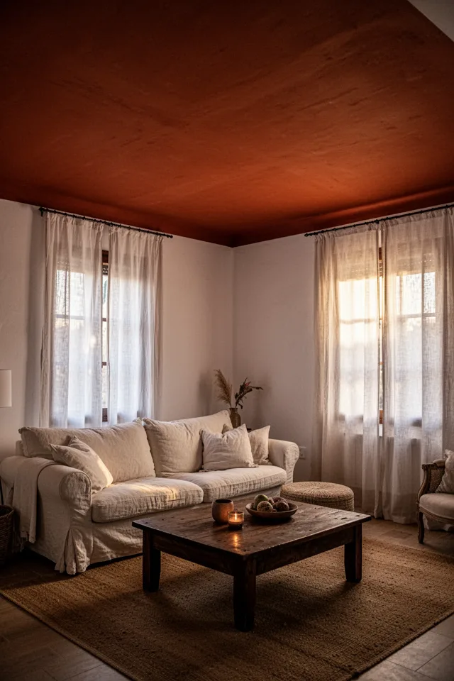
Everyone starts with the walls. That’s the mistake. The ceiling is the one surface you never touch, never bump into, never scuff. So it can handle the most intense color. I painted my living room ceiling a warm, dusty brick red (Benjamin Moore’s Bricktone, if you’re curious) and it did something no wall color ever could: it pulled the whole room downward, making it feel cozier and lower. The walls stayed off-white, but suddenly the room had a spine.
The trade-off? It’s a pain to paint. You’ll need a good extension pole, a steady hand, and about a day of neck strain. But once it’s done, it lasts. And it’s cheap—under $60 for a gallon of quality paint. Just avoid high-gloss; a matte or eggshell finish hides imperfections better and doesn’t glare under lights.
The ceiling is the one surface that can be loud without shouting. Start there.
2. A Color Dump on One Wall (Not an Accent Wall)
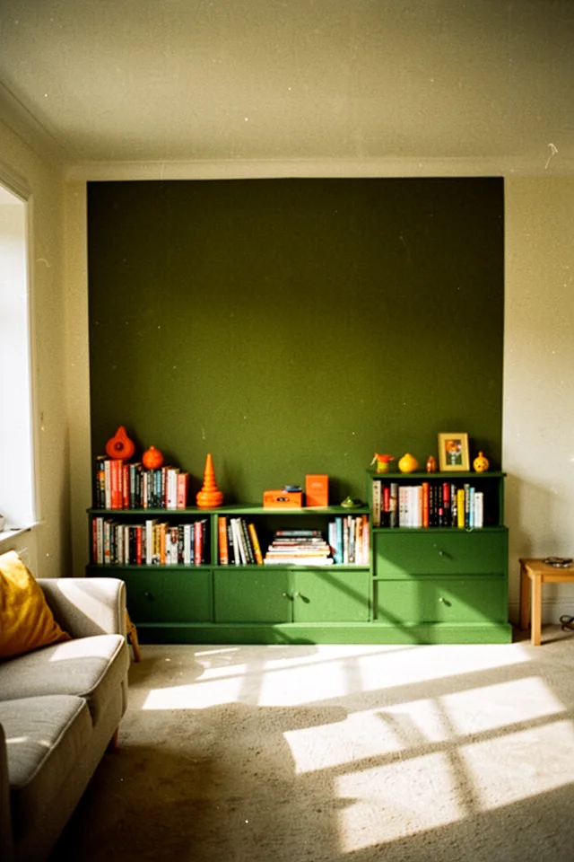
Accent walls usually fail because they’re isolated—a color slapped on one surface with nothing else to connect it. I call this a “color dump”: you take a strong hue and let it spill onto the furniture, the trim, maybe even the floor molding. I did this with a deep olive green: I painted the wall, then painted a low IKEA bookshelf the same shade. Suddenly the color felt intentional, not like a leftover decision.
The secret is that the surrounding room stays very neutral—white or light beige. The color dump becomes a zone, not a statement. It ages well because you’re not fighting it. Cost? About $80 for paint and a small brush for the shelf. Just make sure the shelf is wood or MDF that takes paint well. Laminate needs a primer.
Let the color bleed onto the furniture. That’s how you make it stay.
3. The Collector’s Wall of Clashing Frames
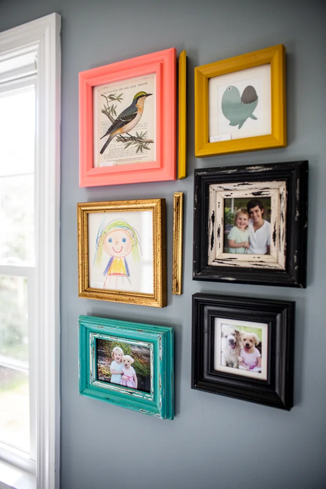
Most gallery walls are too safe: all black frames, all white mats, spacing measured with a level. Boring. I started collecting thrift-store frames in whatever colors I could find—bright coral, faded mustard, a teal that looks almost turquoise. I hung them on a dark blue wall (not navy, a softer slate blue) and the whole thing came alive. The clashing frames became the color palette. No additional art budget needed.
Here is the honest truth: it only works if the wall color is strong enough to ground it. A pale wall will look messy. Go dark or go home. The trade-off? Dusting all those frames is a pain. But it’s a small price for a wall that actually looks like a person lives there. Cost: under $20 per frame if you thrift, plus $30 for paint. Total for a whole wall: maybe $100.
Colorful frames on a dark wall read as intentional. On a white wall, they read as a yard sale.
4. A Rug That Does All the Work
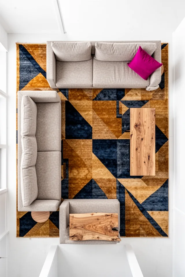
If you only do one colorful thing, make it the rug. A good large rug (8×10 or 9×12) can carry an entire room’s color story. I chose one in ochre and indigo with a faded geometric pattern. Everything else in the room is neutral—white walls, cream sofa, light wood. The rug provides all the visual energy. It’s the easiest bold move because it’s reversible: you can swap it out without repainting.
One thing most guides skip: pattern matters more than color. A solid color rug shows every stain and lint clump. A pattern hides them beautifully. This is a $200–$400 commitment depending on size and material (wool blends are best; synthetic sheds less but feels cheaper). I’ve had mine for four years and it still looks good. Just vacuum regularly and spot-clean with mild soap.
A patterned rug forgives more than a solid one. That’s not design advice—that’s life advice.
5. Paint the Trim in a Contrast Color
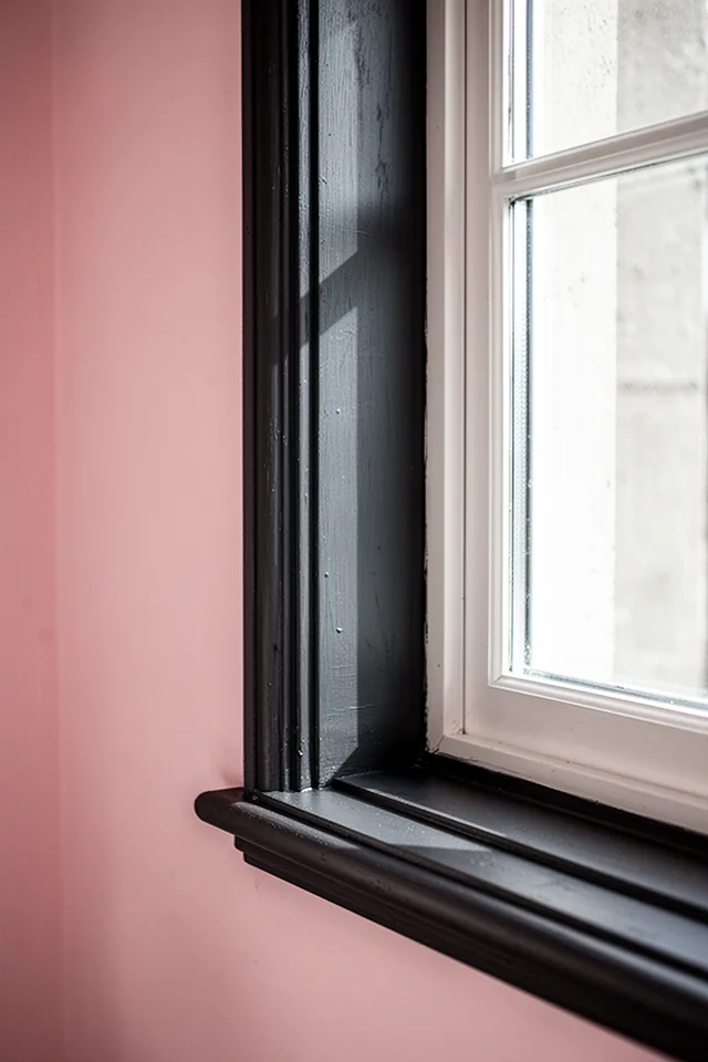
White trim is a default, not a rule. I painted my living room baseboards and window casings a matte charcoal while keeping the walls a soft blush pink. The effect is like a drawing: the dark outlines frame the room and make the pink feel more sophisticated. It also hides scuffs better—light trim shows every mark from vacuum cleaners and shoes.
The catch? It’s tedious. Painting trim requires more precision than walls, and you need to decide whether to also paint the window frames (I didn’t; I left those white for contrast). Use a quality semi-gloss or satin for durability. Cost: about $40 for a quart of trim paint—you won’t need more unless you have a mansion. And be ready to touch up every couple of years if you have kids or pets.
Dark trim makes walls feel softer, and shoes feel less dangerous.
6. A Single Lacquered Piece of Furniture
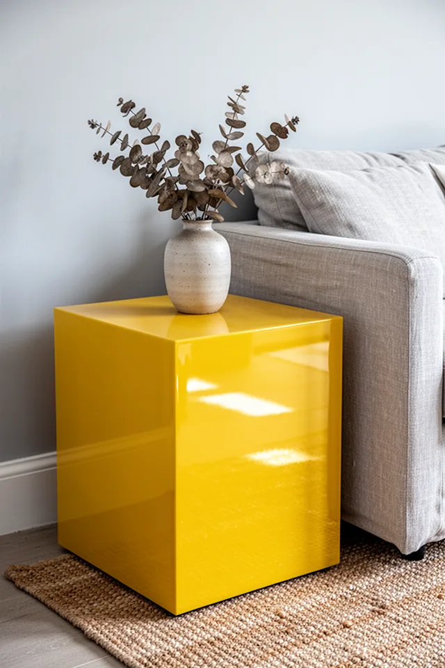
A lacquered piece of furniture—high-gloss, almost candy-colored—brings an energy that matte finishes can’t touch. I have a small side table in a screaming yellow that I found at an antique shop. It’s the only bold color in my room. Everything else is quiet. The gloss makes the yellow feel precious, not loud. It’s like a piece of jewelry.
You don’t need to buy new. You can paint any small wooden table with high-gloss enamel in a bright color. Just sand, prime, and apply multiple thin coats. The downside? High-gloss shows every fingerprint and dust speck. I wipe mine down weekly. But it’s a small table—takes two minutes. Cost: under $30 for a can of paint if you DIY, or $100–$200 for a vintage find.
One glossy piece reads as a choice. A room full of them reads as a carnival.
7. A Saturated Sofa in an Unexpected Color
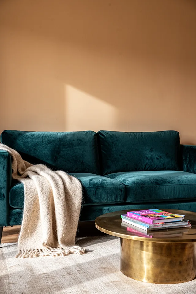
Gray sofas are everywhere because they’re safe. A teal or rust or mustard sofa is a risk that pays off if everything else stays calm. I went with a deep teal velvet—not the pale trendy teal, but a dark one that almost looks black in low light. It anchors the room. The walls are a soft beige, the rug is natural jute, and the only other color is a single orange pillow.
The trade-off is huge: a sofa is a multi-year, multi-thousand-dollar purchase. You have to live with that color. But if you pick a shade that’s dark and complex (teal, charcoal, deep rust), it will feel neutral enough to not fight other colors. Avoid bright reds or lime greens unless you’re ready to commit. Cost: $800–$2,000 for a decent quality sofa. Velvet shows wear patterns—rotate cushions.
A colorful sofa in a dark shade is a neutral with a personality.
8. Stained Glass Window Film as Art
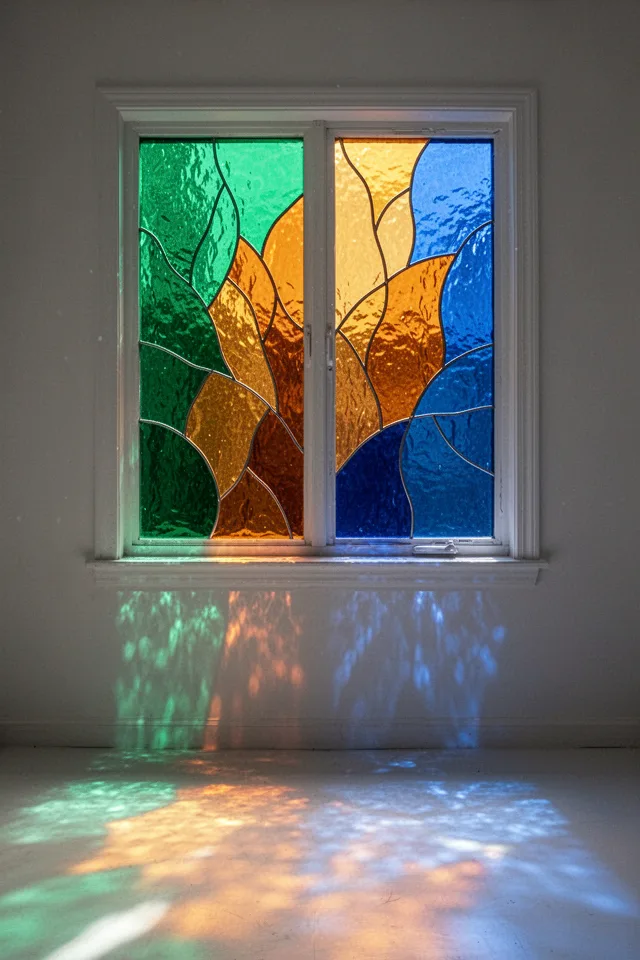
I live in a rental with boring casement windows. Stained glass film changed everything. It’s not the tacky self-adhesive stuff you see on Amazon—there are high-quality films that look like real leaded glass. I installed one in an emerald, amber, and sapphire pattern. Now, at certain times of day, the room is filled with colored light that shifts as the sun moves. It’s better than art.
The version that actually holds up over time: buy a brand that says “static cling” not adhesive, because adhesive leaves residue and bubbles. Static cling sticks to clean glass and can be removed without damage. Avoid cheap brands that fade in sunlight. Cost: $20–$60 per window panel. Installation takes 30 minutes. The only downside is you lose the clear view—but that’s the point.
Color on the window is color you never have to dust.
9. A Bright Painted Bookcase Interior
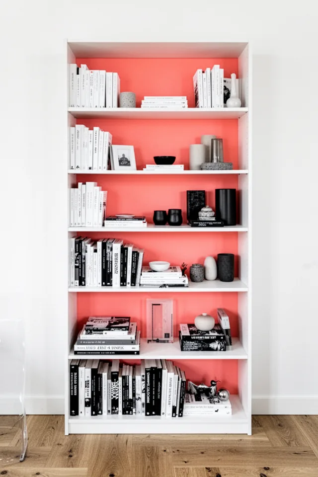
Painting the inside of a bookcase or cabinet is a low-commitment way to add a serious punch. I did the back panel of an IKEA Billy in a bright coral. The front of the shelf is full of books, so you only see the color peeking between objects. It’s like a hidden accent that rewards glancing. It costs about $10 for a sample pot of paint. You barely use any.
The trick is to take the shelves out and paint only the back panel. Then put them back. That way the color is contained. If you paint the shelves themselves, you lose the contrast. This works with any deep color—I’d avoid pastels because they get washed out. Coral, emerald, navy, or chartreuse are all excellent. Just use a primer if the back is raw particleboard.
The back of a bookcase is the cheapest square footage you can color.
10. A Color-Drenched Fireplace Surround
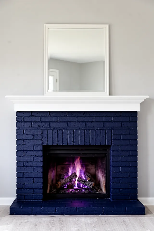
Fireplaces are often the room’s natural anchor, but most people leave brick its original orange-red or paint it white. I went dark—a matte midnight blue that absorbs light. Against pale gray walls, the fireplace feels massive and intentional. It makes the room feel older, more permanent. The blue also hides the inevitable soot marks that accumulate near the opening.
This is a high-commitment project because brick is porous and hard to undo. But if you’re sure, use masonry paint (not regular wall paint) and a roller with a thick nap to get into all the crevices. Cost: about $40–$60 for a quart of quality masonry paint. It will last for years if you don’t use the fireplace too aggressively—heat can cause flaking. I’d skip painting if you have a working wood-burner that gets very hot. For gas, it’s fine.
Dark fireplace = the room has a spine. Light fireplace = the room has a fireplace.
11. A Desk or Console in a Surprise Shade
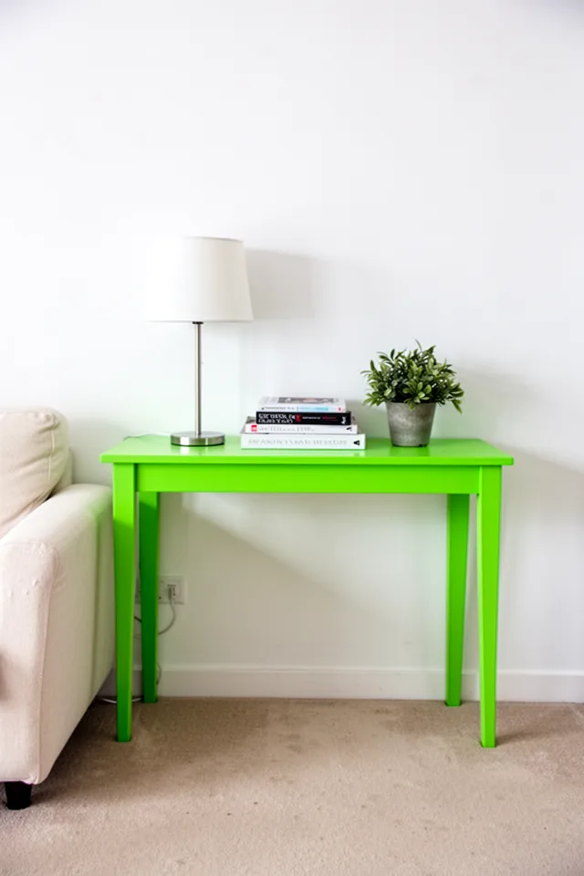
I have a console table in a screaming chartreuse green that I painted myself. It sits in a hallway that passes through my living room. The green is so aggressive that it makes people laugh when they first see it—in a good way. It’s the only piece of furniture in that micro-zone, so it can get away with being outrageous. The rest of the room stays calm, so the console doesn’t have to match anything.
This idea works best in transitional spaces—behind a sofa, in an entry, against a blank wall. Not the main seating area. Pick a color you would never put on a wall: chartreuse, fuchsia, turquoise. Paint an old thrift table or buy unfinished wood and DIY. Cost: $20 for paint, $30 for a used table. The downside is touch-ups: the edges get dinged. Keep some leftover paint handy.
A piece of furniture that doesn’t match anything is always more interesting than one that matches everything.
12. Multi-Colored Curtains (Not a Single Block)
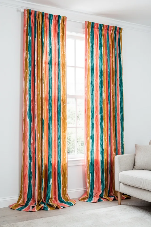
Single-color curtains are fine, but they don’t deliver the visual impact of a bold pattern. I found a vintage fabric with irregular vertical stripes in coral, mustard, and teal and had simple panels made. They are the only pattern in the room. They pull together colors that would fight if used elsewhere. The white walls let them breathe.
You can cheat: buy white curtains and use fabric paint markers to draw stripes or blocks. Not kidding. I did that in a rental and it looked intentionally abstract until I took them down. Real fabric is better, but this is a $30 alternative. If you buy ready-made, look for curtains with a block-print or ikat pattern—they hide dust and uneven folding. Cost: $80–$150 for good quality patterned curtains.
Curtains are the room’s eyelashes. Make them dramatic.
13. A Painted Floor in a High-Traffic Zone
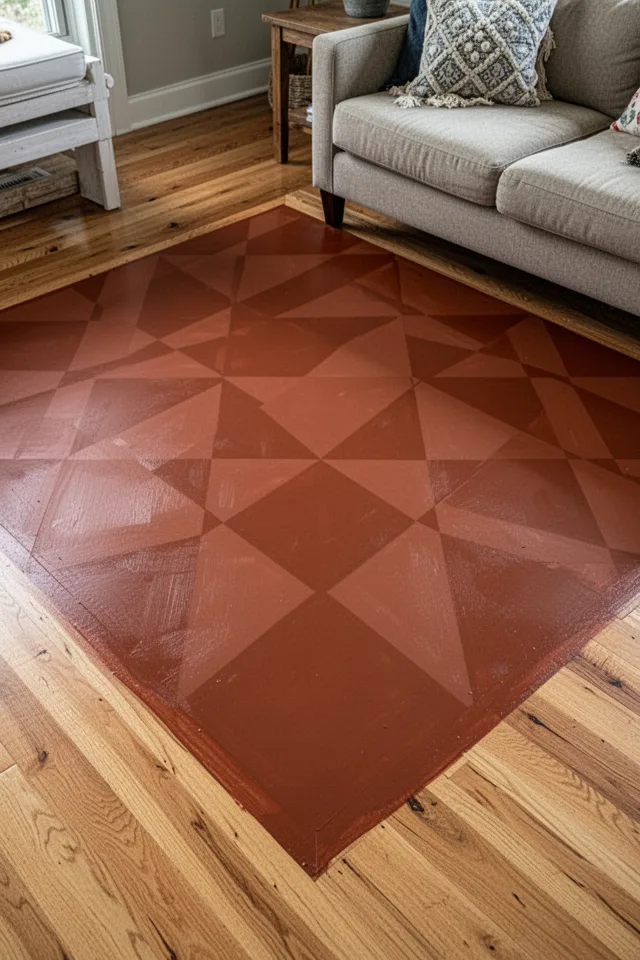
This sounds insane, and it is. But hear me out. I have a small area in front of my sofa where the wood floor was already damaged, so I painted a rectangular “rug” in a terracotta diamond pattern using floor paint. It looks like a permanent kilim. It’s easier to clean than any rug because you can mop it. It never sheds. It never slides.
Do not attempt this without proper floor paint and a clear polyurethane seal. The traffic in this zone is brutal. I used two coats of porch-and-floor enamel and three coats of water-based poly. It’s held up for three years with only minor wear in the center. Cost: about $80 total if you already have the floor. The risk is that you can’t undo it easily—but you can always paint over it with a neutral floor color later.
A painted floor rug is permanent decoration that also protects the wood underneath. Win-win.
14. A Bold Lampshade as a Color Source
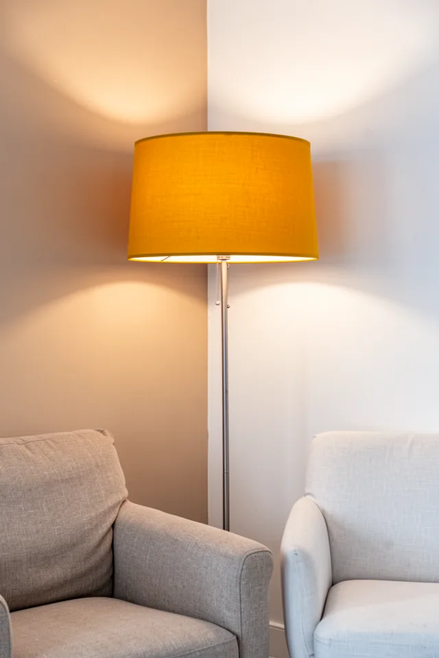
Lampshades are underrated color vehicles. I replaced a boring white drum shade with a bright mustard yellow one, and that single change made the corner of the room feel complete. The light passes through the shade and tinted everything around it warm. It’s like having a color filter for your room that you can switch on and off.
You can find shades in almost any color at home stores or online for $30–$70. The key is to choose a shade that lets light through (not too opaque) unless you’re using it as a pure accent. I recommend a subtle textured fabric like linen or cotton—the texture gives depth. Avoid plastic; it looks cheap and can melt. The trade-off is that colored light changes the perceived color of everything nearby, so test with your lampshade on before you commit to wall colors.
A colorful lamp shade is the cheapest way to change how a room feels at night.
15. A Door Painted an Unexpected Color
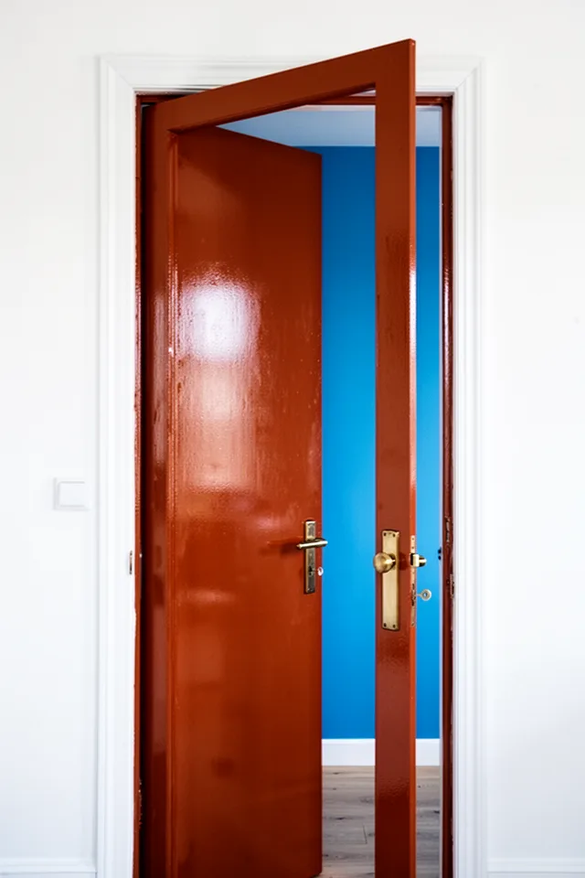
Interior doors are the forgotten surfaces. I painted my hallway-facing door a glossy rust orange. It’s not a door I use constantly—it goes to a small utility room—but it’s visible from the living room. It adds a pop of heat in an otherwise neutral corridor. The rest of the hallway is white, so the orange door becomes a punctuation mark.
Use a semi-gloss or high-gloss paint for doors because they get handled. Flat paint will show finger marks. Cost: about $15–$20 for a quart of high-gloss paint, enough for two doors. The only real issue is that if you later want to sell, a colored door might be a turnoff for some buyers. But it’s just a door—you can repaint it in an afternoon.
A colored door is the handshake of the room. Make it memorable.
16. A Velvet Pouf or Ottoman as a Color Splash
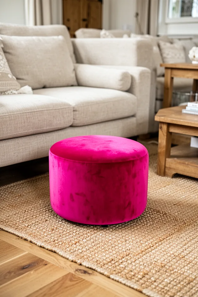
You don’t need a big piece to make a color statement. A small velvet ottoman or pouf in a knockout color—raspberry, cobalt, chartreuse—can be the spark that makes everything else feel intentional. I have a raspberry pink velvet pouf that I got for $40 on clearance. It sits on a jute rug next to a beige sofa. It’s absurdly pink and it works because it’s the only pink thing.
The scale is critical. A small object in a saturated hue reads as a deliberate accent. A large one would feel like a mistake. Also, velvet shows everything: dust, pet hair, drink spills. I vacuum mine weekly and spot-clean with a damp cloth. But for $40, it’s an easy risk. Cost: $30–$100 depending on size and material.
A small velvet pouf is like a cherry on top—except the cherry is neon pink and everyone sees it.
17. A Painted Tray or Coffee Table Top
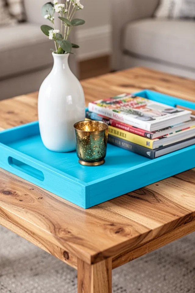
This is the lowest-stakes idea on the list, and one I use constantly. Find a plain wooden tray—thrift stores have dozens for under $5—and paint it a bright color. Place it on your coffee table, and suddenly your table has a focal point. You can swap out the tray seasonally or when you get bored. It’s temporary boldness.
I have a cyan blue tray that I’ve had for three years. The paint has chipped a little on the edges, but that adds character. If you want it perfect, seal it with a clear varnish. Cost: under $15. The true beauty is that you can take it away anytime and the room remains neutral. It’s the color training wheels for anyone scared of commitment.
A painted tray is a color decision you can reverse in five seconds. No pressure.
Conclusion
Bold color is not a personality test. It doesn’t have to match your “aesthetic” or your zodiac sign. The only real question is: are you tired of looking at a room that doesn’t make you feel anything? If the answer is yes, then pick exactly one of these ideas and do it this weekend. Not next month. Not after you find the perfect shade.
If I had to give one starting point: the painted ceiling. It’s the least expected, the most dramatic, and the one that strangers always comment on. It changes the entire feel of the room without taking up a single square inch of floor space. But even a $30 lampshade will do more for your living room than another gray throw pillow.
Color is not decoration. It’s the cheapest way to tell your own space you’re still paying attention. Now go paint something.