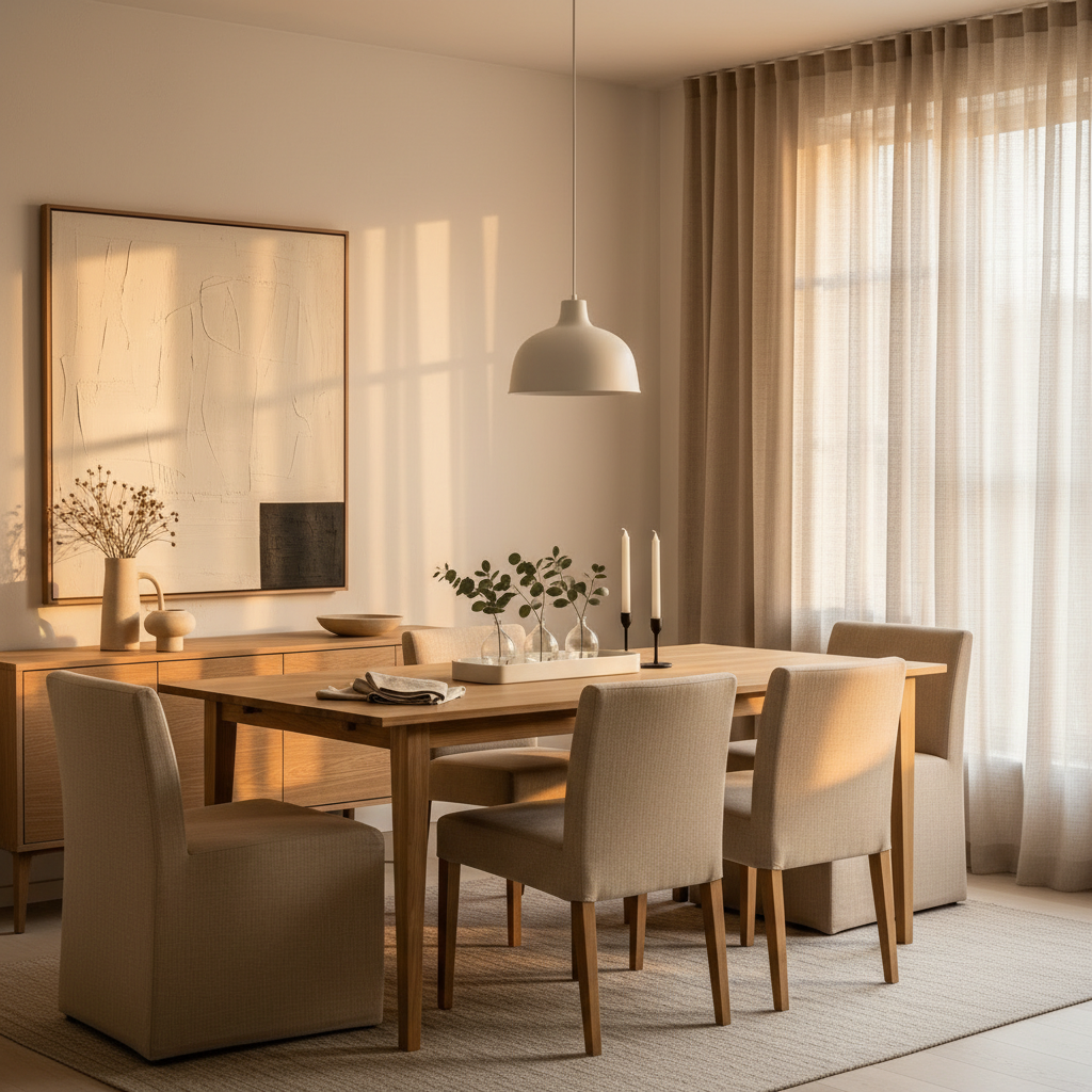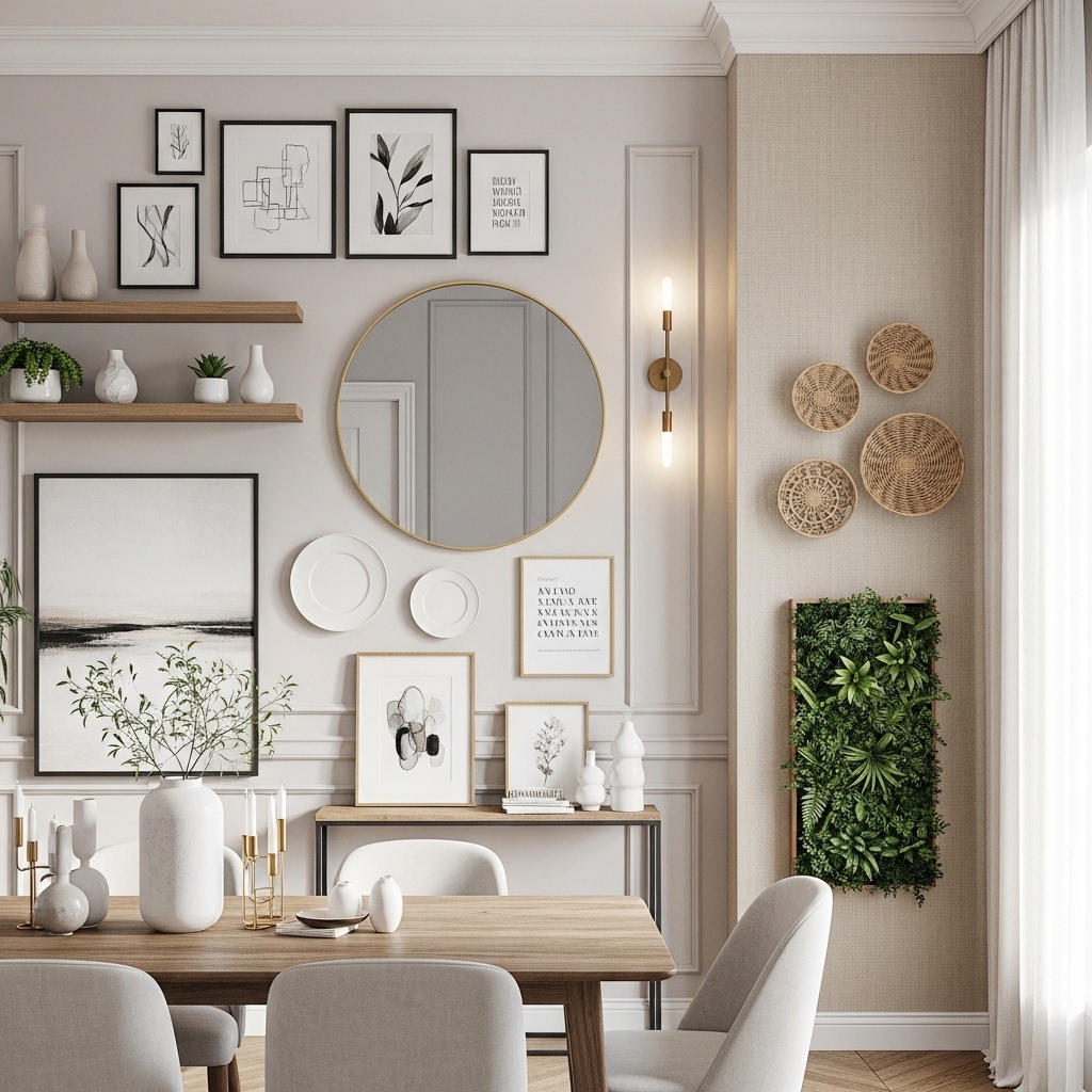
Mid-century modern design has one of the longest second lives of any interior style ever conceived. It peaked in the 1950s and 60s, went quiet for a while, and then came roaring back with a staying power that genuinely surprises people who assumed it was a passing trend. The reason it keeps returning is simple: the bones are too good to ignore. Clean lines, warm wood tones, sculptural furniture, and a colour palette that somehow manages to feel both nostalgic and completely current. The dining room is where mid-century design really earns its keep, because the furniture proportions — those tapered legs, those low-slung credenzas, those gently curved chairs — translate beautifully to a space built around gathering. Whether you’re starting from scratch or layering mid-century elements into an existing room, these twelve ideas cover the full range of what’s possible, practically and beautifully.
1. The Walnut Dining Table: The Non-Negotiable Foundation
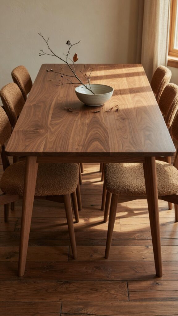
If there is one piece that defines a mid-century dining room above everything else, it’s the walnut table. Not oak, not pine — walnut. The deep, chocolatey warmth of walnut grain with its subtle purple undertone is specific to this era and utterly irreplaceable in achieving the right atmosphere. Veneered versions exist at lower price points and are genuinely fine if the quality is good, but solid walnut behaves differently over time, developing a patina that only improves with use and occasional oiling.
The silhouette matters as much as the material. Look for a table with tapered, angled legs — the 45-degree outward splay is the signature mid-century detail that separates an authentic piece from a generic wood table. Avoid cabriole or turned legs entirely; they belong to a different era. In terms of shape, rectangular works for most dining rooms, but an oval walnut table is arguably the most elegant mid-century option and seats more people than you’d expect relative to its footprint. One watch-out: very dark walnut can make a small, north-facing dining room feel cave-like. Balance it with warm white walls and generous lighting.
2. Sculpted Chairs with Architectural Presence
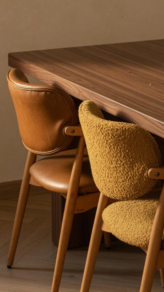
Mid-century dining chairs are not an afterthought — they’re sculpture. The best ones from this era have a quality that very few contemporary designs replicate: they look good from every angle, empty or occupied, and they age in a way that makes them look more interesting rather than simply worn.
The shell-back chair is the archetype here — a single moulded seat-and-back form in fibreglass, moulded plywood, or upholstered foam on a wooden or metal base. If you’re buying new, look for chairs that reference this form honestly rather than ones that approximate it loosely. Mixing chair finishes around a single table is a genuinely good mid-century move: two leather chairs at the heads of the table with four boucle or fabric chairs along the sides creates a layered, collected quality. Keep the leg finish consistent across all chairs even if the seats vary — that common detail holds the mix together visually. One real constraint: very low shell chairs can feel uncomfortable for people who are tall. Sit before you commit whenever possible, or check the seat height against your table clearance carefully.
3. The Sunburst Mirror: Earning Its Place on the Wall
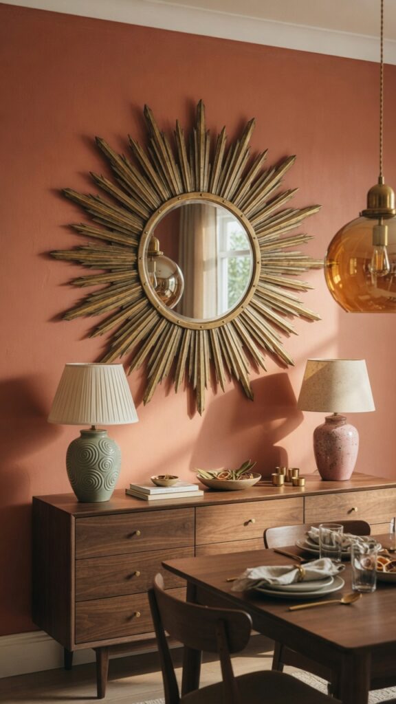
Few single decorative objects are more associated with mid-century design than the sunburst mirror, and few are more frequently misused. Done well, it’s a room-defining focal point. Done poorly, it reads as costume — a prop signalling “mid-century” without actually contributing to the room’s coherence.
The difference is almost always scale. Most people choose a sunburst mirror that is too small for the wall they’re hanging it on. In a dining room, the mirror should feel generous — at least 80cm in diameter for a standard wall, and ideally closer to 100–120cm if the wall can carry it. Brass-toned or gold metal rays are the most authentic choice; avoid chrome, which reads more contemporary and loses the warmth that makes this piece work. Hang it at eye level when standing — not centred over a credenza as if it were a bathroom mirror, but positioned so the centre sits at approximately 155–165cm from the floor. One honest constraint: in a very small dining room, a large sunburst mirror can feel overwhelming and slightly theatrical. In that case, a smaller convex mirror in a brass frame achieves a similar retro effect with considerably less visual weight.
4. A Warm Terracotta or Mustard Accent Wall
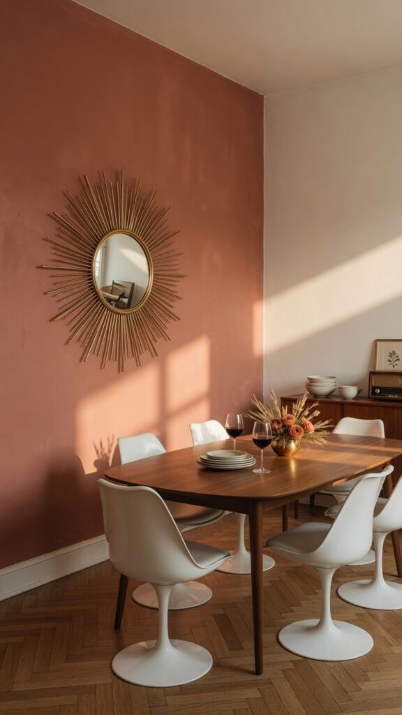
Mid-century modern is not a beige style. It was born in an era of optimism and it shows — the original interiors were full of colour, just handled with more restraint and sophistication than the maximalism that came after it. Translating that into a modern dining room means choosing one wall, one confident colour, and committing fully.
Terracotta and mustard are the two most authentically mid-century choices for a dining room accent wall. Terracotta — specifically the warm, slightly muted clay tones rather than anything approaching orange — works beautifully against walnut furniture because the undertones echo each other. Mustard or ochre reads more graphic and bold, better suited to rooms with lighter wood tones and white or cream upholstery. In both cases, a matte finish is non-negotiable — sheen on a coloured wall looks cheap and undermines the whole effect. If you hate repainting or you’re renting, a large-scale canvas or textile wall hanging in a similar earthy palette achieves a comparable warmth without permanent commitment. One thing to watch: if your dining room receives a lot of direct afternoon sun, very warm terracotta can tip into feeling hot and intense by evening. Balance with cool-toned textiles and natural materials like rattan.
5. The Credenza: Low, Long, and Indispensable
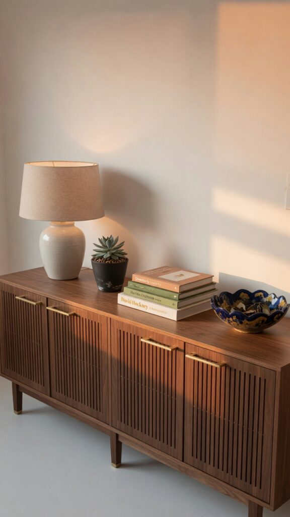
The credenza might be the most useful piece of furniture in a mid-century dining room, and it’s consistently underestimated. It provides storage for table linens, candles, and serving pieces while its long, low profile anchors the room visually and creates a styling surface that gives the space personality.
The proportions are specific: a proper mid-century credenza sits at approximately 75–82cm high with a long, horizontal form — ideally at least 150cm wide for a standard dining room wall. Slatted or cane-front doors are the most period-appropriate option, often combined with solid panels on alternate sections. Tapered legs in walnut or teak are essential; a credenza that sits flush to the floor belongs to a different design era entirely. Brass hardware — bar handles or small round pulls — is the finishing detail that elevates the piece from furniture to statement. On the surface, resist the urge to overstyle. A lamp, one or two ceramics, a plant, and a couple of books is the upper limit. Here’s the trick: the negative space on a credenza top is part of the composition, not wasted surface area.
6. Rattan and Cane: Texture That Earns Its Place
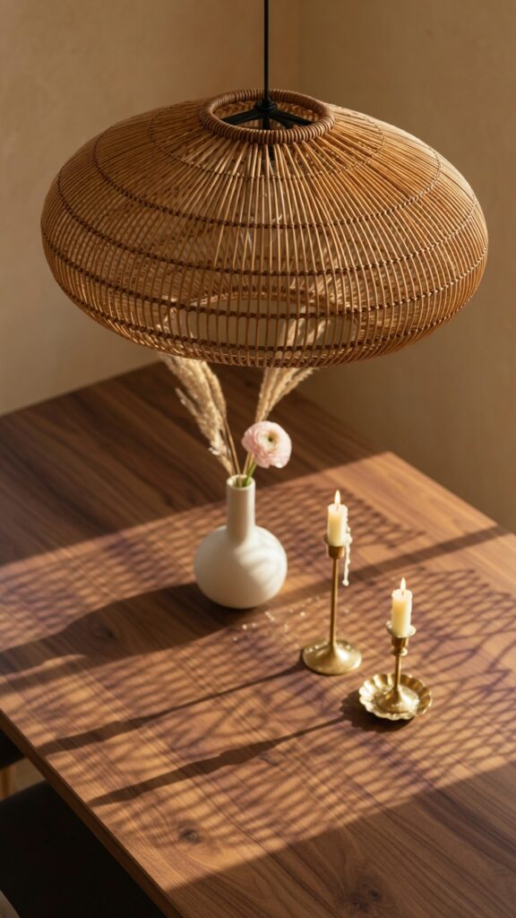
Rattan and cane arrived in mid-century interiors as a legacy of post-war travel and a growing interest in craft materials, and they’ve never really left. In a mid-century dining room today, they serve as the organic counterpoint to the clean geometry of walnut and metal — softening without weakening, adding texture without visual noise.
The pendant light is the highest-impact rattan element in a dining room. An oval or drum-shaped rattan shade hung low over the table (70–75cm from table surface to the bottom of the shade) casts the most beautiful dappled light of almost any pendant material — the weave creates shadow patterns on the table below that change as daylight shifts. This effect is entirely lost if you hang it too high. Beyond the pendant, consider cane-front cabinet inserts on a credenza or a rattan-seated accent chair in a corner. One constraint: rattan can tip a room toward bohemian or coastal if you’re not careful. Keep everything else crisp and intentional — clean-lined furniture, deliberate colour palette — and rattan reads as mid-century. Let things slide into looseness and you’ve lost the plot. The weave is the warmth; the lines are the discipline.
7. A Geometric Wool Rug in Burnt Orange, Cream, and Olive
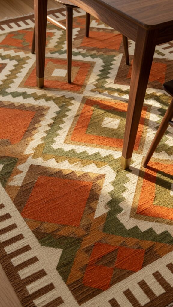
The rug under a mid-century dining table is one of the most powerful colour and pattern decisions in the room — and one of the most skipped, usually because people worry about practicality. That’s understandable, but it’s also a missed opportunity, because the right geometric wool rug grounds the entire room and provides the one place where mid-century’s love of pattern can really breathe.
The palette should pull from the room’s existing tones and extend them: if your walls are terracotta-adjacent and your furniture is walnut, a rug in burnt orange, cream, and olive adds graphic energy without introducing a jarring new colour. Geometric patterns — diamonds, chevrons, abstract repeating forms — are the most period-appropriate choice. Avoid florals entirely; they belong to a different aesthetic conversation. Flat-weave wool is the most practical option under a dining table, offering the colour and pattern of a traditional rug without the pile that catches chair legs and complicates cleaning. Size generously — all chair legs must remain on the rug even when pulled out. One watch-out: very bold geometric rugs in small rooms can feel relentless. Scale the pattern complexity to the room size.
8. Brass Hardware and Fixtures: The Metal That Defines the Era
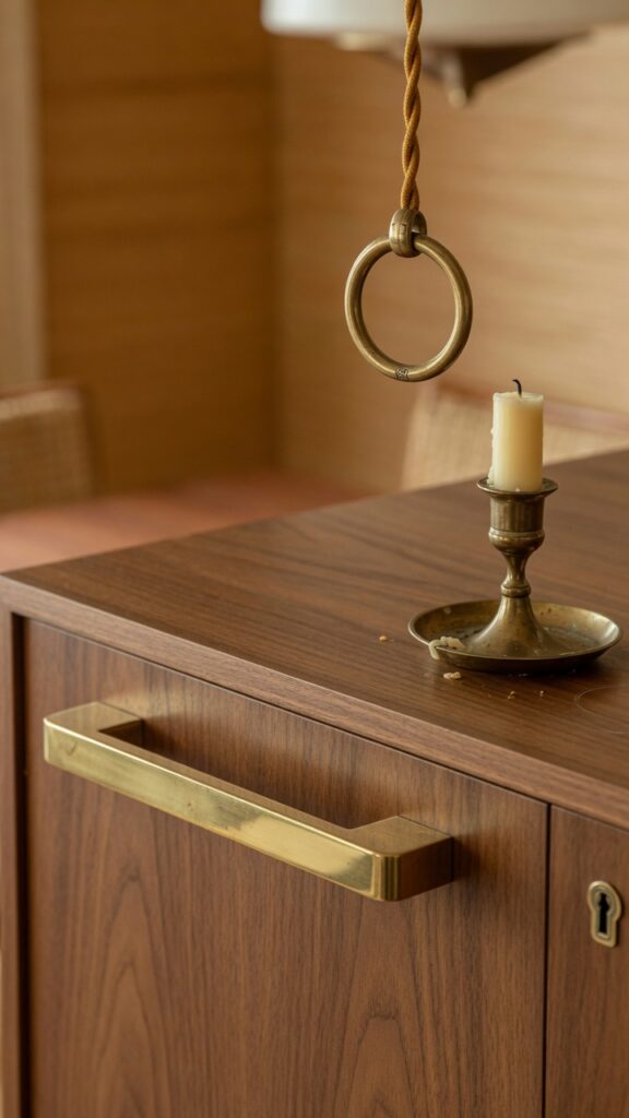
Brass is to mid-century design what chrome is to Art Deco: the metal that carries the era’s entire personality in its finish. Get the metal right and the room coheres. Use the wrong metal — polished nickel, brushed steel, matte black — and something subtly off-key undermines all the other right decisions.
The key distinction for a modern mid-century room is between brushed or satin brass and polished brass. Polished brass looks period-accurate in the strictest sense but can feel brassy and high-maintenance in a contemporary home — it shows fingerprints constantly and requires regular attention to maintain its shine. Brushed or unlacquered brass, which develops a natural patina over time, is the more liveable and arguably more interesting option. Use it consistently across hardware: credenza handles, pendant light fixtures, candlesticks, and picture hooks should all share the same brass family. Mixing brass with matte black accents is a valid contemporary move, but keep it deliberate — one or two matte black elements maximum, not a scatter of both metals across every surface. That said, brass alone in a room with very warm wood tones can feel heavy. Balance with white or cream upholstery to give the warmth somewhere to breathe.
9. Statement Lighting: The Sputnik Chandelier
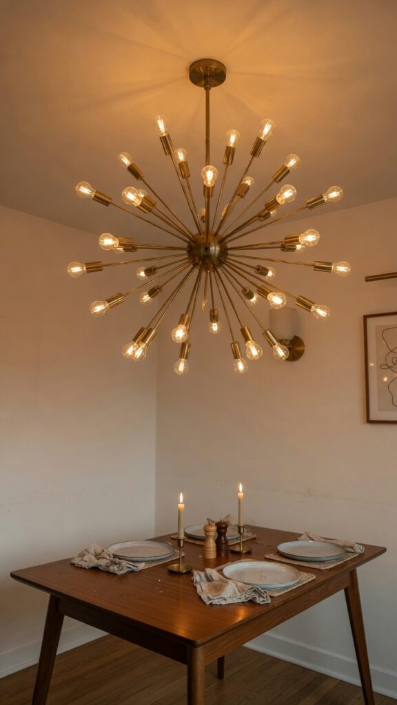
The Sputnik chandelier is perhaps the most cinematically mid-century light fixture ever designed — a starburst of metal arms radiating from a central sphere, each tipped with an exposed bulb. It was inspired by the space race, designed in an era of genuine optimism about the future, and it has somehow retained every bit of that energy six decades later. In a dining room, it works as a room-defining centrepiece.
Hang it at the right height — 75–85cm above the table surface for standard ceiling heights. If your ceilings are higher than 2.7m, adjust upward slightly but never so high that the fixture loses its presence over the table. Brushed brass is the most versatile finish; chrome versions exist and are period-appropriate but read cooler and more contemporary. Use Edison-style filament bulbs rather than standard LED globes — the visible filament reinforces the period aesthetic and the warm light temperature (2200–2700K) is essential for dining room atmosphere. One constraint: in a room with low ceilings (below 2.4m), a full Sputnik chandelier can feel cramped and slightly dangerous for taller guests. A flush-mounted version or a smaller-scale alternative is the smarter choice.
10. A Gallery Wall with Mid-Century Art Prints
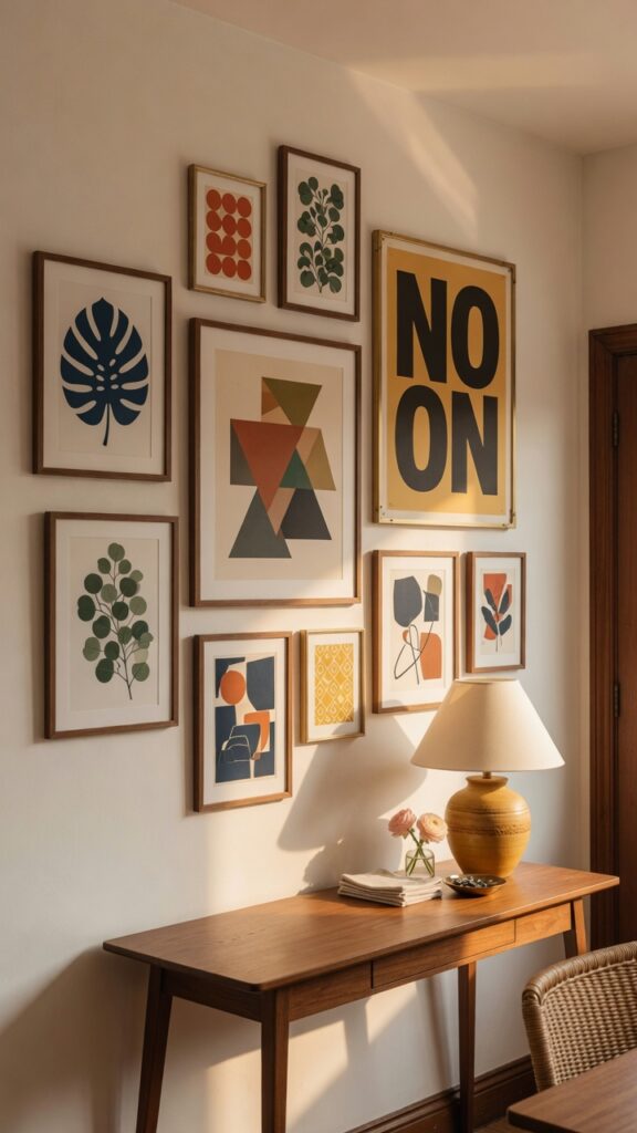
A gallery wall in a mid-century dining room is not a random collection of things you like — it’s a curated argument. The art, the frames, and the arrangement all need to speak the same visual language, and that language is specific: geometric abstraction, bold graphic forms, and limited, confident colour.
Mid-century art prints that work well include abstract geometric compositions in ochre, teal, olive, and black; single-colour botanical line drawings; typography posters from the 1950s and 60s; and abstract expressionist prints in warm earth tones. Avoid watercolour florals, family photographs mixed into the arrangement, and anything with a rustic or farmhouse sensibility — these break the visual code entirely. Frame consistently: simple walnut or thin brass frames, or a mix of both. Avoid chunky white frames, which read too contemporary, and ornate gilt frames, which belong to another era. Arrange asymmetrically rather than in a rigid grid — mid-century sensibility is about organic confidence, not military precision. One practical note: plan the arrangement on the floor before committing any nails to the wall. Photograph it from above and live with the image for a day before hanging.
11. Velvet Upholstery in Teal, Olive, or Mustard
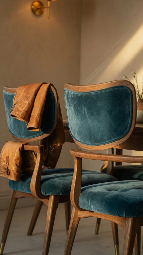
Velvet in a mid-century dining room is one of those choices that photographs dramatically and lives beautifully — but only if the colour is right. The wrong velvet (think: overly saturated jewel tones, cool blues, or anything approaching navy) pulls the room away from its period roots and toward something more generic. The right velvet — teal with a slight grey in it, olive that leans more green than brown, mustard that stops short of being orange — is deeply specifically mid-century.
The texture of velvet is also doing important work here: it absorbs light in a way that linen and leather don’t, creating depth and richness that makes the chairs feel substantial and considered. For dining chairs specifically, a performance velvet (solution-dyed, with some stain resistance built in) is a far more practical choice than standard velvet without sacrificing the visual effect. Consider velvet on two chairs only — the heads of the table — with a complementary but different fabric on the remaining seats. It creates hierarchy and prevents the room from feeling like a showroom. One honest constraint: velvet and households with children or pets have a complicated relationship. The nap shows every handprint and the fabric attracts pet hair like a magnet. In that situation, a velvet-effect microfibre is a smarter material choice.
12. The Finishing Layer: Table Styling with Ceramics and Candlelight
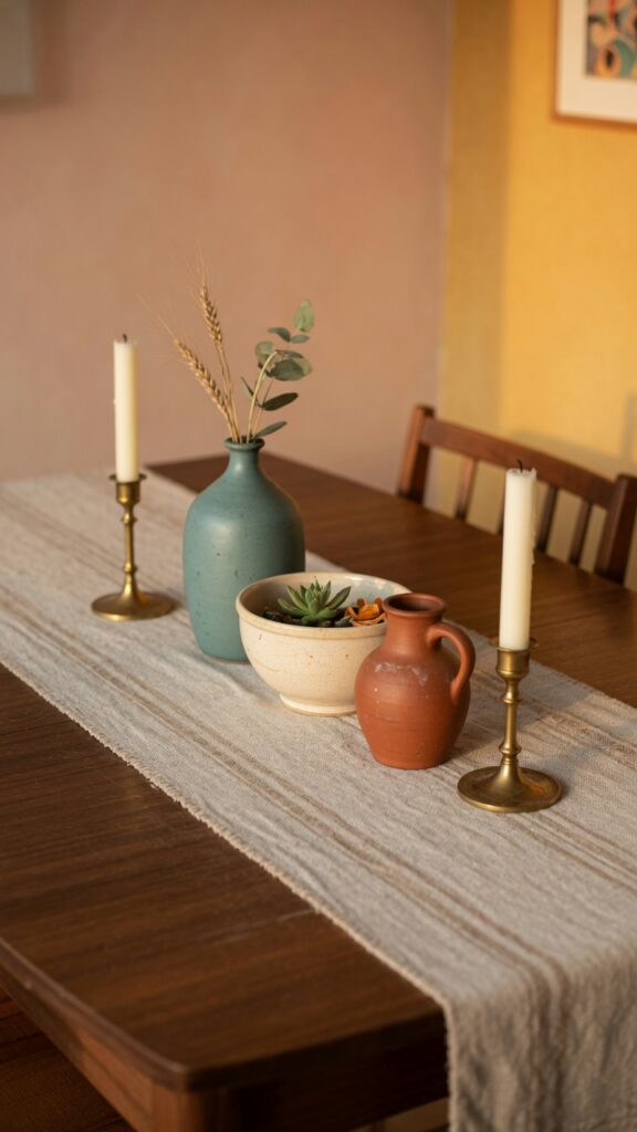
The table itself is the last thing most people think about styling, which is backwards. In a mid-century dining room, the table surface is active even when not set for a meal — it’s a composition that should look intentional from across the room and inviting up close.
The centrepiece logic is simple: vary heights, limit colour, mix materials. Three ceramic vessels — one tall, one medium, one low — in a cohesive palette of teal, terracotta, and cream creates the kind of arrangement that looks effortless but is actually the result of deliberate editing. Handmade ceramics with slightly irregular surfaces are far more interesting than perfectly uniform factory pieces. Flank the ceramics with two brass candlesticks at a slightly lower height than the tallest vessel. A linen or woven cotton table runner in a neutral warm tone anchors the arrangement without competing with it. One designer rule worth following: resist the urge to add too much. Four elements on a dining table centrepiece is the maximum before it starts reading as cluttered rather than styled. The empty walnut surface on either side of the arrangement is part of the composition — it lets the wood grain speak and prevents the table from looking like a market stall. Mid-century restraint is the point.
Mid-century modern dining rooms have endured because they operate on principles that genuinely work: honest materials, confident colour, sculptural form, and a deep respect for the relationship between furniture and space. What often gets lost in the trend coverage is that this style rewards patience and specificity. The wrong shade of terracotta, the wrong metal tone, the wrong scale on a mirror — these things matter more in a mid-century room than in more forgiving styles because the language is precise. The good news is that once you understand the rules, the decisions become easier rather than harder. A walnut table with tapered legs. Brass that patinas. A bold geometric rug that grounds the room. Velvet in the right muted tone. These are not complicated choices — they’re just specific ones. Make them deliberately and the room will reward you with a kind of timeless warmth that trends simply cannot manufacture.