Dining rooms occupy a funny middle ground in most homes — too formal to feel casual, too infrequently used to justify major renovation, and somehow always the last room to get proper decorating attention. Shelves change all of that. A well-styled shelf does more visual work than a gallery wall, more practical work than a sideboard, and more personality work than any rug you’ll ever pick. The trick is knowing what actually belongs on one — and what ends up looking like you panic-bought things five minutes before guests arrived. Whether your dining room is a dedicated space with crown molding and a chandelier, or a corner of an open-plan kitchen, these twelve ideas will give you something real to work with. Not mood boards. Actual decisions.
1. The Limewash Wall Shelf
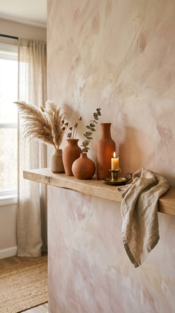
Limewash paint and open shelving are one of those combinations that look effortless in photos precisely because someone thought about them carefully beforehand. The texture of limewash — that chalky, slightly uneven finish — gives shelf objects something to push against visually. Smooth ceramics, matte brass, and rough-edged dried botanicals all pop off it in a way they simply don’t against a flat eggshell wall.
Here’s the trick: keep your shelf material light. White oak, pale ash, or even a whitewashed MDF shelf will work. A dark walnut shelf against limewash tends to fight rather than complement. For objects, stick to three anchor pieces — one tall, one medium, one low — and resist filling every inch. One thing to watch: limewash absorbs moisture more than standard paint, so if your dining room has humidity swings, seal it properly before mounting anything heavy. That said, the result is warm, tactile, and genuinely beautiful in candlelight.
2. Sculptural Ceramics as the Star
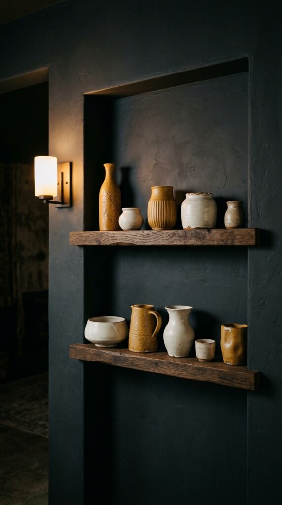
Most people treat ceramics as fillers. They shouldn’t. A genuinely good ceramic piece — whether it’s a wheel-thrown vase with a running glaze or a slab-built bowl with an uneven rim — has the presence of sculpture. In a dining room, where you’re already drawing people around a table and asking them to look at things, a shelf full of considered ceramics becomes a quiet conversation starter.
The formula that works: odd numbers, varied heights, and a consistent glaze family. You don’t need to match colors exactly — warm creams, ochres, and dusty terracottas all sit together naturally. What kills it is mixing shiny glazed pieces with matte ones randomly. Pick a finish and commit. Skip this if you have young kids or a chaotic household — open shelves with irreplaceable handmade ceramics and flying elbows are a stressful combination.
3. The Renter-Friendly Leaning Shelf
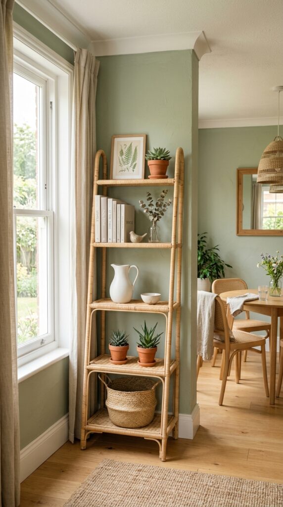
Not everyone can put a drill to their walls — and even if you can, sometimes the right answer is a piece of furniture that moves with you. A leaning shelf in the dining room is genuinely underrated. It takes up a narrow footprint, requires zero commitment, and because it’s slightly casual by nature, it actually looks better with relaxed styling than a rigid floating shelf does.
Rattan is the best material choice here: light enough not to tip, warm enough to work with almost any wall color, and textural enough to hold its own in a room that already has a table and chairs competing for attention. Style it the way you’d style a bookshelf — a few books horizontal, a few vertical, some objects between. The key constraint: because it leans, it can’t hold anything heavy or fragile near the top. Keep the upper shelves for lightweight botanicals and the lower shelves for books and heavier ceramics. Works best for renters, and honestly, for anyone who moves furniture seasonally.
4. Brass and Dark Wood, Done Properly
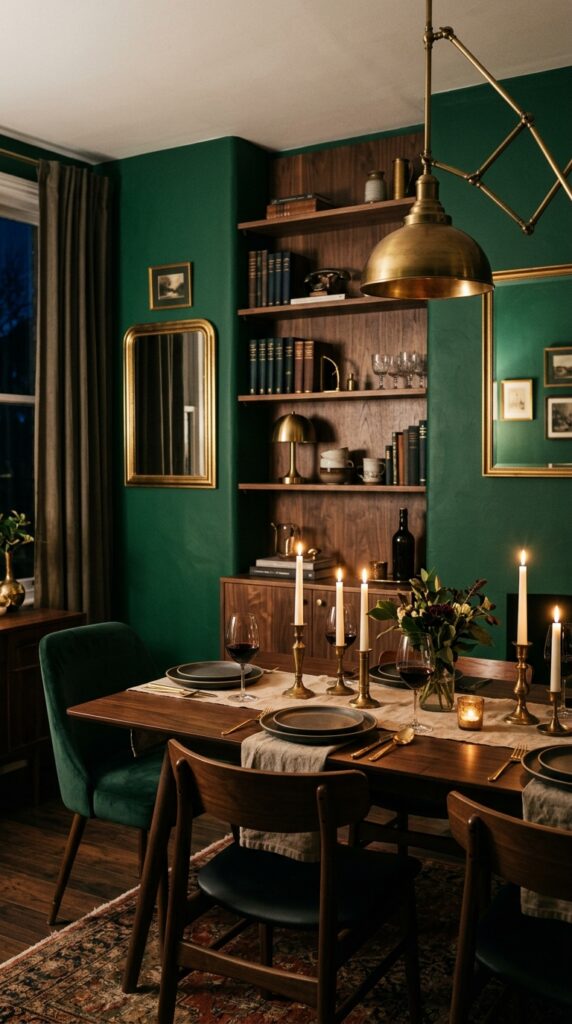
The discipline here is restraint on the brass. Two or three pieces maximum — candlesticks, a bud vase, a small object. More than that and it tips into precious territory. Keep the books dark-spined; bright or white book covers destroy the cohesion. One thing to watch: this combination can feel loud in smaller dining rooms with low ceilings. If your room is under ten feet, consider a single shelf rather than stacked shelves, and keep the wall color slightly lighter — olive rather than deep forest green.
5. Open Shelf as a Drinks Display
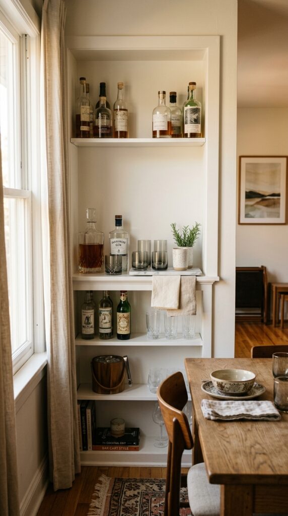
If you entertain at all — even informally — a shelf dedicated to a drinks display is one of those ideas you’ll wonder why you didn’t do sooner. It’s functional, it looks beautiful, and it gives guests something to interact with when they arrive before dinner. The visual logic is simple: glass catches light, and light is free decor.
The key is editing. You don’t need every bottle you own on display — just two or three decanters with spirits you actually drink, a set of matching glasses, and one small tray to anchor everything. A marble or slate tray works better than wood here because it’s wipe-clean. Fresh herbs in a small vessel add life and smell incredible. The constraint: this only works if you’re genuinely tidy. A drinks shelf with sticky rings, half-empty bottles, and random bottle caps quickly becomes the worst-looking thing in the room. Commit to the upkeep or skip it.
6. The Full-Wall Statement Shelf
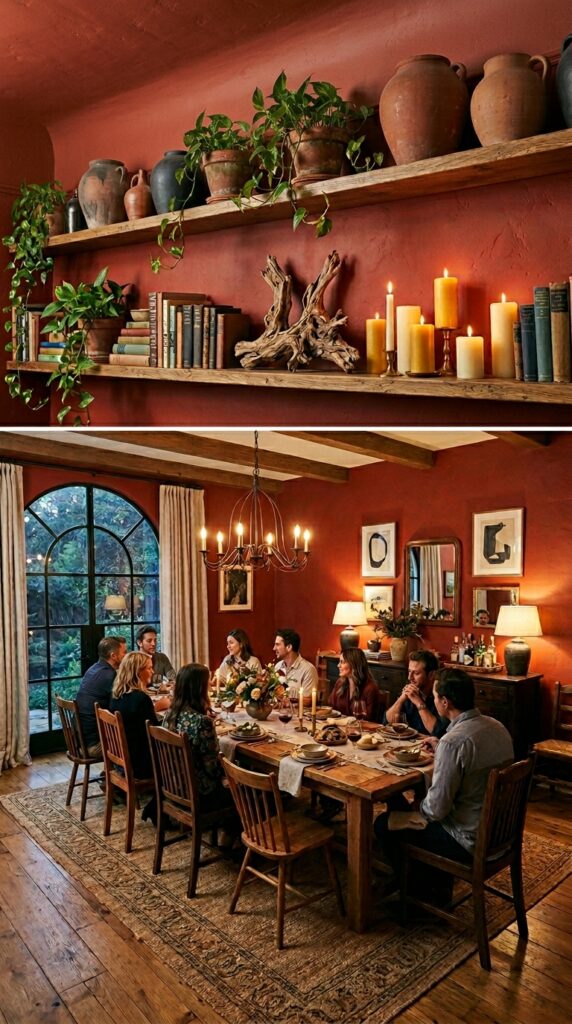
A single shelf that runs wall-to-wall at picture-rail height is a genuinely architectural move — it draws the eye along the entire room, makes ceilings feel taller, and turns one surface into a gallery. It also requires you to style it like one continuous piece rather than a series of small vignettes, which is harder than it sounds.
Think of it in thirds. Left third: tall objects, some height. Middle third: varied and slightly lower — this is where your eye rests. Right third: something that echoes the left but doesn’t mirror it exactly. Trailing plants are your best friend on a high shelf — pothos and philodendron spill beautifully and require almost no light. The practical caveat: you need serious wall anchors and ideally a stud finder, because a shelf this long under any real weight is a safety issue if it’s not mounted correctly. If your room faces north, add a small warm-toned wall sconce below the shelf at one end — the difference in how it reads in the evening is significant.
7. Wabi-Sabi Styling with Natural Materials
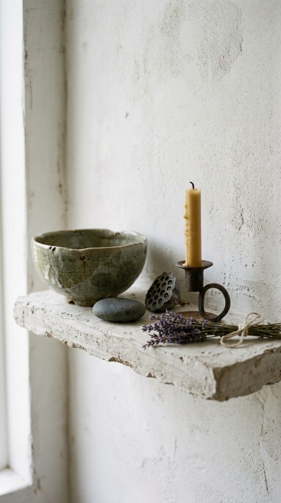
Wabi-sabi is one of those aesthetic labels that gets thrown around carelessly, but the underlying principle is worth taking seriously: embrace imperfection, natural materials, and things that show their age. In a dining room context, this means resisting the urge to buy everything new and matching. A shelf styled this way should look like it was assembled slowly, over time, from things that actually mean something.
Concretely: rough plaster walls, hand-thrown ceramics with uneven rims, a single dried botanical, a river stone, an iron candleholder with visible hammer marks. No plastic, no shiny acrylic, nothing with a label still on it. The editing rule for wabi-sabi styling is stricter than any other: one object too many and it tips from serene to cluttered. If you share the space with someone who likes things “finished-looking,” this aesthetic can be a hard sell — have the conversation before you start pulling things off other surfaces to put on the shelf.
8. Color-Blocked Shelves with Bold Paint
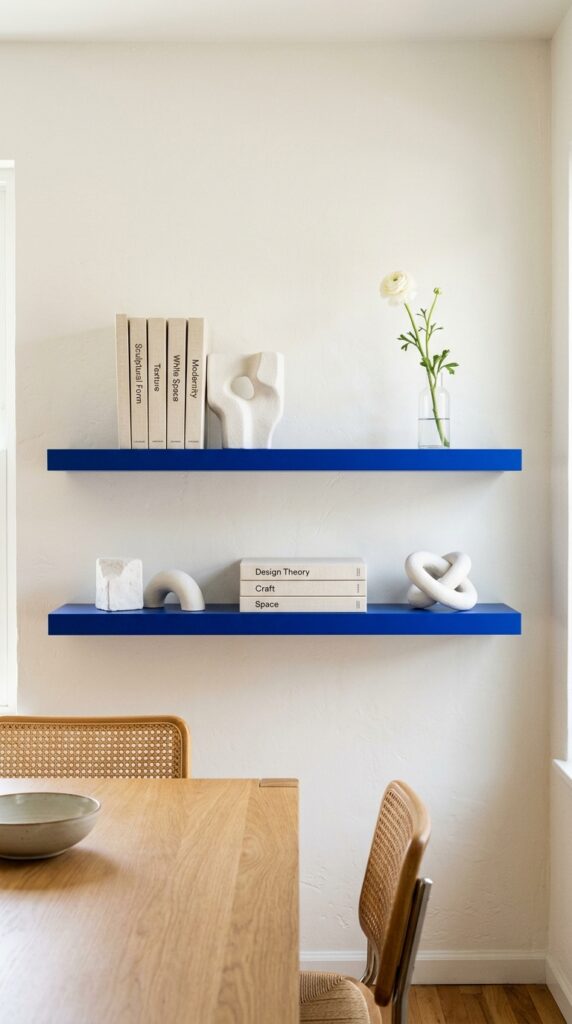
Painting your shelves a color — not the wall, the actual shelf surface — is one of the most impactful low-cost moves in dining room decor. It transforms a functional object into a design feature. Cobalt blue, deep terracotta, forest green, even matte black. The shelf becomes the art, and everything on it exists to complement the color rather than compete with it.
The styling rule that makes this work: keep objects on a color-blocked shelf simple and largely neutral. White plaster, clear glass, cream linen, natural wood. If the shelf is bold, the objects should be quiet. This is not the place for your most colorful ceramics. One practical note: if you hate repainting, use a specialist furniture paint or lacquer rather than wall paint — it’s more durable, easier to wipe, and holds its color longer. This look works particularly well in dining rooms that already have white or off-white walls; it adds punch without requiring you to commit to a full wall color.
9. The Floating Corner Shelf Arrangement
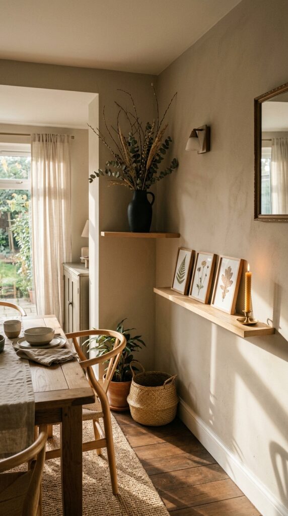
Corners are the most underused real estate in any dining room, and floating shelves in a corner arrangement — mounted at different heights on adjacent walls rather than matching — solve two problems at once: they use dead space productively, and they add architectural interest to an otherwise flat room. The asymmetry is intentional. Different heights create movement.
Keep the objects sparse here. Because corner shelves are inherently smaller, overcrowding them is very easy and very unflattering. One tall object on the higher shelf, two or three small objects on the lower one, and deliberate negative space between. Dried botanicals are excellent here — a single sculptural branch in a vessel reads as art rather than filler. The constraint: this arrangement needs the walls to be in reasonable condition. If you have scuffs, repairs, or wall texture inconsistencies at eye level, corner shelves will draw attention to them rather than away.
10. Layered Art and Objects Together
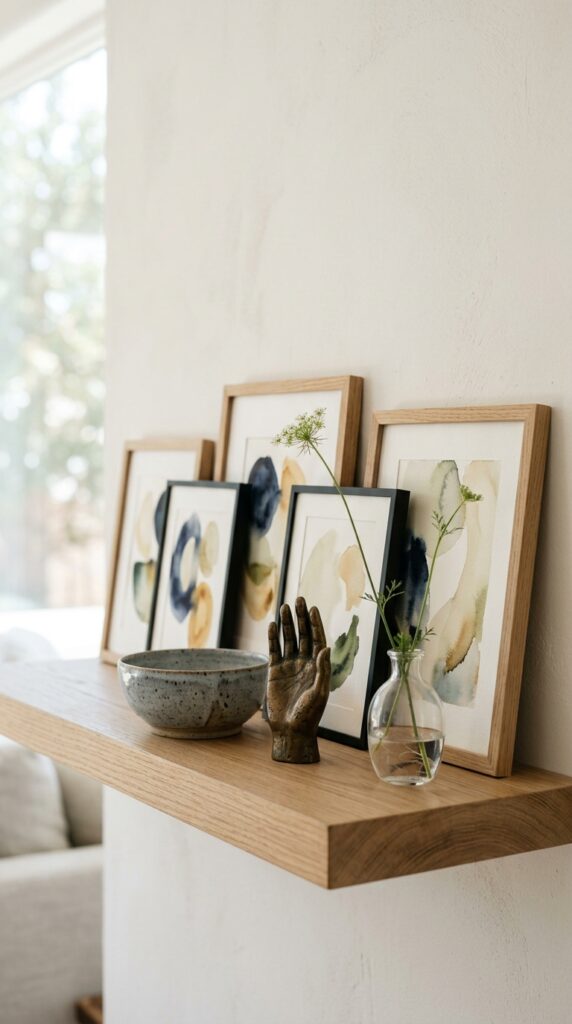
Leaning small-framed artwork against the wall at the back of a shelf — rather than hanging it above — creates a layered, gallery-like quality that flat shelf styling rarely achieves. It’s also infinitely adjustable without putting more holes in your wall, which makes it ideal for anyone who rearranges things seasonally or just hasn’t quite committed to a layout.
The framing matters more than the art itself. Slim profiles in black, brass, or natural wood. Mix two frame styles maximum — three starts to look like you raided a flea market without a plan. Stack frames slightly in front of each other if depth allows, rather than lining them up. Objects in front should be significantly lower in height than the frames, or the frames disappear entirely. One watch-out: this look needs a shelf with at least ten inches of depth. On a shallow four-inch shelf, leaning art tips forward constantly and never quite sits right.
11. The Herb and Ceramic Kitchen-to-Dining Shelf
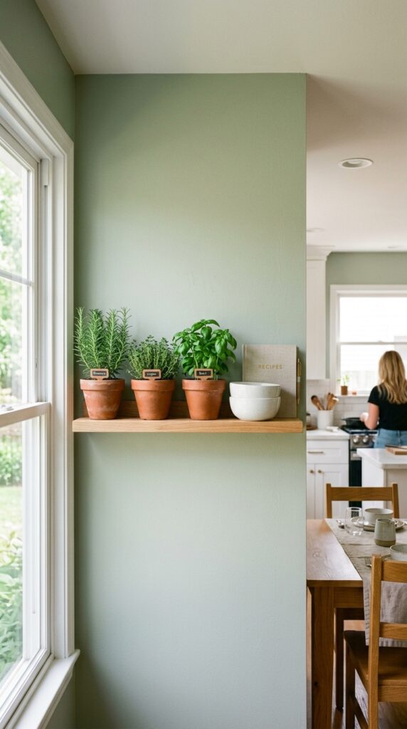
In open-plan homes where the dining area flows into the kitchen, a shelf that bridges the practical and the decorative makes perfect sense. Potted herbs in terracotta, a couple of ceramic serving bowls you actually use, maybe a small cookbook or recipe notebook. It’s honest styling — things that live there because they’re used there.
The aesthetic argument for this approach is that it avoids the awkwardness of purely decorative objects in a space that’s clearly about eating and gathering. Everything on the shelf has a reason to exist, and that reads as confident rather than precious. The practical note: live herbs need light. If your dining room doesn’t get at least a few hours of direct or strong indirect light, the herbs will struggle within a few weeks and the whole vibe collapses into sad brown stems. In that case, swap for dried herbs in small jars — still beautiful, zero maintenance.
12. Moody Evening Shelf with Candlelight
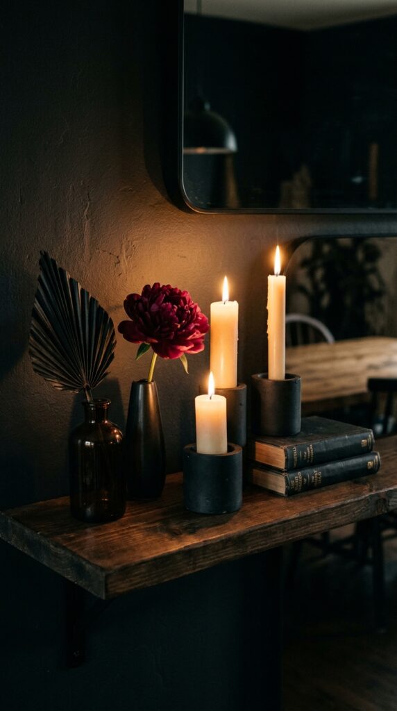
Some shelves are designed for daylight. This one isn’t. A dining room shelf styled specifically for evening — for the hours when you’re actually in the room, with people, with candles lit — operates on completely different logic than one you’re arranging for Instagram at noon. The objects don’t need to be colorful or varied. They need to glow.
Pillar candles are non-negotiable here: tapers tip and drip, tea lights disappear visually. Pillar candles in concrete or ceramic holders at different heights create a flickering still life that no other styling approach matches. Keep objects dark and warm: amber glass, dried blackened botanicals, burgundy or deep plum florals, dark-spined books. Skip anything white or reflective — it catches candlelight too harshly and destroys the mood. If you share the dining room with children or anyone who regularly rushes past surfaces, use LED pillar candles instead. Genuinely good ones exist now, and the compromise is worth the safety.
The dining room shelf, done well, is one of those quiet things that changes how a room feels without anyone being able to say exactly why. Guests sense it — that the room has been thought about, that objects have been chosen rather than accumulated. What you’ve learned today isn’t just twelve styling ideas; it’s the underlying logic behind each one. The restraint of wabi-sabi. The commitment required by a drinks display. The light dependency of living herbs. The specific gravity of brass in a moody room. Good shelf styling isn’t about buying the right things — it’s about understanding why each object earns its place. Come back to these principles every time you rearrange, and your shelf will always look like someone with real taste lives there. Because someone does.