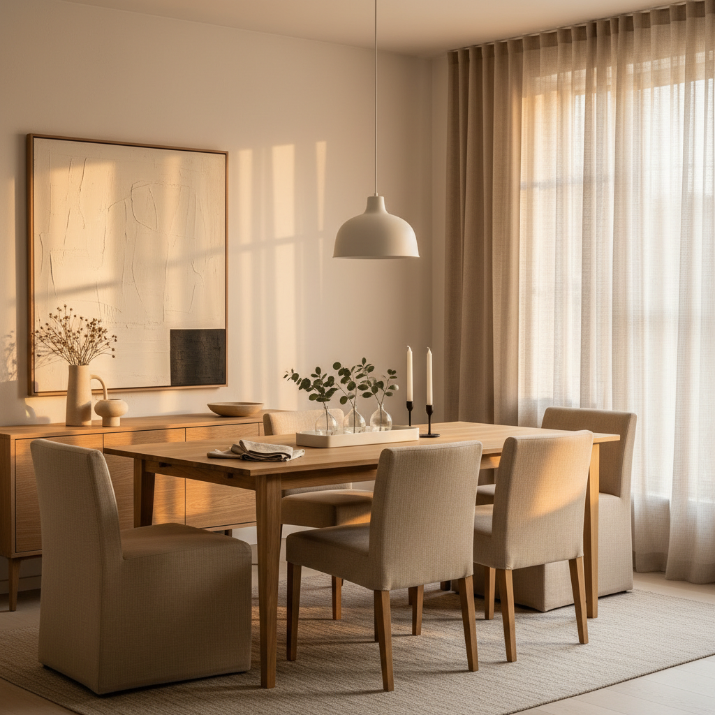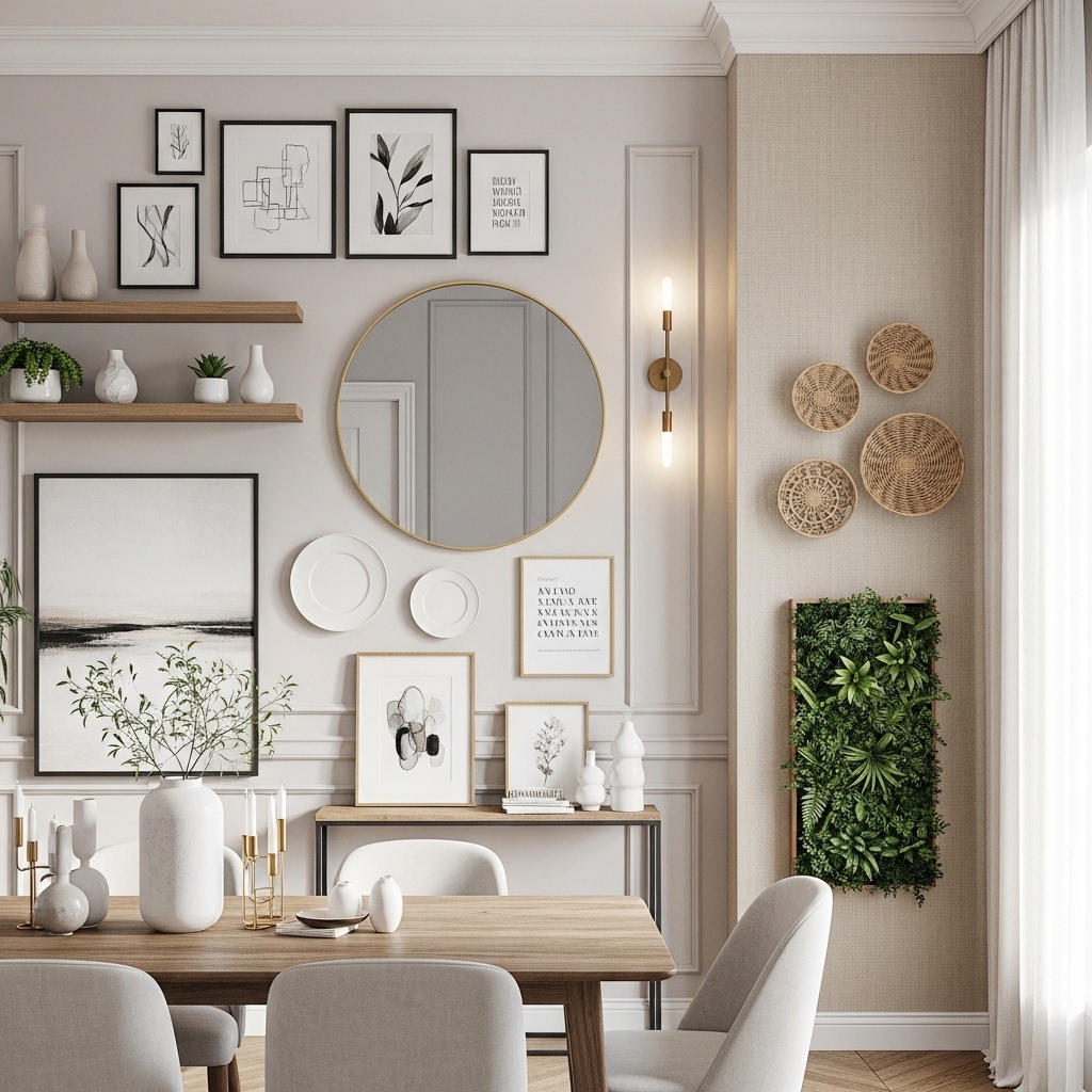
Color drenching has officially graduated from a Pinterest experiment to a legitimate design philosophy — and honestly, it’s about time. For years we’ve been told to paint walls white, add a “pop of color,” and call it a day. But there’s something genuinely transformative about committing to a single hue and letting it wrap around a room like a well-tailored coat. Done right, it doesn’t shrink a space or overwhelm it. It does the opposite: edges soften, architecture becomes sculpture, and rooms start to feel like places you actually want to linger in for hours.
The trick, of course, is keeping it sophisticated rather than chaotic. That’s where most people stumble — they pick a color they love on a chip and forget that paint behaves differently across walls, ceilings, and trim. Below are twelve approaches I keep coming back to: some bold, some surprisingly subtle, all of them grown-up. Take what works for your space and skip what doesn’t.
1. The Moody Olive Living Room
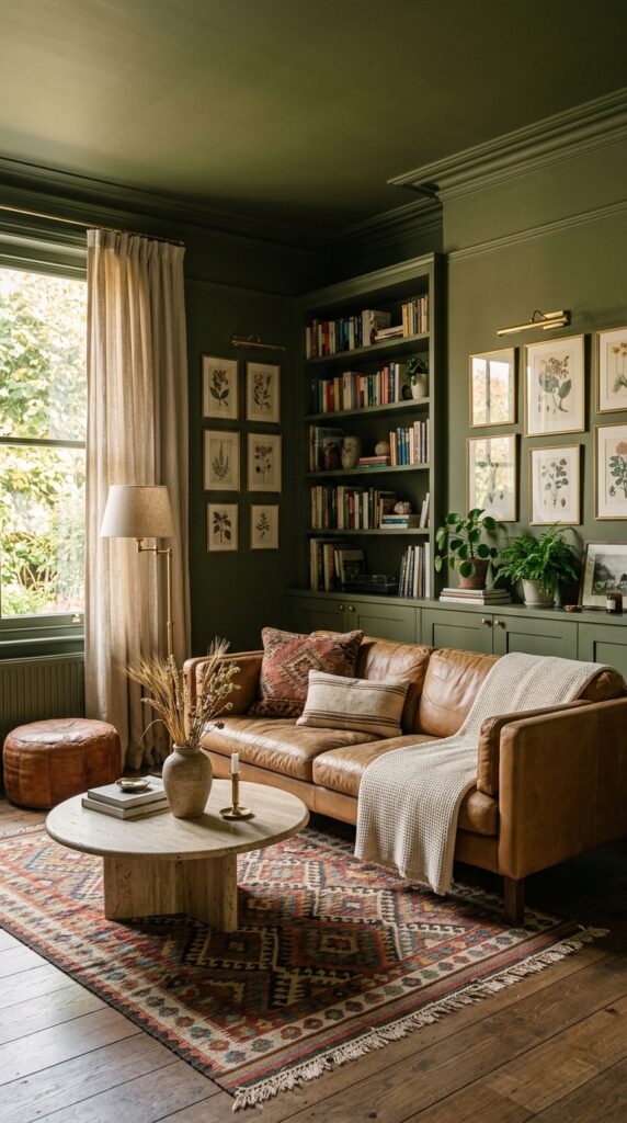
Olive green is the chameleon of saturated colors — it reads neutral until you put it next to something cool, and then it suddenly looks like a forest. That’s exactly what makes it perfect for drenching. Stick to a matte or eggshell finish; anything glossier will fight you under artificial light. Pair it with warm undertones throughout the room: camel leather, brass hardware, oak floors, terracotta. Cool metals like chrome or polished nickel will clash and make the green look swampy.
If your room faces north, test the paint on a large board before committing — north light can pull olive toward gray-brown, which some people love and others find depressing. Layer in texture rather than competing colors: a chunky boucle, a worn kilim, a velvet cushion in a deeper shade of the same green.
The takeaway? Olive rewards restraint. Let it do the talking and keep everything else quiet.
2. Terracotta Bedroom That Feels Like a Hug
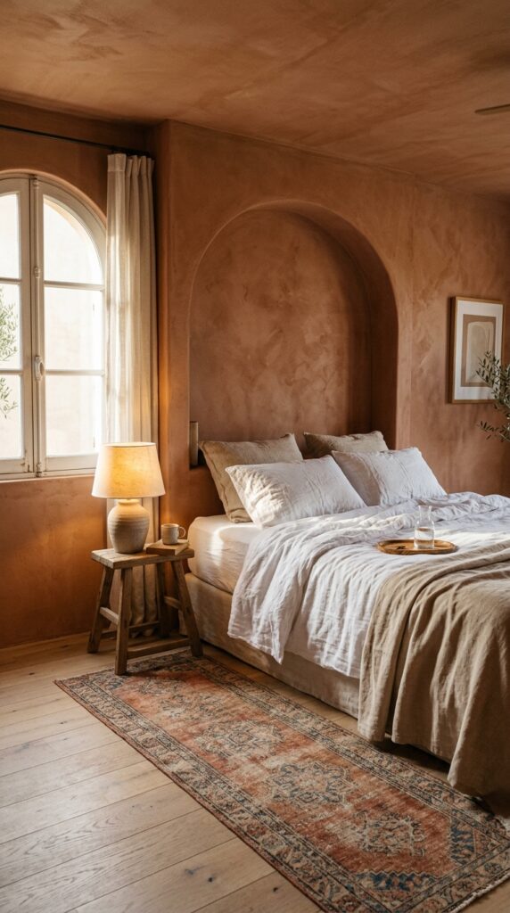
There’s a reason terracotta keeps trending — it’s the closest thing to wrapping yourself in a sun-warmed adobe wall. For bedrooms specifically, it does something magical: it makes morning light look like late afternoon, and it makes everyone’s skin look better in the mirror. That alone is worth the commitment.
Use a limewash or plaster finish if you can swing it. The subtle mottling adds depth that flat paint simply can’t replicate, and it ages beautifully instead of looking dated. Pair it with raw linen bedding (never polyester — it’ll look cheap against the warmth), unlacquered brass fixtures, and a single piece of unfinished wood furniture.
One thing to watch: terracotta can tip into pink under cool LED bulbs. Swap to 2700K warm bulbs everywhere, including any reading lamps. Skip patterned bedding — it competes. Let the wall be the pattern.
The bedroom should feel like a held breath. This palette delivers.
3. Inky Navy Home Office
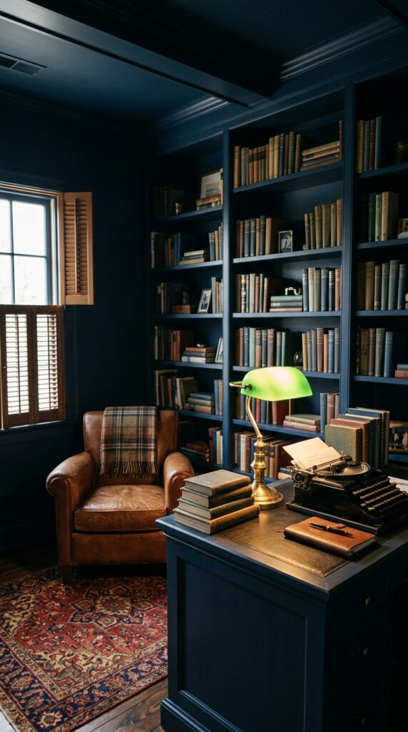
Dark, drenched offices are having a moment, and for once the trend has substance. Navy reduces visual noise, which is exactly what you want when you’re trying to think. The eye stops scanning for stimulation and settles. Productivity, weirdly, goes up.
Go all the way — paint the trim, the door, the inside of the bookshelves. Half-measures look like mistakes. Then warm it up aggressively: brass lamps, leather seating, a wool rug with some red in it, books with worn cloth spines. Without those warm anchors, navy can feel like a corporate boardroom from 1998.
Skip this if you only have one small window. Navy needs either ample daylight or generous lamp lighting (plural — at least three sources). One overhead bulb won’t cut it.
A drenched office isn’t a vibe; it’s a productivity tool dressed in beautiful clothes.
4. Buttery Yellow Kitchen Nook
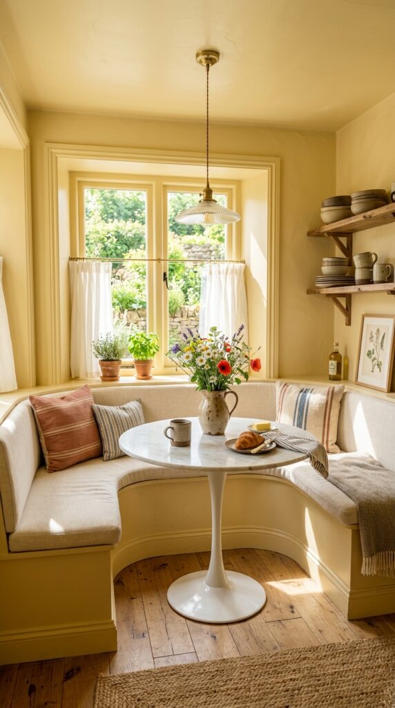
Yellow gets a bad rap because most people pick the wrong one. The wrong yellow is acidic, fluorescent, depressing. The right yellow — soft, buttery, almost cream with a whisper of gold — is one of the most flattering colors you can put on a wall. Especially in a kitchen, where you want energy without aggression.
Drench a breakfast nook rather than the whole kitchen if you’re nervous. It’s a contained moment, easy to commit to, and it transforms morning coffee into something ceremonial. Pair with white marble, brass, natural wood, and woven baskets. Avoid pure white textiles — they’ll make the yellow look dingy. Choose cream or oatmeal instead.
If you share the space with someone who hates yellow, this one’s a hard sell. Color drenching is not a compromise palette. Pick your battles.
The takeaway: yellow done well feels like sunshine bottled.
5. Dusty Plaster Pink Powder Room
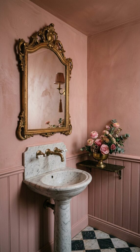
Powder rooms are where you should take your biggest swings. They’re tiny, you’re not in them long, and guests will remember them more than your living room. Drenching one in a dusty, grown-up pink — think aged plaster, not bubblegum — is the kind of move that signals real confidence.
Go matte, always. Glossy pink reads juvenile. Add unexpected darkness somewhere: a black marble countertop, an oil-rubbed bronze fixture, a deeply patinated mirror. The contrast keeps it from feeling like a nursery. A patterned floor — checkerboard, mosaic, anything graphic — grounds the softness.
The watch-out: lighting. Pink walls and cool LEDs are a horror show. Warm bulbs only, and ideally sconces rather than overhead lighting.
Done right, a pink powder room is the design equivalent of a perfect lipstick: confident, slightly subversive, deeply considered.
6. Forest Green Library Corner
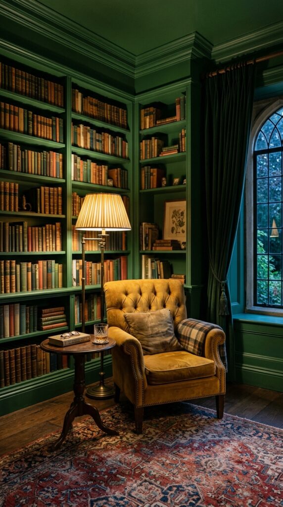
Forest green is what happens when olive grows up and gets a passport. It’s deeper, richer, and reads almost as a neutral against wood tones and warm metals. Drenching a reading corner — even just one wall plus the ceiling and the bookshelves — turns an ordinary nook into a room within a room.
Match the books to the mood: worn cloth bindings, leather, faded jackets. New paperbacks with loud covers will fight the wall. If you must keep them, turn them spine-in or store them in baskets. Layer warm lighting at multiple heights — table lamp, floor lamp, picture light. Never a ceiling fixture.
This works best in homes with at least 9-foot ceilings. In low-ceilinged rooms, deep green can feel oppressive rather than enveloping. Test before you commit.
A green reading corner is an invitation to slow down. Accept it.
7. Sky Blue Sun Room
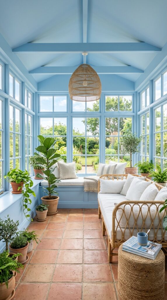
Sky blue is the color drenching cheat code. It’s saturated enough to feel like a real choice, but it bounces light so generously that even small spaces feel bigger. Sun rooms, breakfast areas, and glassed-in porches were practically designed for this treatment.
Choose a satin or eggshell finish here — matte can look chalky in bright light. Pair with rattan, terracotta, and lots of green plants. The combination feels Mediterranean without being a theme. Keep textiles white or oatmeal; introducing other colors muddies the airiness.
Avoid this in rooms that get harsh western light only. By 4 p.m., sky blue under that kind of glare can take on a fluorescent edge. Morning and midday light is its sweet spot.
The takeaway: this isn’t a brave color. It’s a smart one.
8. Chocolate Brown Dining Room
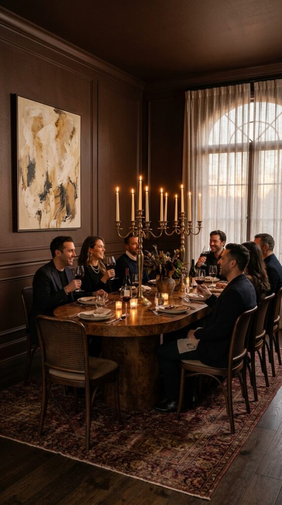
Brown is back, and color-drenched brown is the most surprising version of it. Forget the muddy taupes of the early 2000s — we’re talking deep, espresso-rich, almost-black browns that make a dining room feel like the kind of restaurant where you eat slowly and order another bottle.
Brown flatters food, candles, skin, and almost any wood tone you bring in. Pair with cane, rattan, burl wood, brass, and cream textiles. Keep artwork minimal but generously scaled — one large piece beats five small ones in a drenched room. Tapered candles are non-negotiable; overhead lighting kills the magic.
Skip brown drenching in a room you also use for breakfast. The mood is firmly nighttime, and morning light can make it feel like a hangover.
A brown dining room is theater. Lean in.
9. Lavender Guest Bedroom
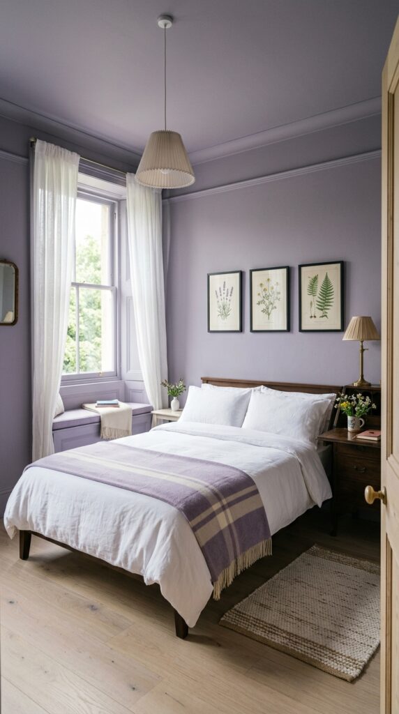
Lavender is the color most people don’t take seriously, which is exactly why drenching a guest room in it lands as such a confident choice. The trick is picking a dusty, gray-leaning lavender — not a sweet, fresh, Easter-egg purple. Think faded heirloom, not toy.
Guest rooms should feel generous and a little impersonal in the best way — like a thoughtful boutique hotel. A drenched lavender room delivers exactly that. Keep textiles almost entirely white and cream so the wall stays the star. Add one piece of dark wood furniture for grounding. Botanical art works beautifully here; abstract art tends to fight.
The watch-out: don’t extend lavender into adjacent rooms. It’s a moment, not a thread. From the hallway, the contrast should feel like opening a small surprise.
Guests will remember this room. That’s the point.
10. Charcoal Gray Hallway with Gallery Wall
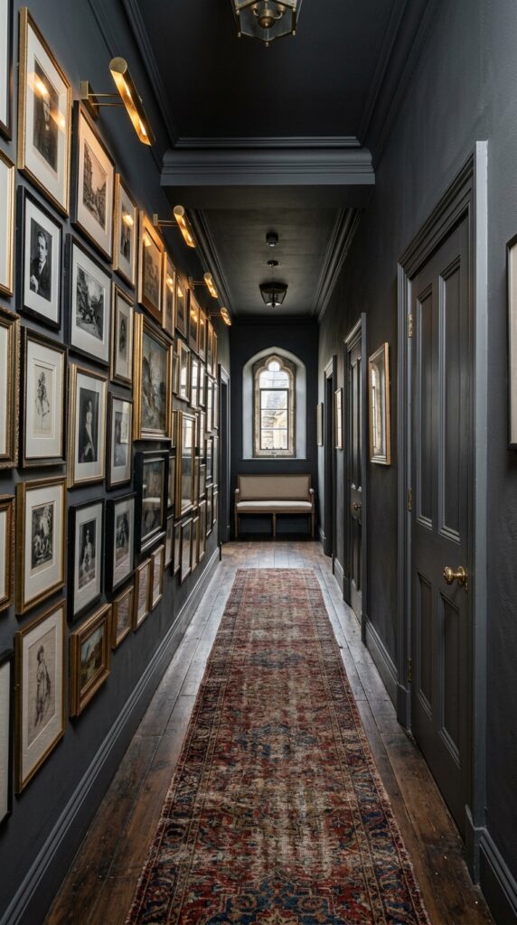
Hallways are the most underused rooms in any home. They’re transitional spaces, sure — but they’re also opportunities for drama you can’t pull off elsewhere. Drenching a hallway in charcoal turns a forgotten passage into a moment.
The gallery wall is what makes it sing. Hang densely, salon-style, with mismatched frames in black and brass. Black-and-white photography reads especially well against charcoal — the contrast feels intentional rather than accidental. Add picture lights for evening drama; they cost more than you’d think but transform the space entirely.
This works best for renters too — a single hallway is a manageable repaint, and the impact-to-effort ratio is unbeatable. Just check your lease.
The takeaway? Charcoal hallways make every room you walk into afterward feel brighter by comparison. That’s a design trick you can’t unlearn.
11. Burgundy Den or Snug
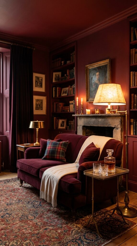
Burgundy is the most polarizing color on this list, and also the most rewarding when it works. It’s a winter room, a fireplace room, a Sunday-afternoon-with-a-book room. Don’t try to make it feel light and breezy — it never will.
Lean into the moodiness. Velvet, cashmere, tartan, worn leather, dark wood. Tonal layering matters here: pair burgundy walls with a slightly darker or slightly lighter burgundy sofa, plus cream and cognac accents. Avoid bright accent colors — they’ll look like clown noses against the depth of the wall.
Skip this in a room with cool fluorescent overhead lighting; it’ll turn the burgundy muddy and the room funereal. Lamps only, warm bulbs only, dimmer switches if possible.
A burgundy snug is a personality room. If you have one, you’ll know.
12. Soft Sage Kitchen with Tonal Cabinetry
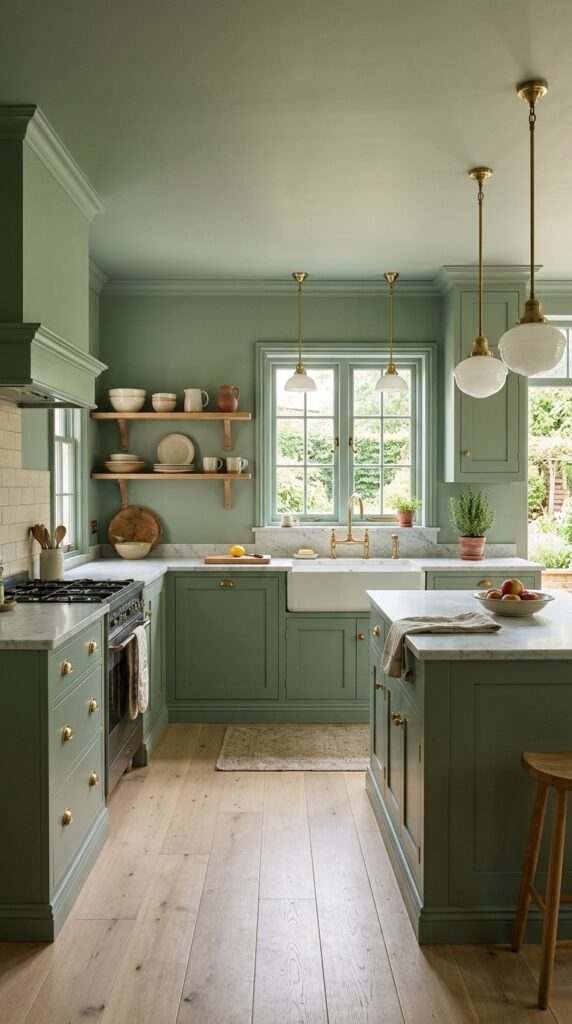
Sage green kitchens have become a bit of a cliché — and yet, when you drench the entire kitchen in the same sage rather than just doing the lower cabinets, the result feels fresh again. The continuity is what elevates it. Walls and cabinets in the same color make the kitchen read as architecture rather than a collection of parts.
Choose unlacquered brass hardware (it’ll patina beautifully), white or cream marble counters, and pale oak floors. Keep open shelving styling minimal and tonal — stoneware in cream, oatmeal, and white. Avoid colorful small appliances; they’ll fight the calm.
The watch-out: tonal kitchens can feel flat if you don’t introduce texture. Add a fluted glass cabinet front, a textured backsplash, or a marble with movement.
The takeaway? Sage drenched right doesn’t feel trendy. It feels inevitable.
If there’s one thing I hope you take from all of this, it’s that color drenching isn’t about being bold for the sake of it — it’s about commitment. The reason these rooms feel sophisticated rather than chaotic is that someone made a clear decision and followed it through every surface, every finish, every lamp choice. Half-painted accent walls and one-off color pops are what make rooms feel busy. Full saturation, surprisingly, is what makes them feel calm.
Start small if you’re nervous. A powder room, a hallway, a single nook. Live with it for a season before deciding whether to extend the language to other rooms. And remember that paint is the most reversible decor decision you’ll ever make — far easier to repaint a wall than to replace a sofa you’ve stopped loving.
Bookmark this article and come back when you’re ready to commit. We dig deep into the details most decor sites skim over, because the difference between a room that looks expensive and one that doesn’t usually lives in the small choices. Glad you spent this time with us — come back soon.