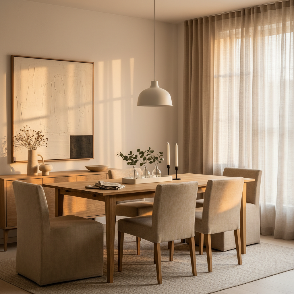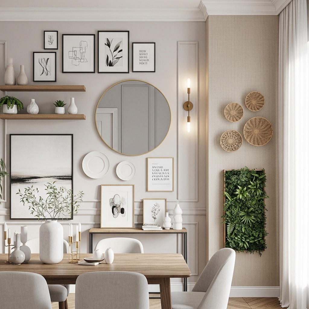
There’s a moment in every home when you walk in and realize the space is fine. Just… fine. The sofa works, the rug is okay, nothing is broken, but nothing sings either. That’s the moment most people start scrolling Pinterest at midnight and end up paralyzed by ten thousand beige rooms that all look identical.
I’ve decorated my own apartments through three moves, helped friends rescue their rentals from landlord-white purgatory, and learned the hard way that “bold” doesn’t mean expensive or chaotic. It means committed. It means picking a few things you actually love and letting them be loud, while the rest of the room stays quiet enough to listen.
What follows are twelve ideas I keep coming back to, the kind that genuinely change how a room feels the second you walk in. Some require a paintbrush. Some require nothing but rearranging what you already own. All of them work.
1. Drench a Room in One Saturated Color
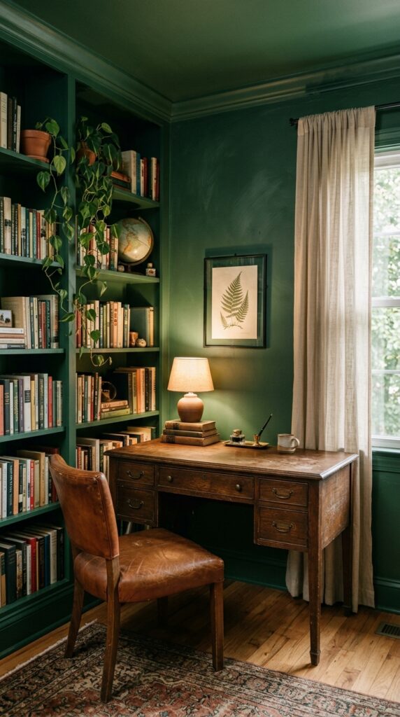
Color drenching is the cheat code I wish I’d discovered five years earlier. You paint the walls, ceiling, trim, doors, and sometimes even the radiator the same single color, and suddenly a boring rectangle becomes a destination. The trick is committing fully. Half-painted ceilings ruin the effect.
Pick a color you can live with at 8 a.m. and 10 p.m. Deep greens, oxblood, plummy browns, and inky blues work in almost any room. Pale lemon and dusty terracotta are surprisingly easy to live with too. Use a matte or eggshell finish to soften reflections and hide imperfect drywall.
One thing to watch: drenching a tiny windowless bathroom in black sounds cool until you’re brushing your teeth in a cave. Make sure you have at least one decent light source, ideally warm-toned, before you commit. Powder rooms, studies, and bedrooms are the easiest wins. Living rooms work too if you balance the saturation with pale upholstery and natural wood.
The takeaway: pick the color, then paint everything. Halfway is worse than not at all.
2. Layer Two Rugs Instead of Buying One Big One
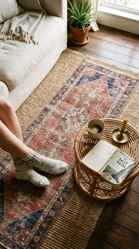
Most people buy one rug, hate that it’s either too small or wildly expensive, and live with the regret for years. Layering solves both problems. A big jute or sisal base in a standard size costs almost nothing, and a smaller patterned rug on top adds the personality.
Stick to a few rules. The base should be neutral and textural, never patterned. The top rug should be smaller, ideally vintage or vintage-looking, and placed slightly off-center or at an angle. Don’t try to be too symmetrical, that’s where it starts looking like a furniture showroom.
The watchout: if you have a robot vacuum or shed-prone pets, layered rugs become a maintenance nightmare. Edges curl, corners lift, and you’ll be flattening them weekly.
For everyone else, this is the single fastest way to make a room look collected instead of catalog-bought.
3. Treat Your Ceiling Like a Fifth Wall
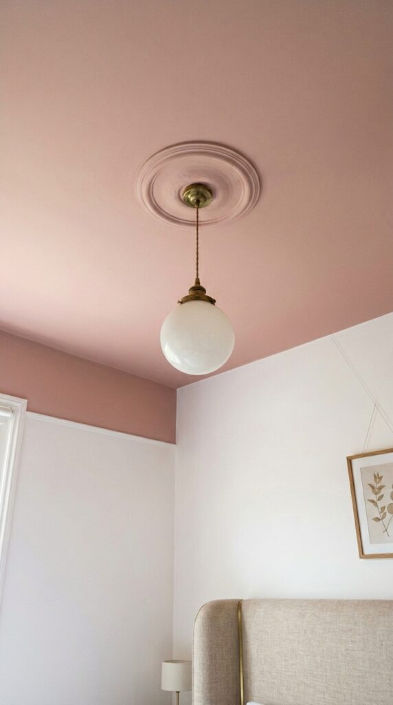
Everyone defaults to white ceilings. White ceilings are fine. They’re also the most underused 200 square feet in your home. A painted ceiling, whether it’s a soft pink, a deep navy, or even just a few shades darker than your walls, instantly makes a room feel intentional.
Soft, dusty colors work in bedrooms because they reflect a flattering glow downward. Deeper tones like charcoal or forest green make tall ceilings feel cozier and lower ceilings feel more dramatic, oddly enough. If you’re nervous, start with a color one or two steps off white, like bone, mushroom, or pale sage.
Skip glossy finishes unless your ceiling is in perfect condition. Every flaw will show. Flat or matte is your friend here.
If you ever sell or move out, a ceiling repaint is one of the easiest reversals in decorating. Low risk, high reward.
4. Build a Statement Headboard Wall
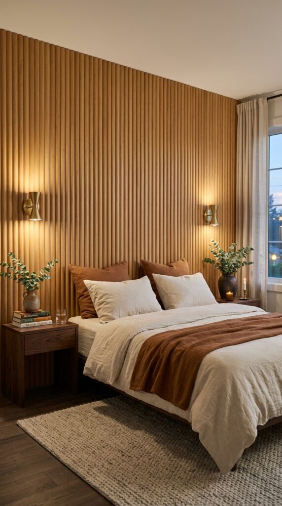
Your bed eats the most visual space in the bedroom, but most people leave the wall behind it completely empty. A statement wall behind the headboard pulls the whole room together without asking you to redo anything else.
Fluted wood paneling is having a moment for good reason. It adds warmth, texture, and a subtle vertical line that makes ceilings feel taller. If wood feels like too much, try limewash paint in a tonal color, a tall upholstered headboard that runs ceiling to floor, or a single oversized piece of art centered above the bed.
Watch the proportions. The treatment should be roughly the width of your bed plus the bedside tables, not an awkward strip floating in the middle. Wider always reads more luxurious than narrower.
The whole room reorients around this one move. Nothing else has to change.
5. Mix Vintage and New on Purpose
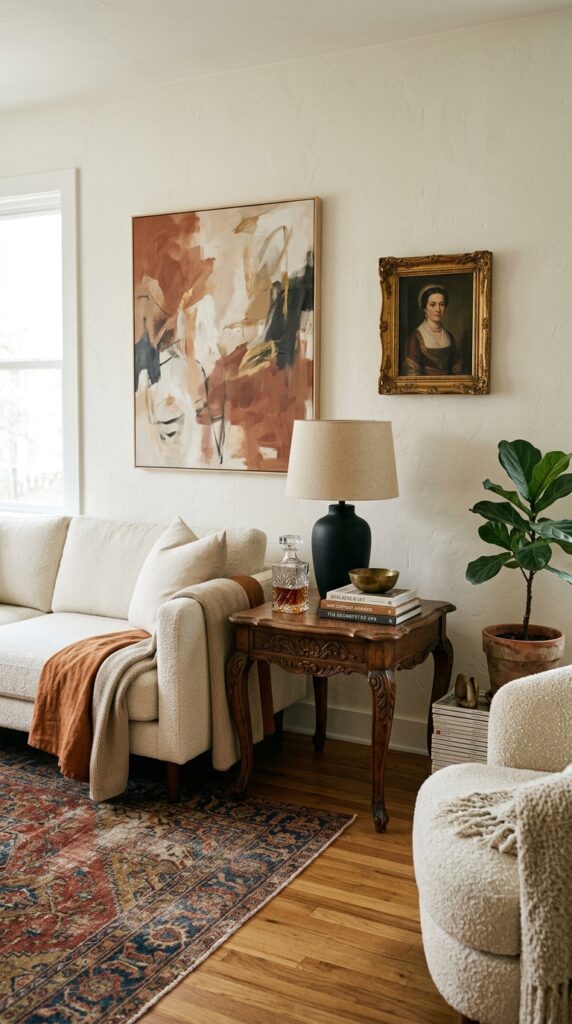
Rooms that feel “designed” almost always mix old and new. The contrast does the heavy lifting. A sleek modern sofa next to a dark, ornate antique table looks more interesting than two of either kind.
Aim for roughly a 70/30 ratio. If your big pieces are modern, the accents should lean vintage, and vice versa. Estate sales, marketplace listings, and grandparents’ attics are gold mines. Look for pieces with patina, slightly worn brass, lived-in leather, marble with a chip on the corner.
Here’s the trick: don’t try to match wood tones perfectly. Walnut, oak, and cherry can absolutely live together in one room as long as you have at least three different tones, not two clashing ones.
If you hate clutter, this approach can feel risky. The fix is restraint, just one or two strong vintage pieces, surrounded by quiet modern ones.
6. Go Hard on a Single Material
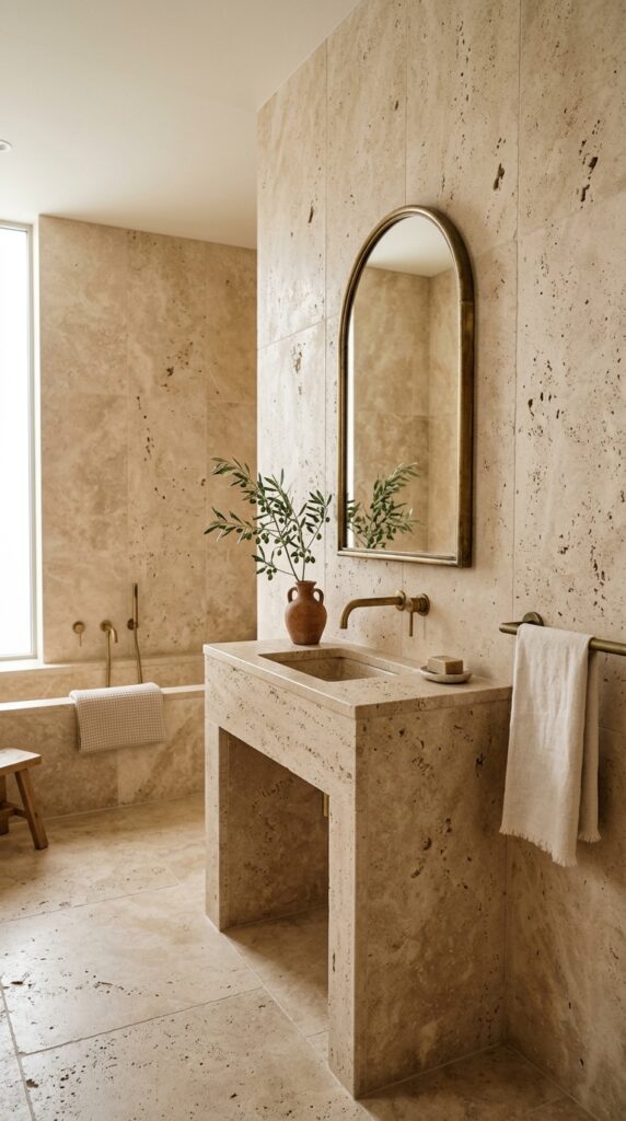
There’s something quietly luxurious about a room that commits fully to one material. Travertine, oak, plaster, terracotta, brass. When the same texture wraps multiple surfaces, the room reads as deliberate, almost architectural.
This works best in bathrooms, kitchens, and entryways where the bones of the room are already doing visual work. Pick a material with natural variation so it doesn’t feel flat. Stone with veining, wood with knots, plaster with hand-troweled texture. Lifeless, perfect surfaces are the enemy here.
The constraint is budget. Real travertine and full-wood paneling are expensive. Renters and tighter budgets can fake the effect with peel-and-stick stone-look panels, limewash paint that mimics plaster, or a single feature wall instead of the whole room.
Done right, a single-material room feels like a piece of architecture you happen to live inside, not a space you decorated.
7. Add Sculptural Lighting That Doesn’t Apologize
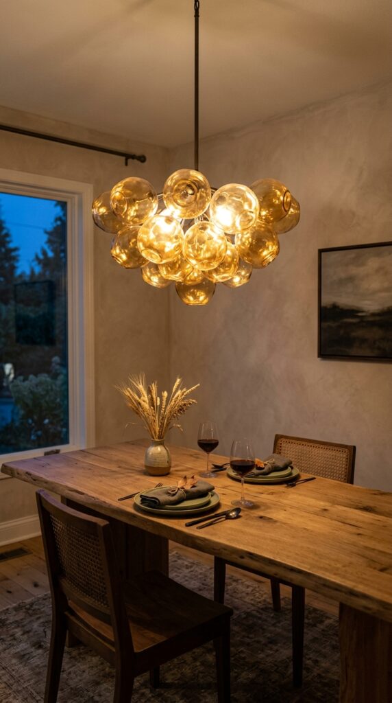
Lighting is where most rooms quietly fail. Builder-grade flush mounts and the same boring three-bulb fixtures kill the mood before you even start decorating. The fix is one fixture that’s almost too big.
Pendants over dining tables, kitchen islands, and even foyers should feel slightly disproportionate, in a confident way. Sculptural shapes, hand-blown glass, paper lanterns the size of a small planet, woven rattan that throws shadows on the ceiling. The fixture itself becomes art.
Hang it lower than you think. Thirty to thirty-six inches above a dining table is the standard, and most people hang theirs way too high out of fear.
The watchout: don’t pair a statement pendant with equally loud sconces and a busy chandelier in the same sightline. One main character per room.
A great light fixture is the cheapest way to make a room look ten times more expensive.
8. Style a Vignette That Feels Lived In
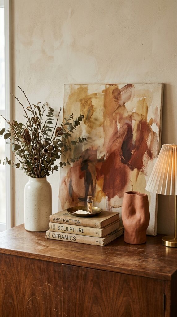
A vignette is just a small grouping of objects on a surface, but most people get it wrong by either over-styling or scattering things randomly. The principle is simple. Vary heights, mix materials, and group in odd numbers.
Three objects almost always works. A tall thing, a medium thing, and something low or horizontal like a stack of books. Add one organic element, branches, a single stem, a piece of fruit, dried grass. Materials should mix, ceramic with wood with metal with paper.
Skip this approach if the surface is something you actually use every day, like an entryway console where keys and mail pile up. Vignettes need to be slightly protected to stay looking good.
The takeaway: edit ruthlessly. Three intentional objects beat fifteen accidental ones every time.
9. Use Textiles to Add Softness Without Renovating
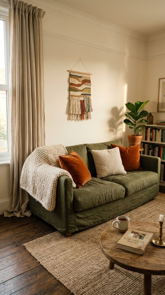
Textiles are the most underrated decorating tool, especially for renters who can’t repaint or replace flooring. The right combination of fabrics can completely change the temperature of a room without a single nail in the wall.
Layer textures, not just colors. Linen for breeziness, velvet for depth, boucle for nubby contrast, wool for weight. A room with all the same fabric reads flat. A room with five different textures in a tight color palette reads designed.
Curtains specifically are worth spending on. Hang them high, almost to the ceiling, and let them just kiss or slightly puddle on the floor. Stubby curtains that stop above the windowsill make ceilings look lower than they are.
The watchout: too many patterns at once gets chaotic fast. Pick one patterned textile and let everything else play in solids and textures.
Soft surfaces are how a room starts to feel like home.
10. Hang Art Big, Hang It Low
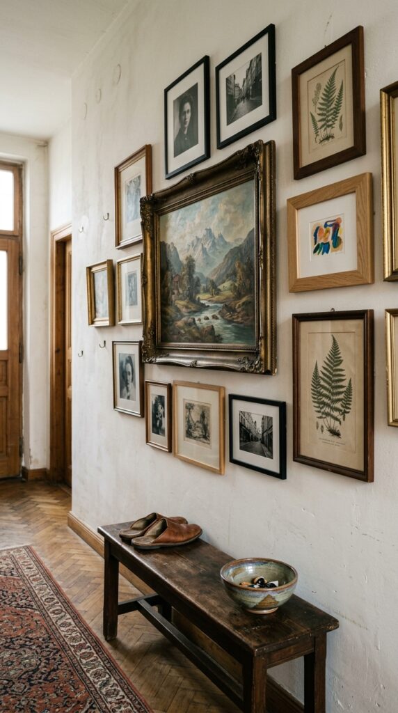
Most people hang art too high and too small. The standard “eye level” rule is not actually a rule, it’s a guideline that gets misapplied constantly. Art should relate to the furniture below it, not float in the middle of a wall like a postage stamp.
The bottom of a frame should sit roughly six to eight inches above a sofa or console. Single statement pieces should be at least two-thirds the width of the furniture beneath them. For gallery walls, anchor one large piece first, then build outward with smaller works.
If you can’t afford original art, oversized vintage finds, large posters in nice frames, and even your own framed photography all work. Scale matters more than provenance.
Skip this if you genuinely don’t connect with what’s on your walls. Empty walls beat filler art every time.
11. Bring in Plants With a Heavy Hand
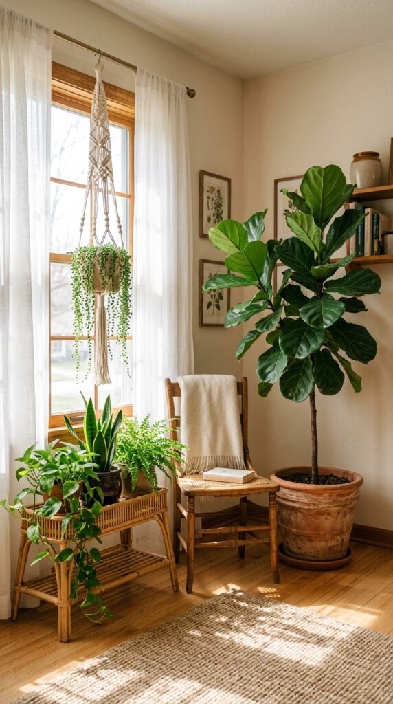
One small plant on a shelf is decoration. Six plants of varying sizes is an environment. The difference is dramatic, and plants are still one of the cheapest ways to add life and color to a room.
Mix sizes aggressively. One floor-standing statement plant like a fiddle leaf, olive tree, or bird of paradise. A few mid-sized plants on stands or surfaces. Trailing plants up high to add vertical drama. Vary the planters too, terracotta, ceramic, woven baskets, never all matching.
If your room faces north or gets minimal light, skip the dramatic plants and lean into pothos, snake plants, and ZZ plants, which actually thrive in low light. There’s no shame in a great fake plant either, the realistic ones have come a long way.
Plants soften every hard edge in a room.
12. Paint One Unexpected Thing
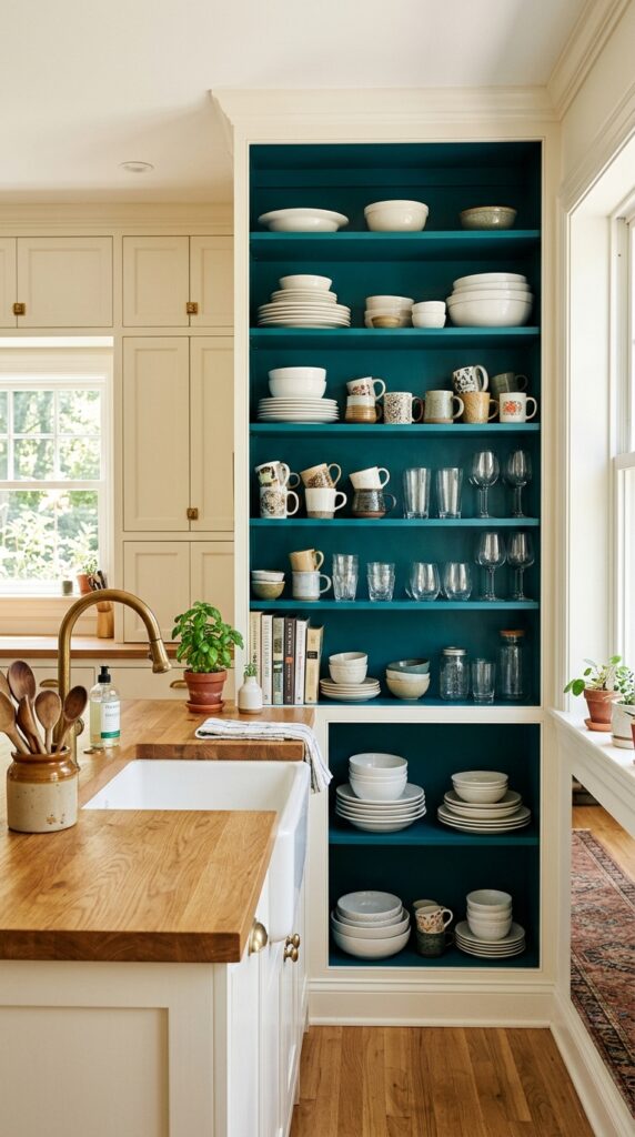
The best decor moves are often the smallest. Painting one unexpected surface, the inside of a bookshelf, the back of a built-in, a single door, the underside of a stair railing, gives a room a wink of personality without committing to a full color scheme.
Pick something tucked or framed, where the color will read as a deliberate accent rather than a mistake. The inside of open shelving is my favorite, because it makes everything you display look better against a colored backdrop. A painted door is a close second, especially if the rest of your trim is white.
The constraint is restraint. One painted surprise is charming. Three painted surprises in the same room is a craft project. Pick your spot, commit, and stop.
It’s the kind of detail guests notice and ask about.
A bold room isn’t about chasing trends or copying a magazine spread. It’s about making decisions, real ones, even when the safer choice would be beige paint and a neutral sofa. Every idea here started with someone who got tired of waiting to make their space feel like theirs.
You don’t need to do all twelve. Pick two that genuinely excite you and ignore the rest. A drenched ceiling and a layered rug. A statement pendant and an unexpected painted shelf. The combinations are endless, and the best rooms aren’t the ones that follow rules perfectly. They’re the ones that show their owner had a point of view.
If you found yourself nodding at one of these ideas, save this article, screenshot it, send it to the friend who’s been agonizing over their living room for six months. We write practical, opinionated, real-world decor guides every week, the kind that assume you have a budget, a landlord, or a partner who hates change. Bookmark us and come back when you’re ready for the next room. Your home is supposed to feel like yours. Start there.