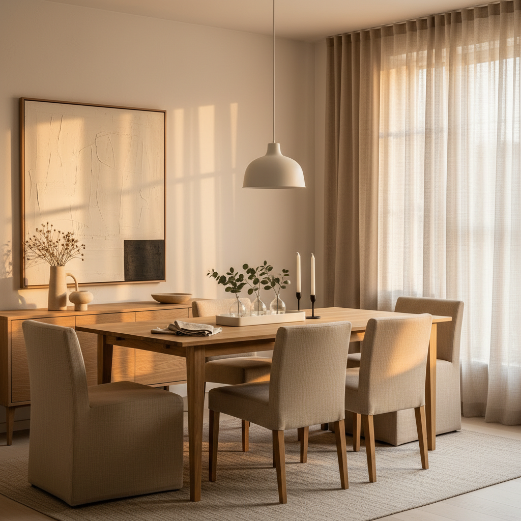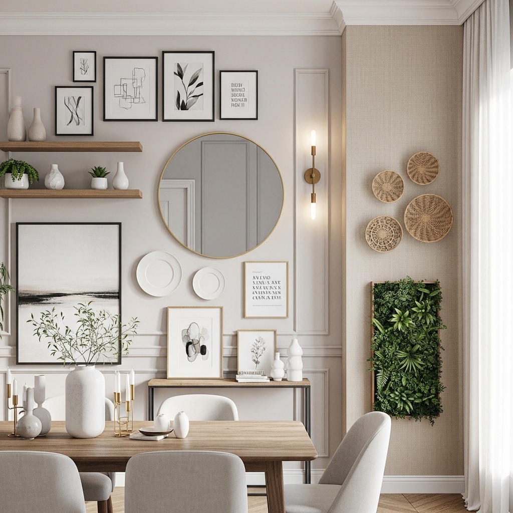
There’s a specific kind of frustration that comes with living in a home where everything is technically fine. The walls are beige. The floors are okay. The cabinets close. Nothing is broken, but nothing is interesting either. Builder-grade homes are designed to offend no one, which means they rarely delight anyone. And if you’ve ever walked into your own living room and felt like you were standing in a hotel lobby from 2011, you know exactly what I mean.
The good news: you don’t need to gut the place to fix it. Most of what reads as “luxe” in a home isn’t expensive — it’s intentional. It’s the swap of a flat builder light for something with a little soul, the addition of trim where there was none, the courage to paint something dark when everyone told you to keep it white. The twelve upgrades below are the ones I keep coming back to, the ones that genuinely shift a space from generic to yours. Some are weekend projects. Some are one-afternoon fixes. None require a contractor.
1. Swap the Flush-Mount “Boob Light” for Something with Soul
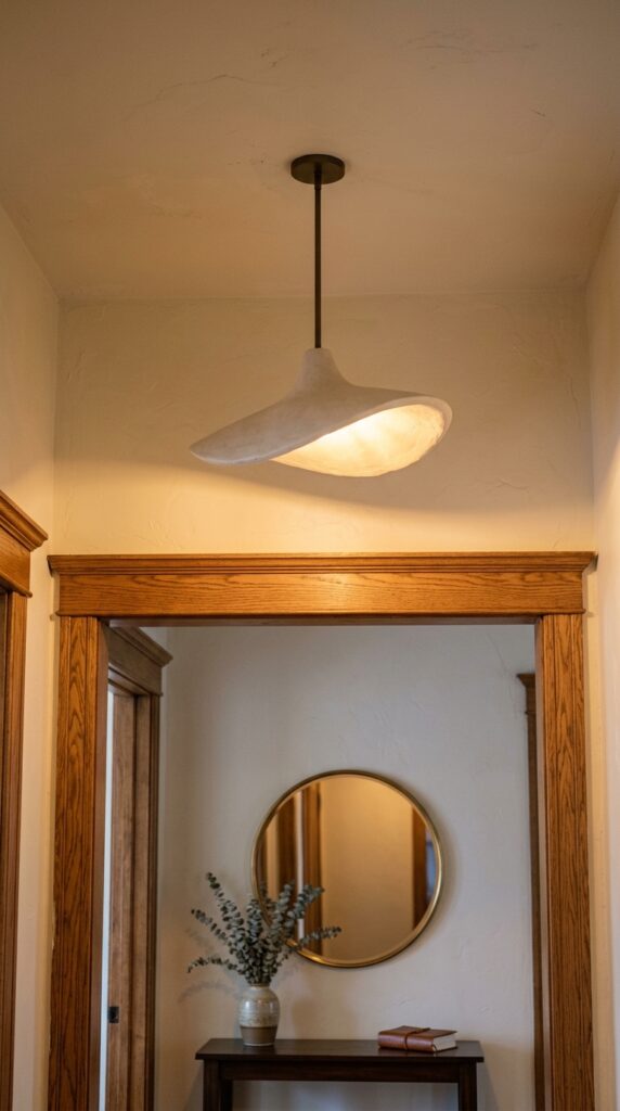
If I could only change one thing in a builder-grade home, it would be the ceiling lights. Those flat, frosted-glass nipples that come standard in hallways and bedrooms — they’re the single biggest tell that nobody has touched the place since closing day. Swapping them out is genuinely one of the highest-return projects you can do, and most fixtures install in under twenty minutes if your wiring is already there.
Look for plaster pendants, fluted glass semi-flush mounts, or small rattan drum shades. Anything with a real material — ceramic, brass, linen, paper — will instantly feel more considered. In bedrooms, I love a small hand-blown glass globe; in hallways, a fluted alabaster pancake.
One thing to watch: scale. Builder ceilings are often only eight feet, so don’t grab a chandelier meant for a foyer. Measure your ceiling height and keep at least seven feet of clearance below the fixture.
A new light changes how a room feels before you’ve moved a single piece of furniture.
2. Add Picture-Frame Molding to a Boring Wall
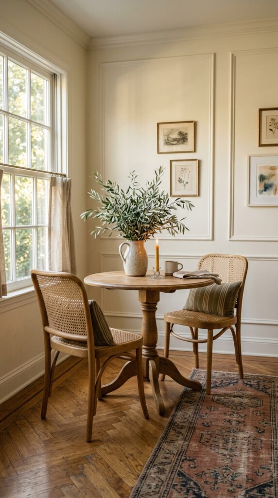
Picture-frame molding is the cheapest “expensive” upgrade in existence. We’re talking thin lengths of pine trim, mitered at the corners, nailed straight onto the drywall to create rectangular panels. Painted the same color as the wall, it adds quiet architecture to rooms that have none. Painted a contrasting shade, it becomes the focal point.
A few rules I follow. Keep your panels rectangular and slightly taller than wide — squares look fussy. Leave roughly four to six inches of breathing room between the panel edges and the wall edges. And use a laser level, not a tape measure and your eyes. Trust me on this.
The trade-off: it’s labor, not money. Plan a Saturday, watch one good tutorial, and accept that your first cut will be wrong.
The wall stops being a wall and starts being a feature.
3. Paint the Inside of Your Bookshelves a Deep, Moody Color
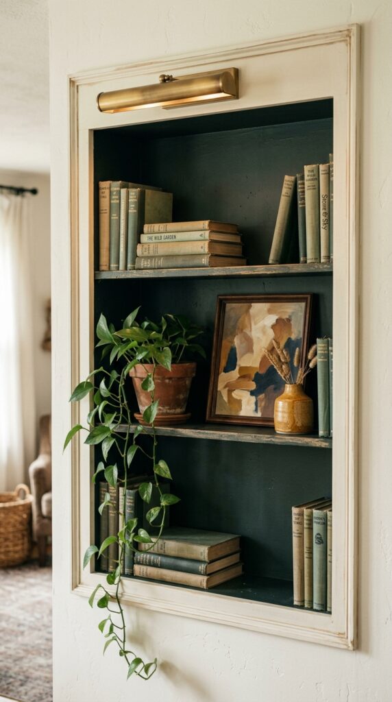
Built-ins, even the cheap ones, transform when you paint the back wall. It costs maybe thirty dollars in paint and an afternoon, and the result reads like custom millwork. The contrast between a saturated interior and the lighter exterior creates depth — your books and objects suddenly pop instead of disappearing into beige.
Go deep. Forest green, oxblood, charcoal, navy, or a moody plum all work beautifully. Skip anything pastel; it’ll just look like an Easter egg. Use a matte or eggshell finish so it doesn’t reflect glare.
The constraint here is styling. A painted backdrop is unforgiving — clutter shows. You’ll need to cull your shelves down to about seventy percent of what you currently have, then style with intention.
It’s the closest thing to a magic trick in this entire list.
4. Replace Every Single Cabinet Knob and Pull
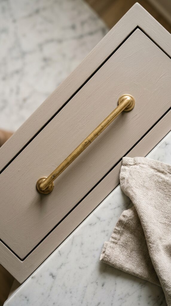
Builder hardware is almost always wrong. Too small, too shiny, too generic — those tiny round chrome knobs that say “I came in a contractor’s bulk pack.” Replacing every knob and pull in your kitchen is tedious but transformative, and it’s something a renter can absolutely do (just keep the originals in a labeled bag).
A few opinions. Unlacquered brass is the gold standard because it ages beautifully — it’ll patina over the years, which is the opposite of what cheap finishes do. Long, slim bar pulls on drawers feel custom. Mixing knobs on uppers and pulls on lowers reads more designed than matching everything.
Watch the hole spacing. If your existing drawers have two-screw pulls, measure the center-to-center distance before ordering. Otherwise you’ll be filling and re-drilling holes, which is its own weekend.
Small change, disproportionate impact.
5. Layer Lighting in Three Heights
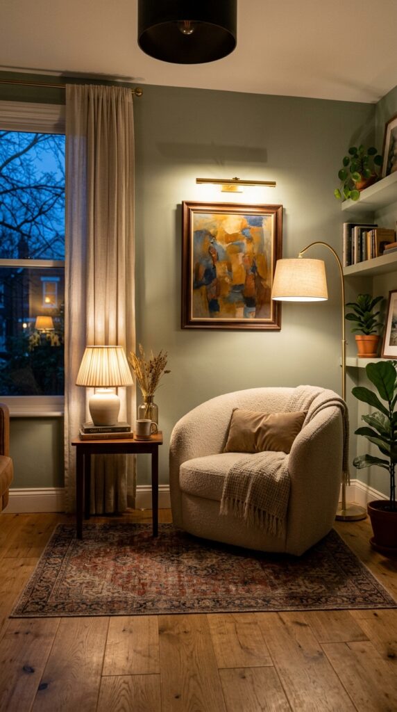
The single biggest reason builder-grade homes feel flat at night: every room has exactly one light source, mounted dead center on the ceiling. Hotels and well-designed homes follow a different rule — light at three heights. Overhead, eye-level, and low.
Here’s how I think about it. Eye-level means table lamps on side tables, console tables, dressers. Low means a floor lamp arching over a chair, or a small picture light above art. Then turn the overhead off entirely once the sun goes down. The room will instantly feel like a different space.
The watch-out: avoid cool-white bulbs. You want 2700K or warmer, ideally with dimmable bulbs in everything you can dim. Cool light makes even beautiful rooms look like a dental office.
Lighting isn’t decoration. It’s atmosphere.
6. Replace Hollow-Core Doors with Solid or Paneled Ones
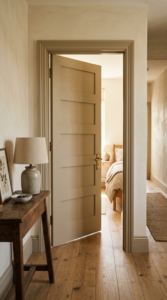
Hollow-core doors are the unsung villain of builder-grade homes. They sound cheap when they close, they dent if you look at them wrong, and the flat slab style screams “1990s tract house.” Swapping them out is more involved than other projects on this list, but the payoff is significant.
You have options. Solid-core paneled doors give you weight and architecture. If you can’t replace, you can fake it: glue thin MDF strips to your existing slab doors in a five-panel or shaker pattern, caulk, and paint. The result is shockingly close to the real thing.
While you’re at it, replace the flat-blade hinges with ball-tip hinges and swap the round knobs for levers in brass or matte black. Tiny detail, huge difference.
Doors are the punctuation of a home. Make them count.
7. Treat Your Windows Like They Matter
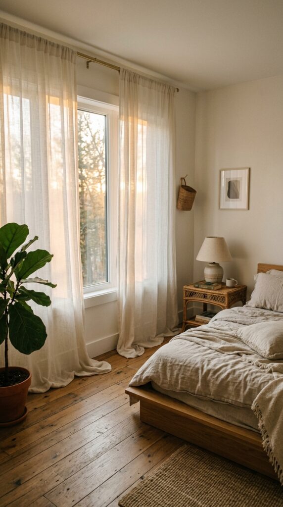
Builder homes almost always come with cheap faux-wood blinds and curtain rods mounted three inches above the window frame. Both choices make ceilings look lower and rooms look smaller. Fix this and your space will instantly feel taller and more expensive.
The rules. Mount your rod as close to the ceiling as possible — not above the window, near the crown. Curtains should extend at least eight to twelve inches past the window frame on each side, so when open, the fabric isn’t blocking glass. And the panels should kiss the floor or break gently, never float above it like high-water pants.
Material matters. Linen, even cheap linen, looks expensive. Polyester, even pricey polyester, looks like it’s pretending. If you share the space with sun-sensitive sleepers, layer sheers with blackout panels behind.
Floor-grazing curtains are the fastest way to make a room feel architectural.
8. Add a Single Piece of Real Stone
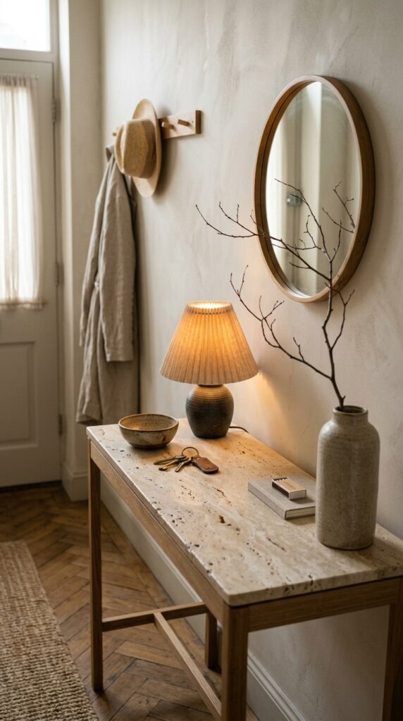
You don’t need a kitchen full of marble to get the luxe-stone feeling — you just need one honest piece of stone somewhere prominent. A travertine side table. A marble cutting board left out on the counter. A stone tray on the coffee table. A tiny soapstone bowl on the bathroom vanity.
Real stone has weight, irregularity, and a quiet authority that no laminate or printed surface can fake. Travertine is having a moment for a reason — the warm cream tones and natural pitting feel both ancient and modern. Honed marble, with its softer matte finish, feels more lived-in than polished.
The trade-off: real stone stains. If you’re precious about objects, seal it, or accept that a wine ring is character, not damage.
One stone piece anchors a room the way a single great accessory anchors an outfit.
9. Rethink Your Entry — Even If You Don’t Have One
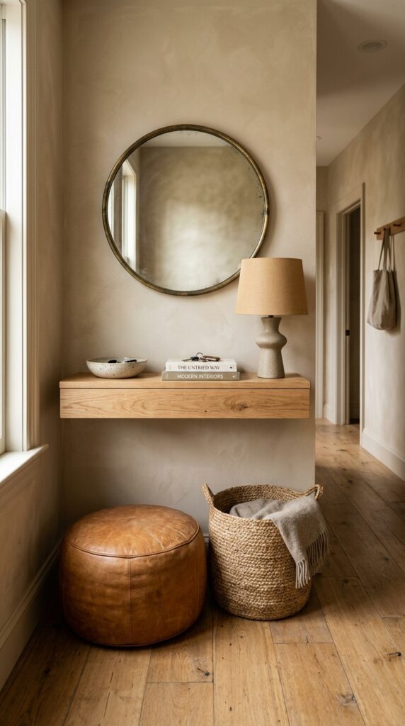
Most builder homes don’t have proper entries. You walk in, you’re already in the living room. This is fixable without construction — you just have to declare an entry where there isn’t one.
A narrow console (eight to ten inches deep is plenty) against the nearest wall, a mirror above it, a basket below for shoes, a small lamp left on a timer. That’s it. The lamp is the secret — coming home to a softly lit corner instead of flipping on an overhead changes the entire emotional tenor of walking through your door.
If you genuinely have no wall, a leaning ladder shelf or a slim bench along whatever surface exists will do the same job. Renters: command hooks above can hold a small mirror and bag hooks without damage.
Entries set the tone. Even a fake one is better than none.
10. Use One Unexpected Material in Every Room
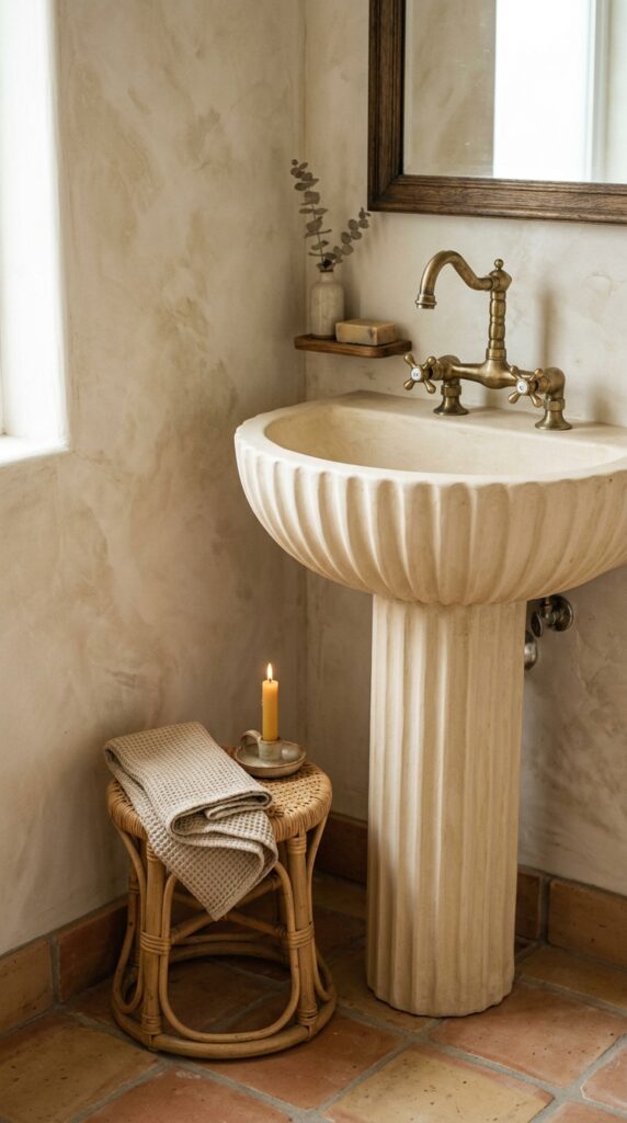
The fastest way to make a room feel curated rather than catalog-ordered is to introduce one material the room “shouldn’t” have. A rattan stool in the bathroom. A vintage rug in the kitchen. A plaster vase in the home office. An unexpected texture creates friction, and friction creates interest.
Builder homes default to a flat material palette — drywall, laminate, polyester, glass. Adding something organic and tactile (terracotta, jute, rattan, raw wood, plaster, linen) shifts the entire feeling of the space.
Skip this if you hate visual clutter, or if you’re someone who needs everything to match. The look only works if you commit to a little mess of materials.
The trick is one unexpected piece per room. Two becomes a theme. Three becomes a Pinterest board.
11. Limewash or Plaster One Wall
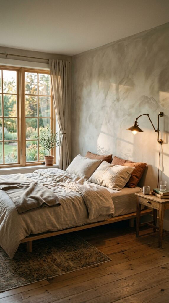
Flat builder paint is the visual equivalent of fluorescent lighting — technically functional, deeply soulless. Limewash and plaster finishes have texture, depth, and a subtle cloudiness that catches light differently throughout the day. One accent wall in limewash will do more for a bedroom than any piece of art you could hang on it.
A few notes. Limewash is renter-friendlier than you’d think — it’s mineral-based and applies with a big brush in cross-hatched strokes. Roman clay (a thinner version of plaster) gives an even smoother, more troweled look. Both come in tinted versions; I’d stick to warm putties, soft terracottas, or muted greens.
The catch: it’s a learned skill. Practice on a closet wall first. And if your room faces north with cool light, lean warmer than you think — cool light flattens everything.
It’s the difference between a wall and an atmosphere.
12. Style with Negative Space, Not More Stuff
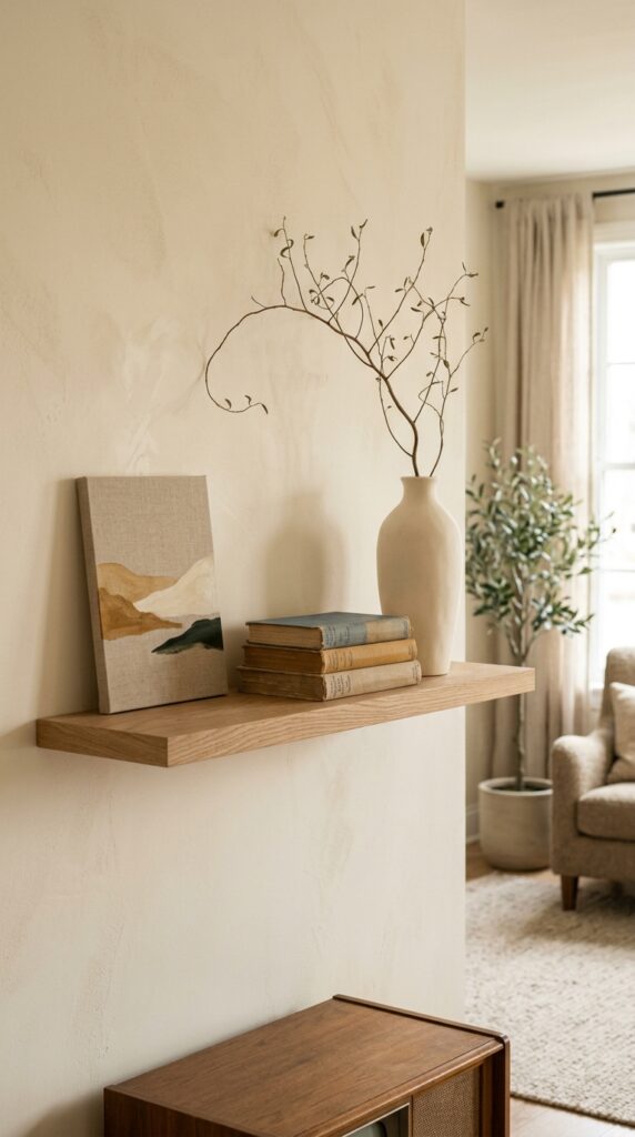
The final upgrade isn’t something you add — it’s something you remove. Builder-grade homes often get over-decorated in an attempt to make them feel less generic, and the result is visual noise that makes everything feel cheaper. The single most luxe-feeling thing you can do is edit.
Try this. Walk into your living room and remove half the objects on every surface. Then put back only the pieces you genuinely love. Coffee tables should hold three to five things, max. Shelves should be roughly seventy percent styled, thirty percent empty. Walls don’t need a gallery — sometimes one large piece, well-lit, says more than ten small ones.
The trade-off is real: empty space can feel unfinished if you’re used to maximalism. Live with it for a week before refilling. Most people don’t.
Restraint is the most expensive-looking choice you can make.
A Final Thought Before You Start
Here’s the thing nobody tells you about making a builder-grade home feel luxe: it’s almost never about money. It’s about attention. The homes that stop you in your tracks — the ones that feel like the owner has taste — are simply homes where someone made a series of small, intentional decisions instead of accepting whatever came installed. New hardware. A different paint color. A real stone tray. A lamp at eye level instead of just an overhead.
You don’t have to do all twelve of these. Pick three. Start this weekend. Live with the changes for a month, then pick three more. Slowly, almost without noticing, your home will stop feeling like everyone else’s and start feeling like yours.
If you found something here you hadn’t thought of before — a finish, a swap, a small rule that reframes how you see your own rooms — that’s exactly what we’re here for. Bookmark this page, send it to the friend who keeps asking why their living room “feels off,” and come back when you’re ready for the next room. Good design is a slow conversation, and we’ll keep having it with you.