There’s a moment, usually around year three of living in a beige rental, when you realize the “calm neutral” bedroom everyone promised would feel restful actually just feels flat. A bedroom is the one room nobody else really sees, which means it’s the one room you can decorate entirely for yourself. No client-pleasing greige, no resale-friendly white walls. Just color, personality, and the kind of small whimsical choices that make you happy at 7 a.m. before coffee.
Bold bedrooms have a reputation for being chaotic or hard to live with, but the good ones aren’t accidents. They follow a few real rules: anchor with one dominant color, add tactile contrast, keep the lighting warm, and leave breathing room somewhere. The twelve ideas below lean playful without tipping into cartoonish, and most of them work whether you own your place or you’re working around a landlord who frowns at nail holes. Pick the ones that fit your light, your space, and your tolerance for visual energy.
1. The Cherry Red and Pink Power Combo
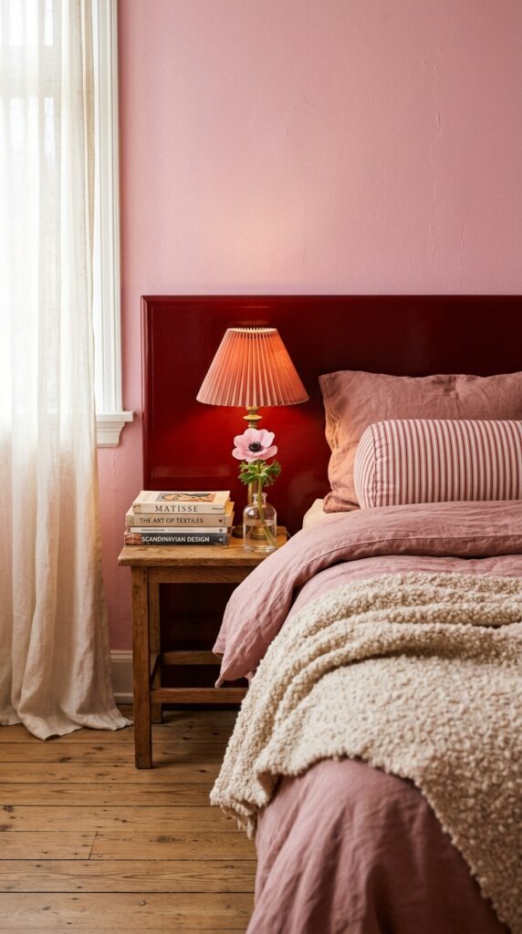
Red and pink used to be a divisive pairing, and now it’s basically a love language. The reason it works in a bedroom specifically: red brings the drama, pink softens the edges, and together they read more sophisticated than either color alone. The trick is choosing pinks with a little dust or warmth in them rather than anything too bubblegum, unless that’s genuinely your thing.
Try a cherry red headboard against a powdery pink wall, or flip it: pink velvet bed against a single red accent wall. Keep your woods warm (oak, walnut) and avoid cool grays in the mix because they’ll fight the palette. A red-striped bolster pillow is a low-commitment way to test this if you’re nervous.
One watch-out: this combo can read very stimulating, so balance it with at least one calm neutral like cream linen or unbleached cotton. If you’re a light sleeper, dial the saturation down a notch. Bottom line: pink and red is bold but surprisingly easy to live with.
2. Color-Drenched in a Single Bold Hue
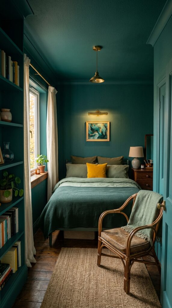
Color drenching, painting walls, ceiling, trim, and sometimes even doors all in the same shade, is the move when you want a room to feel like a complete world. It sounds intense and it is, but counterintuitively it makes small bedrooms feel bigger because there’s no visual stop where the wall meets the ceiling. Your eye just keeps going.
Pick a color you genuinely love, not one you think you should love. Deep teal, oxblood, mustard, and warm terracotta all photograph well and live well. Use a matte or eggshell finish on walls and a slightly more durable satin on trim so you still get subtle definition. If you’re committing this hard, splurge on better paint, the pigment depth is worth it.
The constraint here is light. North-facing rooms can turn a moody shade into a cave, so test a large swatch for at least 48 hours. Skip color drenching if you rent and can’t repaint when you leave. Otherwise, lean in.
3. A Headboard Wall That Acts Like Art
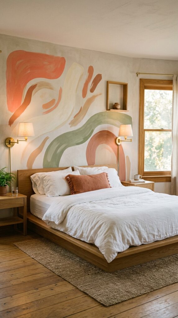
If a full color-drenched room feels like too much, a single painted statement behind the bed delivers about 80% of the impact with 20% of the commitment. Think of the wall behind your headboard as a giant piece of art you don’t have to buy.
You can paint a soft arch in a contrasting color, a hand-drawn mural with abstract shapes, or simple wide blocky stripes in two or three tones. Use painter’s tape and a level for crisp lines, or go freehand for that human-made wobble that’s actually charming. Skip glossy finishes here, matte plaster paint reads more grown-up and photographs beautifully.
Watch the scale. The shape should be a little wider than your bed and tall enough to give the headboard a proper backdrop, otherwise it looks accidental. A quick takeaway: this single wall does more for personality than ten throw pillows ever will.
4. Mixed Pattern Bedding That Doesn’t Clash
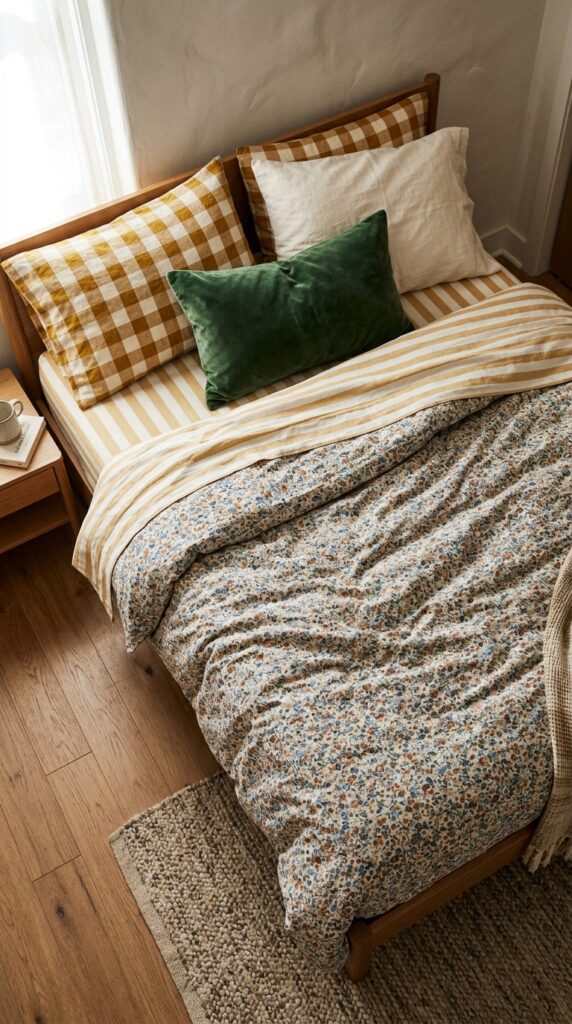
Mixing patterns on a bed feels intimidating until you learn the cheat code: vary the scale and share at least one color across all the patterns. A small floral, a medium stripe, and a large check will read intentional even if the prints have nothing else in common, as long as one or two colors thread through.
Stick to three patterns max on a bed, plus one solid for breathing room. Cotton and linen forgive a lot here because they wrinkle naturally and stop the bed from looking too costume-y. Avoid anything overly silky or shiny when you’re mixing prints, the surfaces start competing.
Constraint: if you share the bed with someone who finds visual noise stressful, this might genuinely affect their sleep. Test with throw pillows first before committing to printed sheets. The takeaway: pattern mixing is a confidence game, and confidence comes from a shared color story.
5. The Unexpected Ceiling Moment
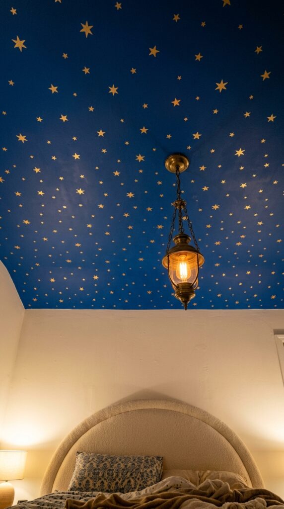
Most people never look up, which is exactly why painting the ceiling is the most underused trick in a bedroom. You spend more time staring at it than any other surface in your home. A colored ceiling, especially when the walls stay quieter, gives the whole room an enveloping, slightly cinematic quality.
Try a deep blue, a soft blush, or a warm putty for something subtler. If you want whimsy, hand-painted stars or a single soft cloud shape can lean dreamy without veering into nursery territory. Keep the trim crisp white to anchor the contrast, and make sure your lighting is warm because cool bulbs flatten any painted surface above your head.
The watch-out: low ceilings with dark colors can feel oppressive in tight rooms. If your ceiling is under eight feet, stick to lighter tones or save this trick for a room with better proportions. Quick takeaway: look up, and decorate accordingly.
6. Curvy Furniture in Saturated Tones
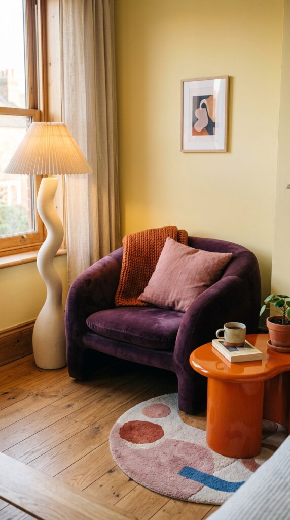
Sharp-edged furniture works fine, but curves are what make a colorful bedroom feel grown-up rather than chaotic. Round side tables, scalloped headboards, mushroom lamps, and kidney-shaped benches all soften the visual energy of saturated color. The combination of bold hue plus organic shape is what makes a room feel curated instead of loud.
Look for one curvy hero piece, an armchair, a vanity stool, a circular ottoman, in a saturated jewel tone. Velvet and boucle both work beautifully here because the texture catches light differently than flat fabric. Lacquered finishes in playful colors (think glossy persimmon or deep aubergine) photograph like jewelry.
Watch the scale: in small rooms, one curvy statement piece is plenty. Two starts to feel busy. Skip this if you tend to bump into furniture in the dark, those curved corners are forgiving but the velvet isn’t. The takeaway: shape matters as much as color.
7. A Whimsical Lighting Mix
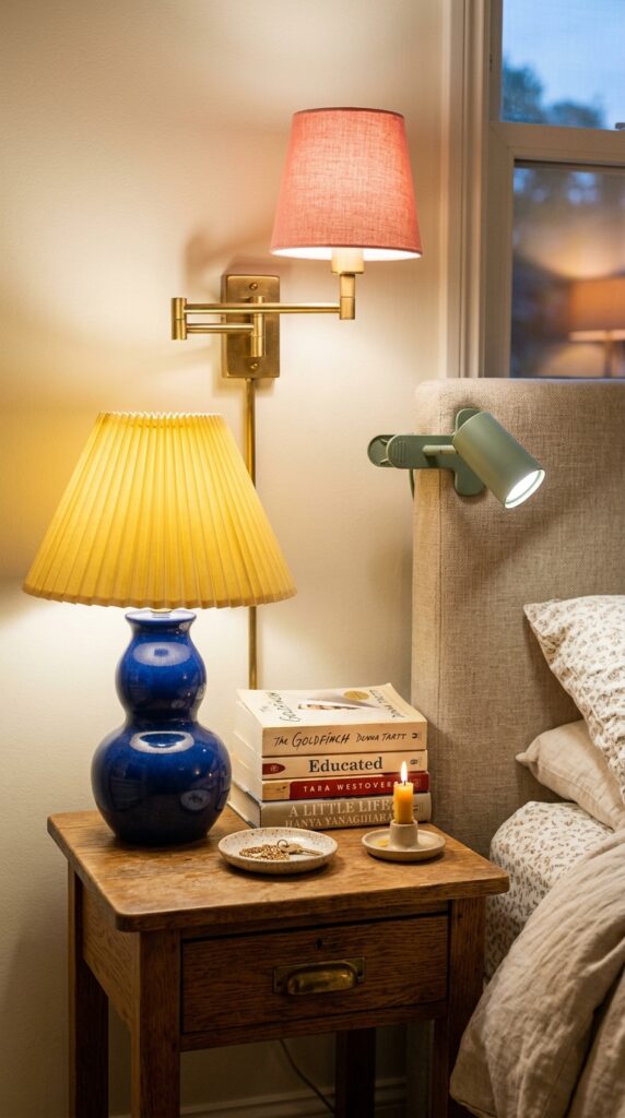
A boring overhead light will undo every other choice you make in a colorful bedroom. Layered lighting, a sconce, a table lamp, maybe a floor lamp or string light, gives the room dimension and lets you actually live in different moods. Bright for getting dressed, low and warm for reading, even lower for everything else.
Mix shade shapes and colors deliberately. A pleated shade in one color, a fluted ceramic base in another, a brass wall sconce with a fabric drum in a third. They don’t need to match, they need to relate. Stick to warm bulbs (2700K or below) because anything cooler will turn your beautiful saturated walls into a hospital corridor.
Constraint: if you rent, plug-in sconces with cord covers are your best friend. The takeaway: light shapes color more than people realize, choose both with intention.
8. A Renter-Friendly Color Refresh
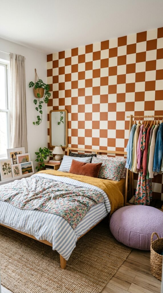
Renting doesn’t mean settling for landlord beige. The trick is using removable, reversible, and freestanding pieces to layer color without losing your deposit. Peel-and-stick wallpaper has come a long way, look for thick matte versions, not the cheap shiny ones, and stick to one accent wall to keep installation manageable.
Other renter wins: a colorful upholstered headboard that leans against the wall instead of mounting, oversized art that leans on the floor, large floor cushions in saturated tones, and a colorful area rug that covers ugly carpet. Even swapping out white outlet covers for colored ones makes a real visual difference for under twenty bucks.
Watch out for command strips on textured walls, they fail in summer heat. Test in a hidden spot first. The takeaway: color is mostly about textiles and accents anyway, so renting is honestly less of a constraint than people pretend.
9. Texture-First, Color Second
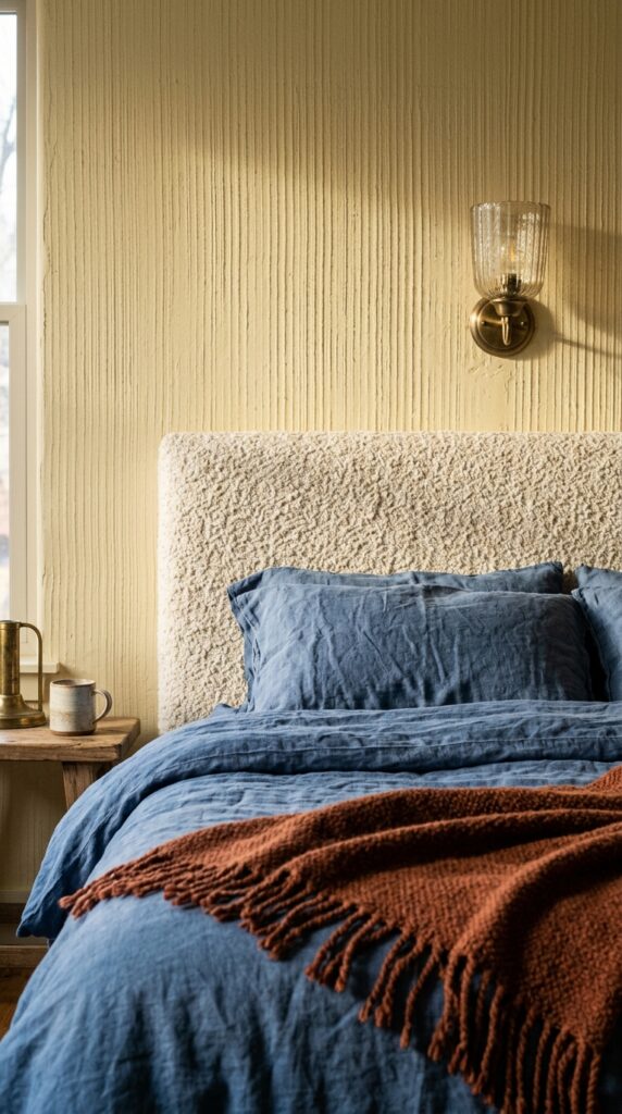
Bold color without texture reads flat, like a kid’s drawing. Bold color with layered texture reads like a real, considered space. This is probably the single biggest difference between a Pinterest-perfect bedroom and a bedroom that actually feels good to be in.
Stack at least three textures near the bed: a nubby boucle, a washed linen, a soft cotton, a chunky knit, a smooth velvet. Add a hard texture too, fluted plaster, woven rattan, hammered brass, to keep things from getting too soft. Raking light from a window or sconce will reveal all that depth, which is why bedside lighting matters so much in colorful rooms.
The watch-out: texture overload can read shaggy and unkempt if everything’s nubby. Anchor with one smooth surface (a lacquered side table, a polished floor) for contrast. Quick takeaway: color is the headline, texture is the article.
10. Bold Color With a Calm Bed
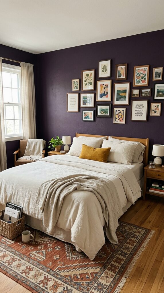
Here’s a counterintuitive move: when the walls and surroundings are loud, the bed itself can be almost monastic. Cream linen, a single neutral throw, maybe one small accent pillow. The bed becomes the visual rest stop in a vivid room, which means you actually want to climb into it at the end of the day.
This works especially well if you’ve gone hard on color drenching or wallpaper. Layer the bed with different textures of the same neutral, slubby linen, soft cotton percale, a waffle weave, so it still has depth without competing. Skip pure stark white, which reads cold against saturated colors. Cream, oatmeal, and warm bone all play nicer.
Watch the temptation to add “just one more pillow.” Stop yourself. Three pillows total is often enough. The takeaway: in a bold room, restraint somewhere is what makes everything else sing.
11. A Vintage Rug as the Color Anchor
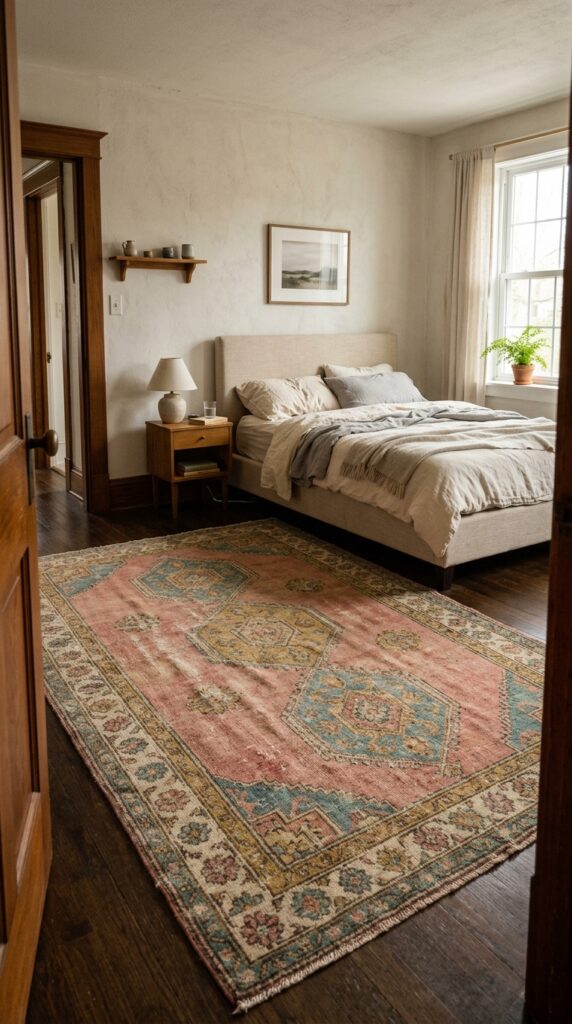
A great vintage rug, the kind with faded reds, soft blues, and that perfectly worn-in patina, can carry an entire bedroom’s color story by itself. You build the rest of the room around the rug instead of fighting it. Pull two or three colors from the rug for your bedding, art, and pillows, and the whole space feels effortlessly coherent.
Buy the biggest rug you can afford and afford the space for, ideally large enough that the bed sits at least two-thirds on it. Tiny rugs floating in the middle of a room are one of the most common decorating mistakes. Look for wool, hand-knotted, with some real age to it; new “vintage-style” rugs almost always look fake under good light.
The watch-out: vintage rugs vary wildly in quality, ask about the foundation and pile before buying. Takeaway: let the rug lead and the room follows.
12. Playful Art Hung Salon-Style
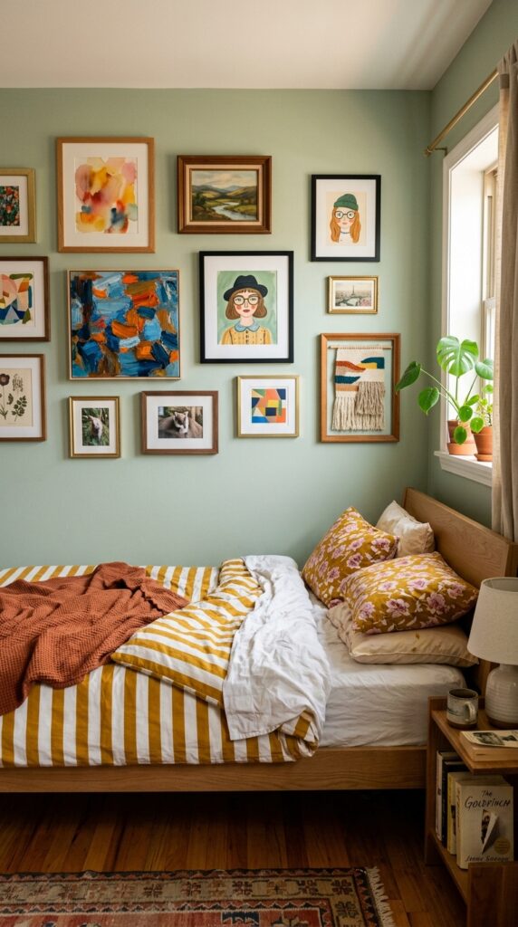
Salon-style hanging, lots of small artworks clustered together, is the move when you’ve got a collection of things you actually love but no single piece big enough to anchor a wall. It feels collected and personal in a way matching art sets never do. Mix sizes, frames, subjects, and yes, even quality. A serious print can hang next to a postcard your friend sent you.
Lay everything out on the floor first and play with the arrangement until it feels balanced but not symmetrical. Hang the largest piece slightly off-center and build outward. Frame even cheap prints, it elevates everything. Mixing brass, warm wood, and matte black frames keeps it from feeling matchy.
Watch out: gallery walls grow over time. Leave room for new additions. Skip this if you move often, patching that many holes is genuinely painful. The takeaway: art should feel collected, not curated by an algorithm.
Final Thoughts
A colorful bedroom isn’t about following trends or copying a saved Instagram post pixel for pixel. It’s about figuring out which shades genuinely make you feel something and then building a room where those colors get to live properly, layered with texture, lit warmly, and softened with the kind of curves and quiet moments that make a bold space actually restful.
The best whimsical bedrooms break a few rules on purpose: they color drench when they shouldn’t, mix patterns that “clash,” and hang art salon-style instead of the safe single-piece-above-the-bed move. But they always get the fundamentals right, scale, lighting, restraint somewhere, and a clear color story you can describe in one sentence.
Start with one idea from this list, not all twelve. Maybe it’s a painted ceiling, maybe it’s a vintage rug, maybe it’s just swapping in linen bedding with a real personality. Build slowly, buy fewer but better things, and trust your eye more than the algorithm. Bookmark this page, you’ll want to come back when you’re ready for the next layer.