Paint is the most underrated decorating tool we have. It’s cheap, fast, and almost embarrassingly effective compared to the months of furniture-shopping most of us do trying to “fix” a bedroom. A weekend with a roller and the right color can do what a new headboard never will, which is shift the whole mood of the room before you even walk in.
What follows isn’t a list of trendy color names you’ll regret in two years. These are twelve directions I keep coming back to, both for clients and in my own home, because they actually hold up. Some are bold, some are quiet, and a few are deeply renter-friendly. Pick the one that matches the room you actually live in, not the one you wish you had. A north-facing box and a sun-flooded loft want very different things, and the wrong white can turn either of them sad. Let’s get into the good stuff.
1. Soft Plaster Pink That Doesn’t Read as Girly
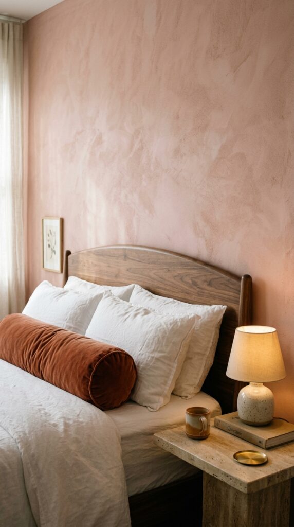
Forget the bubblegum stuff. The pink worth painting your bedroom is the one that looks like it has dust in it, the kind of dusty, slightly muddy pink that reads as warm neutral in daylight and turns gorgeously moody at night. It plays beautifully with wood tones, especially walnut and oak, and makes brass hardware look intentional instead of bridal.
A few things that help this color land. Pair it with at least one earthy contrast, like a rust pillow or a chocolate throw, so the room doesn’t drift into nursery territory. Keep your bedding mostly white or oatmeal so the wall stays the main event. And use a matte finish, not eggshell, because the chalkiness is the whole point.
The watch-out: cheap pinks photograph fine but live badly. Get good samples and tape them up for two days before committing. The takeaway is simple. Pink, done right, is one of the most flattering colors a bedroom can wear.
2. Deep Forest Green for a Cocooning Effect
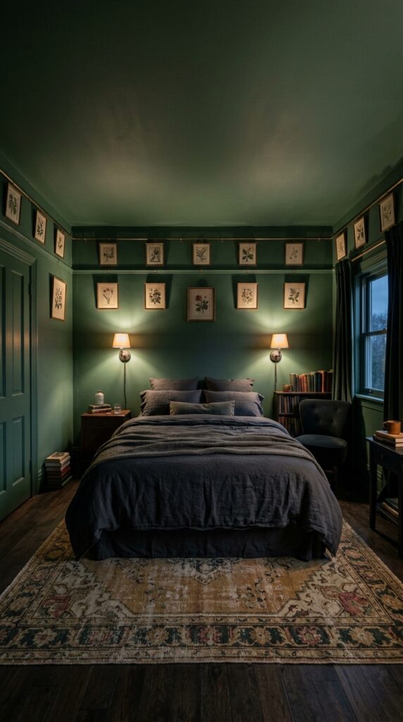
This is the move when you actually want your bedroom to feel like a bedroom, not a hotel lobby. Wrapping the whole room, ceiling included, in a dark green is the closest thing paint can get to a hug. It blurs the edges of the room, makes the bed feel like the center of gravity, and forgives a lot of imperfect drywall.
Lean into the drama instead of fighting it. Use warm metals like aged brass, keep your bedding rich and tactile, think charcoal linen or a heavy wool blanket, and add a single warm light source instead of overhead lighting. A dimmable sconce on each side of the bed does most of the work.
One thing to watch. Dark rooms need warm light. A cool LED bulb in here will turn the whole space cold and weirdly clinical. Stick to 2700K or lower. The takeaway: dark green isn’t shrinking your room, it’s making it feel like somewhere you actually want to sleep.
3. Warm White That Actually Has a Personality
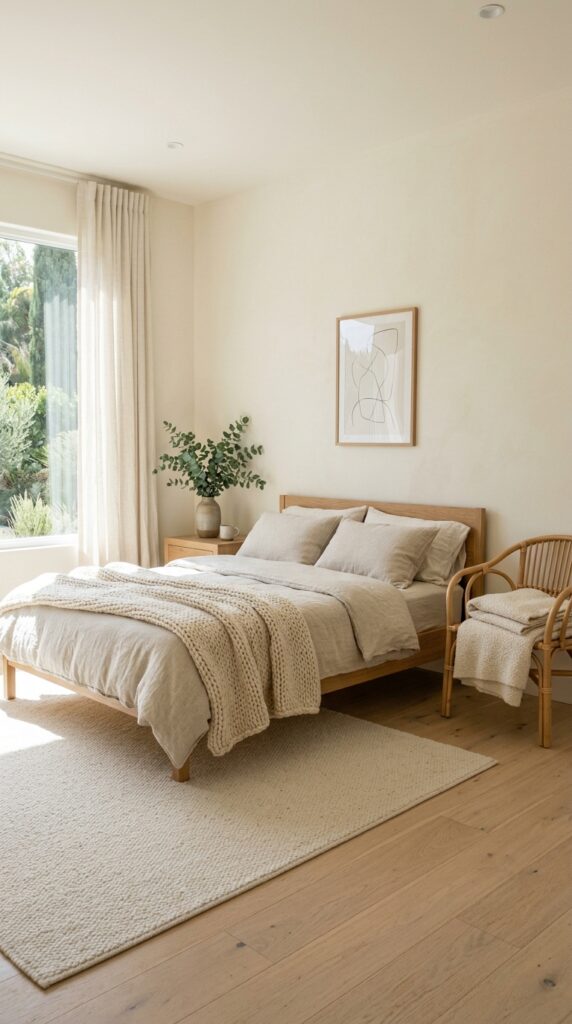
Bright white is a trap in most bedrooms. It looks crisp on paint chips and turns blue, cold, and slightly hospital-ish on actual walls, especially with morning light. A warm white with a hint of yellow, cream, or even a barely-there pink undertone is what you actually want.
The trick is in the test. Paint a poster-board sample, not a tiny patch on the wall, and move it around the room over a full day. Pay attention to how it looks at night under your lamps, because that’s when you’re actually in there. Pair your warm white with natural textures, oak, rattan, linen, jute, and the room reads layered instead of flat.
Skip this if you’re someone who hates anything that looks faintly yellow. The takeaway: a warm white is the easiest, most timeless paint decision you’ll ever make, as long as you sample it properly.
4. Painted Headboard Wall as a Renter Hack
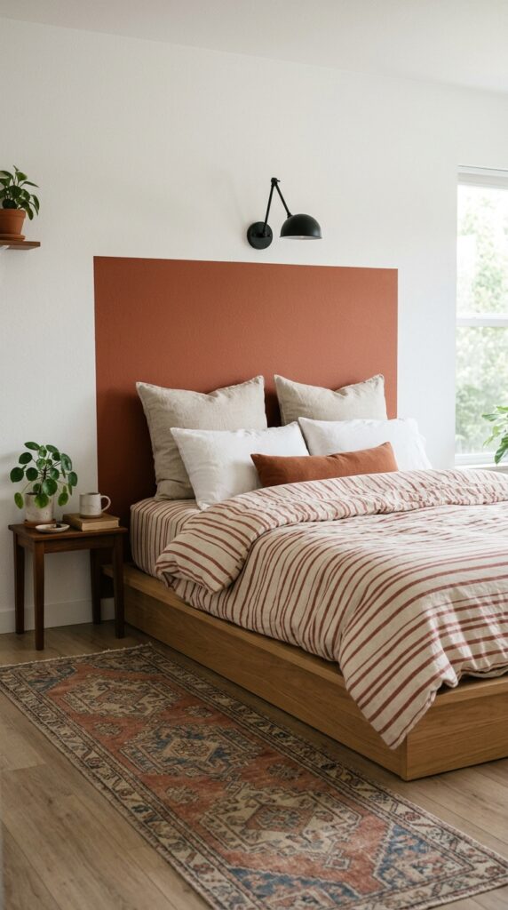
If you can’t commit to a full wall, paint a headboard. Literally. A rectangle of color directly on the wall, behind the bed, gives you the visual weight of a real headboard for the cost of a paint sample. It’s the move I recommend most often to renters and to anyone who changes their mind about color every six months.
Keep the proportions slightly larger than your bed, around six inches wider on each side, and tall enough to extend at least eight inches above your pillows. Use painter’s tape and a level. A matte finish reads more architectural than a satin one.
The watch-out is messy edges. Take your time pulling the tape while the paint is still slightly wet, and don’t rush this step. The takeaway: a painted headboard does ninety percent of the work of a real one, and you can change it next year if you get bored.
5. Two-Tone Walls With a Picture Rail Line
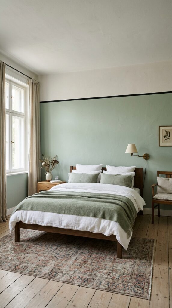
Two-tone walls sound fussy until you see them done well. The classic version splits the wall horizontally somewhere between two-thirds and three-quarters of the way up, with a darker or more saturated color below and a lighter color above. It makes ceilings feel taller and adds an architectural detail that the room probably doesn’t have otherwise.
A few rules that help. Keep the lower color the more grounded one, sage, clay, soft navy, taupe, and the upper section lighter and quieter. Add a slim painted line in a contrasting color where they meet to fake a picture rail. Match your bedding loosely to the upper color so the bed visually floats.
Skip this if your ceilings are under eight feet. It compresses low rooms in a way that’s hard to undo. The takeaway: two-tone walls are the best way to add architectural personality to a builder-grade box.
6. Moody Navy for a Grown-Up Bedroom
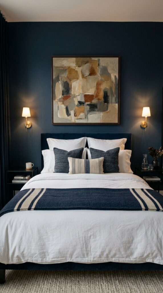
Navy is the closest thing to a guaranteed sophisticated bedroom color. It flatters almost every wood tone, makes white bedding look like it belongs in a magazine, and ages incredibly well. The version I recommend has a slight gray or green undertone, never a purple one, which can read teenage.
Layer it carefully. Crisp white bedding, brass or matte black hardware, and at least one warm wood element keep navy from going cold. A single piece of art with warm tones, terracotta, ochre, rust, will save the room from feeling like a corporate suite.
The constraint here is light. Navy needs either real natural light or really intentional artificial light, ideally two warm-toned lamps and a dimmable overhead. A single ceiling bulb will make this room feel like a cave in the wrong way. The takeaway: navy is the safest bold color you can pick, as long as you light it like you mean it.
7. Color-Drenched Ceiling for an Unexpected Twist
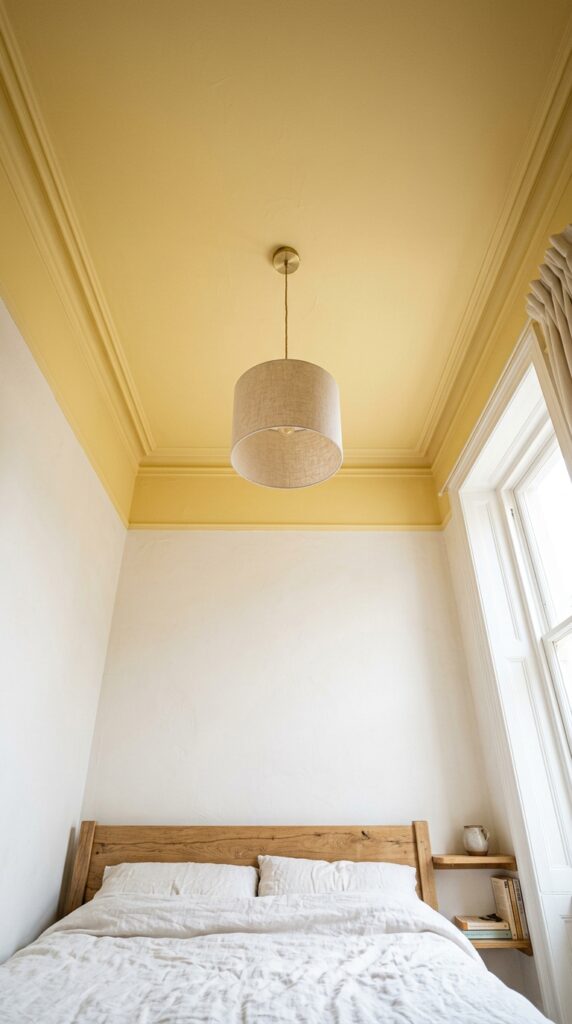
The fifth wall is the one nobody paints, which is exactly why painting it works. A colored ceiling instantly makes a room feel designed instead of decorated. It also reflects color down into the space in a way that’s softer and more flattering than a feature wall.
Pick a color with warmth, a buttery yellow, a soft peach, a powdery blue, a dusty pink, and carry it slightly down onto the crown molding or the top few inches of the walls so the transition doesn’t look accidental. Keep the rest of the room quiet so the ceiling reads as a deliberate choice.
One thing to watch. Glossy ceiling paint shows every roller mark and imperfection. Stick to flat or matte, and use a high-quality roller. The takeaway: a colored ceiling is the most underrated paint move in decorating, and it costs the same as any other wall.
8. Earthy Terracotta for Warmth Without Drama
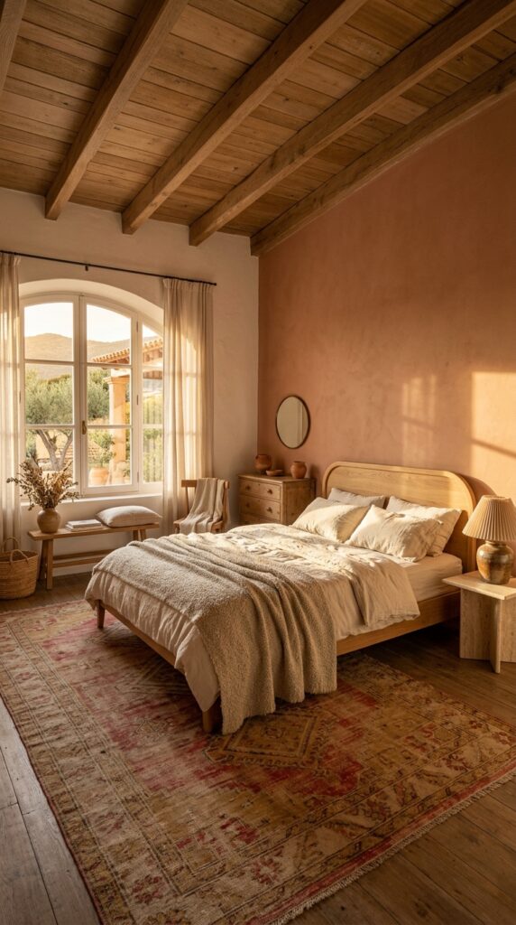
Terracotta is having a moment, but the right version of it has been working in homes for centuries. Skip anything that looks orange under your light. You want the dusty, slightly brown, slightly pink version that reads as warm earth, not pumpkin.
It pairs effortlessly with cream, oatmeal, soft black, and any wood from oak to walnut. A vintage rug in faded reds will tie everything together without trying. Keep the bedding mostly neutral so the wall stays the warm focal point.
The constraint is undertone. Terracotta in a north-facing, low-light room can go muddy fast. If your room doesn’t get direct sun, choose a slightly pinker version of the color and test it for at least three days before committing. The takeaway: terracotta is the warmest neutral you’ll ever paint a bedroom, and it makes everything else in the room look more expensive.
9. Soft Sage Green for Quiet Calm
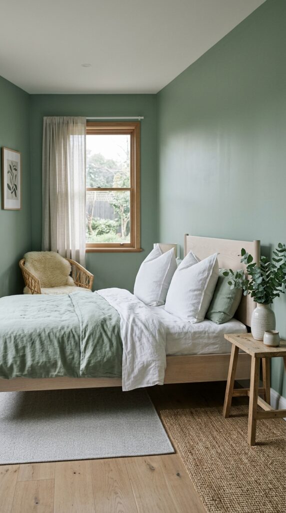
Sage is the green for people who think they don’t like green. It reads almost as a neutral, sits beautifully with both warm and cool tones, and feels instantly calming, which is what most of us actually want from a bedroom.
Stick to a sage with gray in it, not yellow, for the most timeless version. Pair it with pale wood tones, ash, white oak, light walnut, and natural fibers like rattan or jute. A small piece of nubby boucle or a sheepskin throw adds the warmth this color sometimes needs.
Skip this if you love high-contrast, high-energy spaces. Sage rewards quiet, slow rooms, not maximalist ones. The takeaway: sage is the closest thing to a foolproof bedroom color, and it’ll still feel right in ten years when whatever’s trending now has long aged out.
10. Charcoal Accent Wall for Modern Edge
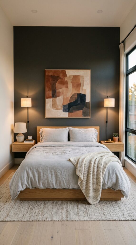
Black walls are dramatic. Charcoal walls are wearable. A single charcoal accent wall behind the bed gives you the depth and modernity of black without making the room feel like a dim cave. It also makes everything you put in front of it, white bedding, brass lamps, oak frames, look more designed.
Choose a charcoal with a warm undertone, slightly brown or slightly green, never a cool blue-gray, which can feel cold and dated. Keep the surrounding walls warm white so the contrast feels intentional. One serious piece of art above the bed seals it.
The watch-out is finish. A satin or eggshell charcoal will show every flaw on the wall. Use a flat or matte finish, and prep the wall properly. The takeaway: charcoal is the grown-up version of a black accent wall, and it makes a small bedroom feel intentional instead of cramped.
11. Limewash or Plaster Finish for Texture
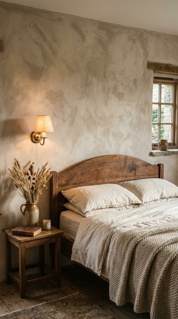
Flat paint is fine. Textured paint is a vibe. Limewash and lime-based plaster finishes have a soft, cloudy depth to them that flat paint physically can’t replicate, and they make almost any room feel like it was decorated by someone with very good taste and a lot of patience.
The good news is the modern versions are forgiving. Most can be applied with a wide brush in two thin coats, and the imperfections are the point, so you don’t have to be precise. Stick to warm earth tones, beige, clay, soft white, dusty pink, for the most flattering result.
Skip this if you rent and your landlord is strict, because the texture is harder to fully cover than flat paint. The takeaway: a limewash wall is the single biggest upgrade in perceived quality you can give a bedroom for under a hundred dollars.
12. Color-Blocked Geometric Wall for Personality
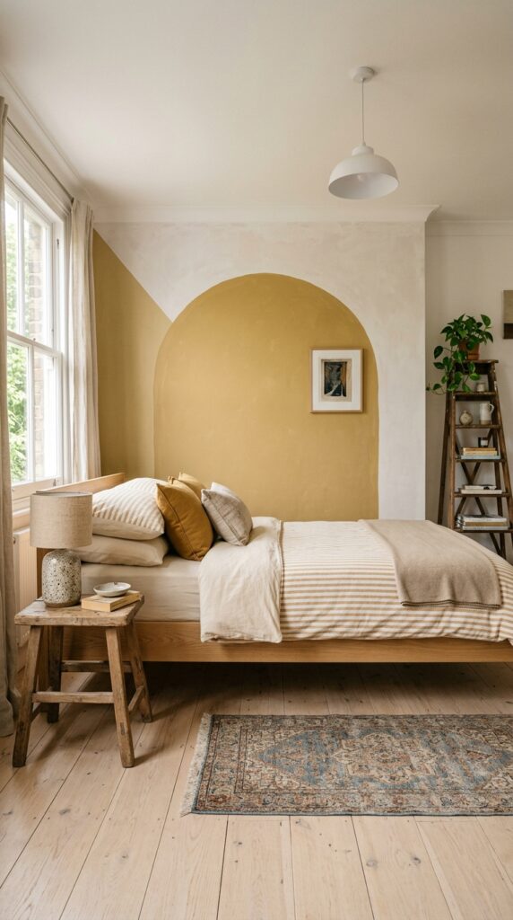
If you want personality without committing to a whole bold room, paint a shape. An arch, a half-circle, a soft rectangle, all of these add visual interest in the way a piece of art does, except you can change it whenever you want. It’s a particularly good move for renters and for kids’ rooms that need to grow up eventually.
Keep the shape large and the colors soft. A muted mustard, a dusty blue, or a chalky pink reads as design, while a saturated primary reads as a daycare. Use a level and painter’s tape, and don’t free-hand the curves unless you’re truly confident.
The constraint is restraint. One painted shape per room, never two, or it starts to feel like a kids’ play area. The takeaway: a color-blocked wall is the easiest way to add personality to a bedroom without buying a single new thing.
Final Thoughts
Paint is the closest thing decorating has to a real reset button. None of these twelve ideas require a renovation, a designer, or a serious budget. They just require you to be honest about the room you actually have, the light it actually gets, and the way you actually want to feel when you walk into it at the end of a long day.
Start with the option that fits your real life, not the prettiest one on the list. If you rent, paint a headboard or a shape. If you own and your bedroom faces north, lean into warmth, terracotta, plaster pink, buttery cream. If you’ve been craving calm, sage and warm white will deliver. If you want drama, navy and forest green are waiting.
The best part about paint is that none of it is permanent. Try something, live with it, and change your mind in a year if you want. That’s the whole point of a home.
Bookmark this page, come back when you’re ready to pick up the roller, and tell us which one you tried. We love seeing how these ideas actually land in real rooms, not just staged ones.