A bedroom should feel like a hug. Not a showroom. Not a Pinterest board that gives you anxiety. A real, finished space where you actually want to spend time—and not just sleep.
The thing about “finished” is that it doesn’t mean expensive or matchy-matchy. It means intentional. Every element has a reason for being there, whether that’s comfort, function, or simply the way afternoon light hits a particular shade of blue. I’ve walked into $500 bedrooms that feel complete and $50,000 ones that still feel sterile and unresolved. The gap isn’t about budget. It’s about layering, texture, lighting, and a few anchor pieces paired with thoughtful restraint elsewhere.
What follows are 25 concrete ways to move your bedroom from “barely decorated” to “I clearly designed this space on purpose.” Some are small tweaks—a better pillowcase, a wall color, swapped hardware. Others are bigger swings: rethinking your layout, adding functional storage, or installing a headboard that makes mornings feel intentional instead of rushed.
Don’t copy everything. Steal the ideas that fit your life, your budget, and the room you actually have—not the one you wish existed.
1. Invest in a Real Headboard (Even a Simple One)
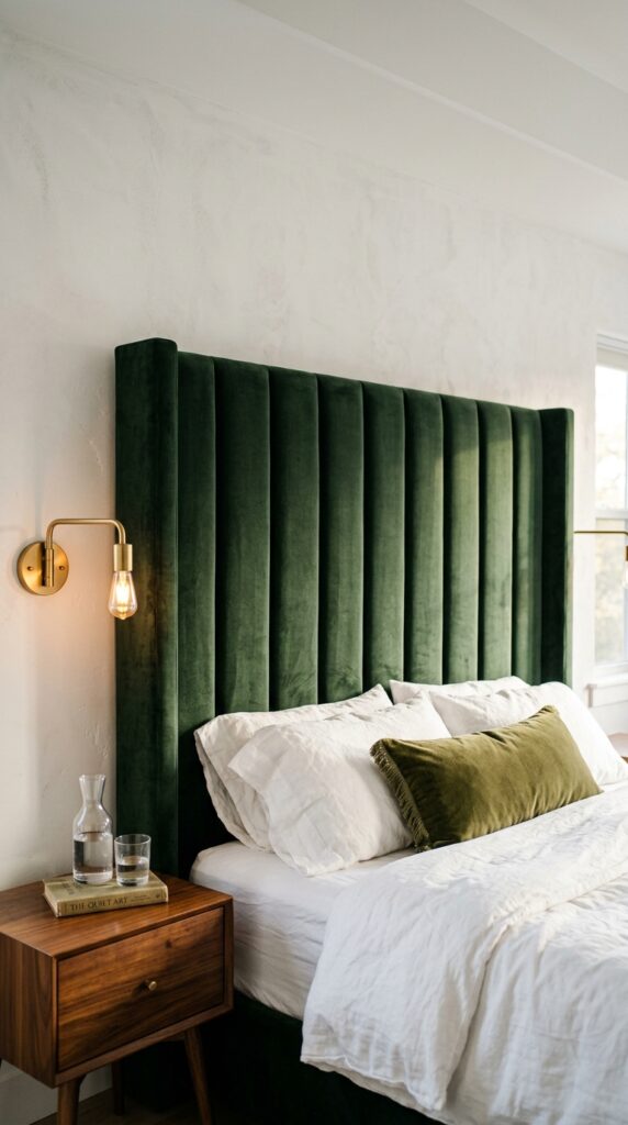
A room without a headboard reads as temporary. It looks like you just moved in and haven’t gotten around to the rest. A proper headboard—upholstered, wooden, cane, even a tall painted board mounted to the wall—immediately anchors the bed and gives the room a focal point.
Upholstered headboards add softness and absorb sound, which matters more than people realize in echoey apartments. Linen and boucle hide stains better than velvet, but velvet ages beautifully if you don’t have pets. Wood headboards in oak or walnut bring warmth without trend-risk.
Skip cheap particleboard versions. They sag within a year and somehow look worse than no headboard at all. If money is tight, a powder-coated metal frame in matte black or aged brass costs under $150 and still reads intentional.
Pick something you’ll love in three years, not just this season. Headboard trends move slowly—buy boring on purpose.
2. Layer Your Lighting (No Overhead Light Alone)
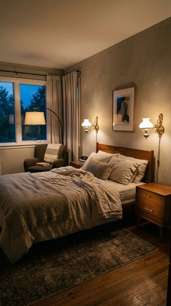
Overhead lights are the enemy of a finished bedroom. They flatten everything, kill mood, and make 9 p.m. feel like a dentist appointment.
The fix is layering three types of light: ambient (dimmed overhead or skip it entirely), task (bedside lamps for reading), and accent (sconces or a small lamp on a dresser for atmosphere). Always use warm 2700K bulbs. Cool white belongs in garages.
Wall sconces flanking the bed are the single biggest upgrade I recommend. They free up nightstand space, create symmetry, and feel custom even when they aren’t. Plug-in versions exist for renters—no electrician needed.
One watch-out: don’t mix bulb temperatures within the same room. One cool bulb will ruin the entire scheme and you’ll feel it before you see it.
The takeaway: light the room at three heights, dim everything, stay warm.
3. Commit to One Accent Wall Color
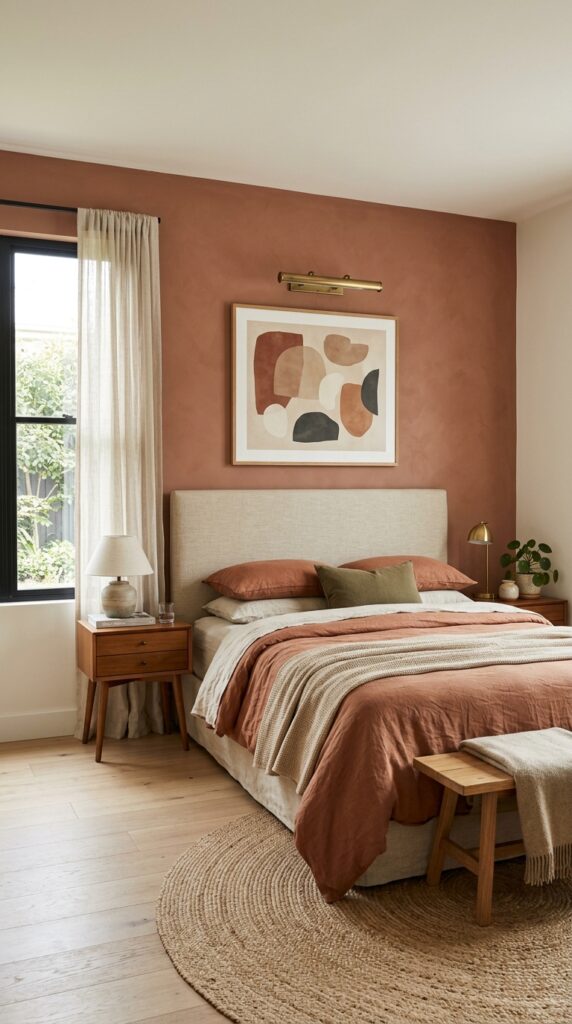
An accent wall done right transforms a room. Done wrong, it dates the space in 18 months.
The trick is choosing a color you genuinely love rather than the trending shade on Instagram this month. Dusty terracotta, deep forest, warm sage, plaster pink, ink navy with gray undertones—these age gracefully. Bright teal, millennial pink, and barn red usually don’t.
Paint the wall behind the headboard. That’s the wall you see when you walk in, and the one that frames you when you’re in bed. Avoid painting walls with windows—the contrast fights with natural light and shrinks the room visually.
Always go matte or eggshell, never glossy. Glossy reads cheap and reflects light awkwardly.
If your room is under 100 square feet, skip the accent wall entirely. In small rooms, color belongs in textiles, not on walls. Test samples for three days in real light before committing—paint shifts dramatically between morning, noon, and lamp light.
4. Upgrade Your Bedding in Layers
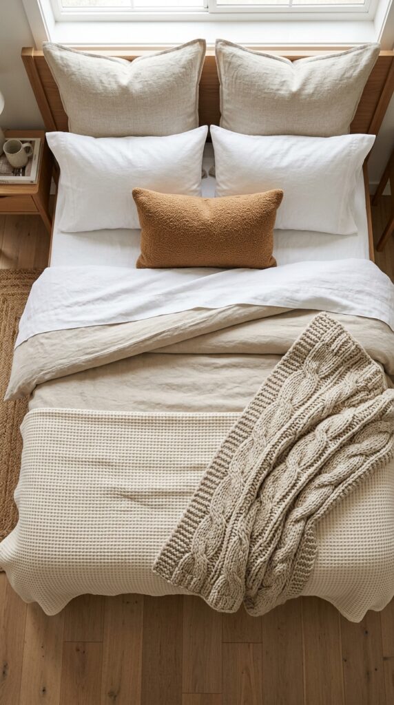
The bed is 70% of what your eye sees. If the bedding looks tired, the room looks tired—no amount of decor fixes that.
Build it in layers: fitted sheet, flat sheet, lightweight coverlet or quilt, duvet folded at the foot in warmer months or pulled up in cooler ones, then pillows. The folded-duvet move is the single biggest “hotel bed” hack. It adds visual height and a sense of abundance without effort.
Stick to natural fibers—linen and washed cotton wrinkle, but those wrinkles read luxurious. Polyester blends look shiny and cheap, no matter the price. Linen feels stiff for the first few washes, then becomes the softest thing you own.
For pillows, the rule is: two sleeping pillows, two decorative euros, one accent lumbar. Anything more becomes a chore to remove every night, and trust me, you’ll stop making the bed entirely within a month.
5. Add a Rug That’s Actually Big Enough
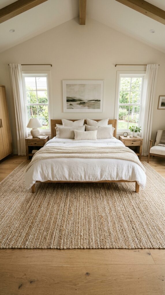
The most common decor mistake I see: a tiny rug floating under the foot of the bed like a postage stamp. It makes the whole room look unfinished and the bed look like it’s drifting.
The rule is simple. The rug should extend at least two to three feet on either side and at the foot of the bed. For a queen, that means an 8×10 minimum. For a king, a 9×12. The bed should sit on the rug starting roughly from the nightstand line forward.
Natural fiber rugs (jute, wool, wool-jute blends) are forgiving, hide dust, and pair with almost any style. Skip pure synthetic rugs—they pill and trap odor in a closed room.
If you have wood or tile floors, a rug isn’t optional. Your feet hitting cold floor every morning will erode any sense of luxury you’ve built elsewhere.
6. Hang Curtains High and Wide
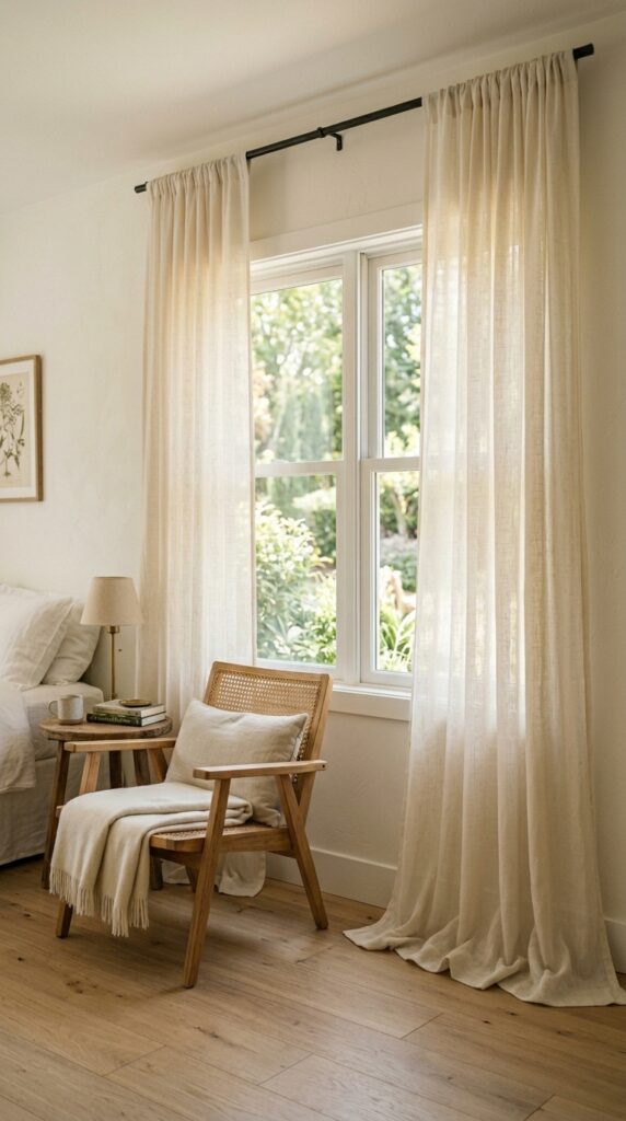
Curtains hung at window-frame height make a room look squat. Always mount your rod within two to four inches of the ceiling, and extend it at least 8 to 12 inches past the window frame on each side. This makes the window look bigger and the ceiling taller. It costs nothing—it’s just where you drill the holes.
The curtains themselves should kiss the floor or puddle slightly. Anything shorter (the dreaded high-water curtain) looks like you didn’t measure.
Linen and cotton blend panels in cream, oatmeal, or soft taupe work in 90% of bedrooms. Velvet adds drama and is excellent for blackout in master suites. Avoid stiff, shiny polyester panels—they never drape properly.
Here’s the trick: even if you have blinds, layer sheer curtains over them. The softness changes everything, especially when light passes through in the late afternoon.
7. Mix Textures, Not Just Colors
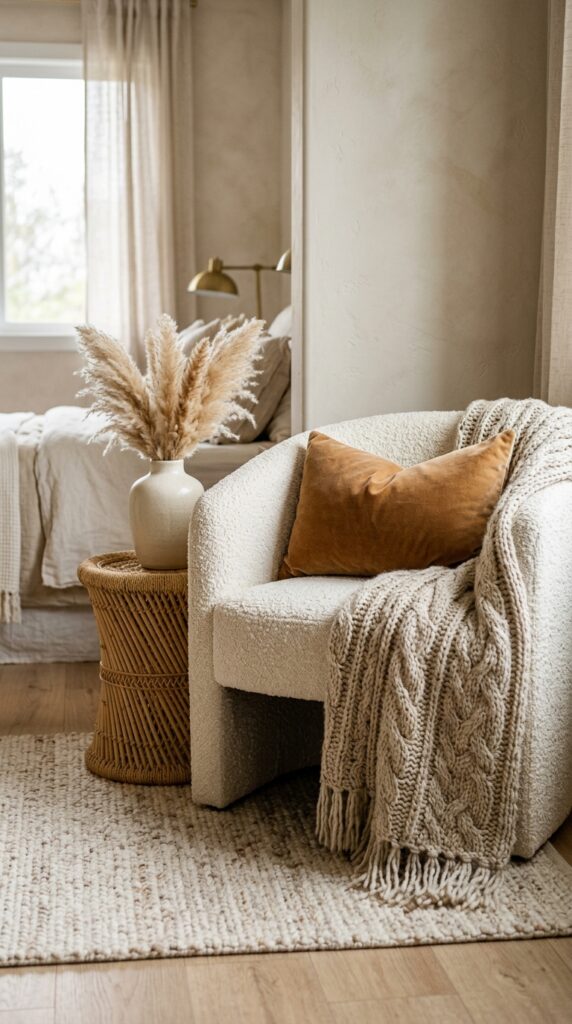
Rooms that fall flat usually share the same problem: everything has the same texture. Smooth bedding, smooth walls, smooth wood, smooth lamp. Even if the colors are beautiful, the eye gets bored.
The fix is mixing materials within a tight color palette. Pair linen with boucle. Velvet with wool. Smooth ceramics with woven rattan. Matte plaster walls with glossy brass hardware. The contrast between rough and smooth is what makes a neutral room feel rich instead of beige.
A good rule: in any vignette (nightstand, dresser top, reading corner), include at least three textures. A ceramic lamp, a woven basket, a stack of books with a linen-wrapped journal on top—that’s three textures in one square foot.
One thing to watch: don’t go heavy on shiny textures. Too much chrome, glass, or polished metal in a bedroom feels cold. Keep the shine to one or two small accents.
8. Style Your Nightstand Like a Designer
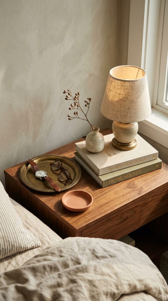
Nightstand styling is where most people give up. They drop a lamp, a phone charger, and a half-empty water glass on it and call it done.
The formula that always works: one tall element (lamp), one short element (small vase, candle, or dish), one stack (two or three books), and one personal piece (a framed photo, a brass tray, a small bowl). That’s it. Four objects max.
Hide the ugly stuff inside the nightstand—charging cables, lip balm, the random earplugs. A nightstand with at least one drawer is non-negotiable. Open-shelf nightstands look great empty and chaotic in real life.
If you share the bed, repeat the formula on the other side, but don’t make it identical. Slightly different objects, same visual weight. Matching everything looks like a hotel room. Loosely matching looks like a home.
9. Bring in Real (or Convincing) Plants
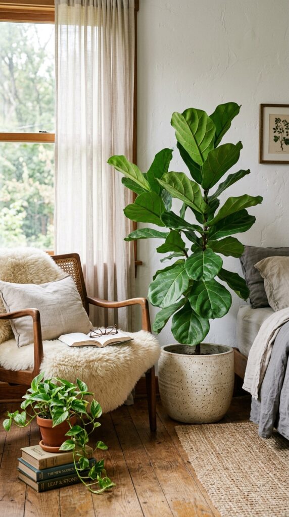
Plants are the cheapest way to make a room feel alive. Even one tall plant in a corner changes the energy of a space.
For bedrooms, choose low-maintenance options that tolerate lower light: snake plants, ZZ plants, pothos, philodendron. Fiddle leaf figs look incredible but are notoriously dramatic; only attempt one if you have bright indirect light and patience.
The pot matters as much as the plant. Skip plastic nursery pots—drop them inside a textured ceramic, stoneware, or woven basket planter. A $15 pot upgrade makes a $20 plant look like a $200 plant.
If you have a north-facing room with minimal light, go faux. High-quality artificial plants now look completely real from more than a foot away, and you skip the watering guilt.
One watch-out: large plants right next to the bed can feel oppressive at night. Keep big plants in corners or across the room, not directly beside your head.
10. Add a Reading Chair (Even in a Small Room)
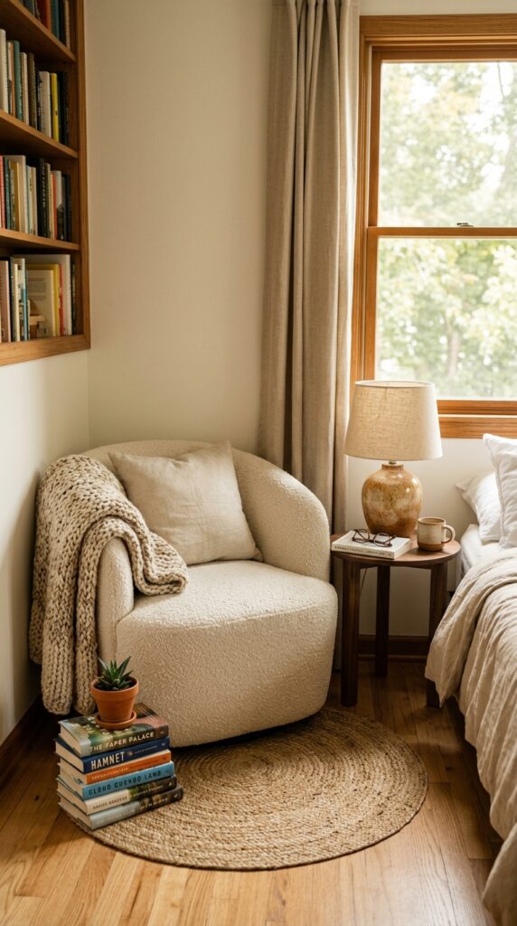
A reading chair signals that your bedroom is a room you live in—not just a room you sleep in. Even in tight spaces, a small accent chair in a corner adds function and visual weight.
Skip the chair if you’ll just pile clothes on it. Be honest with yourself. If you know it’ll become a laundry rack within a week, use that corner for a small dresser or a tall plant instead.
For chairs that actually get used, prioritize comfort over silhouette. A small boucle armchair, a vintage leather reading chair, or even a curved slipper chair all work. Pair it with a side table just big enough for a cup of tea and a book.
Lighting matters here too—a small floor lamp or a wall-mounted swing arm beside the chair makes it functional. Without good light, it becomes furniture nobody uses.
11. Install a Picture Ledge Above the Bed
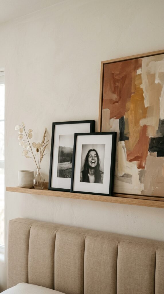
Hanging art above the bed terrifies most people. Picture ledges solve that anxiety entirely. You lean instead of hang, you can rearrange whenever, and you can add small objects between the frames for depth.
A single ledge above the headboard, roughly the width of the bed, holds three to five pieces beautifully. Layer the frames—a larger piece in the back, smaller ones in front, slightly overlapping. Mix a vertical and a horizontal frame. Throw in one small object (a ceramic, a stack of small books, a tiny vase) for texture.
For renters, this is one of the best moves available. Two screws into studs, no commitment to gallery wall configurations.
Keep frames in a similar finish family—all natural wood, or all black, or a controlled mix of two. Too many finishes turns it into a flea market vignette instead of a curated wall.
12. Swap Out the Hardware
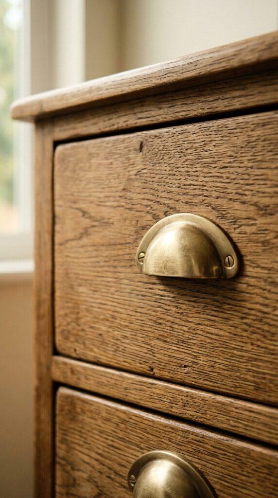
The fastest, cheapest furniture upgrade you’ll ever make. Replace the knobs and pulls on your dresser, nightstands, and closet doors. Total cost: usually under $80. Total impact: significant.
Aged brass, matte black, and warm bronze all read elevated. Cheap chrome and plastic don’t. If your furniture came from a flat-pack store, the original hardware is almost always the weakest link—replace it and the piece instantly looks more custom.
Measure your existing hardware spacing (center to center) before buying replacements. Most cup pulls are 3 or 3.75 inches. Knobs are single-hole and universal.
If you hate the idea of unscrewing every knob in your bedroom, prioritize the most visible: the dresser front and the nightstand drawers. Closet doors can wait.
This is also one of the only upgrades you can take with you when you move. Save the original hardware in a bag for when you leave.
13. Use a Bench or Trunk at the Foot of the Bed
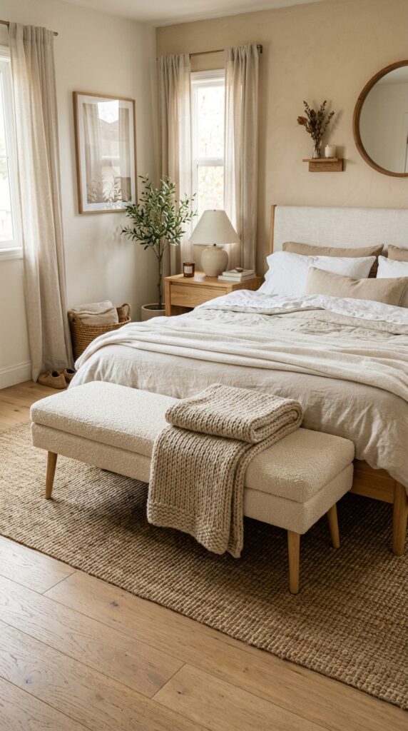
A bench at the foot of the bed is one of those finishing touches that immediately reads “designed.” It creates a visual stop, gives you a place to put on shoes, and serves as overflow space for throw blankets and a couple of pillows when the bed gets stripped at night.
For storage you actually use, choose a trunk or a bench with a lift-top. Off-season bedding, extra pillows, and the spare duvet all live there instead of cluttering closets.
Match the bench width to roughly two-thirds the width of the bed. Wider looks bulky, narrower looks underscaled. Upholstered tops feel softer; wood tops feel more architectural. Both work depending on the rest of the room.
Watch for height. If the bench is taller than the mattress top, it visually competes with the bed. Aim for the bench top to sit just below the mattress line.
14. Add a Statement Mirror
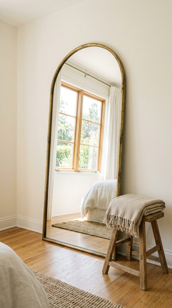
A large mirror does three things at once: it reflects light, makes the room feel bigger, and adds an architectural element without needing built-ins.
Lean a tall mirror (at least six feet) against the wall opposite a window. The reflected light essentially gives you a second window. Arched mirrors feel softer; rectangular leaners feel more modern. Both work.
Avoid small, decorative mirrors scattered around the room. One large mirror always beats three small ones. Same principle as art—bigger pieces look more intentional.
If you’re worried about leaning mirrors with kids or pets, use mirror anchor straps. They’re invisible behind the mirror and prevent any tipping. Five-minute install.
One quick note: don’t position a mirror directly facing the bed if it bothers you to catch your reflection at night. Some people don’t mind; some hate it. Trust your gut.
15. Build a Functional Dresser-Top Vignette
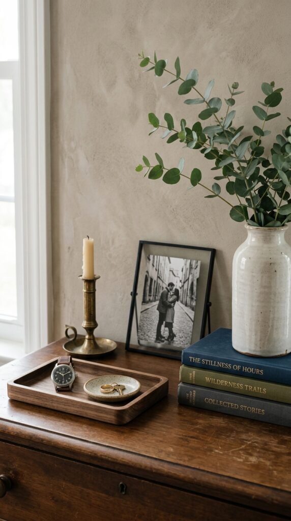
A dresser is prime real estate that most people waste. Either it’s empty (looks unfinished) or it’s covered in random stuff (looks chaotic).
The styling formula: a large anchor element on one side (a tall vase with branches, a framed art piece leaning against the wall), a medium element in the middle (a small lamp, a stack of books with an object on top), and a tray or dish to corral the small daily items (jewelry, keys, glasses).
Trays are the secret weapon. Anything small without a tray looks like clutter; the same items inside a wooden or brass tray look styled. It’s the same trick used by every magazine stylist.
Leave at least 30% of the dresser top empty. Crowded surfaces never read luxurious, even with beautiful objects.
16. Use a Tonal Color Palette
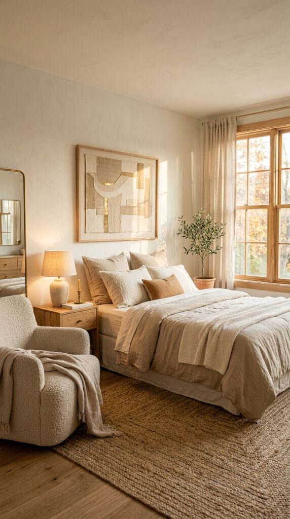
Tonal palettes—working within one color family at varying intensities—are the easiest way to make a room look intentional. Instead of fighting with multiple colors, you let texture and tone do the work.
Pick a base color you love (warm creams, soft greens, dusty blues, terracottas) and find five to seven items in different intensities of that color. A pale sand wall, a slightly darker linen duvet, a deeper oatmeal blanket, a caramel leather chair, a chocolate brown frame. Same family, different depths.
The reason it works: your eye reads cohesion instead of competition. Even with a dozen items, the room feels calm.
Skip this approach if you love color and bold contrast. Tonal rooms can feel monotonous to people who get energy from saturated palettes. There’s no rule that says neutral is better—just that tonal is easier to pull off without missteps.
17. Add Wall Sconces Instead of Table Lamps
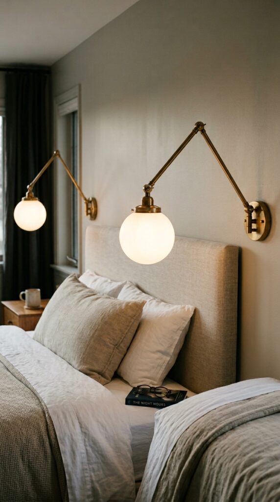
Wall sconces beside the bed free up your nightstand and look immediately more polished than table lamps. They’re a small change that punches above its weight.
Swing-arm sconces are the most functional—you can pull them closer for reading and push them back when not in use. Fixed sconces look more architectural but offer less flexibility.
For renters or anyone allergic to electrical work, plug-in sconces exist and look nearly identical to hardwired ones. The cord runs down the wall to the outlet behind the nightstand. Use a small cord cover painted to match the wall and it disappears.
Aged brass and matte black are the safest finishes. Polished chrome reads cold. Whatever you choose, match the finish to other metals in the room—mixing two metals is fine, mixing four looks accidental.
18. Layer a Throw at the Foot of the Bed
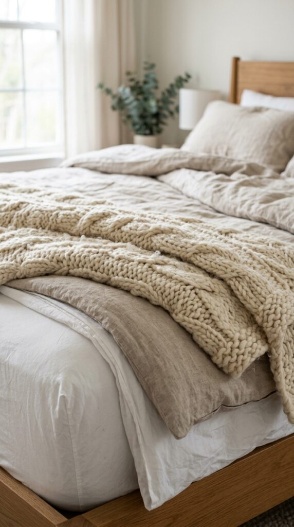
A throw at the foot of the bed does two things: it adds texture and it signals comfort. A perfectly made bed without a throw can feel cold; a throw casually folded across it makes the whole bed feel inviting.
The trick is in the drape. Don’t fold it perfectly square—a slight diagonal or a casual fold reads natural. A perfectly aligned throw looks like you tried too hard.
Choose a texture that contrasts with your duvet. Smooth duvet, chunky knit throw. Linen duvet, soft waffle-weave throw. Velvet duvet, wool throw. The contrast is what makes it visually interesting.
For warmer climates or summer months, swap the heavy knit for a lightweight linen or cotton throw. Functional layering—blankets you actually use—always looks better than decorative ones that sit unused.
19. Mount a Long Tapestry or Textile Above the Bed
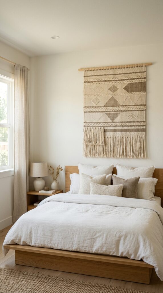
If hanging a single piece of framed art above the bed feels too small or too predictable, a large textile or tapestry fills the space beautifully. It also softens the wall acoustically—useful in rooms with hard floors or echo.
Look for natural fiber weaves in muted tones: cream, oatmeal, soft sage, dusty rust. Skip anything synthetic or anything with overly bright bohemian patterns; those date the fastest.
Hang it on a wooden dowel mounted with two simple brackets, or use a hidden cleat for a cleaner finish. The bottom of the textile should hover just above the headboard, not touch it.
This is a great move for tall walls or rooms with high ceilings, where a single frame can look lost. It’s also one of the best ways to soften an otherwise minimal, modern bedroom without committing to wallpaper or paint.
20. Use a Tray for Bedside Clutter
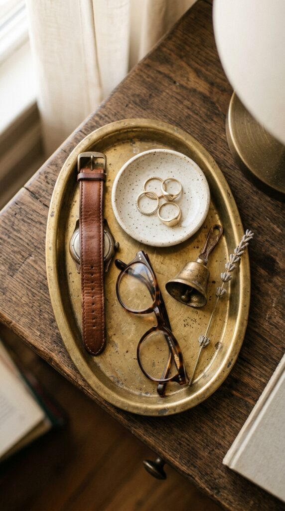
The fastest styling fix for a chaotic nightstand: drop a small tray on top and put all the random items inside it. Watch, glasses, rings, lip balm, the random hair tie. Inside the tray, they read as styled. Outside the tray, they read as clutter.
Oval and rectangular trays both work. Brass, wood, ceramic, even leather—choose a material that contrasts with your nightstand surface. A brass tray on dark wood looks intentional; a brass tray on a brass-trimmed nightstand disappears.
Keep the tray to about a third of the nightstand’s surface area. Larger trays dominate; smaller ones look forgotten.
Bonus: a tray makes morning cleanup easier. Lift the tray, dust under it, set it back down. Instant tidiness.
21. Add Built-In or Floor-to-Ceiling Storage Cues
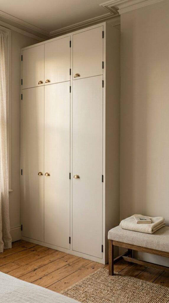
Visible storage is what separates a finished bedroom from a half-organized one. Built-ins are the dream, but most of us don’t have the budget or the lease to install them.
The renter-friendly version: tall wardrobes painted the same color as your walls, so they read as built-in. The eye stops registering them as furniture and starts reading them as architecture. The difference is dramatic.
If you have a closet, invest in matching baskets or fabric bins inside it. Open shelving in a closet looks chaotic without coordinated bins. Three or four large woven baskets along the top shelf hide everything ugly.
A clean, low dresser in solid wood always beats a tall, cheap one. Lower furniture makes ceilings feel taller and walls feel longer. If you’re picking one piece of bedroom furniture to upgrade, pick the dresser.
22. Style a Window Corner With a Chair and Plant
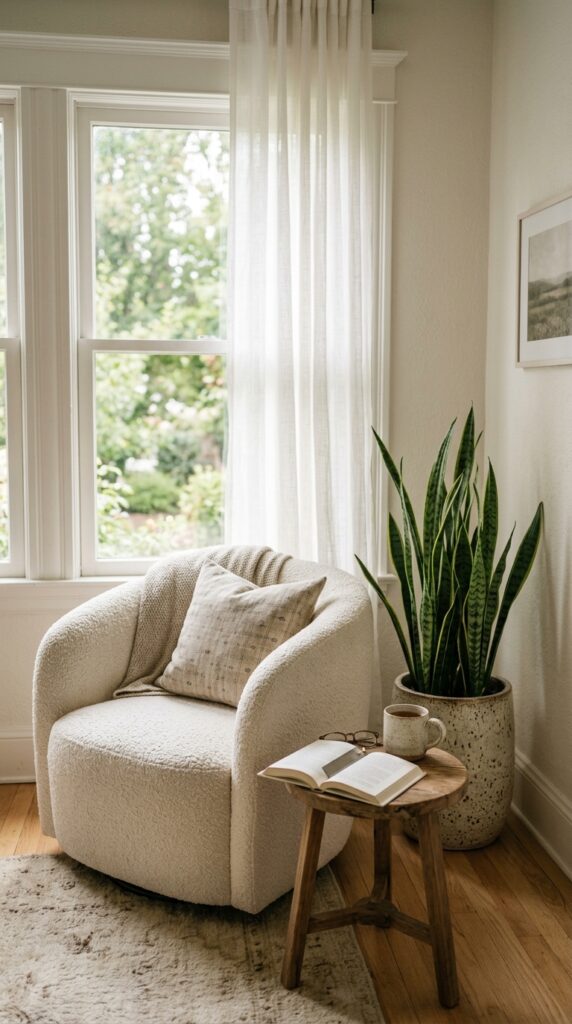
A window without anything beside it is a missed opportunity. A small chair and a tall plant in that corner instantly turns dead space into a destination.
For tight rooms, the chair doesn’t need to be large. A small slipper chair, a low lounge chair, even a vintage wooden chair with a sheepskin tossed over it all read intentional. Add a side table just big enough for a mug.
The plant on the other side balances the visual weight. A tall plant—even a faux one—roughly the height of the back of the chair creates symmetry without being matchy.
This corner doesn’t have to be a serious reading nook. It just has to look like one. Half the time mine ends up holding a folded sweater for the next day. That’s fine. It still finishes the room.
23. Use Black or Dark Wood as a Visual Anchor
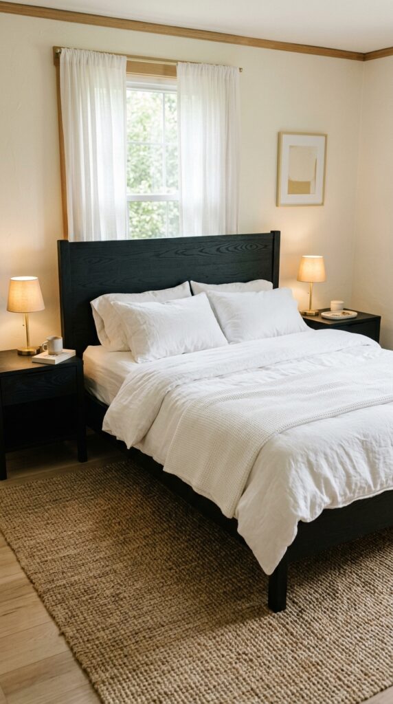
Neutral rooms often look soft and beautiful in photos but feel a little floaty in person. The fix is one anchor in a much darker tone—usually black or deep walnut—that grounds the whole palette.
A black-framed bed, a dark wood dresser, or even a single matte black floor lamp gives the eye somewhere to land. Without that anchor, cream and oatmeal rooms can feel slightly unresolved.
You don’t need much. One major piece in a deep tone is enough for a whole room. Two starts to feel intentional. Three and beyond, you’re moving toward a moody aesthetic, which is fine if that’s the goal.
Watch out for matching everything in the same dark tone—it starts to feel furniture-store coordinated. Vary the depth slightly so it reads collected, not bought-in-a-set.
24. Hide the Cords (Seriously)
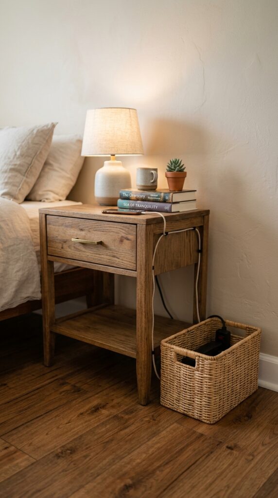
Nothing kills a finished bedroom faster than a tangle of black cords snaking from a lamp, a charger, and a power strip across the floor.
The fix is unglamorous but transformative. Run cords along baseboards using small adhesive clips. Route them behind the nightstand. Hide the power strip inside a small woven basket beside or behind the nightstand. Use cord covers in wall color where cords have to climb a wall (for sconces, for example).
For chargers, a small leather or wooden charging tray that catches the cord and your phone in one spot eliminates 90% of the visual clutter.
This is the kind of detail people don’t consciously notice—but they feel the difference when they walk in. Clean cord management is one of the single biggest upgrades that costs nothing but ten minutes.
25. Edit Ruthlessly
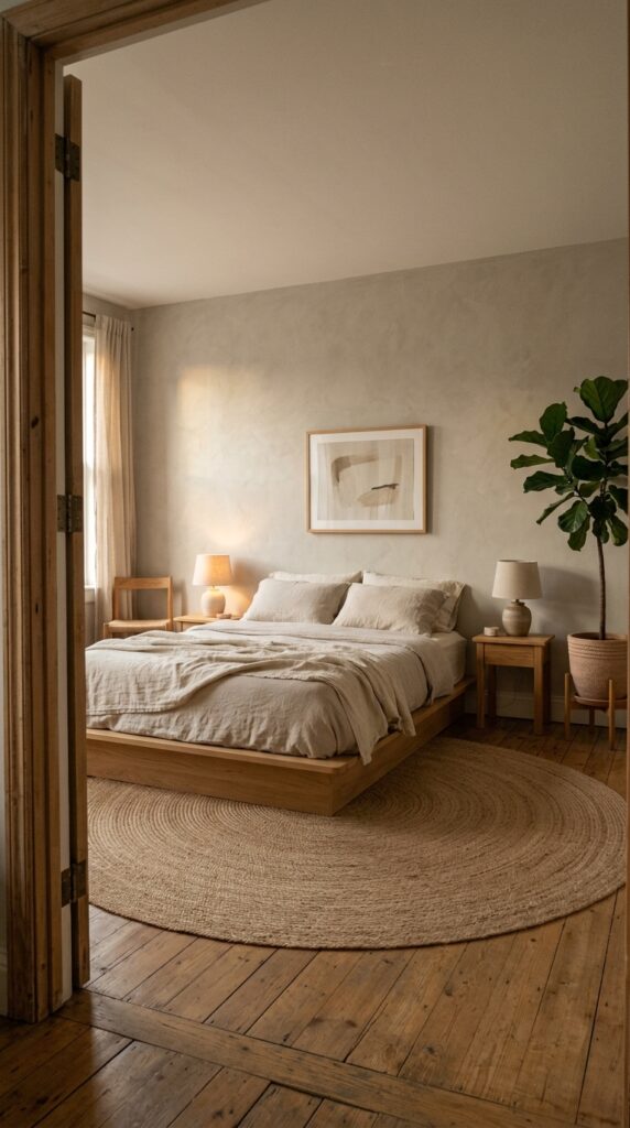
The final, most important rule: take something out.
The difference between a beautifully decorated room and an overstuffed one is almost always a few too many objects. One extra throw pillow. A second small table that doesn’t need to be there. Three framed pieces on a dresser where one would do.
Every time I finish styling a room, I walk through and remove three to five things. Almost always, the room looks better afterward. Less doesn’t mean cold. Less means each remaining thing matters.
Try this: photograph your bedroom on your phone. Look at the photo, not the room. Photos compress clutter and show you what’s actually too much. The eye in real life forgives; the camera doesn’t.
If you can’t decide what to remove, start with anything that has no function and no real meaning. Decorative objects you bought because they were on sale are usually the first to go.
A finished bedroom isn’t the one with the most stuff. It’s the one with exactly the right amount.
Conclusion
A bedroom comes together when you stop chasing trends and start making decisions that fit how you actually live. The headboard you’ll love in five years. The lighting that makes 10 p.m. feel calm instead of harsh. The rug that’s actually the right size. The cords you finally hid behind the nightstand. None of these are dramatic on their own. Stacked together, they’re the difference between a room that feels unfinished and a room that feels like yours.
The biggest takeaway: a finished bedroom is built in layers, not in one shopping trip. Add one or two changes a month, live with them, then add more. You’ll end up with a space that feels collected rather than purchased—and that’s the look no catalog can sell you.
Save this guide, pick three ideas to start with, and come back when you’re ready for the next round. The best rooms aren’t designed in a weekend. They’re refined over time, with intention and a little bit of opinion. That’s exactly what makes them feel like home.