Narrow entryways have a reputation they don’t entirely deserve. Yes, they can feel like a corridor you’re passing through rather than a space you’re actually in. Yes, they collect clutter faster than any other room in the house. And yes, a bad furniture choice in a tight hallway can make the whole thing feel like a loading dock. But here’s what most decorating advice gets wrong: the goal isn’t to fake width you don’t have. It’s to use what’s there — light, height, depth, and texture — in ways that make the space feel like a considered, intentional part of your home.
A well-styled narrow entryway can actually feel more intimate and beautiful than a sprawling foyer. It just requires a different set of rules. Fewer pieces, chosen more carefully. Smarter use of vertical space. Materials and finishes that work with light rather than absorb it. These twelve ideas are built around those principles — and none of them require knocking down a wall.
1. Run the Flooring Lengthwise to Trick the Eye
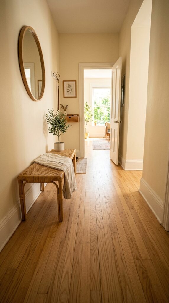
Before you buy a single hook or hang a single mirror, look at your floor. The direction your flooring runs has more influence on how a narrow space feels than almost any decor choice you’ll make. Planks or tiles laid lengthwise — running away from the entrance rather than across it — create a visual corridor that draws the eye forward and makes the space feel longer and more purposeful. Laid across the width, the same floor makes a narrow hallway feel like a series of speed bumps.
If you’re renovating or replacing flooring, choose narrow planks in a light tone: white oak, pale ash, or a whitewashed pine. Lighter floors reflect overhead light back into the space, which in a north-facing hallway can make a real perceptual difference. If you’re working with existing flooring you can’t change, a runner rug achieves the same directional trick — just make sure it runs lengthwise and stops a few inches short of both walls so the floor border remains visible on either side. That visible border of floor is crucial; it’s what signals width to the brain.
One constraint: very dark floors in a narrow hallway will swallow light and make the walls close in. If you have dark floors and can’t change them, compensate aggressively with pale walls, reflective surfaces, and warm overhead lighting.
2. Floor-to-Ceiling Storage That Earns Its Inches
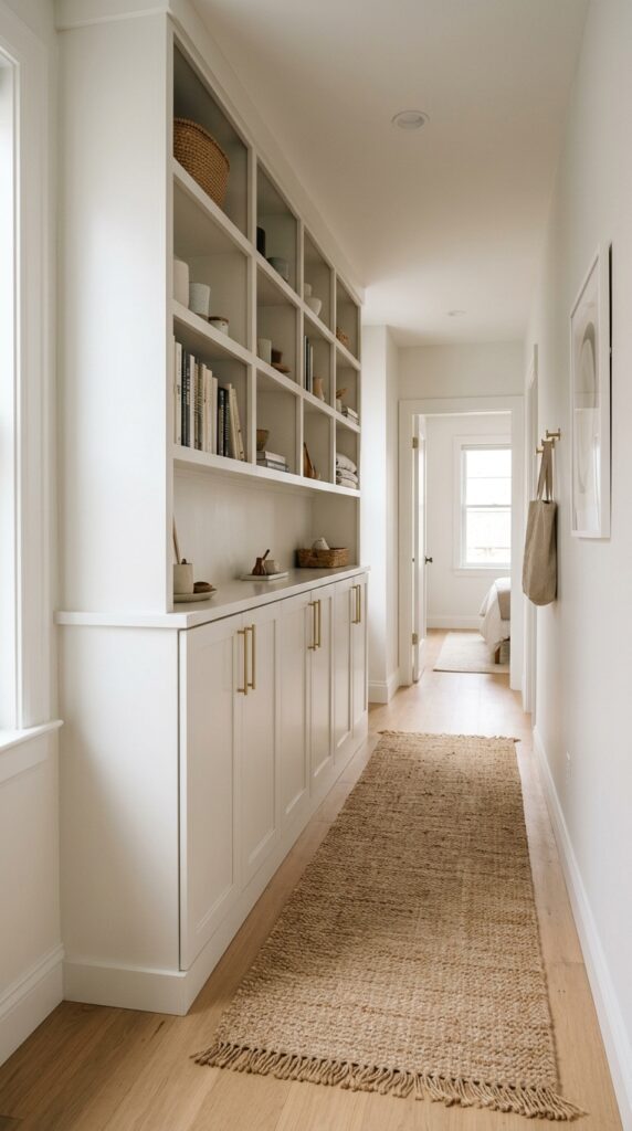
When floor space is at a premium, the only direction left is up. Floor-to-ceiling storage units in a narrow entryway do something counterintuitive: rather than making the space feel smaller, a well-designed tall unit reads as an intentional architectural element when it’s painted the same color as the walls. The unit disappears into the wall and the eye reads it as structure, not furniture.
The split approach works best for everyday function: closed lower cabinets for shoes, outerwear, and bulky items, and open upper shelving for baskets, books, or objects you actually want to see. The closed lower section keeps the visual noise low at eye level where it matters most, while the open upper section gives the wall some personality without overwhelming the space.
Here’s the designer rule that makes or breaks this: paint the unit, the trim, and the wall behind all in the same color. Not similar — the same. This erases the seams and makes everything read as one continuous surface. Even a flat-pack unit treated this way looks built-in. Finish with simple recessed or flush hardware; anything that projects outward in a narrow hallway will catch elbows and bags on every pass. Flat bar pulls or touch-latch doors are both smart choices here.
3. A Single Statement Mirror at the End of the Hall
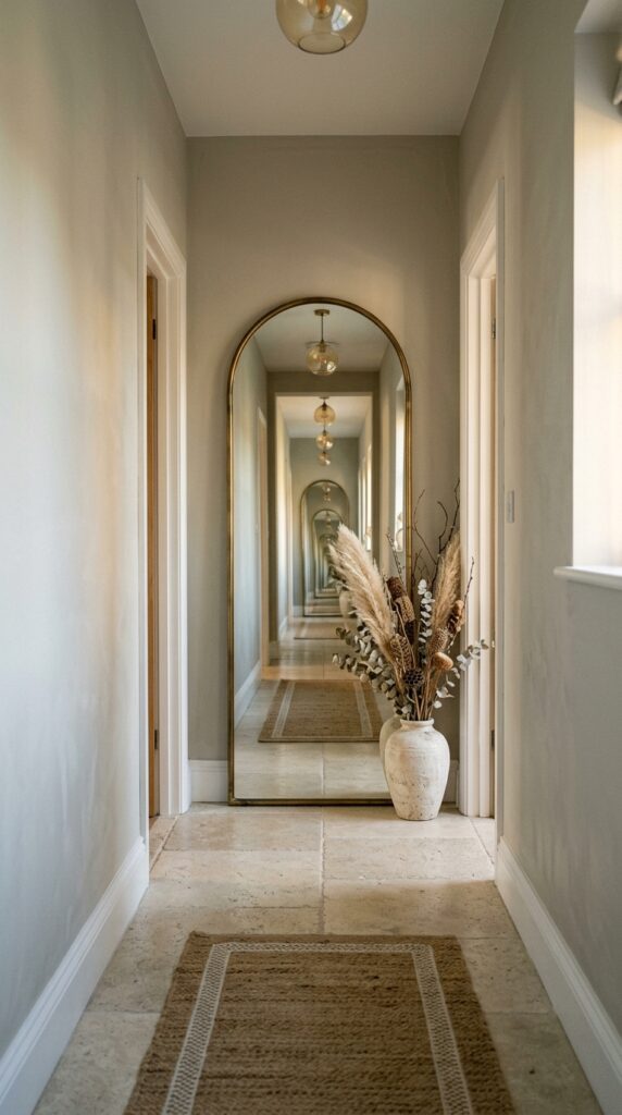
This is one of the oldest spatial tricks in interior design and it works because it’s based on optics, not illusion. A large mirror placed at the termination point of a narrow hallway reflects the entire length of the space back at you, effectively doubling the perceived depth of the corridor. It’s the closest thing to adding square footage without construction.
The format matters: tall and vertical is always better than wide and horizontal in a narrow space. An arched or full-length rectangular mirror in a slim frame — aged brass, matte black, or natural wood — adds to the sense of height without competing with the walls. Lean it rather than hang it if your floor allows; a leaning mirror feels more relaxed and is easier to reposition. If the hallway terminates at a door, hang the mirror on the wall beside it rather than on the door itself — doors move, and a mirror that swings is both disorienting and a hazard.
One thing to watch: if there’s a coat hook directly in line with the mirror, you’ll spend every morning looking at your own back. Offset the mirror slightly from the main hook zone or position it where the reflection shows the most flattering section of the hallway — usually the entrance end, with natural light behind the viewer.
4. Pale Paint Plus Satin Finish: The Light-Bouncing Formula
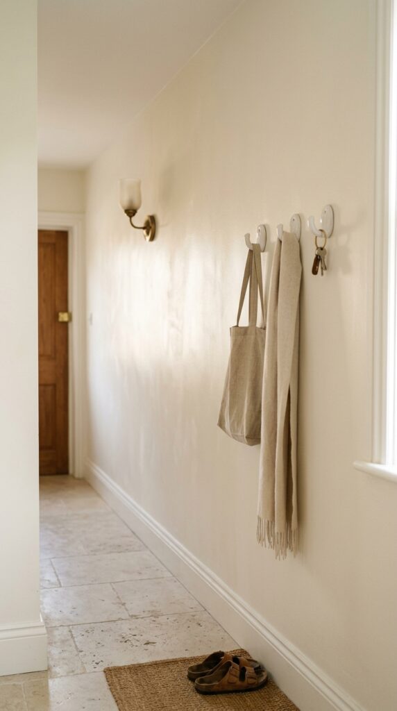
Most people paint their entryway walls in flat or matte paint because it hides imperfections. In a narrow hallway, that’s the wrong call. Matte paint absorbs light. In a space that typically gets less natural light than any other room in the house, absorbing light is the last thing you want to do. A satin or eggshell finish on a pale wall reflects ambient and artificial light back into the space — subtly but meaningfully — and the result is a hallway that feels brighter and slightly larger without any additional lighting.
The palette choice matters too. Warm whites and very pale greiges outperform cool whites in narrow spaces because they don’t feel clinical. Avoid gray in north-facing hallways without supplemental warm lighting — it will read as flat and cave-like by afternoon. Soft white, pale linen, warm ivory, and barely-there sage all work beautifully and add personality without committing to color in a space where saturation can feel oppressive.
One practical note: paint your doors, trim, and walls all in the same tone. This “tone-on-tone” approach eliminates the visual breaks that make a narrow hallway feel segmented and choppy. When the eye sees one unbroken color field, the space reads as unified and unexpectedly calm.
5. Wall-Mounted Everything: Keep the Floor Visible
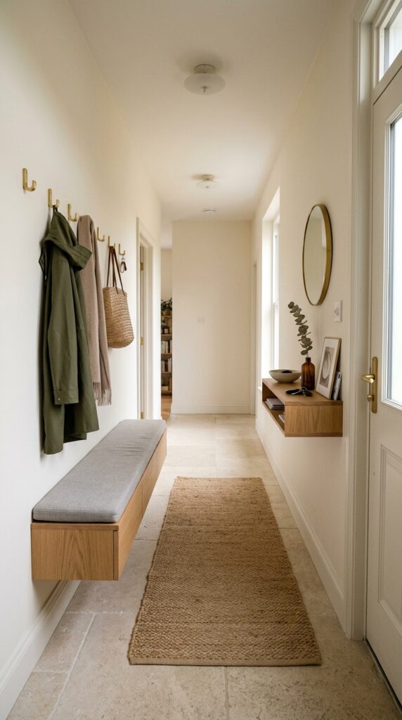
The single most effective thing you can do in a narrow entryway is keep the floor clear. Not tidy — clear. No furniture legs, no baskets sitting directly on the ground, no shoe racks on the floor. When the floor is visible from one end of the hallway to the other, the space feels wider and more open because the eye can trace the full width of the floor without obstruction.
This means going wall-mounted on everything that can reasonably be mounted: a floating bench instead of a legged one, wall hooks instead of a freestanding coat rack, a narrow floating shelf instead of a console table with legs. A floating bench at 18 inches high keeps the shoe zone organized beneath it while freeing up the visual floor plane entirely. Wall-mounted hooks take up zero floor space by definition.
The key is choosing mounting hardware that’s actually rated for what you’re putting on it. A floating bench that someone sits on daily needs proper stud mounting — two to four screws into wall studs, not drywall anchors. Do it right once and it holds for years. Do it cheaply and it pulls out of the wall within months. In a rental, freestanding pieces with very slim profiles (under 12 inches deep) are the next best thing.
6. Vertical Stripes: The Classic Height Illusion
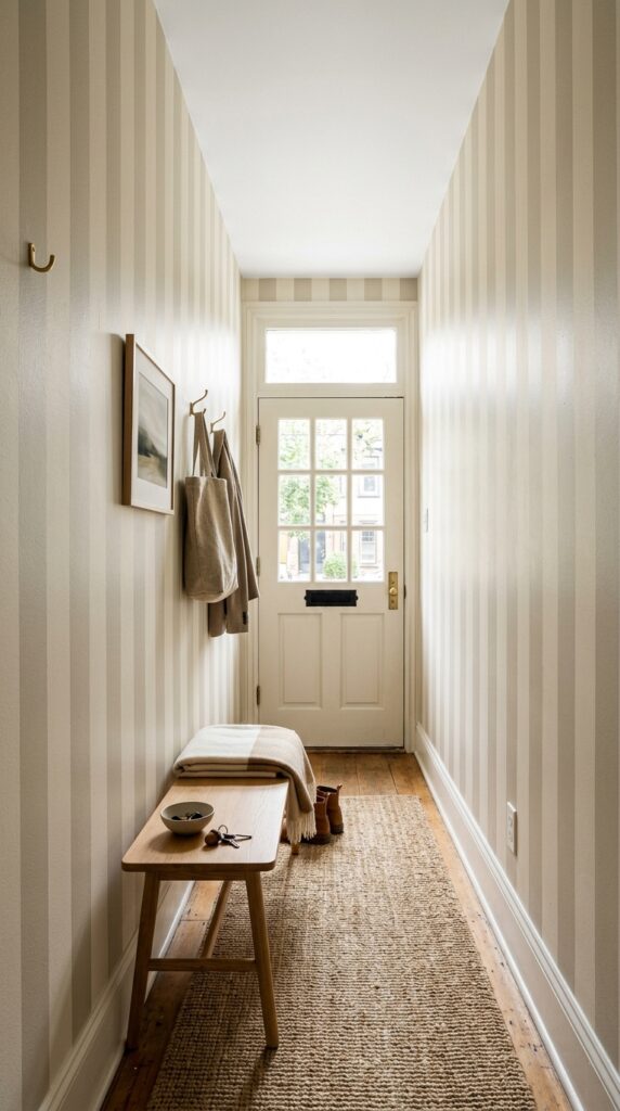
Vertical stripes on an entryway wall have been making rooms feel taller since the nineteenth century and they still work — not because they’re a trick, but because they direct the eye upward along the wall rather than across it. In a narrow hallway where width is the problem, drawing the eye vertically is exactly what you want.
The modern version of this idea is subtle. Forget bold contrast stripes; instead, choose two tones within the same family — a warm white and a barely-there greige, or a soft sage and a slightly deeper sage — and paint them in four-to-six-inch vertical bands. From a few feet away the pattern reads clearly as directional. Up close, the shift is gentle and sophisticated rather than graphic or overwhelming. This can feel loud in smaller, darker entryways where high contrast would dominate, so keep the tone difference soft.
Alternatively, a vertically grooved wall panel — the kind now available as peel-and-stick or paintable MDF — gives you the same visual direction without brushwork. Paint it all one color for a more architectural, textural effect rather than a striped one. Both approaches cost very little and have a high visual payoff.
7. The Narrow Console Table Done Right
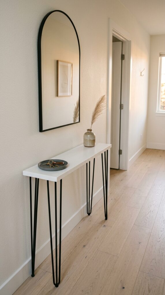
A console table in a narrow hallway is a calculated risk. Get the depth wrong and it turns the hallway into an obstacle course. Get it right — and pair it with the right objects on top — and it becomes the best-dressed ten inches in your home.
The rule is strict: nothing over twelve inches deep. Ten is better. Hairpin legs or slender tapered legs in a slim profile keep the visual weight low. A solid apron table or anything with a thick base belongs in a wider space. The leg design matters because in a narrow hallway, the space under the table counts — you want to see floor beneath it, which requires legs that are visually light and well-spaced.
On top, exercise real restraint. A tray for keys and daily items (essential), one small vase or plant (one, not a collection), and optionally a small lamp if there’s an outlet nearby. That’s the limit. The moment a console table starts accumulating objects in a narrow hall, it becomes the most stressful surface in the house. The discipline of the tray helps: everything has to fit in the tray or it doesn’t live on the table. A hook or two on the wall directly above completes the setup without adding any footprint.
8. Lighting That Works Downward and Inward
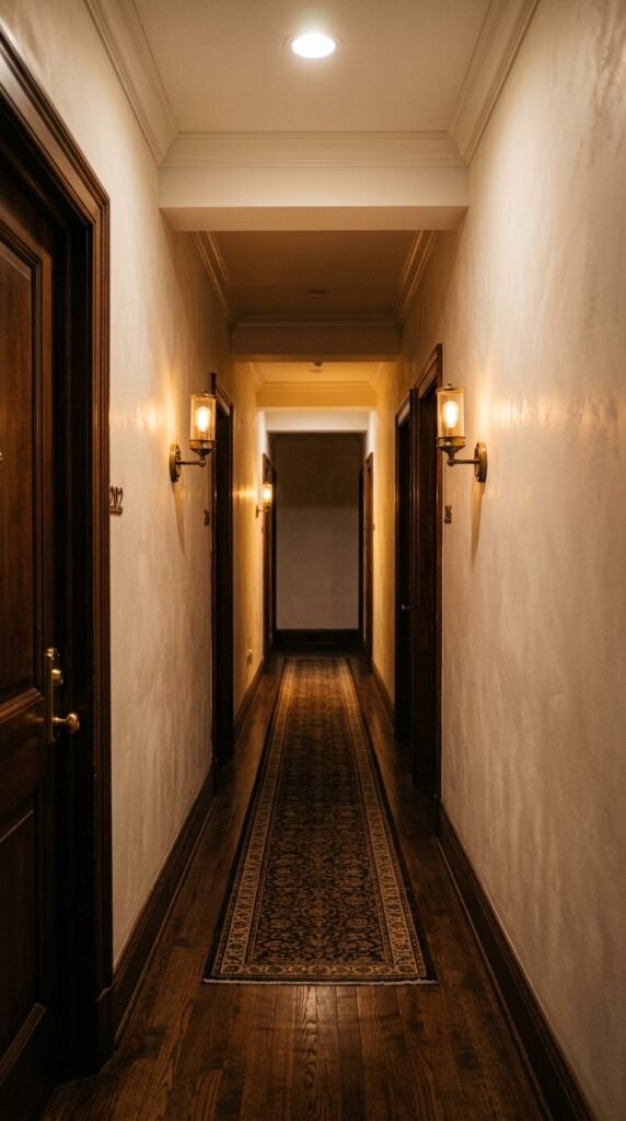
Bad lighting in a narrow hallway makes it feel like a corridor. Good lighting makes it feel like a room. The difference is almost entirely about where the light source is positioned and what direction it points.
Overhead ceiling lights — especially single-bulb flush mounts — illuminate the center of the hallway and leave the walls in relative shadow, which emphasizes the narrowness. Instead, use wall sconces mounted at about five feet on opposing walls. Their light washes onto the wall surface, expanding the perceived width. If you can’t mount hardwired sconces (rental situation, plaster walls), plug-in sconces with a cord cover, or battery-operated wall lights, both work surprisingly well in this context.
Warm bulb temperature — 2700K to 3000K — is non-negotiable in an entryway. Cool light (4000K and above) in a tight space reads as institutional, not welcoming. A second light source at the far end of the hallway — a lamp on a console table, a simple pendant — gives the eye a destination to travel toward, which psychologically lengthens the space. Light layering in a narrow hall is one of the highest-return investments you can make.
9. Light-Toned Natural Materials: Rattan, Cane, and Pale Oak
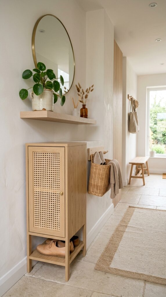
Material choice in a narrow entryway is about visual weight. Heavy, dark, or highly polished materials make walls feel closer together. Light, natural, matte materials do the opposite — they recede rather than advance and let the space breathe.
Pale oak for shelving and furniture, natural rattan or cane for cabinet fronts and baskets, unsealed or lightly oiled wood for hooks and frames — these are the materials that work best in a space where you’re trying to keep things feeling open. They share a quality that matters enormously in small spaces: they have texture without density. Rattan, for instance, is visually porous — you can see through it slightly — which means it doesn’t read as a solid mass blocking space.
Avoid deep espresso stains, high-gloss lacquer, and heavy painted furniture in a narrow hall unless they’re used as a single intentional accent rather than the dominant material. One dark element — a matte black hook rail, a single deep-toned basket — reads as a grounding detail. Multiple dark elements in a tight space create visual compression that no amount of mirrors will fully undo. Choose your materials as a palette and keep that palette light, warm, and breathing.
10. Hooks Over Shelves: The Overhead Zone Strategy
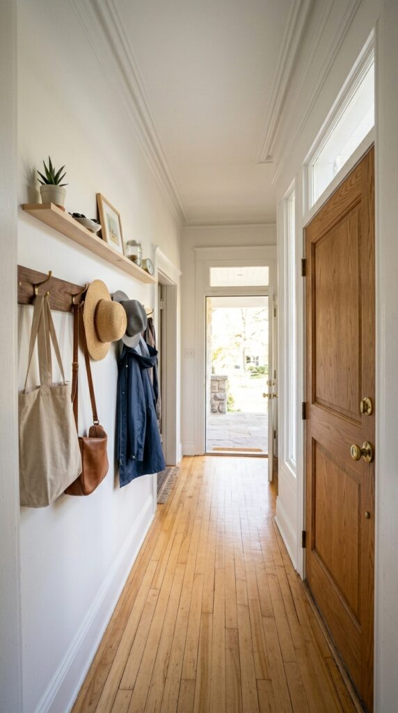
Most people use the bottom half of their entryway walls and leave the top half completely bare. In a narrow hallway, that’s wasted vertical real estate and it pushes all the visual activity to floor level — exactly where you don’t want it. Moving storage upward opens the lower field of view and makes the hallway feel less cramped.
The strategy: mount hooks at the top of the usable wall zone (around 66 to 72 inches from the floor, depending on ceiling height) and reserve anything at eye level and below for flat-wall surfaces only. Bags and lightweight jackets hung high don’t obstruct the sightline down the hallway. A very slim floating shelf just below the crown molding — four to six inches deep — holds sunglasses, small baskets, folded scarves, and objects that would otherwise accumulate at eye level.
This works especially well in hallways with high ceilings, where the overhead zone is genuinely underused. In a hallway with standard eight-foot ceilings, be conservative: one hook rail at shoulder-to-head height is enough — going too high makes items hard to reach and the hallway starts to feel like a storage unit rather than an entryway. Proportion matters.
11. A Cohesive Color Story in Three Tones
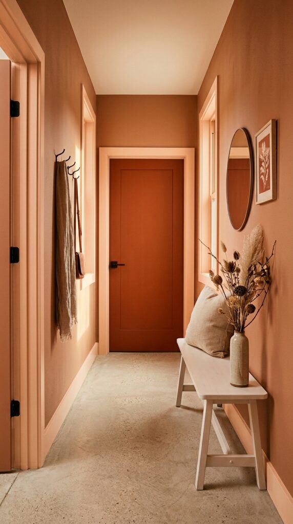
One of the most powerful design moves in a narrow space is committing to a tight, cohesive color story rather than trying to keep things neutral. Neutral is fine, but an intentional tonal palette — three values of the same color family — makes a narrow hallway feel curated and immersive rather than constricted.
The approach: choose one color family (dusty terracotta, soft sage, warm slate, chalky lavender) and paint the walls in the mid-tone, the trim and moldings in a slightly lighter version, and one accent element — the interior of the front door, a single cabinet, a niche — in the deepest version of the same family. Keep the floor and ceiling neutral so the eye has somewhere to rest. The result is a hallway with serious personality that feels spacious because every element belongs together — nothing is fighting for attention.
This approach works best for people who own their home or have landlords who allow repainting. It’s also perfect for those who want an entryway that feels original rather than pulled from a catalog. Avoid this if you frequently change your mind about color or prefer a blank-canvas space — the commitment is real and repainting three tones of the same family back to white takes effort.
12. The Edited Entryway: Less Is the Strategy
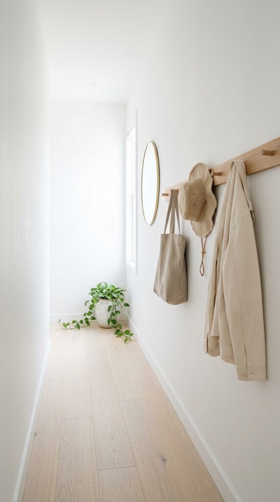
Every piece of advice in this list eventually leads here. The single most powerful thing you can do for a narrow entryway — more than mirrors, more than paint, more than lighting — is to edit it ruthlessly and keep it that way. A narrow hallway with three well-chosen elements reads as intentional and elegant. The same hallway with eight mismatched pieces reads as cramped, regardless of how functional each piece might be.
The edited entryway has one coat storage solution, not three. One surface for daily items, not a shelf and a tray and a basket and a console table all competing for the same narrow zone. One rug, laid lengthwise, not two overlapping. It means being honest about what you actually need near the door versus what’s accumulated there by habit.
A practical audit: stand at your front door and remove everything that doesn’t belong in the entry zone specifically. Whatever’s left is your edit. From there, replace pieces that are doing the same job (three different shoe solutions, for instance) with one better one. In a narrow space, the goal is always fewer decisions, better executed. An entryway that functions with less will always feel more spacious than one that functions with more.
Your entryway is the first room that greets you when you come home and the last one you see when you leave. In a narrow space, that experience is shaped almost entirely by the decisions you make about light, height, and restraint — three things that cost very little and repay enormously.
What makes the ideas on this list work is that none of them are about disguising the narrowness or apologizing for it. A tight hallway, designed with intention, has a specific kind of warmth that a wide-open foyer sometimes lacks. It draws you in and moves you forward. It holds just what it needs to and nothing more.
If you take one thing away from this article, let it be the floor rule: keep it clear, run it long, and let it breathe. Everything else follows from there. Come back whenever the hall starts creeping back toward chaos — it always does — and start again from the floor up.