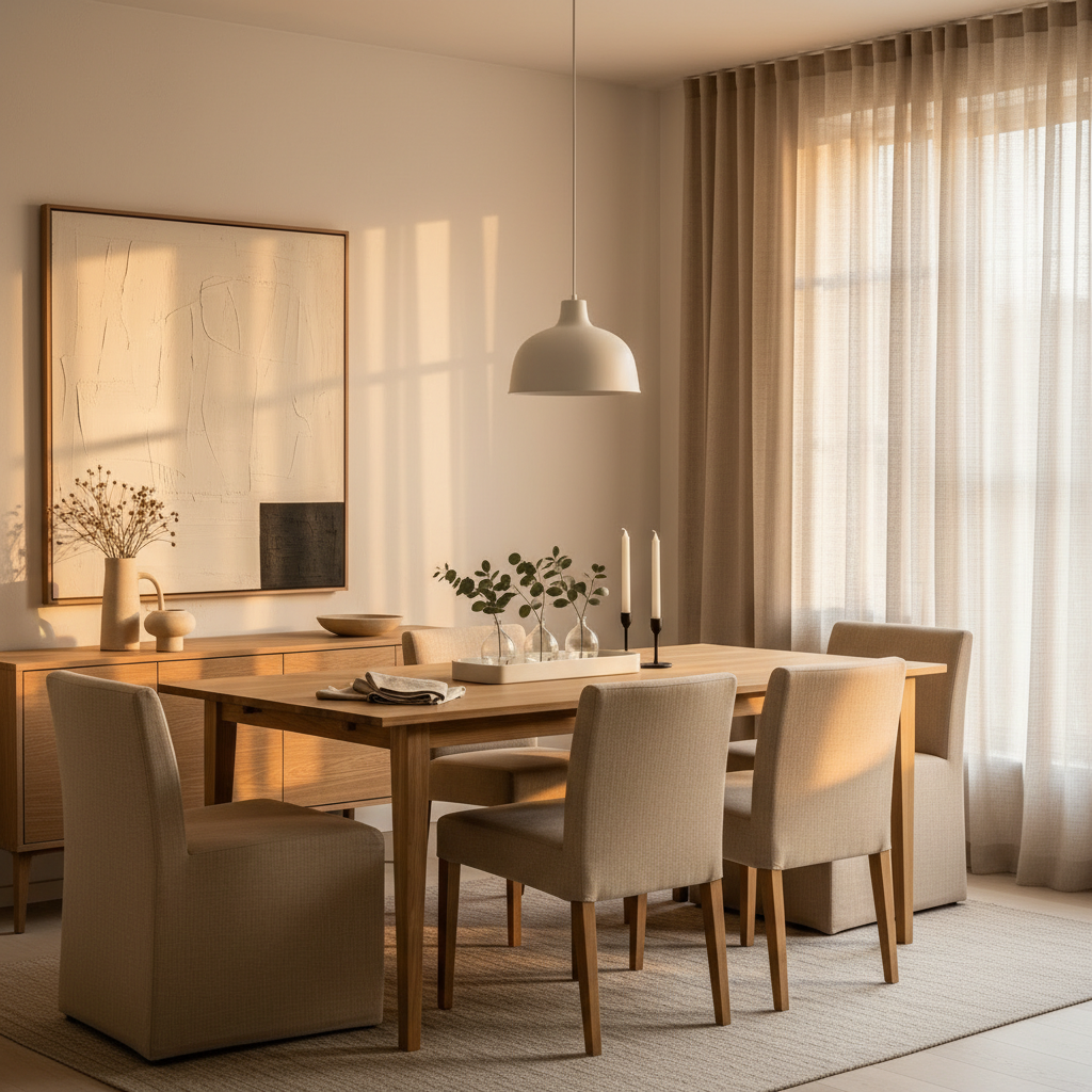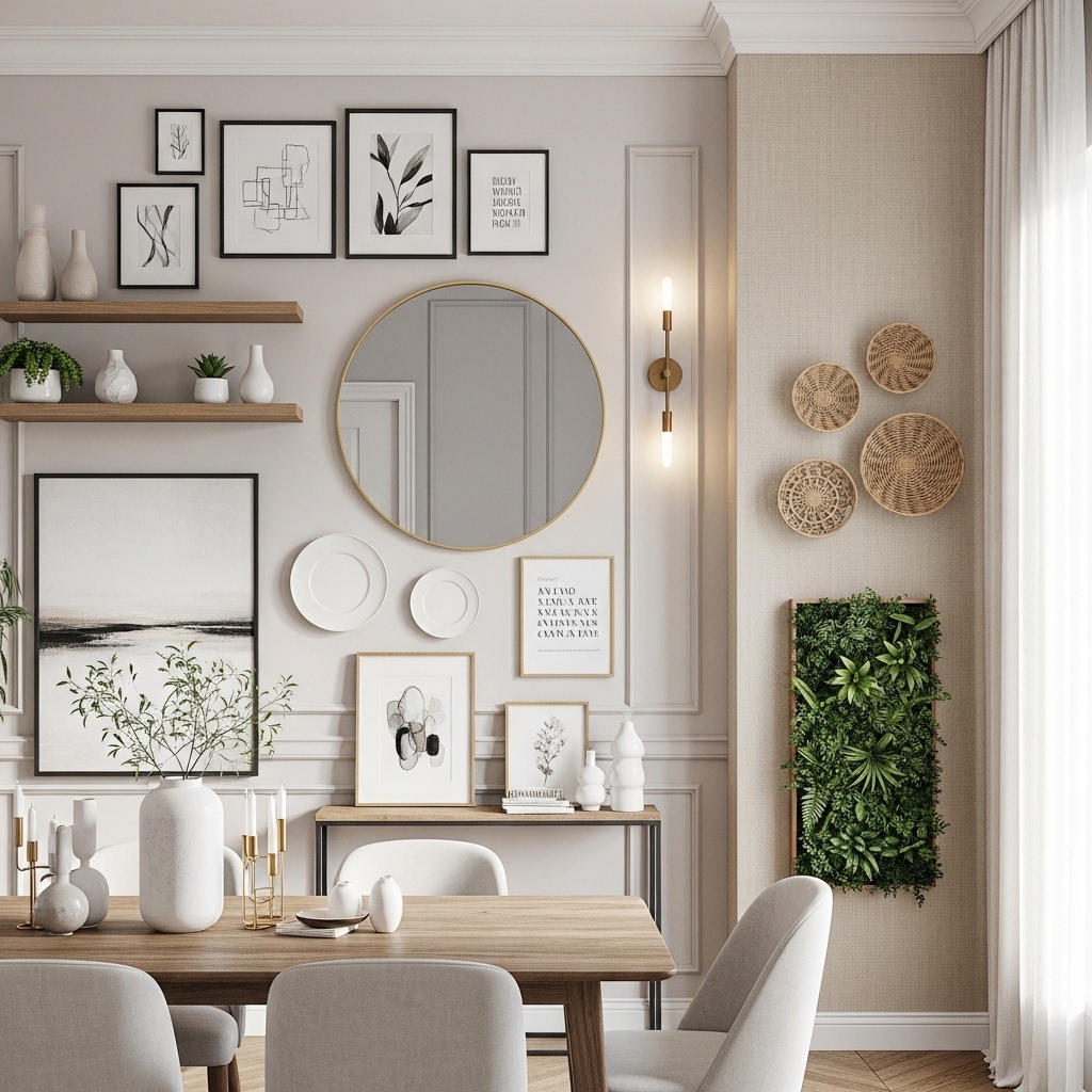
There’s a persistent myth about mid-century modern design — that it needs space. Big rooms, open plans, double-height ceilings. That’s partly true of the originals, the 1950s California case study houses with their glass walls and sprawling floor plates. But the actual design language of MCM? The honest materials, the restrained palette, the furniture that sits low and light on its feet? All of that translates beautifully to small rooms. Better, sometimes, than anything else.
MCM doesn’t rely on bulk to make a statement. A walnut credenza with tapered legs floats visually instead of eating the floor. A single ceramic pendant in amber glaze over a dining table does more than a whole chandelier. This style has always been about intention over accumulation. Which makes it, honestly, a perfect fit for the apartments and compact homes most of us are actually living in.
What follows are twelve specific, practical ideas — not vague inspiration, but the kind of advice you can act on this weekend. Materials are named. Trade-offs are honest. Some of these will work for your space immediately; others need a bit of planning. All of them will make a real difference.
1. The Low-Profile Sofa Trick That Makes Ceilings Feel Taller
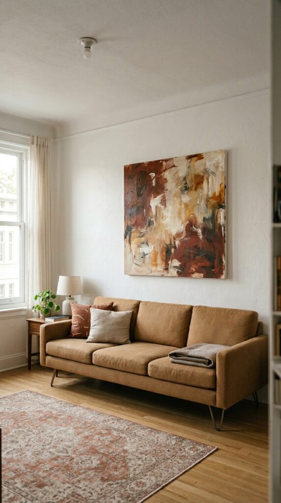
Low furniture is the oldest MCM trick, and it still works. When your sofa sits at standard 18-inch seat height in a room with an 8-foot ceiling, the proportions feel squat. Drop that seat height to 14 inches — which is where most genuine MCM-style pieces land — and suddenly you’ve created visual air between furniture and ceiling. The room breathes.
Look for sofas with exposed tapered legs in walnut or beech. The negative space underneath is what matters most. Keep back height under 32 inches in rooms under 250 square feet. Pair with a low slab-style coffee table in travertine or solid oak — no aprons, no fussy detail. One thing to watch: low sofas are genuinely harder to get in and out of. If you have joint issues, or regularly host people who do, factor that in before committing to the look.
The ceiling didn’t change. Your furniture just finally stopped fighting it.
2. Warm White Walls Aren’t Boring — They’re Strategic
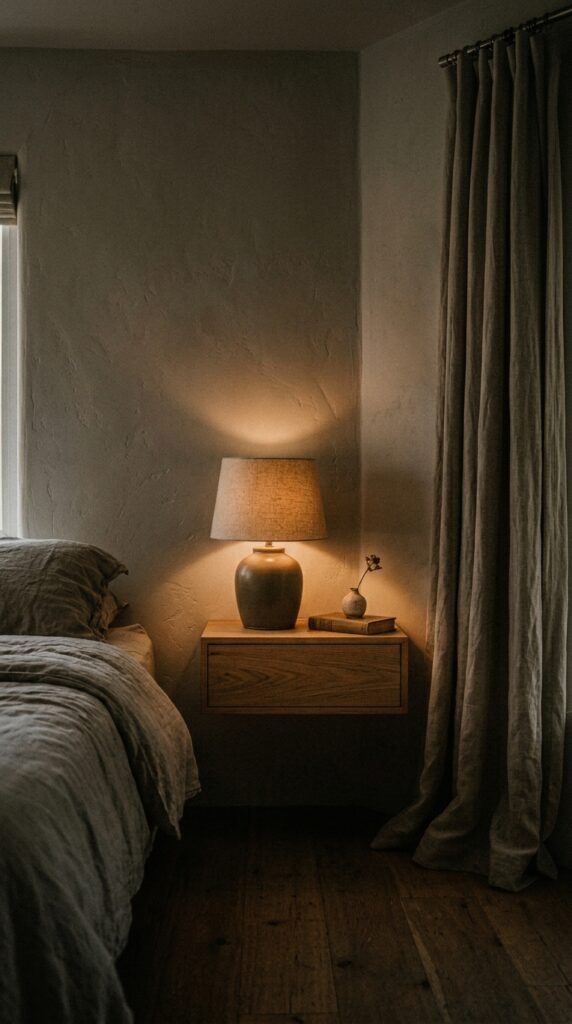
A lot of people reach for bold color in small rooms because they assume white is a cop-out. But there’s a version of warm white — think plaster, bone, aged linen — that does extraordinary work. It reflects light without feeling clinical. It lets your furniture be the character instead of competing with it. And in MCM contexts, where the furniture is already doing a lot of visual lifting, a calm wall is an asset, not a surrender.
Avoid cool whites if your room faces north — they’ll read lavender or grey in natural light and feel cold all day. Matte paint finishes read warmer than eggshell, especially on slightly textured walls. If you hate the idea of repainting, a warm-toned Roman blind in undyed linen can shift the whole room’s temperature without touching a wall. That said, warm whites show marks more visibly than cooler tones, so in high-traffic spaces go eggshell over flat matte for durability.
The right white isn’t a non-choice. It’s the choice that lets everything else matter more.
3. A Walnut Credenza Does the Work of Three Pieces
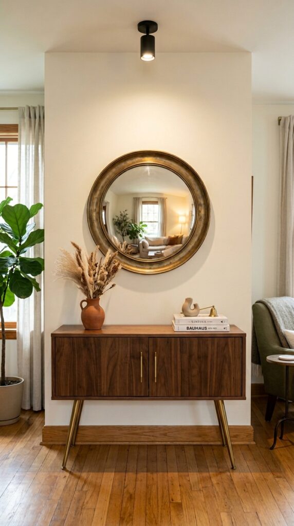
In a small room, every piece of furniture needs to earn its square footage. The MCM credenza — low, long, legs tapered and angled outward — is one of the best multi-taskers in any home. It’s storage. It’s a display surface. It’s a room anchor. And with a mirror hung directly above it, it becomes a full entryway console without the bulk of a traditional console table.
Position it on the longest uninterrupted wall — that horizontal line reads as width and makes the room feel wider than it is. Leave breathing room on the surface: two or three objects maximum. Overcrowding defeats the whole purpose. In bedrooms, a credenza replaces a dresser and two nightstands and still looks better than both. The one constraint: deep credenzas (over 18 inches) will eat a hallway. Measure twice, especially in entryways under four feet wide.
Long and low is its own kind of generous.
4. Pendant Lighting That Anchors Without Overwhelming
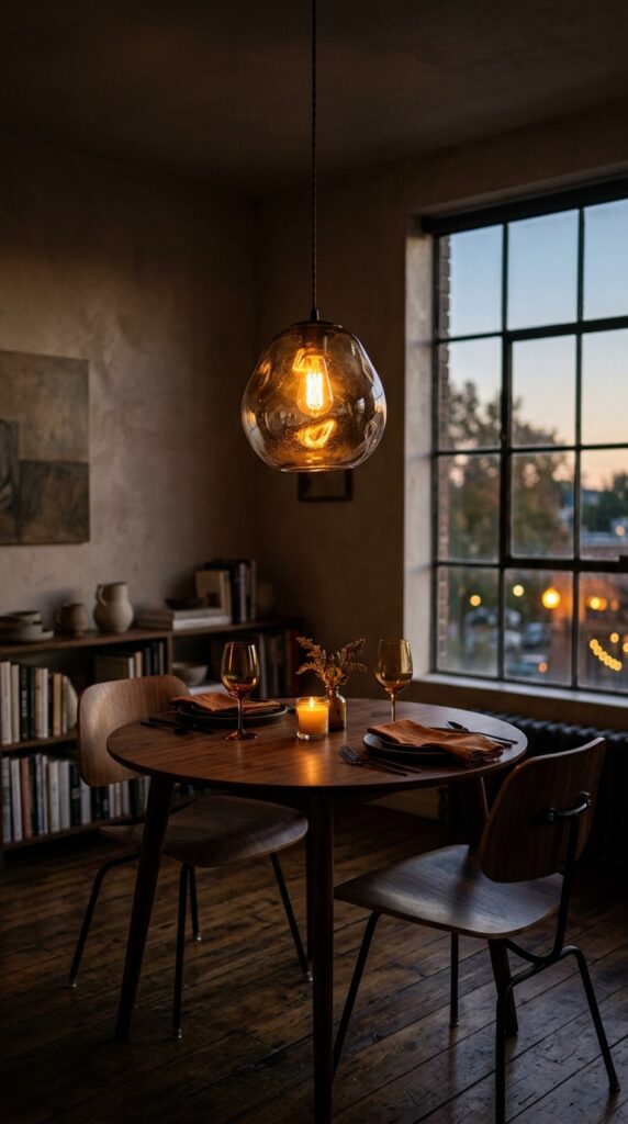
Overhead lighting in small rooms is almost always the first thing to get wrong. Flush mounts are practical but they flatten everything. Chandeliers are often too large, too heavy, too much. The sweet spot for MCM small spaces is a single pendant — one well-chosen, beautifully made pendant — hung lower than you think you should.
Over a dining table, 28 to 30 inches above the surface is the standard. In a living room without a table to anchor it, hang a pendant over a reading chair at around 6 feet from floor to the bottom of the shade. Materials matter enormously here: hand-blown glass in amber, smoked, or opaline white; rattan or woven cane for bedrooms; matte ceramic in an organic shape for kitchens. Skip chrome and nickel — they read contemporary, not MCM. Brass, whether brushed or aged, is the right metal for this aesthetic.
One pendant, placed with confidence, is worth more than five recessed lights placed without intention.
5. The Statement Armchair That Earns Its Corner
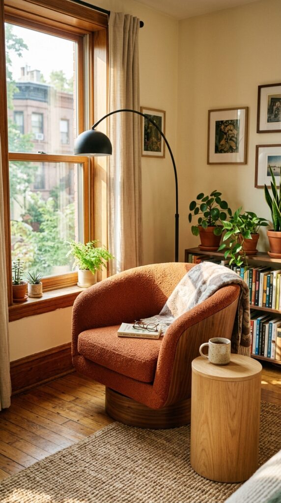
Every small room deserves one piece that makes you stop when you walk in. In MCM design, that piece is almost always the accent chair. Not a matching chair — a contrasting one. Something sculptural. Something in a color that doesn’t appear anywhere else in the room but somehow belongs.
Burnt orange, olive green, deep teal, or rust — any of these work against the warm neutrals that typically anchor an MCM palette. Boucle is the right fabric if you want texture without pattern. Velvet works if you want depth and richness but be honest: velvet in high-use furniture shows compression marks. Boucle hides them. Position the chair at a slight angle — never flat against the wall, never perfectly parallel to the sofa. That small degree of rotation makes it feel considered. Define it with a jute or sisal rug and a floor lamp overhead, and you’ve created a complete room-within-a-room moment.
Skip this if you hate visual clutter. But if you can commit to one bold piece, the armchair is it.
6. Teak Shelving as Architecture, Not Storage
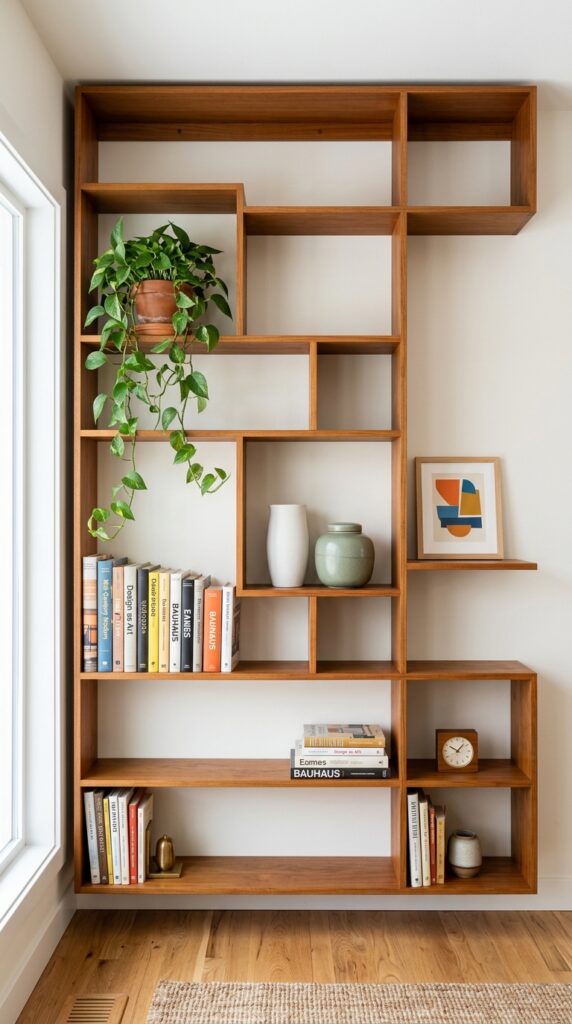
Wall-mounted or freestanding shelving in teak or walnut is one of the great MCM signatures — and in small spaces, it solves two problems simultaneously. It provides storage and it gives a room its visual backbone, something to look at that isn’t a sofa or a television.
Here’s the trick: the shelving needs to be styled like an art installation, not a bookcase. That means negative space is as important as the objects themselves. Aim for about 40% empty shelf — actual empty space, not space filled with things you’re not sure about. Group objects in odd numbers. Vary heights within each shelf zone. Keep a consistent material story: ceramics in two or three related earth tones, books arranged by spine color or turned to face back. One thing to watch — open shelving collects dust at a rate that will genuinely bother some people. If you share the space with someone who finds that stressful, consider a unit with a few closed compartments at lower levels.
Shelving that looks this good is basically free wall art.
7. Cork, Plaster, and Limewash — Texture Over Pattern
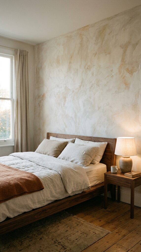
Small rooms often reach for wallpaper when what they actually need is texture. There’s a difference. Pattern in a small room can feel busy very quickly — even a good pattern at the wrong scale becomes noise. Texture, on the other hand, adds depth without demanding attention. It works with the light rather than against it.
Limewash paint is the most renter-accessible option. It goes over standard painted walls and creates that chalky, slightly uneven finish that MCM interiors use as a quiet foil to clean-lined furniture. Venetian plaster is a step up — more commitment, more cost, but absolutely stunning and very much in the spirit of the original case study aesthetic. Cork wall panels in warm honey tones are underused and genuinely beautiful, especially in home offices and bedrooms. They add acoustic insulation on top of visual warmth. For renters: removable limewash-effect wallpaper has gotten remarkably good in the last few years. Not the real thing, but surprisingly close.
Touch the wall. If it tells a story, the room is already more interesting.
8. Brass Hardware — Small Detail, Large Impact
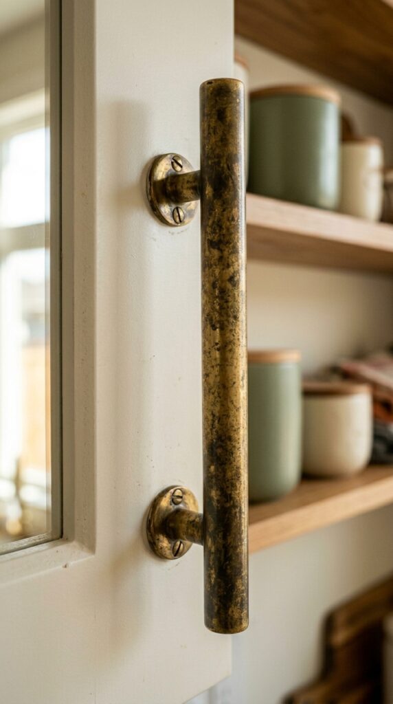
Nobody talks about hardware enough. Which is strange, because hardware is the jewelry of a room — the detail you notice without knowing you’ve noticed it, the thing that makes a space feel finished or not quite there yet. In MCM design, the metal is almost always brass. Not polished to a mirror shine — aged, brushed, or unlacquered so it develops a patina over time.
Swapping cabinet pulls in a kitchen or bathroom is one of the fastest, cheapest upgrades available to renters and homeowners alike. A standard interior door requires eight to twelve screws and no professional help. The transformation is disproportionate to the effort. In bathrooms, extend the idea: a brass towel bar, a brass mirror frame, a single brass wall sconce. Don’t mix metals if you can avoid it. Brass and matte black can work together in MCM spaces — that combination has precedent — but brass and chrome, or brass and nickel, reads unsettled. Pick one warm metal and commit to it throughout the room.
It’s amazing what the right screw cover can do to a room’s confidence.
9. A Jute Rug Defines a Zone Without Closing It Off
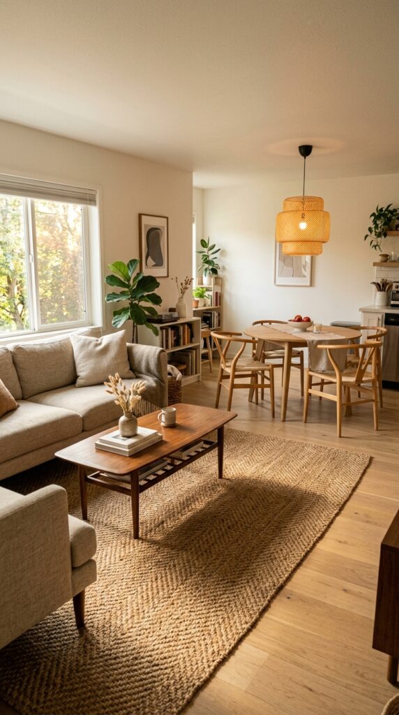
In open-plan small spaces — or any room that needs to feel like it contains more than one purpose — a rug is the most affordable architectural intervention available. It tells you where one zone ends and another begins without needing a wall to do it.
Jute is the MCM-correct choice and also, practically speaking, the most forgiving. It’s durable, it hides dirt well compared to light wool, and it adds warmth without color competition. Size matters more than almost anything else: go larger than you think. The rug should sit under the front legs of the sofa at minimum — ideally under all legs. A rug that’s too small makes a room feel pinched in exactly the way a small room doesn’t need. In dining areas, leave at least 24 inches of rug beyond the chair legs so chairs can pull out without catching the edge. One honest caveat: jute is not soft underfoot. It’s not a barefoot-in-the-morning rug. Layer a small sheepskin or wool runner over it if softness matters to you.
Define the space. Everything else clicks into place around it.
10. Bringing Plants In Without Making It a Jungle
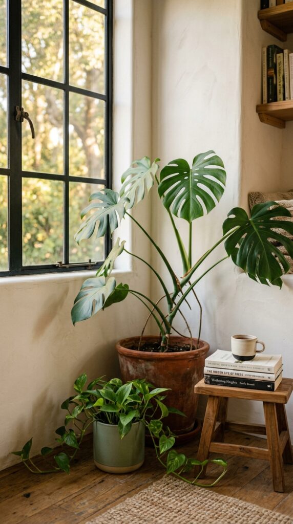
MCM interiors always had plants — that connection to organic form was fundamental to the whole aesthetic philosophy. The mistake most people make is treating plants as decoration, something to scatter around. In small rooms especially, one large plant in the right corner does more than six small ones spread around the room.
The Monstera is the canonical MCM plant for good reason: big leaves, architectural silhouette, tolerant of indirect light. A fiddle-leaf fig if your room gets genuine bright indirect light. A Dracaena if you’re honest about how little attention you’ll actually give it. Terracotta is the right pot material — it breathes, it ages beautifully, and it costs almost nothing. In very small rooms, a trailing plant on a high shelf (pothos, heartleaf philodendron) adds greenery without taking floor space. That said, if you’re not a plant person, one very good quality faux plant in a real terracotta pot is genuinely better than a sad, struggling real one. No shame in it.
One healthy plant, well placed, says more than a shelf full of struggling ones.
11. The Gallery Wall Done Right for Compact Rooms
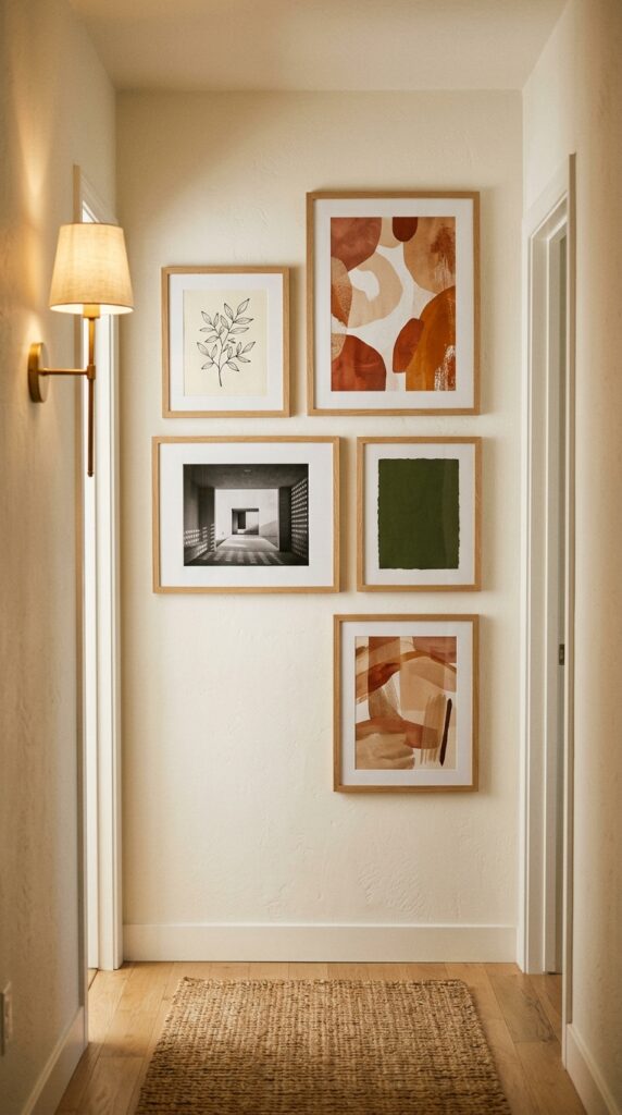
Gallery walls go wrong in small rooms in two predictable ways. Too many frames, too many sizes, no coherent material story — suddenly the wall feels like a yard sale. Or the opposite: too few pieces, too much space between them, everything floating. Neither reads as intentional.
Here’s what works. Limit your frame material to one: natural oak, matte black, or thin brass. Mix the art inside those frames but hold the container consistent. In a room under 300 square feet, keep the gallery to five or seven pieces maximum. Center the arrangement at eye level — 57 inches to the center of the arrangement is the museum standard, and it’s right. Vary the art type: one photograph, one abstract, one object-based print (botanicals, architectural drawings, vintage maps). Avoid text-based prints — in MCM spaces they read contemporary rather than timeless. Leave tighter gaps between frames than you think looks right: 2 to 3 inches between frames makes the group read as a cohesive installation rather than individual pieces that happen to share a wall.
When a gallery wall looks effortless, someone made very deliberate decisions.
12. The Bedside Table Swap That Changes Everything
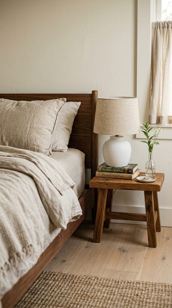
Standard nightstands are often the most generic furniture in a bedroom. Boxy, predictable, too tall for low platform beds, too short for everything else. In MCM small bedrooms, the swap that makes the most immediate difference is replacing the nightstand with something unexpected: a short solid-wood stool, a small ceramic garden stool, or even a stack of large-format art books topped with a tray.
A short oak stool at around 18 to 20 inches is the right scale for most low platform beds. It has negative space beneath it (important — visual lightness), it has no drawers to accumulate junk (arguably a feature), and it costs a fraction of a proper nightstand. Style the surface with extreme restraint: lamp, one book, one small object. That’s the whole brief. If you genuinely need storage beside your bed, a small rattan basket tucked below works without disrupting the aesthetic. One constraint: this approach works for people who aren’t side-sleeper hoarders. If you need reading glasses, a glass of water, a phone, a charger, hand cream, and a sleep mask all within reach, the stool isn’t for you.
The bedroom got quieter the moment the nightstand stopped trying so hard.
The Takeaway
Mid-century modern design has survived seventy years because it solved a genuine problem: how to make a home feel considered and human without making it feel precious or fussy. In small spaces, those qualities matter even more. You don’t have room for furniture that doesn’t earn its place, or colors that fight each other, or lighting that flattens everything into the same grey middle.
What these twelve ideas share is a kind of discipline. Not austerity — MCM was never cold — but a commitment to choosing fewer, better things and then letting them breathe. One walnut credenza instead of a dresser and a console. One pendant instead of four recessed lights. One large plant instead of a shelf of small ones. That’s the actual principle behind everything here.
The good news is that none of this requires a renovation or a large budget. Hardware swaps, a rug, a coat of limewash paint, a low-slung chair in a corner. These are weekend decisions, not building permits. And once you start seeing your space through this lens — what’s earning its place, what isn’t — you can’t really stop. Which is, honestly, the best possible outcome of a design article. Bookmark this page, come back when you’re ready for the dining room, and tell us which idea actually moved into your home.