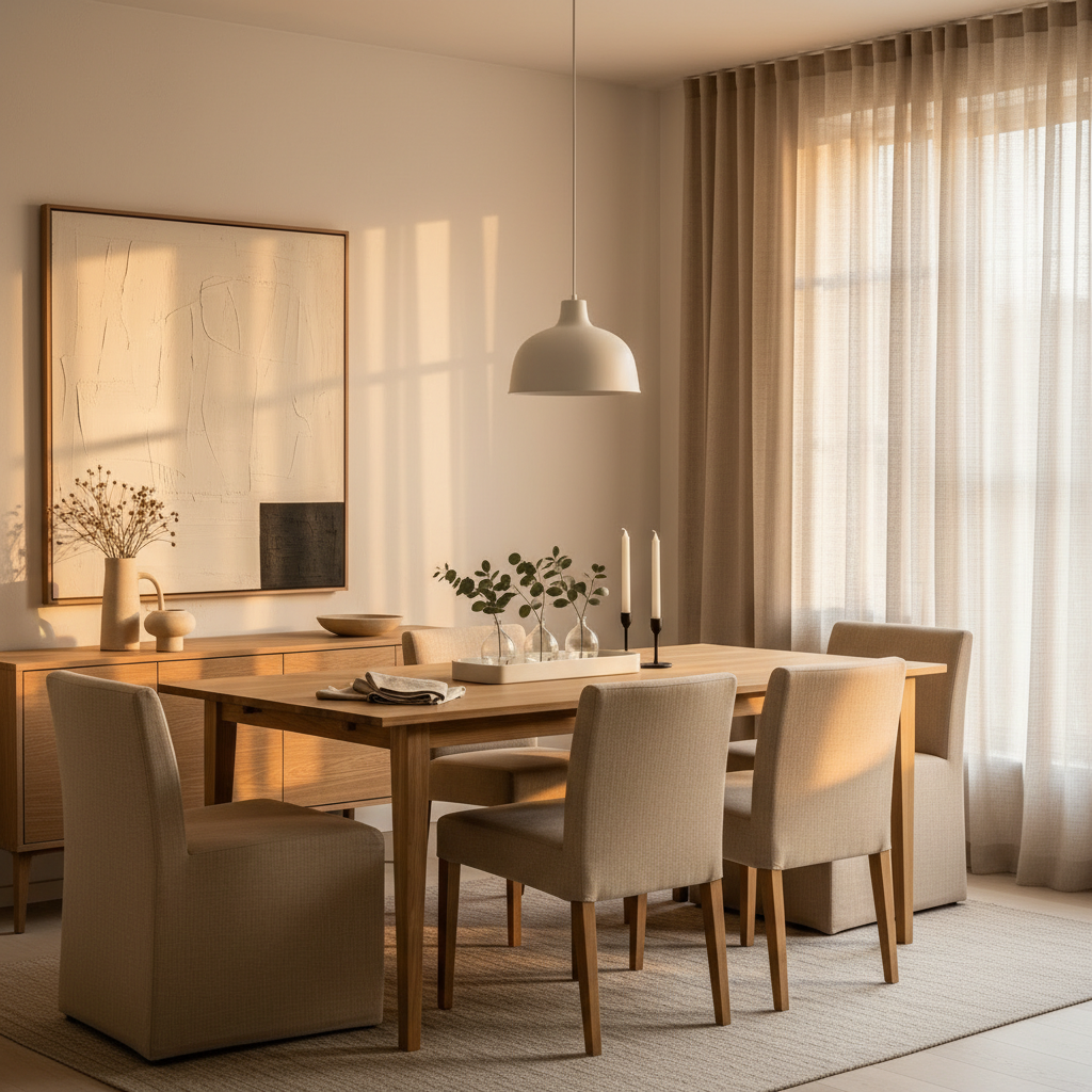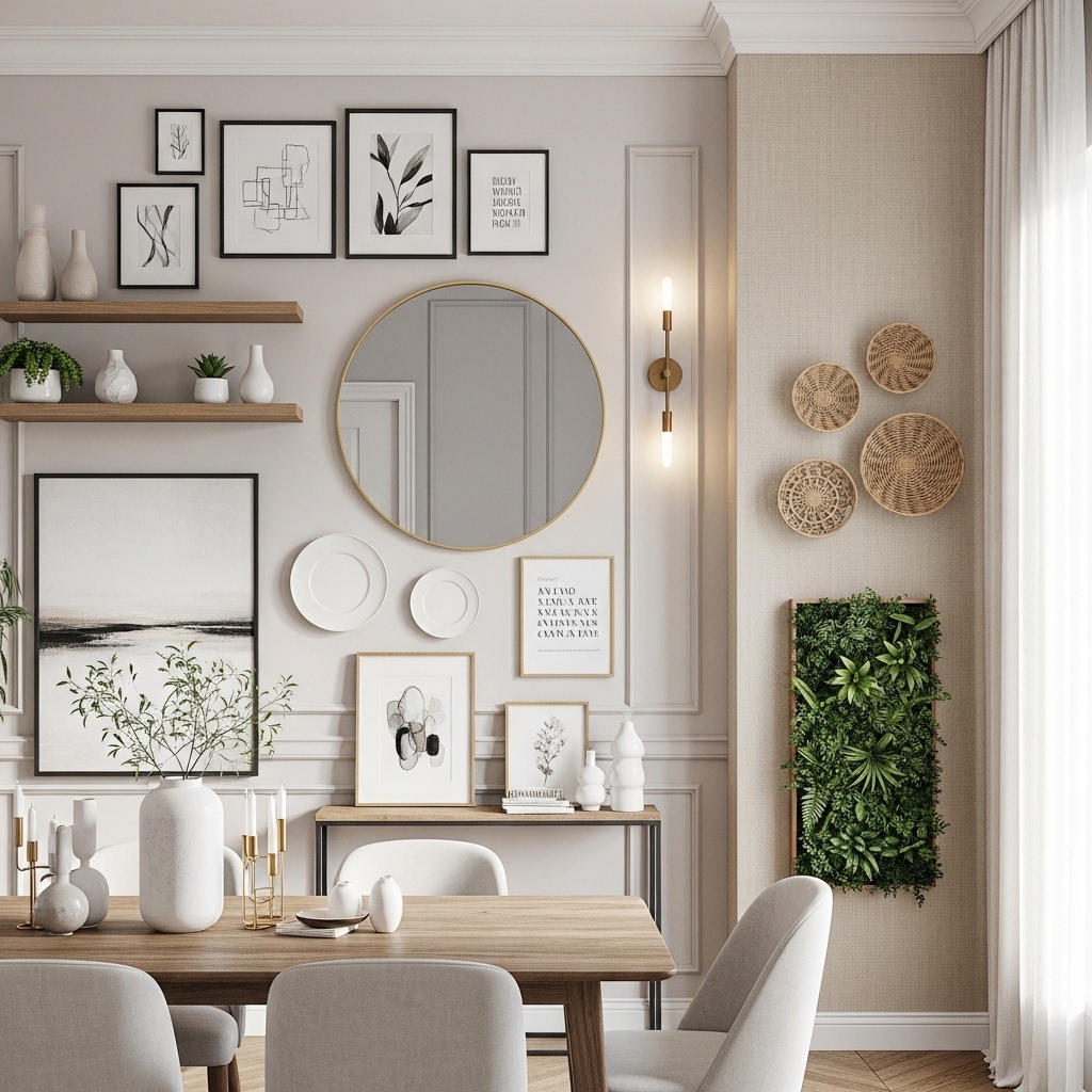
There’s a reason Scandinavian interior design has stayed relevant for decades while other trends burn bright and fade fast. It’s not just the whitewashed walls or the perfectly placed throw — it’s the underlying philosophy that a room should feel good to be in, not just look good in photographs. That distinction matters more in the dining room than anywhere else, because this is the space where you actually live: where breakfast happens in a rush, where long dinners spill into late evenings, where the table hosts both birthday cakes and homework. Getting it right means layering materials with intention, understanding how light moves through the room across the day, and knowing when to stop. The twelve ideas ahead cover every corner of the Scandinavian dining room — from walls and ceilings to textiles and table styling — with honest, practical advice rather than the kind that only works in staged photos. Take what applies, skip what doesn’t, and make it yours.
1. The Warm White Wall: Choosing the Right Off-White
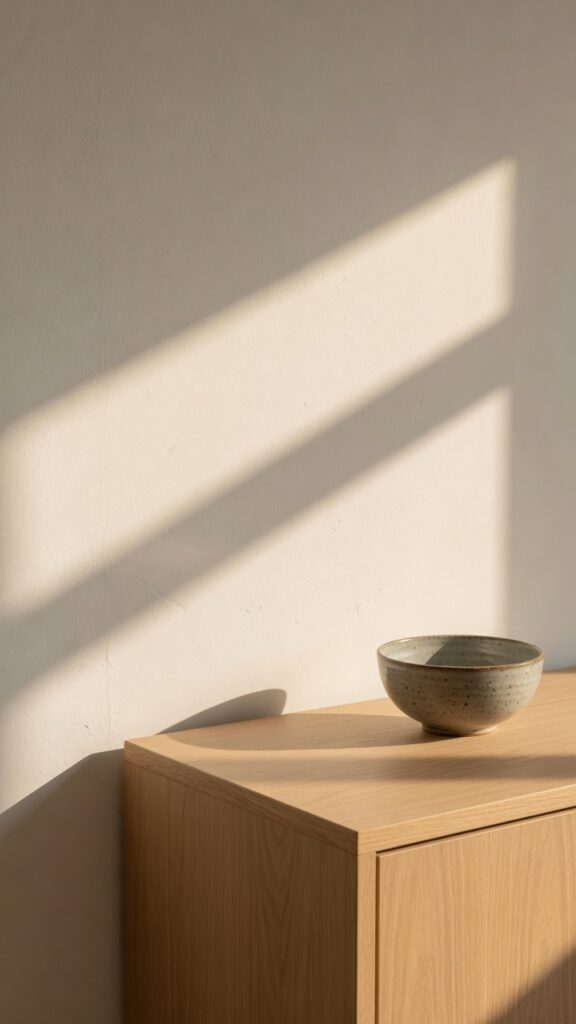
White is both the most obvious and the most misunderstood choice in Scandinavian design. The mistake most people make is reaching for a pure, cool, brilliant white — the kind that looks sharp in a showroom and reads grey and cold once you’re living with it under standard lighting. True Nordic interiors use off-whites with warmth baked in: chalky whites, linen whites, whites with the faintest hint of clay or stone.
Test your chosen white at different times of day in your actual room before committing. A north-facing dining room will make cool whites look distinctly blue by mid-afternoon — in that case, lean toward whites with a warm yellow or red undertone. South-facing rooms can handle slightly cooler whites without losing warmth. Always paint a large sample swatch (at least A3 size) and live with it for a weekend before buying full tins. One thing to watch: high-sheen finishes in white expose every imperfection on older walls. Stick with eggshell or matte for a more forgiving, Nordic-appropriate surface. If you hate repainting every couple of years, invest in a quality trade-grade paint from the start — the pigment density holds better over time. The right off-white doesn’t feel like a compromise. It feels like the room finally exhaled.
2. Low-Hung Pendant Lighting Over the Table
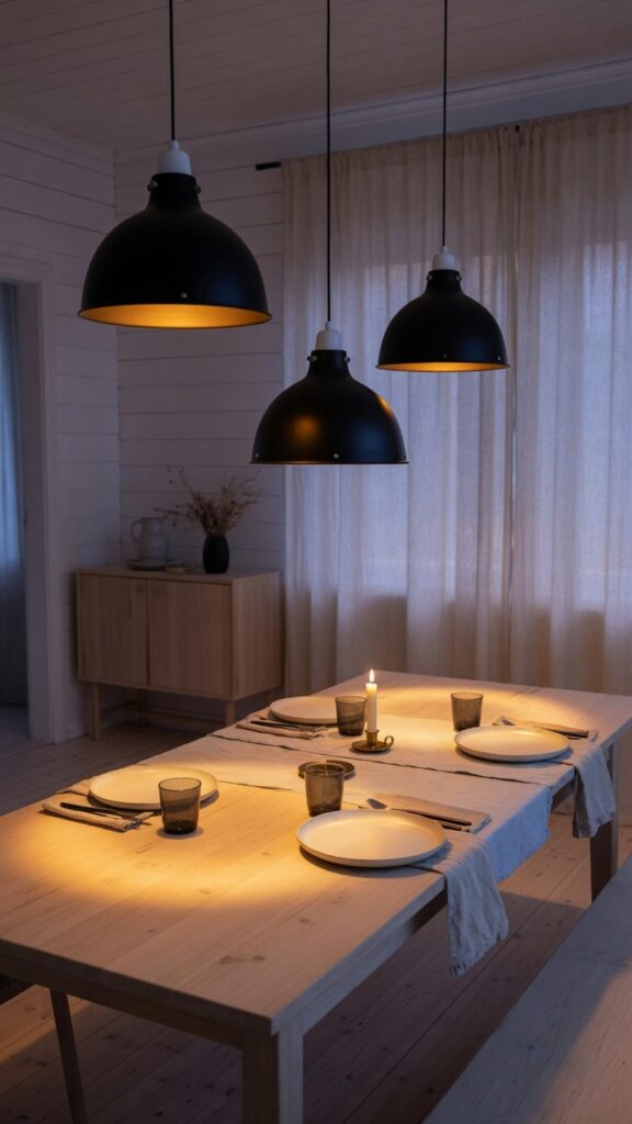
Lighting is the single element most underestimated in dining rooms, and Scandinavians seem to understand this instinctively. In countries where winter darkness stretches for months, layering light becomes less a stylistic choice and more a survival strategy. The pendant over the dining table is the cornerstone of that approach.
The rule is simple: hang your pendants low. Most people hang them too high, producing unflattering overhead light that flattens everything. A good starting point is 70–80cm from the table surface to the bottom of the shade. If your ceiling is particularly high, go even lower — it creates intimacy and draws people in. A single large pendant works beautifully on a round table. For a rectangular table, a cluster of three pendants at staggered heights is visually richer and more interesting than one central fixture. Choose shades in matte black, raw brass, or textured white ceramic — all three read as authentically Nordic without trying too hard. Avoid chrome and polished nickel, which pull toward a more contemporary hotel aesthetic. One constraint: very low ceilings (below 2.4m) make this trick awkward. In that case, a flush ceiling fixture supplemented by table and floor lamps will do more for the room than fighting the architecture.
3. The Long Oak Dining Table as the Room’s Anchor
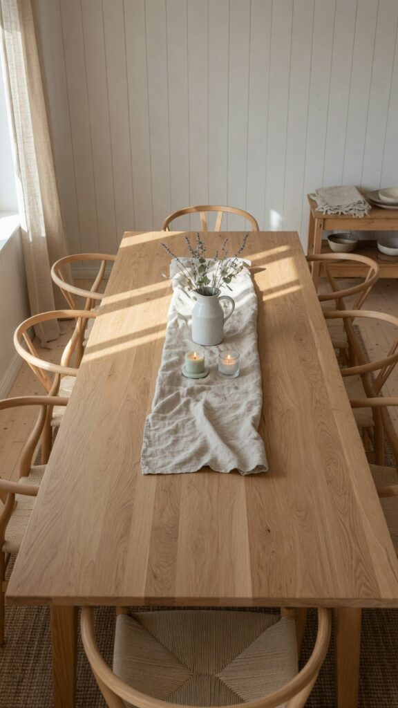
If there is one piece worth spending real money on in a Scandinavian dining room, it’s the table. Not because expensive tables are inherently better, but because solid wood — particularly oak — behaves differently from veneered or laminated alternatives. It develops a patina. It absorbs use, light, and time in a way that makes a room feel genuinely lived in rather than simply decorated.
Solid oak is the Nordic standard for good reason: it’s hard-wearing, available in beautiful grain patterns, and ages gracefully with minimal maintenance. A light oil finish keeps the wood looking natural and is easy to re-apply every year or two. Avoid heavy lacquer — it makes oak look plasticky under certain lighting and chips eventually, requiring professional refinishing. That said, oil finishes are less resistant to water rings and spills, so if you share the space with young children, consider a hard wax oil as a middle ground. In terms of proportion, the table should leave at least 90cm of clearance on all sides for comfortable movement. If your room is narrow, a bench on one side rather than chairs on both will save approximately 30cm of circulation space without compromising seating capacity. The table is not just furniture — it’s the room’s reason for being.
4. Wishbone Chairs and the Art of Mixing Seat Materials
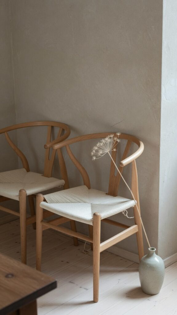
The wishbone chair — that elegant Y-backed design with a woven cord seat — is so associated with Scandinavian interiors that it risks becoming a cliché. But there’s a reason it keeps appearing: the proportions are genuinely exceptional and it sits comfortably at almost any table height. The key is in how you use it.
Rather than buying six identical chairs, consider mixing. Two chairs in natural beech with woven seats, two in a slightly darker stained oak, and two upholstered dining chairs at the heads of the table creates a collected, intentional feel that reads less like a furniture catalogue and more like a room assembled over time. If you’re going all-in on one chair style, vary the finishes subtly — not dramatically, but enough that the eye has somewhere to travel. Fabric seats on wishbone-style chairs are a great option for added comfort during long dinners, but be aware that upholstered versions are harder to clean and don’t suit homes with very young children quite as well as the classic cord seat. One thing to watch: some budget versions of this chair style are significantly lighter in weight, which means they shift and scrape across hard floors constantly. Check the weight before buying and add small felt pads to the feet regardless.
5. A Warm Clay or Stone Accent Wall
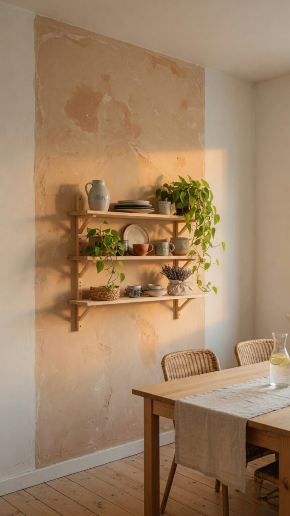
The all-white Scandinavian room has been so thoroughly replicated that introducing a single textured, coloured wall now feels genuinely fresh. The current direction in Nordic interiors is toward natural, mineral pigments — pale terracottas, dusty rose clays, sage greens, and warm stone greys. Not bold feature walls in jewel tones, but subtle shifts in colour that catch the light differently at different times of day.
Limewash or clay-based paint is the most authentic material choice here. Both have natural variation built in — no two patches look exactly the same — which gives the wall an organic, slightly imperfect quality that perfectly offsets the clean lines of Scandinavian furniture. If a full limewash project feels too permanent, clay paint from a standard tin applied with a stippling technique achieves a similar effect with far less commitment. For the dining room specifically, an accent wall works best on the wall your table sits against or the wall you face from the main seating position. Avoid doing the wall behind a large window — the wall disappears into backlight for most of the day and the effect is lost. This can feel loud in small rooms if the colour is too saturated, so always pull back one tone lighter than you think you need.
6. Linen Curtains That Puddle Slightly on the Floor
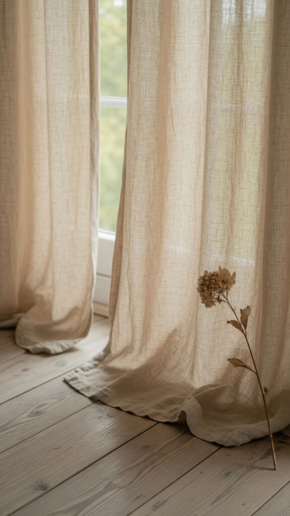
Curtains do more heavy lifting in Scandinavian dining rooms than most people realise. They soften acoustics, control light, add texture, and — when done right — make ceilings feel higher than they actually are. The trick is in the hanging.
Always mount curtain rods as close to the ceiling as the architecture allows, regardless of where the window actually sits. The visual line of fabric descending from ceiling to floor creates an illusion of height that no interior paint colour can replicate. Use linen over synthetic curtain fabrics without exception — linen diffuses light in a way that’s warmer and less flat than polyester, and it gets better with washing, developing a natural wrinkle that looks intentional rather than sloppy. Opt for eyelet or pinch pleat headers rather than tab-top, which reads too casual for a dining room. The puddle: allow just 3–5cm of extra fabric on the floor, not a dramatic trailing pool. It softens the hem without looking like a measuring mistake. One real constraint here — if you have cats or dogs, the floor puddle will become a fur trap and a chew target almost immediately. In that case, hem the curtains to just skim the floor cleanly and skip the puddle entirely.
7. A Statement Ceramic Collection on Open Shelving

Open shelving in a dining room is divisive — skip it entirely if you hate visual clutter or don’t have the discipline for occasional editing. But done well, a wall of curated ceramics is one of the most distinctly Scandinavian things you can do with a dining room wall.
The ceramics that work best here are handmade or hand-finished pieces in organic, muted tones. Think raw stoneware in warm whites and creams, sage green glazed bowls, terracotta pitchers with slightly uneven surfaces. Not precious collectibles — pieces that look like they were bought at a craft market over several years, because ideally they were. The shelving itself should be simple: white-oiled oak floating shelves or a simple ladder-style unit in the same wood as your dining table. Vary the heights and groupings rather than spreading items evenly across the shelf — three pieces clustered together, then breathing room, then a single taller piece. Include at least one living or dried botanical element on the shelf. It softens the composition and prevents it from reading as a shop display. One designer rule worth following: if you can’t keep the shelf edited to items you genuinely like and use, closed-door cabinetry will always look cleaner and require less maintenance.
8. Layered Rugs Under the Dining Table
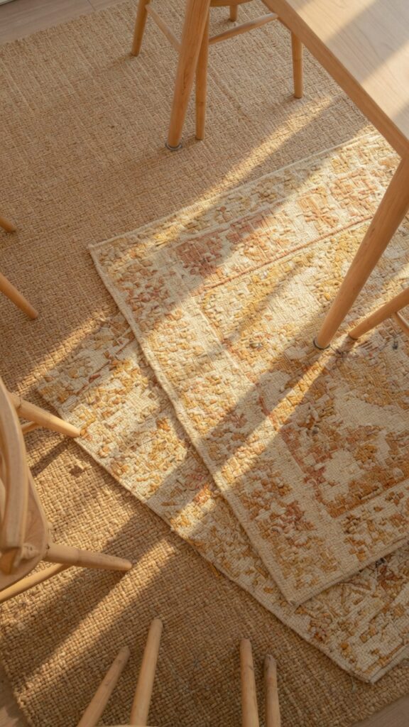
A rug under a dining table used to feel impractical. But the Scandinavian approach makes a strong case for it — particularly in open-plan spaces where the dining area needs to be visually anchored and separated from the surrounding room. The key is in choosing the right materials and sizing generously.
The rug must be large enough that all chair legs remain on it even when chairs are pulled out — the most common mistake is undersizing. As a starting point, add at least 60cm to each side of your table footprint and round up to the nearest available size. Flat-weave rugs are the most practical under dining tables because food and drink can be dealt with quickly and the low pile doesn’t catch chair legs. Jute and cotton flat weaves are both excellent choices. Layering a smaller, more decorative hand-knotted rug on top of a larger, simpler base adds visual depth and a collected quality that a single rug rarely achieves. For the top rug, wool is worth the investment — it’s naturally stain-resistant to a degree, and the texture holds up beautifully over years of use. One honest watch-out: rugs and dining rooms are high-maintenance companions. If the idea of regular vacuuming and occasional professional cleaning doesn’t suit your lifestyle, a beautiful stone or hardwood floor left bare is equally Nordic and far more practical.
9. Candles as the Primary Evening Light Source
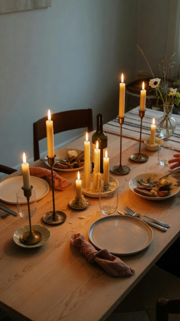
No piece of Scandinavian dining room advice is more consistently underestimated than this: candles are not decorative accessories. In Nordic culture, they are a primary light source for evening gatherings, and the rooms are styled around that assumption.
The practical implication is that your dining room needs to function beautifully in candlelight. That means walls in warm, reflective tones (this is why that chalky off-white matters), minimal dark surfaces that absorb rather than reflect light, and furniture finishes that glow under warm illumination — oiled oak does this exceptionally well, while dark lacquered wood goes flat. Use beeswax or soy candles over paraffin — they burn longer, drip less, and produce a warmer, less acrid light. Vary the heights dramatically: a cluster of three taper candles in a brass holder alongside two low votive candles in ceramic cups creates movement and visual interest that a single candle can’t. If you’re not a fan of the dripping-wax maintenance that comes with tapers, pillar candles on broad ceramic plates with a small amount of sand underneath to catch drips are equally beautiful and significantly less messy. The effect of a properly candlelit Scandinavian dining room in the evening is genuinely difficult to replicate with any electric lighting setup.
10. Bringing Botanicals In: Dried vs. Live
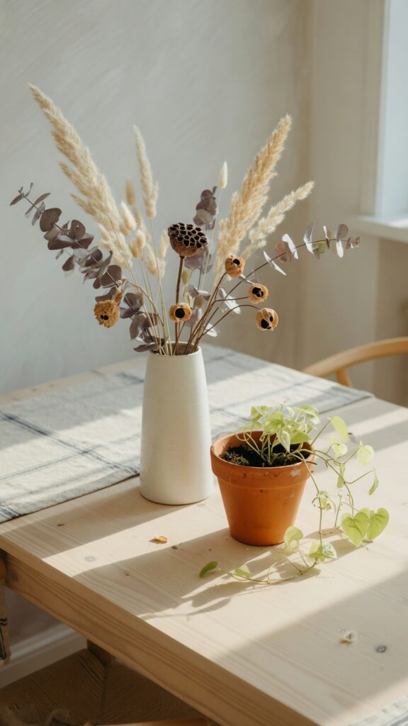
The botanical moment in Scandinavian dining rooms goes well beyond a vase of flowers on the table, and understanding the difference between dried and live plant material will significantly affect the feeling of the space. Both have a role — but they’re not interchangeable.
Dried botanicals — pampas grass, bunny tail grass, preserved lunaria, dried magnolia leaves — bring texture, softness, and permanence. They’re ideal for the dining room because they require zero maintenance and look equally good in winter as in spring. Arrange them loosely in tall ceramic or glass vases without overthinking symmetry. A single, generous bunch in one large vessel consistently looks better than small clusters scattered across a surface. Live plants bring colour and a sense of life that dried material simply cannot replicate. A trailing pothos or a small olive tree in a terracotta pot on a sideboard introduce the kind of organic irregularity that makes a room feel genuinely inhabited. One thing to watch: large flowering plants with strong fragrance can be overwhelming at the dining table where food aromas matter. Keep fragrant florals on a sideboard or shelf rather than centred on the table itself. The most distinctly Nordic arrangement often combines both — dried grass as height, a small live plant as grounding detail.
11. The Sideboard: Functional Sculpture
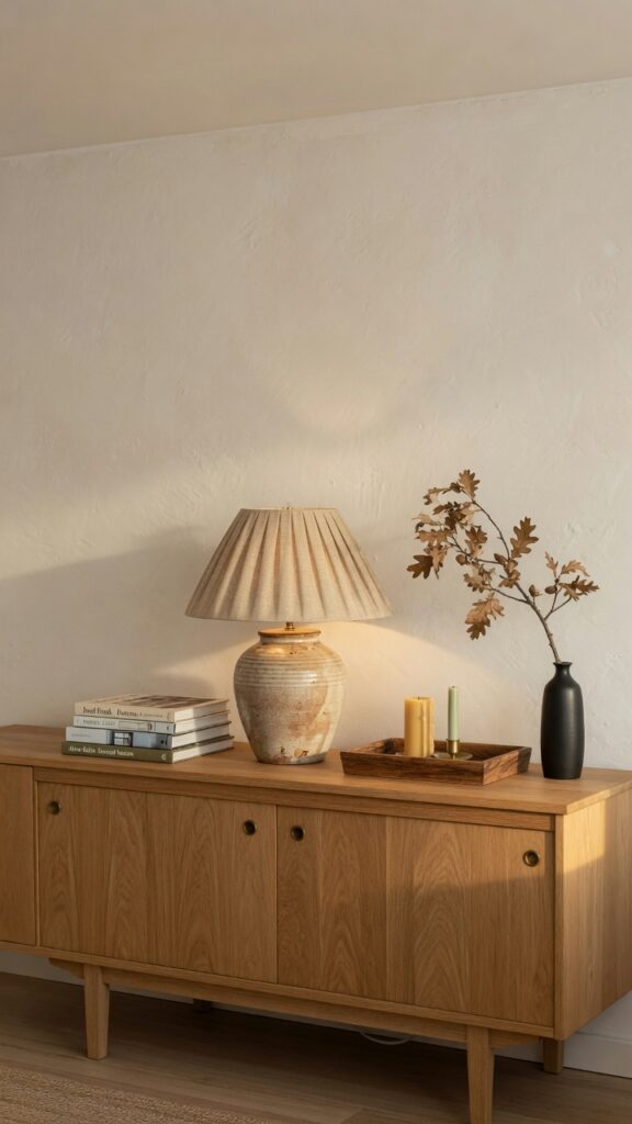
The sideboard is to a Scandinavian dining room what the sofa table is to a living room: a practical surface that doubles as a styling opportunity, and one that reveals a lot about the taste and discipline of whoever lives in the room. Get it right and the whole space gains coherence. Get it wrong and it becomes a visual dumping ground.
For the piece itself, look for solid wood construction with clean, tapered legs — classic Scandinavian mid-century proportions. The low, long silhouette (around 80–85cm high and at least 140cm wide for a standard dining room) keeps the visual weight close to the floor, making ceilings feel taller by contrast. Avoid sideboards with ornate hardware; brushed brass or simple black bar handles are the Nordic standard. On the surface, restrict styling to five or fewer items and leave negative space deliberately. A large lamp with a linen shade provides practical ambient lighting for the room. A tray corrals smaller objects — a candle or two, a small ceramic — and prevents the surface from looking scattered. One or two books provide visual weight and ground the arrangement. Here’s the trick: treat the sideboard’s surface like a shelf that gets edited seasonally, swapping in different ceramics or botanicals rather than letting the same arrangement sit for months. Freshness doesn’t require buying new things.
12. Table Linens and the Quiet Power of Natural Textiles
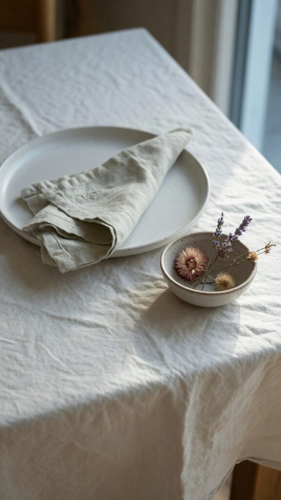
The textile layer on and around the dining table is where Scandinavian interiors make their most tactile argument. This is not about pristine, ironed table settings — it’s about the considered layering of natural materials that invite touch and signal ease.
Start with a linen tablecloth as your base. Stonewashed linen is the single best investment in this category: it’s pre-softened, it looks intentionally relaxed rather than merely wrinkled, and it improves with every wash. Skip the bright white option in favour of natural, undyed linen or a warm oatmeal tone — both age gracefully. Linen napkins in the same or a complementary tone are a small but meaningful detail, and they replace paper napkins entirely for everyday dining without any effort. If a full tablecloth feels too formal for your daily routine, a linen table runner down the centre of the table achieves the same material warmth in a more relaxed format. For winter tablescapes, layer a thin wool blanket or a small sheepskin over one end of the table or a chair back — it reads warm and casual and adds a very specific kind of hygge-adjacent comfort that polyester cannot approximate. One constraint: linen wrinkles. If that bothers you, a cotton-linen blend will hold its shape slightly better while still feeling natural. But in an honest Scandinavian dining room, the wrinkle is the point.
There’s something worth naming about what all twelve of these ideas share: they prioritise material honesty over surface performance. The oak should look like oak, the linen should feel like linen, the wall should show the texture of its paint. Scandinavian dining room design is not really a style in the way that maximalism or coastal design are styles — it’s more of a value system, one that rewards restraint and patience over impulse and trend-chasing. The rooms that get it right are rarely finished in a weekend. They accumulate slowly: a good table first, chairs that earn their place, a rug chosen after living with the light for a season. If you leave today with only one idea, make it this — buy fewer things, but choose them as if they’ll be with you for twenty years. That’s the Scandinavian approach, and it works.