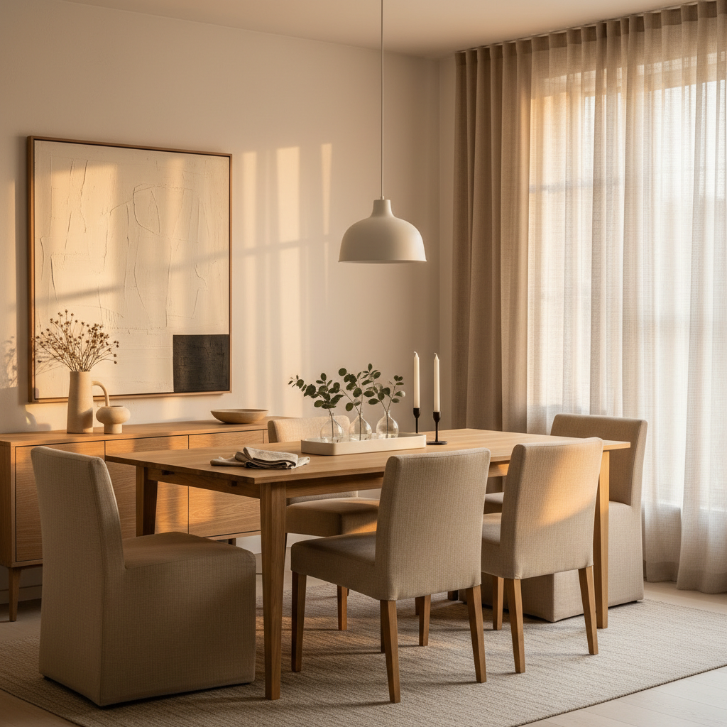
Transitional design has quietly become the way most of us actually want to live. It’s the in-between zone where modern restraint meets the warmth of traditional rooms, and honestly, it’s the easiest style to live with long-term. You get the clean lines without the cold gallery feel, and the soulful textures without the cluttered grandma-house energy. Done right, it ages beautifully and forgives a lot of design sins.
What makes transitional rooms feel effortless isn’t a strict formula. It’s a willingness to mix old and new, hard and soft, matte and glossy, and trust the contrast itself becomes the style. The rooms below aren’t matchy, and they aren’t trying too hard. They’re built on small, smart choices anyone can borrow, whether you own your place or you’re working around a landlord’s beige walls. Pull what works for your space, your light, and the way you actually live.
1. Anchor the Room With a Curved Neutral Sofa
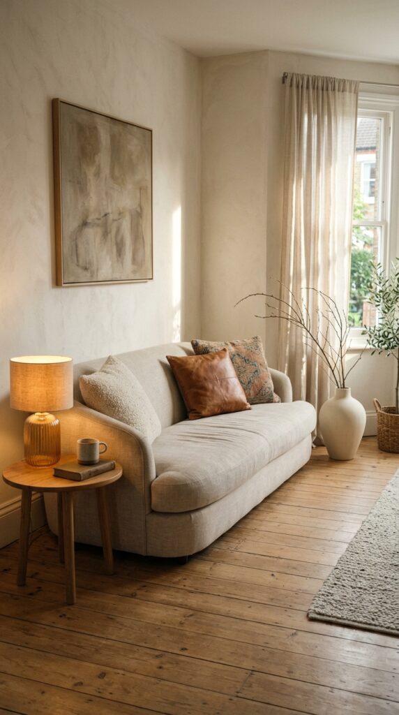
A curved neutral sofa is the single fastest way to make a room feel both modern and warm without committing to one camp. The softness of the silhouette does the heavy lifting, so the rest of your space can stay quiet. Look for a tight back and a low arm if you want it to read more contemporary, or a deeper roll if you want a traditional nod.
Stick to a tonal upholstery, oatmeal, bone, soft taupe, putty, and let texture do the talking. Linen reads relaxed, performance velvet feels dressier, and boucle skews trend-forward (so use it knowingly).
One watch-out: curved sofas eat floor space. If your room is under 12 feet wide, measure twice and consider a loveseat-scale version. The shape needs breathing room or the whole effect collapses.
The takeaway: shape over color, every time.
2. Layer a Vintage Rug Over Wide-Plank Oak
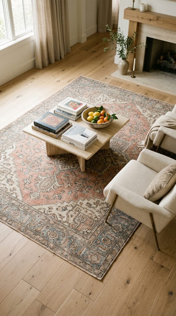
Nothing softens a clean modern room faster than a worn vintage rug. The slightly faded colors, irregular wear, and hand-knotted texture introduce the kind of soul you genuinely cannot buy new, no matter what the catalog says. It’s the secret ingredient in almost every transitional room you’ve quietly admired on Pinterest.
Go larger than you think. A rug that floats in the middle of the room, with bare floor swimming around it, will always look like a mistake. Front legs of every major furniture piece should land on the rug, minimum.
The trade-off: real vintage rugs cost real money, and the cheaper machine-made versions often look plasticky in person. If budget is tight, hunt estate sales, Facebook Marketplace, or a local rug dealer’s odd-size pile, that’s where the bargains hide.
Skip this if you have big shedding dogs and zero patience for a vacuum.
3. Mix Matte Black With Aged Brass
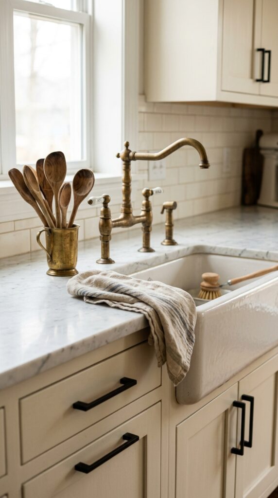
Mixing metals is the move, but you need a clear lead and a clear supporter. Matte black grounds a room and adds graphic punch. Aged brass adds warmth and a slightly antique whisper. Together they read intentional rather than indecisive.
A simple rule: pick one metal as primary (usually 70 percent of the visible hardware) and the other as the accent. Black often wins on cabinet pulls, faucets, and lighting frames. Brass shows up beautifully in sconces, drawer knobs, latches, and small accessories.
Stay away from polished, mirror-shiny brass unless you genuinely love eighties glam. Aged, brushed, or unlacquered finishes patina over time and look more grown-up.
The watch-out: chrome and nickel rarely play nicely with this combo. If you’ve already got chrome fixtures you can’t change, lean harder on warm wood and skip the brass entirely.
The mix is the whole point, just don’t make it a competition.
4. Use Limewash Paint for Walls With Soul
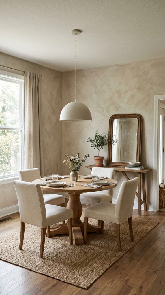
Flat paint walls have their place, but limewash gives you something flat paint never can: gentle movement and depth that shifts with the light. It looks plastered and old-world without the cost of actual plaster, and it’s surprisingly DIY-friendly if you’re willing to commit a weekend.
Stick to soft, complex neutrals, warm putty, dusty bone, mushroom, pale clay. Bright whites get chalky in limewash, and saturated colors can read uneven in a bad way.
Here’s the trick: apply it with a wide masonry brush in loose crosshatched strokes, and don’t try to be perfect. The whole charm is in the variation. Two coats are usually enough.
The constraint: limewash needs porous surfaces or a mineral primer. It will not adhere to glossy or previously latex-painted walls without prep.
The takeaway: it’s the cheapest way to fake old-money walls.
5. Style a Sculptural Floor Lamp as Functional Art
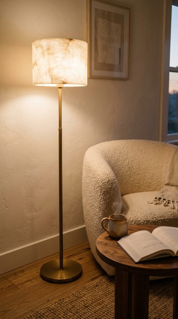
Most rooms are dramatically under-lit because we rely on a single ceiling fixture and call it done. Adding a sculptural floor lamp instantly changes the temperature of a space, both literally and visually. It gives you a third light source at eye level, which is where rooms come alive.
Look for shapes that feel like objects first and lamps second, alabaster column, rounded paper lantern, slim brass arc, ceramic gourd base. Skip anything with a generic drum shade and a black metal pole. You can do better at the same price.
Always put it on a warm-white bulb, ideally 2700K or below, on a dimmer. Cool white light kills the entire vibe.
One thing to watch: scale. A spindly lamp next to a deep sectional looks lost. The lamp should hold its own visually against the largest piece nearby.
Light is decor. Treat it that way.
6. Build a Quiet Gallery Wall With Mixed Frames
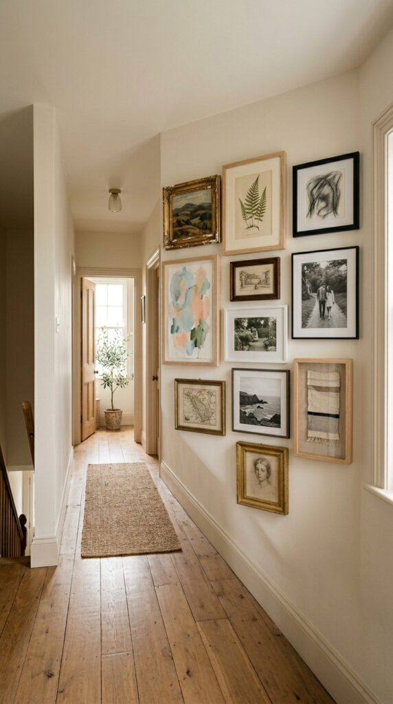
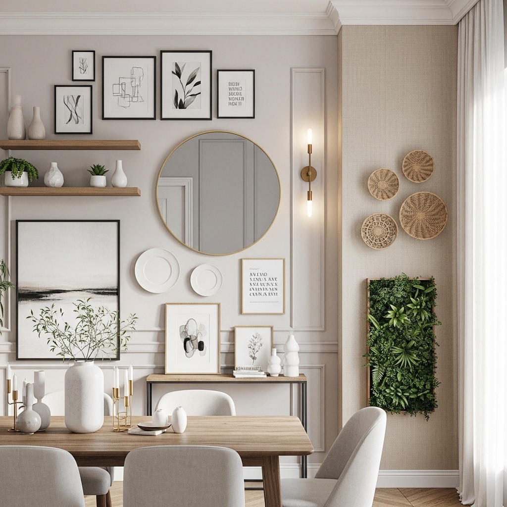
A gallery wall fails when everything matches too tightly or clashes too hard. The transitional version splits the difference: cohesive in palette, varied in frame and subject. Think of it as a curated mantelpiece, just hung up.
Stick to a loose color story, soft neutrals, faded landscapes, a single hit of black, and let the frames be the texture. Mix gold leaf with raw oak with thin matte black, but keep at least two of each repeating across the grouping so it feels rhythmic.
Lay everything on the floor first. Trace each piece on craft paper, tape the templates to the wall, and live with it for a day before nailing.
The watch-out: too many small pieces look busy. Anchor the wall with one larger piece, around 24 by 36 inches or bigger, and let the smaller works orbit it.
Restraint is what makes it look collected, not crowded.
7. Bring in a Burl Wood or Stone Coffee Table
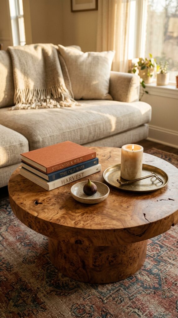
The coffee table is the most-touched, most-seen piece in your living room, and a generic rectangular one in black metal and glass will quietly drag the whole room down. Swap it for something with material presence, burl wood, travertine, honed marble, or solid oak with a sculptural base.
Round shapes work harder in transitional rooms because they soften all the linear furniture around them. They also navigate better in tight layouts where you walk around the table.
Keep the styling honest. A stack of two or three books, one small organic object, a tray, and something living (a low plant or a bowl of fruit). That’s it. Resist the urge to fill every inch.
The constraint: stone tables are heavy. If you’re upstairs in an old building or you move often, factor that in before falling in love.
One real piece beats four trendy ones.
8. Layer Linen, Boucle, and Leather in the Same Room
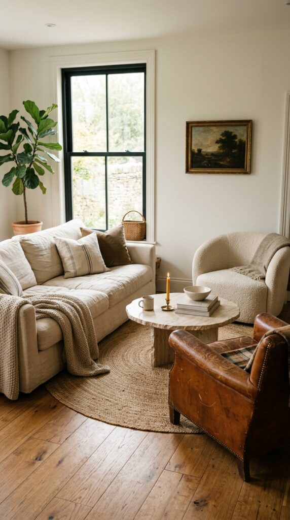
If your room feels flat in photos, the problem is almost always texture, not color. Three textiles working together, linen, boucle, and leather, give you the full tonal range from crisp to fluffy to broken-in. It’s the texture trio that quietly does the most.
Use linen on the largest upholstered piece for that easy, slightly rumpled look. Bring in boucle on a single accent chair or pillow, just enough to feel current without dating the room. Add leather, ideally vintage or distressed, on a smaller chair, ottoman, or bench to ground the softness.
Skip this combo if you have toddlers and white linen at the same time. You will lose. Go for a washable performance linen or a darker tone instead.
The watch-out: too much boucle reads trendy and a little fussy. Treat it like seasoning.
Texture is the new color story.
9. Soften Hard Architecture With Floor-to-Ceiling Drapes
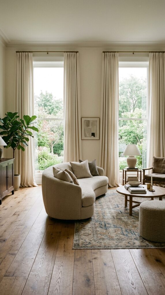
Short curtains hung at window-frame height are the fastest way to make a room look smaller and cheaper than it is. Hang your rods almost to the ceiling, and let the panels skim, kiss, or lightly puddle on the floor. The illusion of height changes the entire room.
Linen is the transitional default for a reason. It moves, it filters light beautifully, and it always looks slightly undone in a way that feels expensive. Stick to ivory, oatmeal, soft sand, or a barely-there pale grey.
Order panels at least 2.5 times the width of your window so they look full when closed. Skinny flat panels read like rentals, even in a million-dollar house.
The constraint: real linen wrinkles, that’s the whole point. If wrinkles stress you out, look at a linen-cotton blend or skip this look entirely.
Long curtains, high rods, full panels. Every time.
10. Add One Antique Piece to Every Room
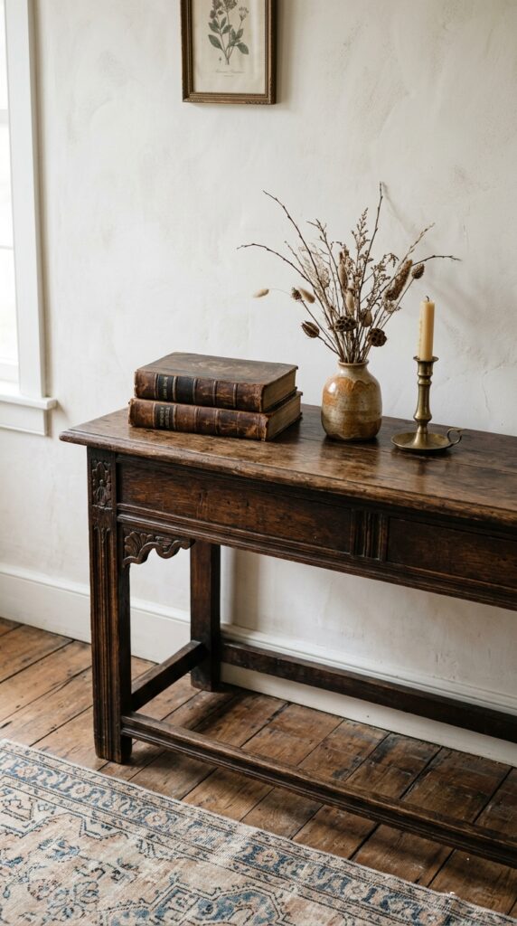
The single biggest mistake in modern rooms is that everything was made in the last five years. You can feel it the moment you walk in, even if you can’t name it. One real antique, even a small one, changes the room’s age and gives it a sense of history that new pieces can’t fake.
It doesn’t have to be precious. A scratched-up wooden stool, a chippy gilt mirror, an old caned chair, a brass candlestick from a flea market. Look for honest wear, dents, patina, slight wobble, that’s the proof.
Place it where the eye lands. Beside a clean-lined sofa, on top of a modern dresser, in the corner of a contemporary bathroom. The contrast is everything.
The watch-out: don’t let the antique disappear into a roomful of other antiques. It needs modern company to read intentional.
One old thing per room. Rule of thumb.
11. Renter-Friendly Trick: Tall Plants and Woven Baskets
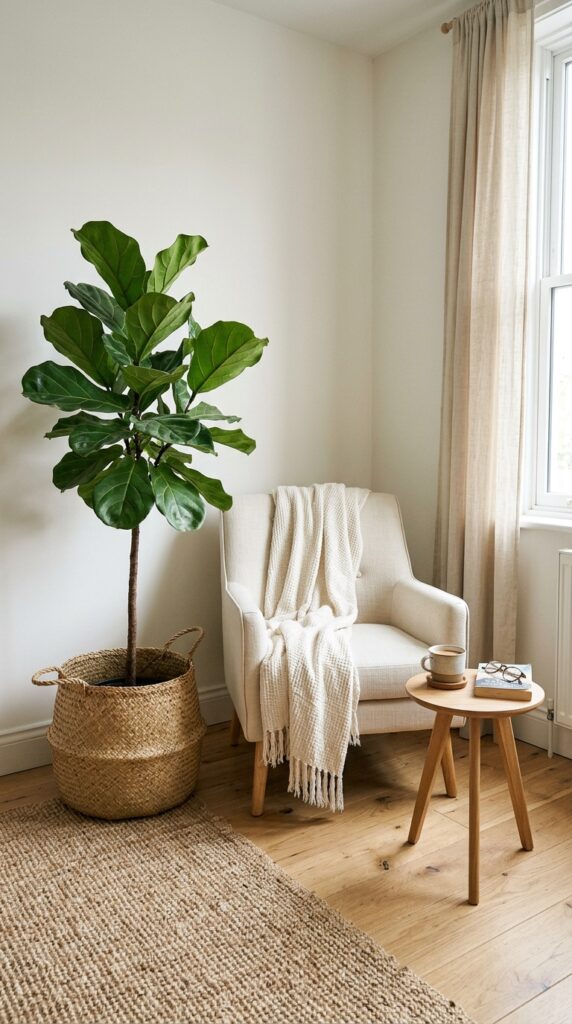
Renters get a tougher hand in design because most of the easy upgrades, paint, hardware, lighting, are off the table. The cheat code is biomass and woven texture. A genuinely tall plant, six feet or more, fills a corner the way a piece of architecture would, but you can take it with you.
Skip the plastic pots. Drop the nursery container directly into a woven seagrass, jute, or rattan basket. The instant upgrade in warmth is wild for the price.
Go for plants with structure: fiddle-leaf fig, olive tree, kentia palm, bird of paradise. Spindly trailing plants don’t carry the same architectural weight in a corner.
The watch-out: most tall plants need real light. If your rental is a north-facing cave, get a high-quality faux. Modern faux trees have come a very long way and look honest in person.
Big plants. Real baskets. Done.
12. End the Day With a Layered Bedroom in Tonal Neutrals
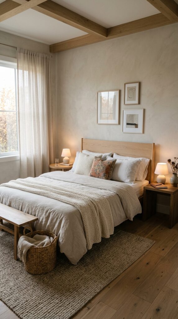
A transitional bedroom should feel like a long exhale. Tonal neutrals, oatmeal, bone, putty, soft sand, do the work because they let texture, not color, set the mood. The whole point is calm.
Layer the bed in three weights: a flat woven duvet or quilt as the base, a chunky knit or waffle throw at the foot, and mixed pillows in different textures (linen, boucle, a vintage cushion or two). Mismatched bedside tables look more collected than a perfectly symmetrical pair.
Put both bedside lamps on dimmers and use warm bulbs. Overhead lights have no business being on after 8pm in a bedroom.
The constraint: all-white bedding looks gorgeous and photographs beautifully, but it’s a commitment. If you’re not the type to wash and iron, lean into oatmeal or natural undyed linen, it hides life.
Quiet wins. Make the bedroom the quietest room you have.
Transitional design works because it doesn’t ask you to commit to a single look forever. It’s flexible, forgiving, and built on real materials and honest contrast, the kind of choices that age into your home rather than out of it. The rooms that feel effortless almost always share the same DNA: tonal neutrals, mixed metals, one or two antiques, generous textiles, and lighting that flatters the space at every hour. None of this requires a renovation or a designer on retainer. Most of it can happen one weekend, one swap, one well-chosen lamp at a time.
If you take one thing from this article, make it this: stop matching, start mixing. Buy fewer things, but buy ones with weight, texture, and a little history. Let your rooms grow slowly, the way the best ones always have. Bookmark this page, come back when you’re stuck, and treat it as a permission slip to trust your own taste. We’d rather you leave with one idea you’ll actually use than ten you’ll forget by tomorrow. That’s the whole point of decorating well: a home that finally feels like yours.