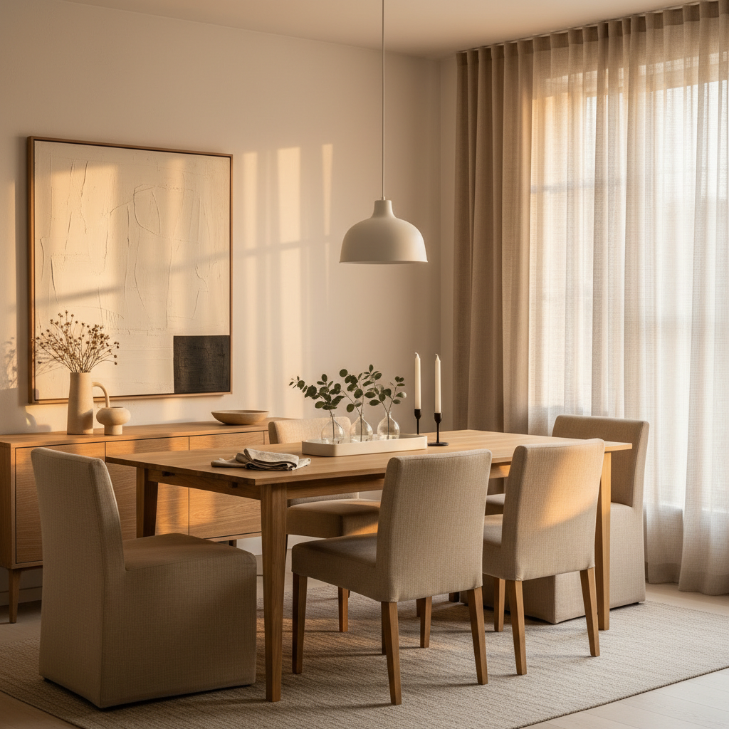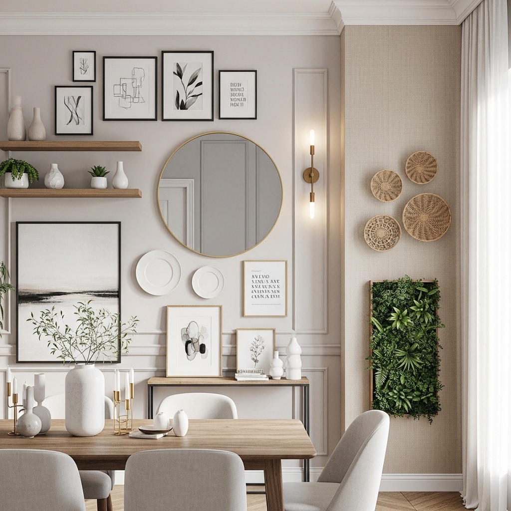
Greige gets a bad rap. People hear “neutral” and picture a builder-grade rental from 2008, but warm greige — the version that leans into honey and clay rather than concrete grey — is genuinely one of the most flattering wall colors you can pick. It softens harsh light, makes wood furniture sing, and plays well with almost every textile in your house. The trick is knowing how to use it without ending up with a flat, lifeless box.
I’ve painted a lot of rooms warm greige over the years, helped friends pick swatches, and watched it fail spectacularly when paired with the wrong undertones. So this isn’t a swatch dump. It’s twelve specific, room-by-room ways to use warm greige that actually look elevated — plus the small material and lighting details that make the difference between “rental beige” and “this looks expensive.”
1. The Plaster-Effect Living Room Wall
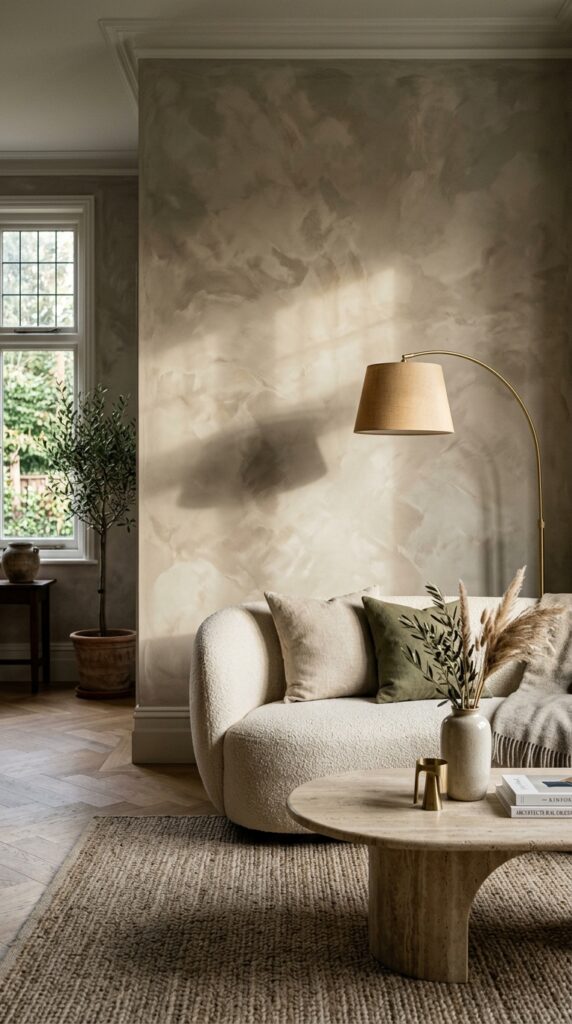
Limewash is having a moment for a reason — it gives warm greige actual depth instead of leaving it flat and dead on the wall. The cloudy, slightly uneven finish reads expensive even in a small room, and it photographs beautifully. Pick a greige with a pinkish or honey undertone for limewash; cooler greys turn dusty and sad in this finish. Apply it in two thin cross-hatched coats and don’t try to make it perfectly even — the imperfection is the whole point. Pair it with one piece of curved furniture and one piece of stone (travertine, marble, even a chunky ceramic). Watch out: limewash chalks slightly and isn’t great in high-traffic hallways or behind a sofa where shoulders rub. Save it for a feature wall you’ll actually look at. The finish does the heavy lifting — your styling can stay minimal.
2. Greige Kitchen Cabinets With Brass Hardware
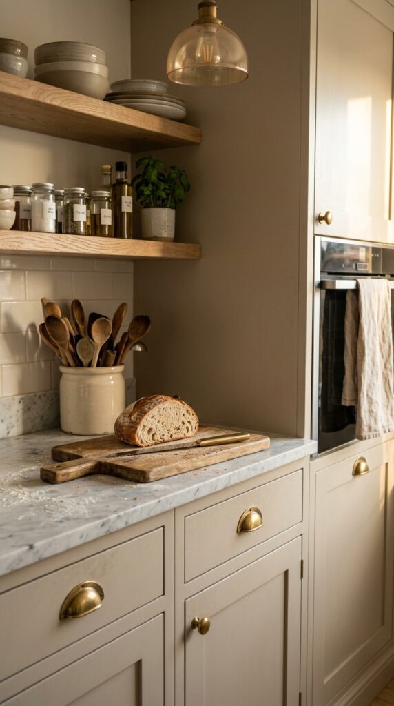
White kitchens are exhausting. Warm greige cabinets give you the same light, airy feeling without the constant smudge anxiety. The key is committing to undertone: a greige with green or honey base looks intentional with brass and wood, while a pink-leaning greige can fight your countertop. Test a sample on actual cabinet doors, not just a wall — paint reads differently on vertical millwork under task lighting. Pair greige lowers with either pale oak or off-white uppers to keep the space from going cave-like. Unlacquered brass hardware is the move if you can stomach the patina; polished chrome will make the whole thing feel cold. One thing to watch: avoid high-gloss finishes on greige cabinets. They bounce light weirdly and exaggerate every brush mark. Satin or eggshell, every time. The result feels like a kitchen that’s been loved for a decade — in the best way.
3. A Bedroom Drenched In Greige (Walls, Trim, Ceiling)
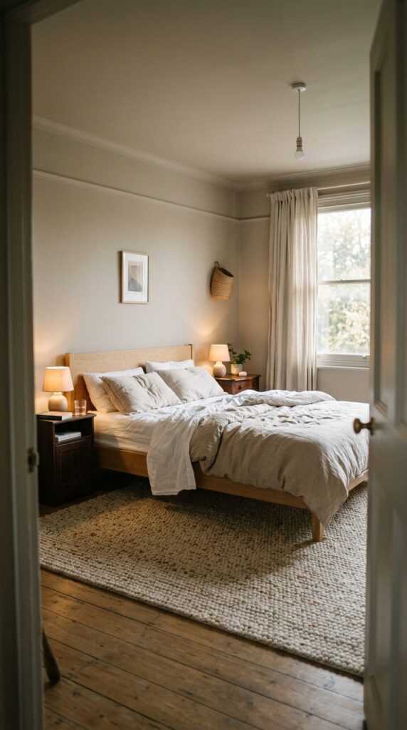
Color drenching — painting walls, trim, and ceiling the same shade — is the move that turns a basic bedroom into something hotel-quality. With warm greige, the effect is especially good because the color is soft enough to feel restful but warm enough to avoid the institutional feeling you get with all-white. Skip the accent wall instinct here. The whole point is the seamless cocoon. Use the same paint in eggshell on walls and satin on trim if you want subtle contrast without breaking the spell. If your bedroom faces north and gets cold blue light, lean into a greige with strong honey undertones to compensate. The constraint: this only works if your furniture has personality. Drenched neutral rooms need texture — chunky wool, linen, slubby cotton, real wood. Without it, you’ve just made a beige box. Done right, you’ll never want to leave.
4. Greige Built-Ins For The Quiet Library Look
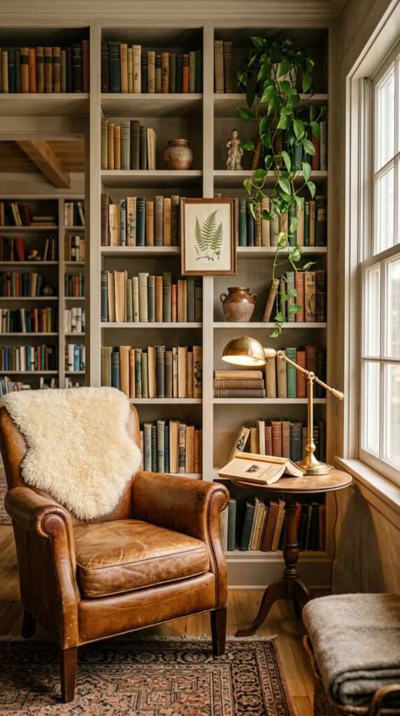
White bookshelves make every book look like it’s screaming for attention. Greige shelves do the opposite — they let your books and objects breathe. This is a small change with an outsized effect, and it’s surprisingly cheap if you already have built-ins. The styling rule: don’t fill every shelf to the brim. Leave roughly 30% breathing room and stack some books horizontally to break up the verticals. Mix in three or four sculptural objects per shelf — a ceramic vessel, a small artwork leaned against the back, a stack of vintage magazines. Keep the object palette tight (creams, browns, terracottas) to avoid visual chaos. Renter caveat: if you can’t paint built-ins, use removable shelf liner in a greige tone for the back panels only. The trick is creating depth, not perfection. Your living room suddenly has gravity.
5. A Greige Hallway With Gallery Wall
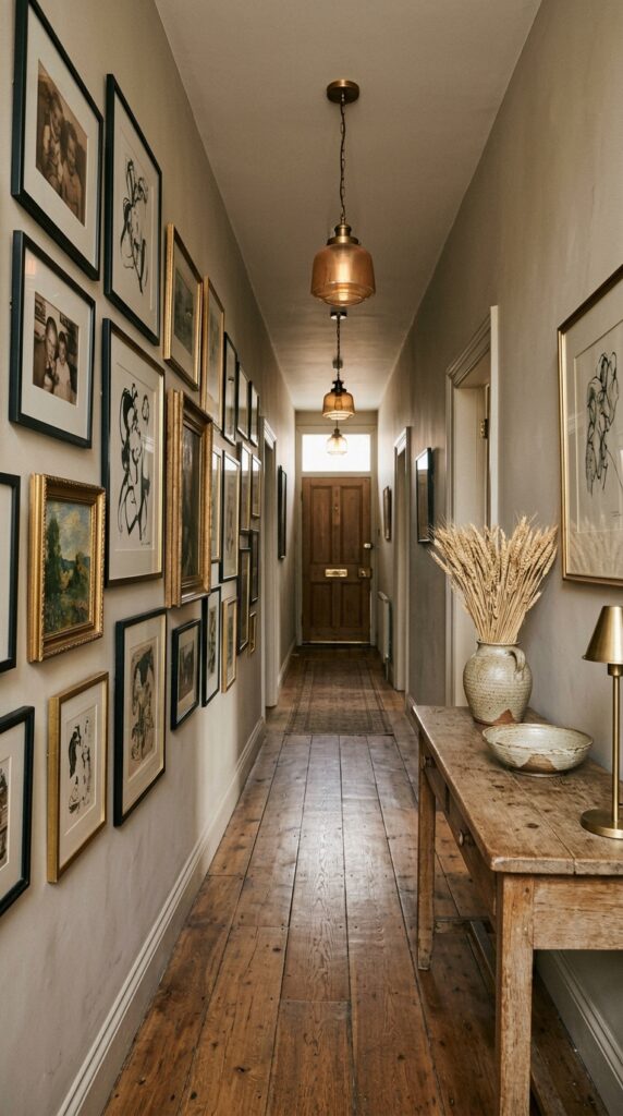
Hallways are usually afterthoughts, which is exactly why they’re the easiest place to look like you know what you’re doing. Greige walls in a hallway do something specific: they make art frames pop without the harsh contrast of white. Black frames look intentional, brass frames look luxe, and even your collection of mismatched yard-sale finds suddenly looks curated. Hang the gallery wall tighter than you think — frames should sit 2 to 3 inches apart maximum. Anchor it around eye level for the average person walking through, not standing still. One thing to watch: don’t go matte if you have kids or dogs in the house. Hallway walls take abuse, and matte greige scuffs visibly. Eggshell is the sweet spot. Add a runner if you have hard floors — it muffles sound and adds the textile layer the space needs. A neglected hallway becomes the moment.
6. The Greige And Black Bathroom
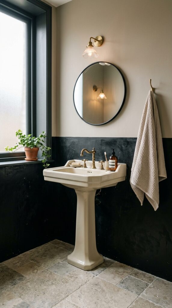
Powder rooms are the place to be slightly braver. Pairing warm greige walls with a black lower wainscot, black tile, or black plaster creates contrast that feels grown-up without going full goth. The greige softens what would otherwise be a stark scheme, and the warmth keeps the room from feeling like a hotel chain bathroom. Brass fixtures are non-negotiable here — chrome flattens the whole palette. If you’re working with a tiny powder room, only do the black on a lower third of the wall; full black walls in a small bath read like a closet. Add one piece of softness: a waffle towel, a linen shower curtain, a small rug. The watch-out: don’t use flat paint in a bathroom, ever. Steam will eat it. Satin or semi-gloss only. The result is the kind of bathroom guests text you about.
7. Greige With Forest Green Accents
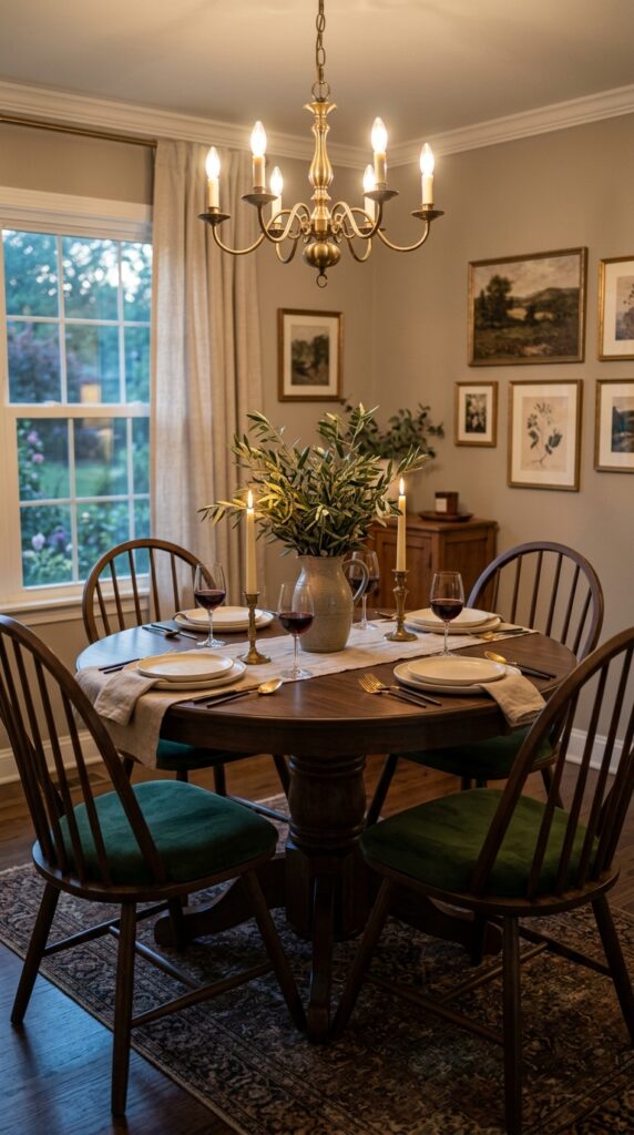
Forest green is the warm greige’s best friend, and almost no one talks about it. Where greige can drift toward boring with too much white or beige around it, deep green pulls it into something earthy and confident. Use it on upholstery first — dining chairs, an accent armchair, a velvet ottoman. If you’re brave, paint a single piece of furniture (a bookshelf, an armoire) in the same green for repetition. Living plants count toward your green quota; a large fiddle leaf or olive tree does heavy lifting. Constraint: skip mint, sage, or any cool green here. Warm greige needs warm greens — think hunter, olive, moss. Cool greens fight the wall undertone and the whole thing goes muddy. Done right, this combo feels like an English country house had a baby with a Brooklyn brownstone. Sophisticated, not stuffy.
8. The Renter-Friendly Greige Refresh
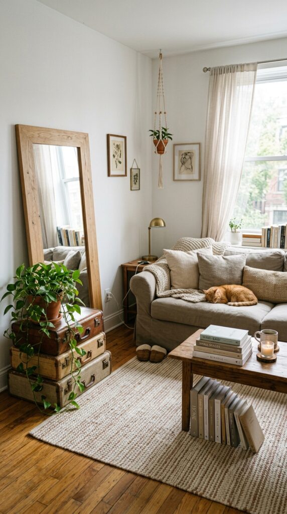
Not everyone can paint. If you’re renting, you can still get the warm greige effect by going hard on textiles and large objects in that tonal range. A greige slipcovered sofa is the foundation — it changes the whole room without a brushstroke. Layer in a large area rug (bigger than you think, please — small rugs make rooms look fragmented), greige curtains that puddle slightly, and at least three large pillows in linen, boucle, or wool. The trick renters miss: scale matters more than color. A single huge greige throw on a white sofa shifts the whole vibe. Watch out for going too monochromatic — without paint to anchor everything, you need 10–15% of contrast (a black lamp, dark wood, a deep terracotta cushion) or the room reads washed out. Removable peel-and-stick wallpaper in a tonal greige texture also works for one accent wall. You don’t need a landlord’s permission to have taste.
9. Greige Exterior Trim And Front Door
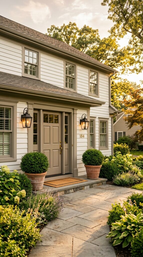
Curb appeal is mostly about cohesion, and warm greige trim is criminally underused on exteriors. Black trim has been everywhere for a decade — greige is the next move. It feels softer, more European, and ages better against weathered brick or stone. Use it on window frames, the front door, and any architectural moldings, but keep gutters and downspouts a different shade (usually matched to siding) so the trim reads as intentional accent, not blanket coverage. Pair with black sconces and unlacquered brass hardware for warmth. The constraint: greige exterior paint absolutely needs the right sheen. Flat fades and chalks within two seasons. Use exterior-grade satin or low-luster, and prime properly. Skip this if your house is heavily shaded — greige can read green-grey under canopy. In sun, it glows. Your house suddenly looks twenty years younger.
10. The Greige Home Office With Layered Lighting
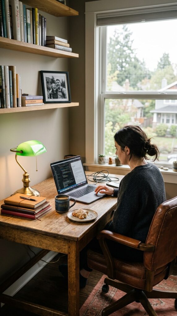
Home offices fail when they’re either too sterile or too cluttered. Warm greige walls solve the first problem — they give you a backdrop that’s calming without being clinical. The second problem is solved by layered lighting, which is the single most underrated office design move. You need three light sources minimum: overhead (ideally dimmable), a desk task lamp (with a warm bulb, around 2700K), and one accent light like a small picture light or shelf lamp. The greige walls reflect this warm light beautifully and reduce screen glare. Add one textile — a wool rug, a leather chair, a linen curtain — to dampen video call echo. Watch out: don’t put a greige wall directly behind your camera if you’re on calls. It can pick up weird casts. Side-light it instead. A workspace that doesn’t drain you by 3pm.
11. Greige And Terracotta Bedroom Vignette
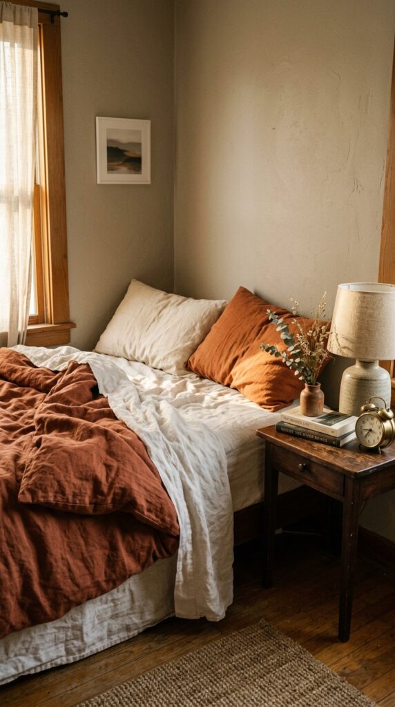
If you want a bedroom that feels warm and grown-up without buying anything new, change your bedding to terracotta tones against warm greige walls. This combination is foolproof. Burnt orange, rust, and clay all pull the warm undertones out of greige and create a sunset-in-a-room effect that’s particularly good for north-facing bedrooms. Stick with stonewashed linen or heavy cotton — synthetic bedding kills the look instantly. Layer in a single contrast piece: a cream throw, a sheepskin at the foot of the bed, a deep brown leather bench. The watch-out is over-matching. Don’t buy a “terracotta bedroom set” with coordinating shams and curtains and rug. Mix tones — a true terracotta duvet, rust pillows, clay-pink throw — so it looks collected, not catalog. Bonus: terracotta hides coffee stains better than white. Practical romance.
12. The Greige Mudroom Or Entry Bench
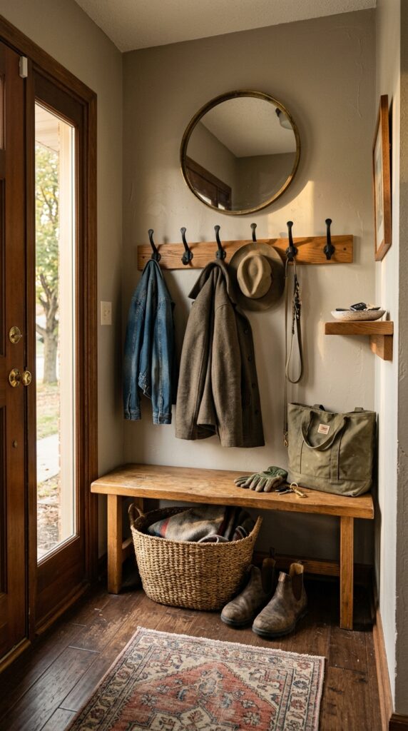
The entryway is the first and last thing you see every day, and most people leave it as an empty wall with a single coat hook. Warm greige walls plus a wooden bench plus iron hooks is a no-fail formula that makes even a tiny entry feel intentional. If you have the space, build or buy a low oak bench — it doubles as a place to put on shoes and a surface to style. Above it, a row of three to five black iron hooks (not too matchy) handles coats and bags. A small framed mirror or piece of art balances the wall. The styling rule: leave one hook empty. Cluttered hooks look chaotic; one empty hook looks lived-in. Watch out for putting your nicest rug here — entries destroy textiles. Use something washable or vintage you don’t mind aging. A small change with a daily payoff.
Why Warm Greige Keeps Working
Warm greige isn’t trendy, exactly — it’s just genuinely flattering, and that’s a quality that doesn’t go out of style. It works because it borrows the warmth of beige without the dated yellow cast, and the sophistication of grey without the cold cast. That balance is why interior designers reach for it again and again, even when bolder colors get all the magazine covers.
The throughline across every idea here is the same: warm greige is a backdrop, not a personality. It does its best work when you layer real materials on top — linen, oak, brass, wool, ceramic, leather. Skip the synthetic shortcuts and the matchy sets, and you’ll get a room that looks expensive even when it isn’t.
If you took one thing from this article, let it be this: test your greige in your actual room, in actual light, before you commit a whole gallon. Undertones shift dramatically depending on your windows, your floors, and even the time of year. Get it right, and warm greige will quietly elevate every room you put it in for years. Bookmark this one — your future self will thank you the next time you stand in the paint aisle wondering where to start.