A blank wall is honestly one of the most underrated opportunities in your home. Most of us stare at one for months, sometimes years, because the options feel overwhelming and the fear of committing to the wrong thing is real. I get it. I’ve stood in front of my own naked walls with a coffee in hand, scrolling through saved images, completely paralyzed by the possibilities.
Here’s the thing though: the walls in homes that look genuinely designed aren’t doing anything magical. They’re following a few quiet rules, mixing textures most people forget about, and leaning into one strong idea instead of five timid ones. You don’t need a renovation budget or a design degree. You need a point of view and the willingness to actually put a nail in the drywall.
Let’s get into twelve ideas that’ll take that empty stretch from forgettable to the part of the room everyone notices first.
1. The Asymmetrical Gallery Wall (Done Right)
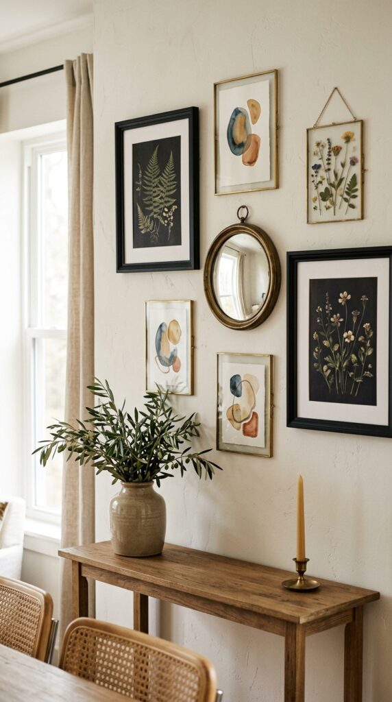
Symmetrical gallery walls are fine, but they’re also a little expected. The asymmetrical version feels collected, like you actually live there and didn’t spend an hour with a level and painter’s tape.
Start with one anchor piece, usually your largest, and place it slightly off-center. Build outward with smaller pieces in varying frame styles, but keep your color palette tight: think black, oak, and brass, or all warm metallics in mixed finishes. Mix in a sculptural object like a small woven hat, a tiny floating shelf with one ceramic, or a vintage hand mirror.
The watch-out: leave more breathing room than you think you need. Crowded gallery walls read as anxious, not curated.
Treat the entire arrangement as one shape, not a grid of individuals. That’s the whole secret.
2. One Oversized Piece, Period
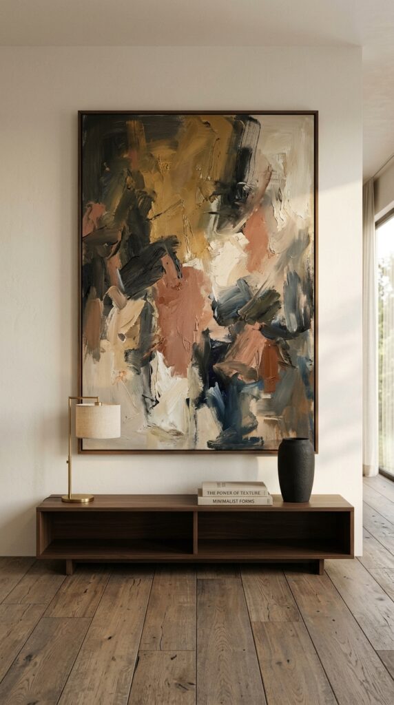
If gallery walls stress you out, do the opposite. One massive piece of art is the lazy genius move of wall styling, and it works almost every time.
Go bigger than feels reasonable. The piece should cover at least two-thirds of the wall’s width, ideally more. Anything smaller will float awkwardly and look like you ran out of budget. Stretched canvas, a printed poster in a chunky oak frame, even a vintage textile pinned to a wooden dowel all work beautifully here.
Skip this approach if you rent and can’t drill into the wall properly, because oversized art needs serious anchoring.
The trade-off is commitment. You’ll live with this piece for years, so choose something you actually love rather than something that just matches the couch. Color trends fade. A piece you genuinely connect with doesn’t.
3. Limewash Paint for Instant Old-World Texture
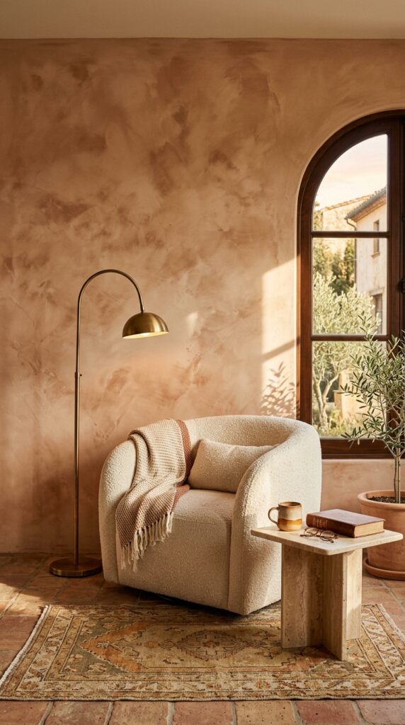
Flat paint on a flat wall is fine, but limewash is what makes a wall look like it belongs in a Tuscan farmhouse or a slow-living magazine spread.
The application is forgiving in a way regular paint isn’t. You use a wide brush and crosshatch in different directions, building up two thin coats. Mistakes look intentional. The finish has a soft, cloudy depth that catches light differently throughout the day. Earthy tones like clay, sage, dusty pink, and warm taupe work best.
One real watch-out: limewash chalks slightly when touched, so it’s not ideal in high-traffic hallways or kids’ rooms unless you seal it.
For renters, ask first. Some landlords won’t blink, others will lose their minds.
4. The Picture Ledge Trick
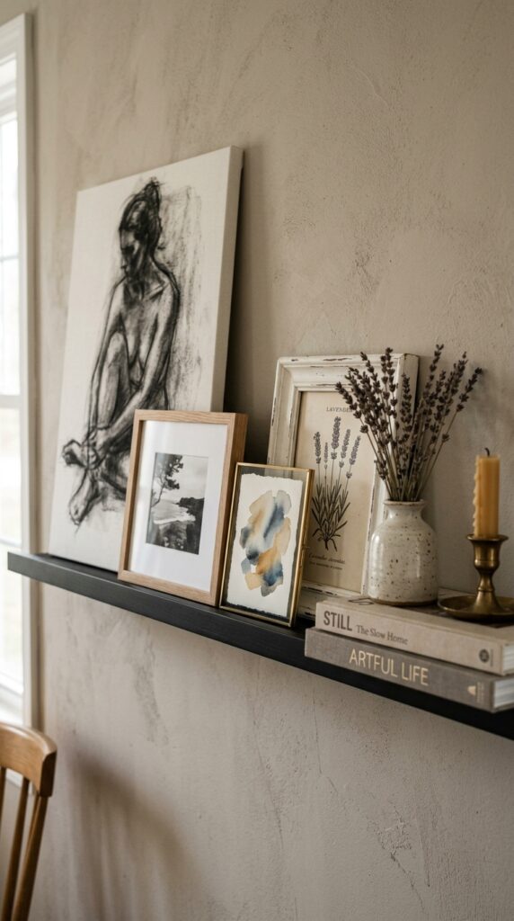
Picture ledges are the secret weapon of indecisive people, and I mean that with love. You can swap pieces in and out with zero damage, and the layered look is genuinely more interesting than a flat hung arrangement.
Use a single ledge for a more minimal look or stack two or three at varying heights. Mix art sizes aggressively, including some pieces that are clearly too big for the ledge so they lean against the wall. Add objects that aren’t just art: a small framed mirror, a sculptural vase, even a vinyl record you love.
The catch is that ledges can collect dust like nobody’s business. Plan to wipe them down monthly.
This one is genuinely renter-gold. Two screws, infinite styling possibilities.
5. Wood Slat Accent Wall
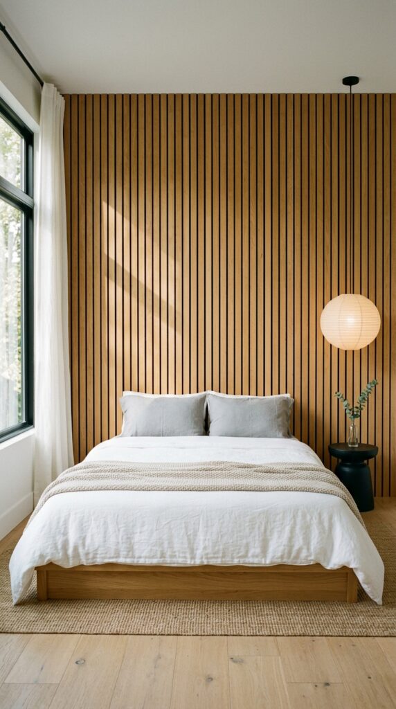
Wood slat walls became everywhere for a reason: they add architecture to a wall that has none, and the vertical lines visually stretch the ceiling.
You can buy pre-made slat panels that peel-and-stick or screw on, which is genuinely a weekend project rather than a renovation. Choose oak or walnut for warmth, or paint the slats in a deep moody color like charcoal or forest green for drama. Keep furniture in front of the wall low and simple. The wall is doing the work; don’t compete with it.
Skip this in tiny rooms with low ceilings. The vertical rhythm only flatters spaces with at least eight feet of height.
It reads as architectural, not trendy, when done in real wood rather than plastic imitations.
6. The Sculptural Wall Hanging
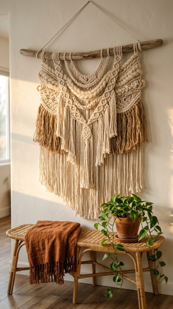
If everything on your walls is flat and framed, your room is missing dimension. A sculptural fiber piece, a woven basket, a carved wooden panel, or even a vintage rug hung on the wall completely changes the energy.
Texture is the underrated hero here. Pieces you can almost feel through the photograph make rooms look intentional rather than decorated. Look for handmade rather than mass-produced; the irregularities are what make it work. Hang it solo on a smaller wall, or pair it with one or two framed pieces nearby for contrast.
The honest downside: woven pieces collect dust and can fade in direct sunlight, so position thoughtfully.
A single textural piece can replace an entire gallery wall and feel more sophisticated.
7. Moody Paint With a Twist
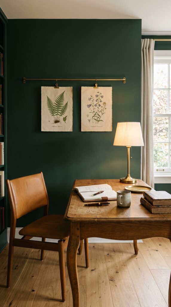
Painting one wall a moody color is the fastest, cheapest transformation in interior design. We all know this. The twist is in execution.
Use matte paint, never satin or eggshell, because the depth of color is what makes it look expensive. Bring the color slightly onto the ceiling, just six inches or so, and it instantly looks intentional rather than commitment-phobic. Try unexpected colors: terracotta, deep plum, ink blue, oxblood. Avoid the predictable navy if you want to look like you have actual taste.
The watch-out: dark walls eat light. If your room faces north or has limited windows, balance with warm lighting and lighter textiles.
A great paint color hides a multitude of decorating sins. It’s your highest-leverage move.
8. The Mirror As Art
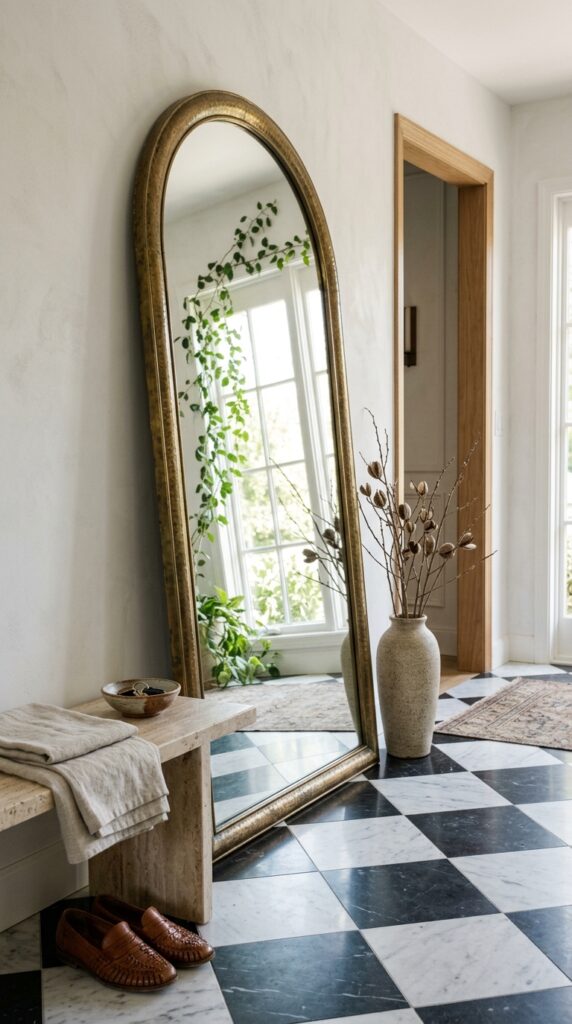
Mirrors aren’t just functional. The right one is sculptural, reflective, and doubles your light in a way that makes a small room feel twice the size.
Lean a tall arched mirror against the wall instead of hanging it. The casual posture instantly makes it feel like art rather than a bathroom afterthought. Look for vintage frames in brass, weathered wood, or hammered metal because anything plastic-looking ruins the effect. Place it where it reflects something good: a window, a piece of art, a beautiful corner.
The trade-off is real estate. Floor-leaning mirrors take up space, so they’re not for tight hallways.
A mirror placed thoughtfully does triple duty: function, reflection, sculpture.
9. Floating Shelves With Restraint
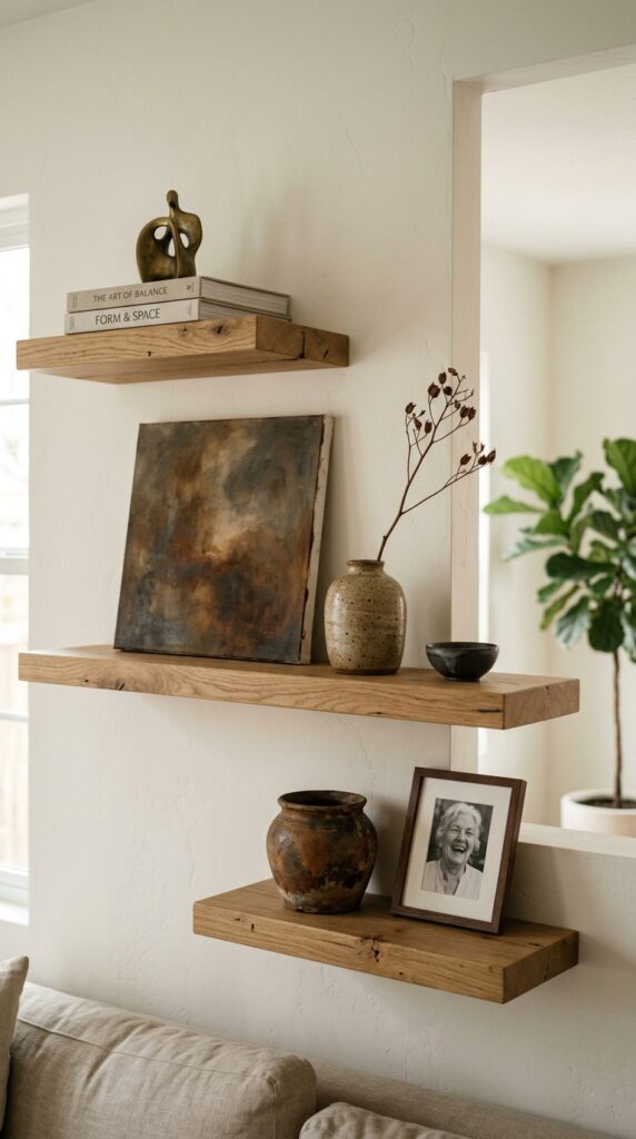
Floating shelves are where good intentions go to die. People mount them and immediately fill every inch with chotchkies they bought at a craft fair in 2019.
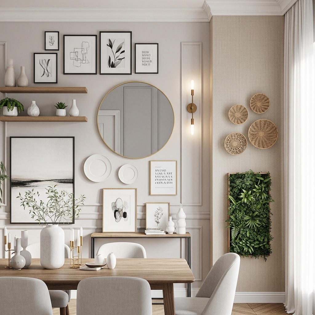
Style with negative space as your best friend. Each shelf should have no more than three or four objects, and at least one of them should be sculptural rather than decorative. Mix heights aggressively: a tall vase next to a low stack of books next to a leaning piece of art. Use objects in three different materials, like ceramic, brass, and wood, repeated across all shelves for cohesion.
Skip shelves entirely if you’re a natural collector. Your walls deserve restraint you can’t provide.
Less stuff, better stuff, more room to breathe. That’s the whole formula.
10. The Tapestry or Vintage Rug Approach
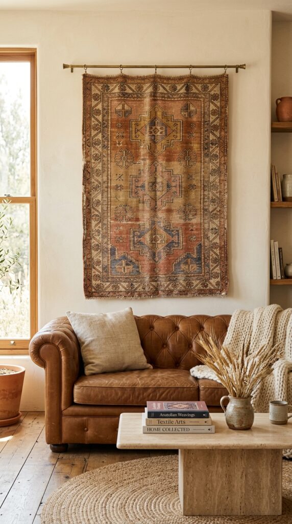
Hanging a textile on the wall is one of those moves that immediately telegraphs taste. It says you traveled, or you thrifted well, or at minimum that you understand softness has a place beyond the floor.
A faded vintage rug works beautifully because the muted tones and worn texture add age to a new room. Mount it from a brass or wooden rod for a clean look, or use small invisible velcro strips for a flush appearance. Keep the rest of the wall completely empty. The textile is the moment.
The catch: real vintage rugs aren’t cheap, and the high-quality reproductions still cost something. Set a budget before you fall down the rabbit hole.
Nothing makes a sterile room feel lived-in faster than fabric on a wall.
11. Picture Lights and Plug-In Sconces
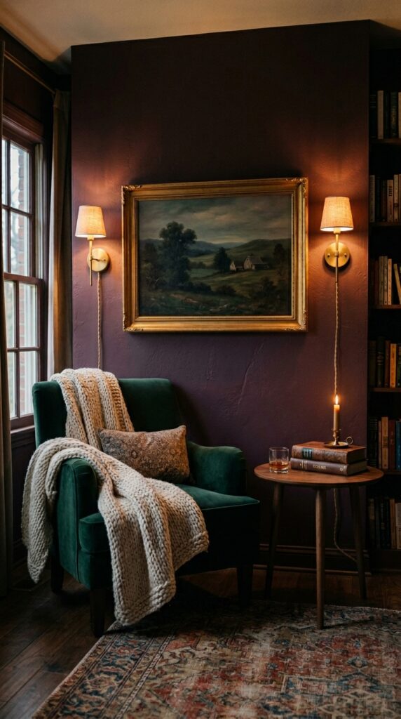
Lighting is what separates rooms that look styled from rooms that look professionally designed. Most people forget that walls need light too.
A picture light over a single artwork gives gallery-level drama for under a hundred dollars. Plug-in sconces flanking a piece or framing a vignette eliminate the need for an electrician, and the cord can be hidden with a simple cord cover painted to match the wall. Choose warm bulbs, always. Cool white light makes everything look like a dental office.
The real watch-out: bad cord management ruins the whole effect. Plan the cord path before you hang anything.
Lit walls feel layered and intentional even when the rest of the room is simple.
12. The Single Statement Vintage Find
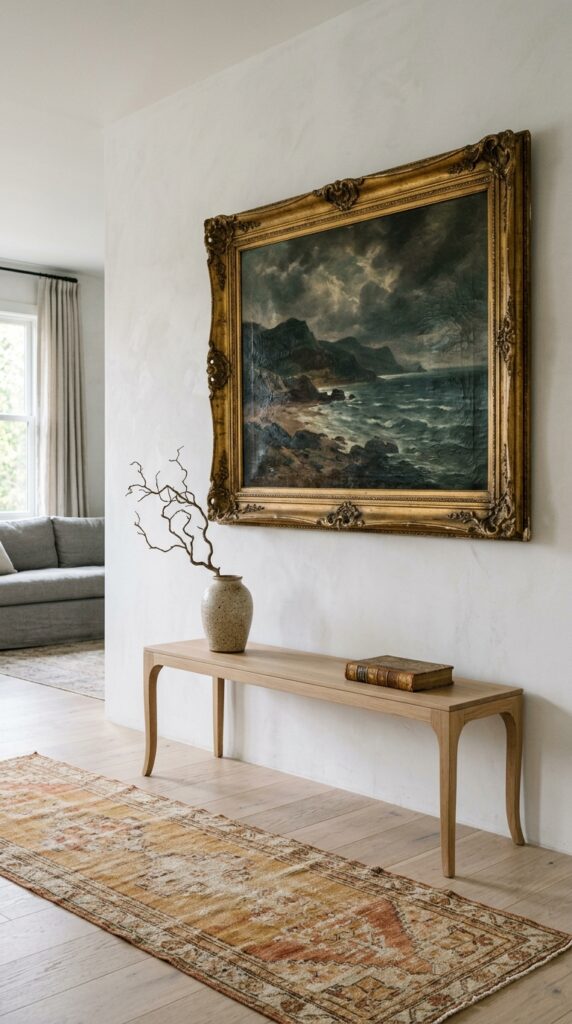
Sometimes the most designer-looking wall has just one thing on it, and that thing is old. A single vintage oil painting, an antique tapestry, a worn architectural fragment, hung in an otherwise modern room creates the kind of tension that makes designers swoon.
Hunt at estate sales, flea markets, online auctions, and your grandmother’s attic. The frame matters as much as the art; ornate and slightly tarnished beats new and shiny every time. Hang it slightly larger than feels right. Resist the urge to add anything else nearby.
The honest watch-out: vintage hunting takes patience. You can’t force-find the right piece in a weekend.
One great old thing in a clean modern room is more interesting than ten new things trying to look curated.
Final Thoughts
The walls in your home don’t need to be solved all at once. Pick the idea that made you pause while reading, the one you can already half-picture in your space, and start there. Designer rooms aren’t designed in a day. They’re built one decision at a time, with a willingness to live with something for a while and then change it when it stops working.
The biggest shift isn’t budget. It’s permission. Permission to commit to a moody paint color, to hang the mirror at floor level, to paint over the mistake next month if you hate it. Walls are forgiving in a way we forget. Spackle exists. Paint exists. The worst that happens is you learn what you don’t like, which is genuinely useful information.
Bookmark this page, save the ideas that hit, and come back when you’re ready for the next wall. We’ll be here with more ways to make your home feel like the kind of place you never want to leave. That’s the whole point, isn’t it?