Pink in a dining room is genuinely underrated. Not the hot pink of a teenage bedroom or the bubblegum gloss of a confectionery shop — but the quieter, more sophisticated versions of the color that have been quietly taking over design-forward interiors for the past few years. Dusty rose, blush, antique pink, terracotta-pink, mauve — these are the shades that work beautifully in a dining room context, where you want a space that feels both energizing and intimate at once.
The dining room is one of the few spaces in a home where bold color choices actually make sense. You’re not sleeping there. You’re not trying to concentrate. You’re eating, talking, lingering over wine — and a little color drama genuinely enhances that. If you’ve been hovering over a pink paint swatch for months, this article is your permission slip.
Here are 12 ideas for bringing pink into your dining room in a way that feels intentional, layered, and absolutely not juvenile.
1. Dusty Rose Limewash Walls
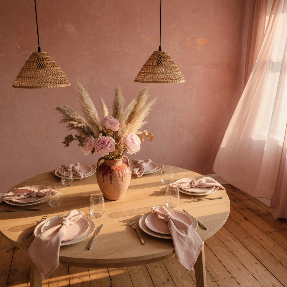
Limewash paint is having a proper moment, and honestly, it deserves it. Unlike flat or eggshell finishes, limewash creates a layered, slightly uneven surface that catches light differently throughout the day — which means your dusty rose wall looks candlelit at dinner even when you haven’t lit a single candle. It’s the most flattering wall treatment for a dining room, full stop.
The key is going dusty, not bright. A rose that leans toward grey or terracotta will feel grown-up and architectural. A rose that leans toward hot pink will read as a mistake by next season. If your room faces north and gets cold light, push slightly warmer — toward a rose-clay tone. South-facing rooms can handle cooler, more muted pinks without feeling washed out.
Pair limewash walls with aged brass hardware, dark walnut furniture, and linen upholstery in warm neutrals. Avoid white — it will make the pink look faded rather than intentional. Ivory and oatmeal are your better bets. One thing to watch: limewash does show scuffs more easily than standard paint, so it’s better suited to dining rooms where walls aren’t constantly being brushed past.
The result is a room that feels ancient, warm, and a little bit romantic — which is exactly what a dining room should be.
2. Pink Velvet Dining Chairs
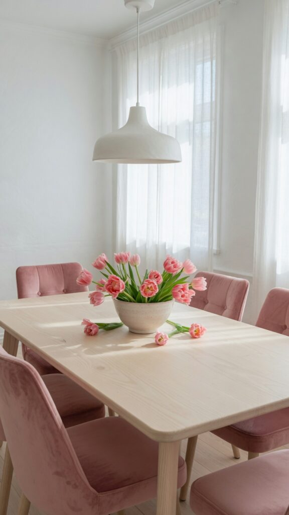
If you’re not ready to commit to pink walls, chairs are the smartest entry point. A set of velvet dining chairs in blush or deep rose can transform a plain white or greige dining room without touching a single wall. The investment is real — good upholstered chairs aren’t cheap — but the impact-to-effort ratio is extremely high.
Velvet specifically is worth the extra spend here. It catches light in a way that makes even a mid-range pink look expensive, and in a dining room setting — where overhead lighting and candlelight both play a role — velvet develops a beautiful depth that flat fabric simply doesn’t have. A deep rose velvet will look almost burgundy in dim lighting and softly pink in bright daylight.
Practically speaking, go for a performance velvet if you have kids or regular dinner party spillage. Crypton and similar performance fabrics now come in velvet textures that are genuinely stain-resistant without feeling plasticky. That said, skip this if you have pets with strong shedding habits — velvet is merciless with pet hair.
Mix the chair color with a table in dark oak, natural rattan, or matte black for contrast. Matching pink chairs with a pink table tips quickly from curated into chaotic.
3. Pink and Brass: The Power Combination
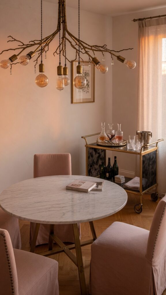
There is a reason this pairing keeps showing up in every high-end interior project — it simply works. The warmth of brass pulls out the gold and honey tones hidden in most pink shades, and together they create a palette that feels luxurious without veering into maximalism.
The trick is using brass sparingly and deliberately. A brass chandelier is the anchor piece — choose one with genuine weight and presence, not a lightweight fixture that reads as decoration. From there, brass appears in supporting roles: cabinet handles, a mirror frame, a drinks trolley, the legs of a sideboard. Three to five brass elements is usually the right count. More than that and the room starts to feel like a hotel lobby circa 2018.
Pink here should be quiet — dusty rose, pale blush, or antique pink rather than anything vivid. The brass is already doing significant visual work, so the pink functions as a backdrop tone rather than a statement. Think blush linen chair covers, a pink-toned plaster wall, or even just a large pink floral arrangement on the table.
If your dining room has a chandelier already, check whether a spray-painted or swapped-out brass version is possible before buying new. It’s a small change that completely shifts the room’s warmth.
4. Blush Pink Ceiling: The Forgotten Fifth Wall
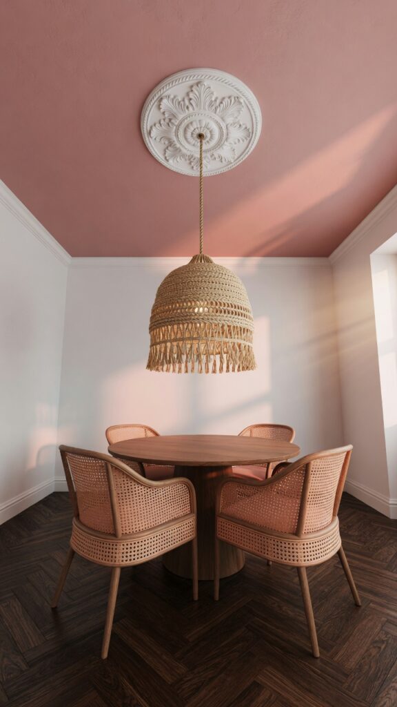
Painting the ceiling pink might sound like the most terrifying design decision in this article. It is also, arguably, the most effective.
A blush ceiling does something no other design trick can quite replicate: it throws a warm, rosy light across the entire room. Every face at the dining table looks slightly better. The whole space takes on a quality that is almost candlelit, even in bright daylight. Restaurateurs have known this for years — warm ceilings are a hospitality trick that somehow never fully crossed into residential design.
The wall color matters enormously here. Blush ceiling with white walls is clean and modern. Blush ceiling with greige walls is cozy and enveloping. Blush ceiling with a deeper color wall — forest green, navy, charcoal — creates drama. What doesn’t work well is matching the ceiling pink to wall pink. Tone-on-tone ceiling and walls reads more as an accident than an intention unless the finish textures are very different.
Use a matte or flat finish on the ceiling — it will make the color look softer and more atmospheric. Satin or semi-gloss will look shiny and slightly plastic. One caveat: if your ceilings are lower than nine feet, a pink ceiling can feel slightly claustrophobic. In that case, limit it to one accent alcove or the space above the dining table only.
5. Terracotta-Pink Tile Backsplash or Feature Wall
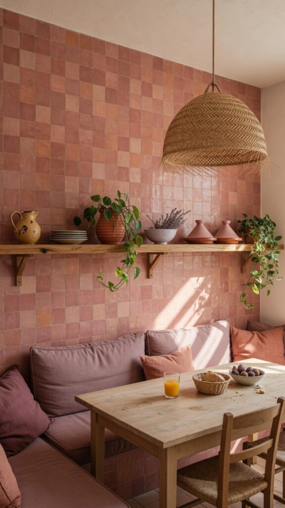
Terracotta-pink sits at the intersection of earthy and rosy — it’s grounded enough to feel warm and organic, but pink enough to read as a deliberate color choice rather than a neutral. In tile form, particularly zellige or handmade terracotta tiles with natural variation, it creates a feature wall with genuine texture and personality.
This works especially well in dining rooms that connect to or open toward a kitchen, where the tile can echo a backsplash material. A built-in banquette against a tiled wall is a combination that delivers both visual richness and practical seating — and it photographs beautifully, which is its own kind of reward.
Zellige tile in particular has a handmade, slightly uneven glaze that catches light from different angles throughout the day. It pairs naturally with oak, linen, rattan, and matte ceramics — the whole warm-organic material family that has dominated interior design for good reason. Avoid pairing it with chrome or cool-toned metals; it needs warmth to function at its best.
The constraint here is cost. Zellige and handmade terracotta tiles are not cheap. If budget is tight, consider limiting the tile to a smaller section — the wall behind a banquette seat, for example — and using a complementary paint color on the surrounding walls. The effect reads as intentional rather than incomplete.
6. Maximalist Pink Floral Wallpaper
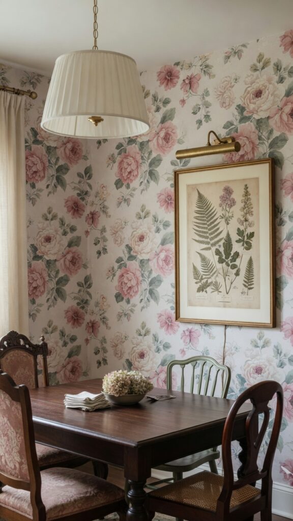
Maximalism is not for the faint of heart. But a bold floral wallpaper in a dining room is one of the cases where going big genuinely pays off — because dining rooms are, almost by definition, theatrical spaces.
The key to making floral wallpaper work rather than overwhelm is scale. A large-scale pattern — flowers the size of dinner plates rather than scattered rosebuds — reads as confident and intentional. Small-scale florals in a dining room can look busy and dated. Go big or genuinely consider going home.
Keep everything else in the room restrained. Dark wood furniture, simple chair silhouettes, a single unfussy pendant — the room’s bones should be quiet so the wallpaper has room to breathe. The mistake most people make is trying to match accessories to the wallpaper’s colors. Instead, pick one color from the pattern and echo it subtly in one or two objects: a vase, a set of napkins, the chair cushion piping.
Skip this if you hate visual commitment or if the room is very small — bold florals need at least a modest amount of ceiling height and floor area to unfold properly. In a compact space, consider papering only one wall behind a sideboard or console table rather than the full room.
7. Pink Linen Table Linens and Layered Textile Styling
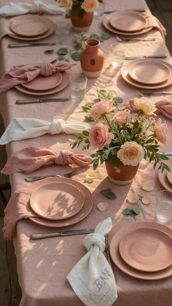
Not every pink dining room intervention needs to involve paint or furniture. Textiles are the most flexible, renter-friendly, and reversible way to bring pink into a dining room — and when done with a thoughtful eye for layering and texture, they can elevate an ordinary table into something genuinely beautiful.
The foundation is a linen tablecloth in blush or dusty rose. Linen is the right choice here not because it’s trendy but because it is honest — it wrinkles, it has texture, it looks lived-in and real in a way that polyester tablecloths never quite manage. Wrinkled linen on a well-set table reads as effortless European; wrinkled polyester just reads as unironed.
Layer over that with napkins that don’t perfectly match. A slightly deeper rose, an antique white, a faded terracotta — mix within a warm tonal family and the effect is curated rather than chaotic. Napkin rings in brass or natural rattan tie the textile layers together.
Ceramic tableware in dusty pink, blush, or speckled cream completes the look. You don’t need a matching set — in fact, the best tablescapes usually involve two or three complementary ceramic styles rather than a uniform service. The constraint: this approach requires more styling effort each time you set the table. If you eat at the dining table every night, a full textile setup may not be practical for daily use.
8. Deep Rose Painted Millwork and Wainscoting
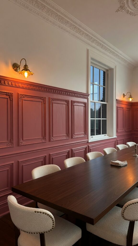
Painting just the lower half of a room — the millwork, paneling, or wainscoting — in a deeper shade while keeping upper walls neutral is one of the most architecturally elegant approaches to adding color to a dining room. It grounds the space visually, draws the eye to the room’s proportions, and feels genuinely considered rather than merely decorative.
Deep rose is a particularly strong choice for wainscoting because its richness suits the more formal, paneled aesthetic of millwork. This isn’t a context for pale blush — the color should have weight. Think closer to dried rose, muted berry, or antique mauve. Something that holds its presence in lower light.
The upper walls should be white, off-white, or a very light warm cream — not another color. The contrast between a rich lower tone and a pale upper wall makes ceilings feel higher and rooms feel more complete. If your dining room has existing wainscoting or picture rails, this is an especially low-effort transformation: simply repaint what’s already there.
Pair with ivory or cream upholstery — boucle, linen, or a textured weave — and keep furniture in dark wood tones for maximum drama. The one watch-out: deep painted millwork is harder to touch up than plain walls, because brush strokes show more on detailed panel edges. Factor that into your maintenance expectations.
9. Rattan and Pink: Bringing the Outdoors In
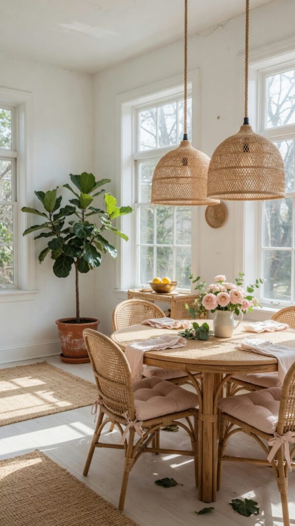
Rattan and pink is one of those pairings that should feel dated by now but somehow keeps arriving in new, relevant forms. The reason it works is material contrast: rattan is inherently rough, woven, and organic, while pink — particularly soft pink — reads as delicate and refined. They balance each other. The pink softens the rattan’s rusticity; the rattan stops the pink from feeling precious.
The most effective approach is to let rattan do the heavy lifting structurally — pendant lights, chair frames, table base, even a sideboard — while pink appears in the softer elements: cushion pads, placemats, a throw folded over a chair, the color of a ceramic vase. This creates a room that feels warm and naturalistic with enough color to be interesting.
Good rattan furniture is not always easy to source at a reasonable price, and cheap rattan can look tired very quickly. Look for pieces with tight, consistent weave and solid frame construction. If you share the dining space with children, rattan chairs with cushion pads are the practical choice — the cushions absorb impact and can be replaced more cheaply than the chairs themselves.
If your dining room gets strong direct light, rattan will fade and dry over time. A UV-protective treatment applied annually extends its life significantly. This is genuinely the sunnier side of a renter-friendly option — most rattan pieces require no installation and simply move with you.
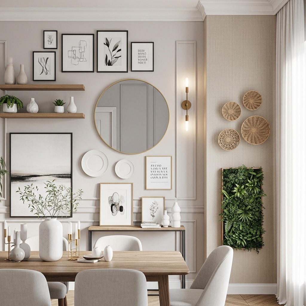
10. Gallery Wall in Pink Tones Above a Sideboard
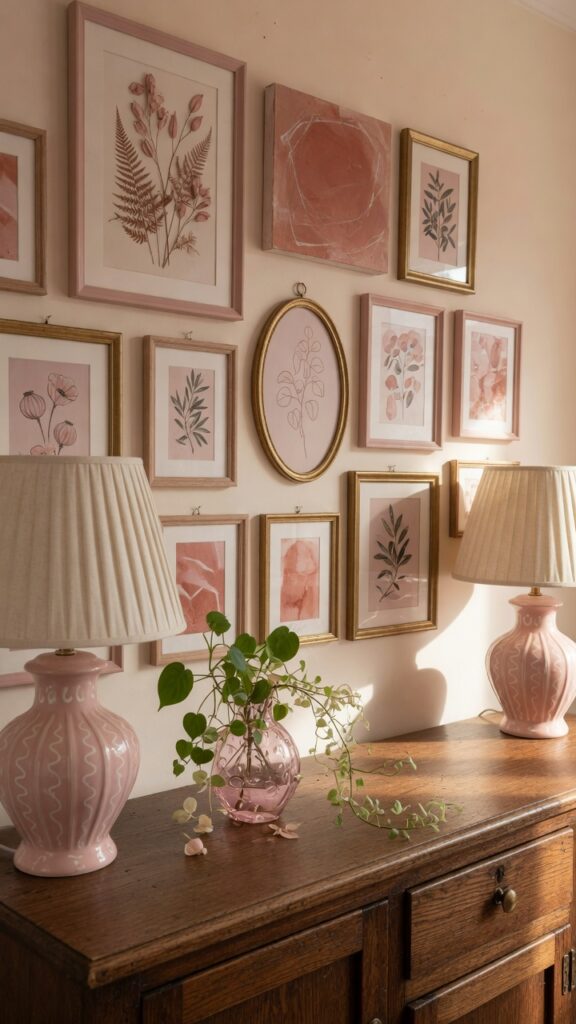
A gallery wall is one of the most accessible ways to introduce pink into a dining room without committing to a single large purchase — and above a sideboard, it has the added structural benefit of filling what is often the most awkward vertical space in the room.
The key to a pink-toned gallery wall that reads as curated rather than assembled is tonal coherence. You’re not looking for matching pink frames or identically pink artwork — you’re looking for prints and pieces where pink, blush, terracotta, and rose appear as recurring notes across an otherwise varied collection. Botanical prints, abstract watercolors, vintage food illustrations, and soft landscape photography all tend to carry warm pink undertones naturally.
Frame choice matters as much as print choice. Brass frames add warmth. Dark walnut or ebonized frames add drama. White frames make the gallery feel more modern and less collected — which is fine if that’s your aesthetic, but misses some of the layered character that makes gallery walls genuinely interesting.
Arrange by laying everything out on the floor first, then transferring to the wall. Start with the largest piece slightly off-center and build outward. Leave even gaps between frames — between two and three inches feels intentional; less looks crowded; more looks scattered. Don’t overthink symmetry. The slightly asymmetric arrangement almost always looks better in real life.
11. Moody Pink: Combining Rose With Deep, Dark Tones
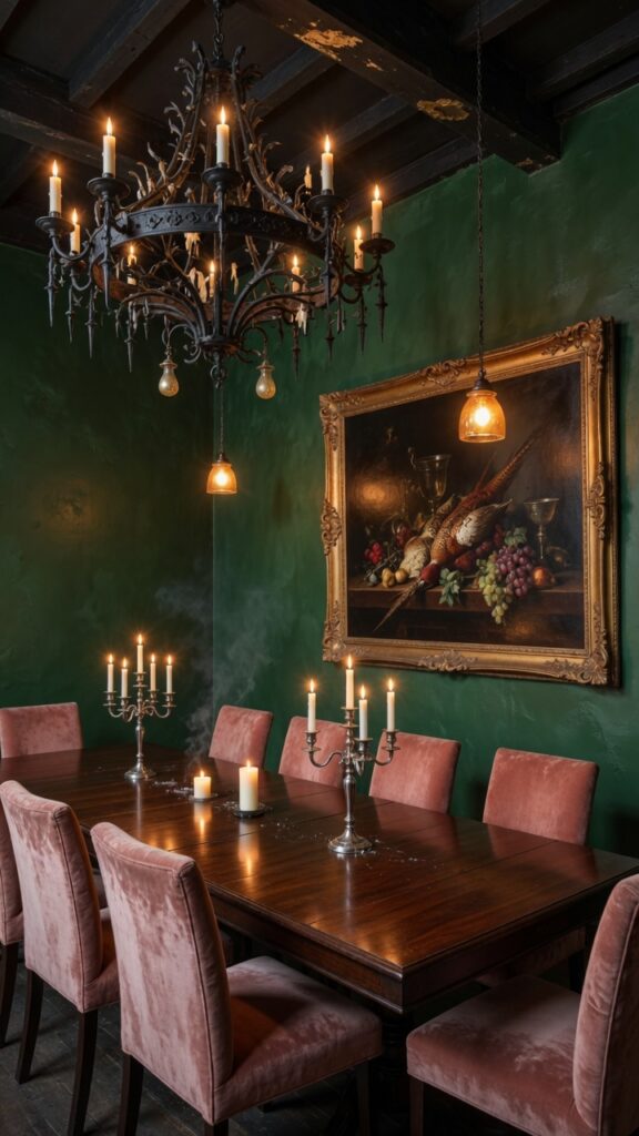
The assumption that pink is inherently light and airy is worth challenging. Pink paired with deep, saturated darks — forest green, charcoal, navy, near-black — creates a dining room mood that is genuinely theatrical, intimate, and sophisticated. This is the approach that makes pink unrecognizable as “pink” and transforms it into something more like jewel-toned luxury.
The contrast here is doing the work. Dusty rose velvet chairs against a dark forest green wall is not a timid combination — it reads as confident and fashion-forward. The rose appears richer and deeper against dark backgrounds than it does against white or neutral tones, which is itself an argument for this approach if you find pale-room pinks a bit thin and unresolved.
Dark rooms need thoughtful lighting. This is not a space where a single overhead flush-mount will serve you well. A chandelier with warm-toned bulbs, supplemented by sconce lighting or candles, creates the layered illumination that makes dark dining rooms sing. Without it, the room risks feeling dim rather than moody — and that’s a meaningful distinction.
Furniture should be heavy and substantial in scale — a long mahogany or dark oak table, substantial chairs, a large sideboard. Skinny, lightweight furniture gets lost in dark rooms. This is a maximalist’s dining room, and it requires commitment to the aesthetic to work.
12. Renter-Friendly Pink: Peel-and-Stick, Accessories, and Temporary Transformations
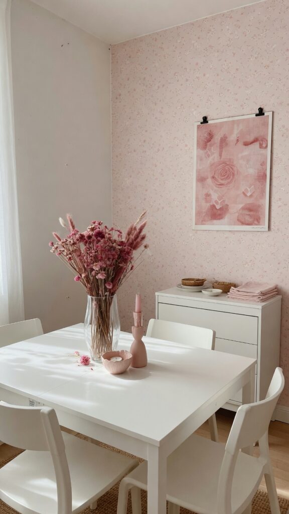
Not everyone can paint, tile, or install a chandelier. If you’re renting, or if you simply want to test a pink direction before committing to it, there are genuinely effective temporary approaches that don’t require permission, significant investment, or any real skill.
Peel-and-stick removable wallpaper has improved enormously in quality over the past few years. The better versions are genuinely indistinguishable from traditional wallpaper in photographs and hold up well over time without lifting at edges — though this depends heavily on the wall surface and brand quality. A single accent wall behind a dining table or sideboard is enough to anchor the room’s color story. When you leave, it comes down cleanly.
Large textile art — a printed fabric piece stretched in a clip frame or hung from a wooden dowel — brings color to walls without damage. Blush and rose tones translate well to printed textiles, and an oversized piece has real visual impact. Pair it with a few smaller framed prints and the wall feels fully composed.
At the table level: a blush table runner, pink-tinted ceramic candle holders, a bouquet of dried peonies or preserved roses, blush placemats — none of this requires any installation, all of it moves with you, and collectively it creates a dining table that feels considered and warm. Renter-friendly doesn’t have to mean provisional. With the right edit of objects and textiles, a temporary pink dining room can feel as intentional as anything permanent.
Pink dining rooms reward the people willing to trust them. The color has a genuine warmth and flattery to it that most dining room palettes simply don’t offer — and the range of pinks available, from the deepest dusty rose to the palest blush, means there is a version of this for almost every taste and aesthetic. Whether you’re limewashing a full room or simply switching out your chair cushions, the shift toward pink in a dining room almost always makes the space feel more alive, more inviting, and more interesting to sit in. That’s not nothing. In a room designed specifically for gathering and lingering, it might actually be everything. Come back to this site whenever you’re ready for your next room — there’s always another layer to explore.